

The Best Examples of Effective Web Design Presentation

Why is the web design presentation important as much as the design itself? How do you present your design work and create a great first impression? We took the time to find great examples and explain the importance of a good presentation for a website. Take your time to find the style that will prove the most effective and complement your work.
Here are some great examples of how to present web design:
1. two-part onepager web design presentation.
Sometimes, one page is all you need to have on your website. You can easily incorporate all the vital information you require. By using distinct sections, you can differentiate testimonials, contact, about me, and multiple ‘call to action’ buttons. The problem may appear when you present your web design to a client. Without an easy way to navigate, the client may have trouble understanding how the website will feel when developed. Consider using the style on the web design presentation similar to the example below.
The designer took the liberty to slice the design into two parts. This way, you can keep the first impression of the landing page in focus. Additionally, you can present the rest of the page and all the details needed.

2. Background Image and Drop Shadow
Simple, yet visually appealing is the ideal to strive for in any design. That is especially true with web design. Notice how the structural line flows from the background to the actual image of the landing page. Just a touch of drop shadow effect is enough to make the design visible.

3. Complementary Flat Background Color
While we are a matter of simple, yet effective designs. Here is another great example. Sometimes just adding a background in a complementary color can mean a world for the design.

4. Website Redesign Presentation
Side by side web design presentation is excellent for presenting multiple concepts, or various pages of a website. It is a lot busier and detailed, but a viable way to present. Find a way to structure and organize all of the pages so they are easier to comprehend.

5. Perspective Presentation
This way of presenting is commonly used in business card design. However, you can see it works for web design as well. The central focus is on branding and making sure your website fits your brand instead of the content of the website.

6. Outside the Box
Think Outside The Box! No better way to put it for this fantastic presentation. Just extending these red shapes to the outside of the landing page box, makes the characters and the entire design come to life.

7. Hovering Screen Design Presentation
This presentation is the most sophisticated design presentation on our list. 3D elements and shadow give a surreal impression of a hovering design.

8. Organic Nature Inspired Presentation
In contrast to the surreal presentation above, we have an organic, nature-inspired example. The greenery looks so live that it feels almost like it’s animated, even though it’s a static web presentation.

9. Animated Music Website Presentation
Moving away from static website presentations, here is a refreshment. A tiny animation can bring the design to life. In this example, the only thing animated is the thin sound waves. And it looks fantastic. You can check the animation by clicking here.

10. Video Animation Web Presentation
Another interesting example is the use of a timelapse video. Such as one that will probably be used on the actual site. With animations and videos incorporated into the presentation, there is no need for fancy backgrounds. Keeping it simple is the way to go. Again, you can check the animation by clicking here.

Grow Your Business with Web Design, Development and Branding
You may also like.
Brown Color in Branding
The Best Websites In January 2020
Leave a comment cancel reply.
Save my name, email, and website in this browser for the next time I comment.
Home PowerPoint Templates Shapes Web Design Concept PowerPoint Slide
Web Design Concept PowerPoint Slide
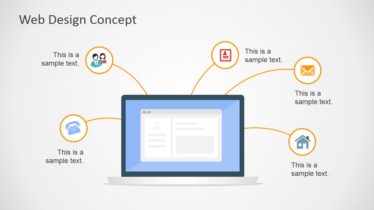
Produce an interactive and modern PowerPoint presentation with the Web Design Concept PowerPoint Slide . Using its chic minimalist presentation design, be able to present your ideas and innovations with a modern flair.
The Internet, as the fastest growing mode of communication in the world, expands almost exponentially every day, generating thousands upon thousands of websites viewed, streamed, and skimmed by the second, This PowerPoint template may be used to capture the Internet’s purpose of communicating ideas, by relating proposed business plans hinging on technology and technological advancements, making use of the popular image of websites as one of the principal components of the presentation design.
Using a flat design, the PowerPoint slides display a typical web layout as the main feature, with lines extending from it to minimalist PowerPoint clipart which may be use to highlight key elements of communication processes. These PowerPoint icons include that of a person, a telephone, a letter, an envelope, and a house.
The presentation template may be used to elaborate on concept discussions, utilizing the existing icons to illustrate various communication alternatives. The presenter may choose to feature the web design as a representation of online transactions and communications which have become more convenient alternatives to conventional communication methods such as personal meetings, phone calls, or letters.
Another use for the PowerPoint template is to highlight important components of a web design which ensure the business organization of heavy web traffic to benefit its marketing and advertising objectives.
The Web Design Concept PowerPoint Slide is most ideal for presenting ideas and concepts which are connected to online networking and web developments. However, the presenter may also edit the PowerPoint slides so that they can become even more aligned to the presenter’s own needs and preferences.
The presenter may also download other Internet-themed PowerPoint templates, such as the Flat SEO PowerPoint Template .
You must be logged in to download this file.
Favorite Add to Collection
Details (3 slides)

Supported Versions:
Subscribe today and get immediate access to download our PowerPoint templates.
Related PowerPoint Templates

Purple Abstract PowerPoint Background

Simple Bottleneck Slide Template for PowerPoint

4-Item Idea Exploration PowerPoint Template

3-Item Futuristic Concept PowerPoint Template
Design Feedback Tools
Upload and send designs to get quick feedback
Content Collection Tools
Add content fields to any design to add helpful context for writers
Website Feedback Tools
Install our on-site widget to collect feedback on any website
Cheat Sheet For Presenting Your Website Designs
Written by: Tyler Morian - Nov 22nd, 2021 - 6 minute read
The process of creating a new website for your clients involves several different benchmarks. First, you conduct your research of the client and their target audience. Next, you present wireframes. Once wireframes are approved, you come to the stage of designing your client’s new website.
It’s easy for a presentation to become daunting if you don’t feel prepared to explain design choices or features. Clients may fixate on a trivial detail, and thus, slow down the web project (meaning more time and less profit for you).
This post is a how-to guide on ways to make a successful website presentation by adding context and annotations to help your client better understand the design elements and design decisions. Whether you are a designer about to share your designs or an account manager getting ready to present, this post will guide your discussion and help you present with confidence.

How to Make A Website Presentation
One of the most important first steps in the presentation process is determining how you plan to present your work to your client. Knowing beforehand how your client will be viewing the presentation is necessary to guide how you will create annotations.
There are a few different ways to go about presenting. You may choose in-person if your client is local or over the phone/video conference. Either way you decide to present, follow these few steps to make your meeting run as smoothly as possible.
1. Create an Annotated Presentation
In previous posts, we discussed the importance of annotating wireframes for your clients. Wireframes are tricky to present, because they are the bare bones of a site structure. Clients don’t always visualize what you have in mind for them and it leaves room for too much feedback on their end.
Website design presentations are a whole different challenge. At this point, your design team (or you, if you’re the designer) has likely spent weeks working on these designs. They feel personal to you. Presenting the new designs can often feel nerve-wracking because you don’t know how your client will perceive the designs.
The best way to prepare yourself (and your client) for your design presentation is to annotate. What do we mean?
Back when design feedback software didn’t exist, we would simply send our design files via email and hop on a call ASAP. We’d avoid allowing the client to sit with the designs too long before we tried to give our best explanation for how and why the designs look the way they do.
Nowadays, we can send design files via design feedback software, such as SimpleStage , to create a guided presentation for web projects. Send multiple designs with annotations on every page to help your clients understand the user flow, see what content you are using as placeholder, what features are designed to increase sales, etc.
Sending files with no context whatsoever leaves your designs up to their interpretation. Annotating designs allows for a more seamless client experience, especially when you use a design feedback software to collect their thoughts.
Pro Tip: If the website you’re designing has more than 15 unique pages, it may be worth setting multiple design meetings to break up the presentations.
2. Show Examples of Website Features
Your website designs will likely include features that are difficult for your client to conceptualize from a flat design file. Include examples from other websites to demonstrate these types of features to paint a clear picture for your client, helping them imagine how the features might fit in and benefit their website.
Curate a custom list of websites that include the key features or animations that you are proposing, and whether conducting the presentation virtually or in-person, be prepared to visit these websites as you go.
3. Document User Flow
Walk the client through the user flow focusing on the customer perspective. Annotating features like scrolling down to see the CTA or using headers to break up content demonstrates thoughtful documentation of user flow.
Highlighting how your designs improve the user experience for your client’s customers can be a big win for your presentation. This is particularly true if your proposed user flow solves a problem in the existing site or otherwise greatly enhances the overall experience. Be sure to call out these features and explain them clearly.

4. Ask Clients for Feedback with Guided Questions
In an ideal world, clients offer timely and useful feedback. Unfortunately, real world client feedback can be vague, insignificant, and needless. Knowing the right questions to ask during your new website presentation will encourage your client to give clear context to their feedback.
It can be meaningful to know how your client feels about the website and why. For instance, asking them to describe how they feel about specific design elements and what elements they feel are missing will shorten the amount of sharing back and forth. Using the word “feel” also offers an empathetic point of view, making your questions less likely to come off as defensive. This disarming tactic helps your clients to receive your questions more positively.
Clients typically only spend a set amount of time giving feedback, so breaking up your requests is a great way to receive more timely and targeted feedback, rather than asking open-ended questions, such as what they think about the site in general.
Asking “Why?” goes a long way . When a client fails to give precise feedback on your designs, asking them why gives them the chance to expand on their comments.
Reminding your client to consider their customer is also important to include in your questions. The target audience is an essential part of their goal for the site, so encourage clients to view the site from the perspective of their ideal customer to help them offer constructive feedback.
5. Use A Design Feedback Software
The days before design feedback software meant emailing design files to waiting for your client to meet you for an in-person presentation. Both have their own sets of challenges and if you aren’t prepared for a presentation, you may feel overwhelmed walking your client through several pages of designs.
Design feedback software allows digital agencies and freelancers to share their design files online, while providing context and annotations for their clients. So regardless if your meeting is in-person or virtual, your clients have all the information they need to give feedback on their designs.
Design Feedback Software exists to:
- Showcase your own annotations to explain how a feature will look once live, what is placeholder, and how the user experience is taken into consideration
- Collect client feedback directly on the designs
- Give multiple stakeholders the opportunity to give feedback without their notes being redundant
6. Anticipate Answering “Why?”
Negative feedback from a client is inevitable. Occasionally, your client may struggle to comprehend why you designed something the way you did. You want them to understand and be confident in your choices, so back up your explanation with logic and reason to support and validate your work.
- Have onboarding notes readily available to refer to
- Show your research on their current brand, competitors, and target customers
- Include designers in the presentation to give more context
Looking for a way to improve the way your agency collects design and website feedback?
SimpleStage is the only platform that unifies the client experience by providing tools to help agencies collect content, feedback and track bugs.
Purposeful Context For a Successful New Website Presentation
By incorporating these strategies and tools into your design process, your team is more likely to maintain clear context, making your website presentation a success. Whether you are face-to-face or sharing a screen, you and your client can better remain on the same page from start to finish.
Subscribe to get our latest posts directly to your email
- Your Email *
- Comments This field is for validation purposes and should be left unchanged.
Related Posts
What is website bug reporting.
No website is completely issue-free for life. And if you’re still in the development stage, your new build may be far from perfect. From unclickable buttons to inconsistent page...
How To Use A Bug Tracking Software
Bug issues come and go, but great agencies always have processes in place to resolve the errors fast. To get rid of bugs without wasting time, you need an...
4 Features You Need in a Bug Tracking and Website Feedback Tool
No website is perfect from the get-go. Whether you need to fix a bug or improve a design, meeting your client’s standards always requires updates. To make these changes...
Start Collaborating Today
Free forever with core features. No credit card required!
Get Early Access
SimpleStage is in public beta. Request your invitation to get early access, awesome discounts, and help shape the platform!

How to Create Beautiful HTML & CSS Presentations with WebSlides
Share this article

Getting Started with WebSlides
Create a web presentation with webslides.
- Frequently Asked Questions (FAQs) about Creating Beautiful HTML & CSS Presentations with WebSlides

This article was peer reviewed by Ralph Mason , Giulio Mainardi , and Mikhail Romanov . Thanks to all of SitePoint’s peer reviewers for making SitePoint content the best it can be!
Presentations are one of the best ways to serve information to an audience. The format is short and sharp, made up of small, digestible chunks, which makes any topic under discussion engaging and easier to understand. A presentation can contain all kinds of data, represented by many different elements, such as tables, charts, diagrams, illustrations, images, videos, sounds, maps, lists, etc, all of which lends great flexibility to this medium of expression.
Particularly on the web, presentations come in handy on many occasions, and there are loads of tools at your disposal to create some nifty ones. Today, I’ll introduce you to WebSlides — a small and compact library with a nice set of ready-to-use components, which you can leverage to build well-crafted and attractive web presentations:
WebSlides “is about telling the story, and sharing it in a beautiful way.”
In fact, one of WebSlides’ main benefits is that you can share your story beautifully and in a variety of different ways. With one and the same architecture — 40+ components with semantic classes, and clean and scalable code — you can create portfolios, landings, longforms, interviews, etc.
Besides, you can also extend WebSlides’ functionality by combining it with third-party services and tools such as Unsplash , Animate.css , Animate On Scroll , and so on.
WebSlides is easy to learn and fun to use. Let’s see it in action now.
To get started, first download WebSlides . Then, in the root folder, create a new folder and call it presentation . Inside the newly created presentation folder, create a new file and call it index.html . Now, enter the following code, which contains the needed references to the WebSlides’ files (make sure the filepaths correspond to the folder structure in your setup):
In this section you’re going to create a short, but complete presentation, which explains why SVG is the future of web graphics. Note: If you are interested in SVG, please check my articles: SVG 101: What is SVG? and How to Optimize and Export SVGs in Adobe Illustrator .
You’ll be working step by step on each slide. Let’s get started with the first one.
The first slide is pretty simple. It contains only one sentence:
Each parent <section> inside <article id="webslides"> creates an individual slide. Here, you’ve used two classes from WebSlides’ arsenal, i.e., bg-gradient-r and aligncenter , to apply a radial gradient background and to align the slide content to the center respectively.

The second slide explains what SVG is:
The code above uses the content-left and content-right classes to separate the content into two columns. Also, in order to make the above classes work, you need to wrap all content by using the wrap class. On the left side, the code uses text-subtitle to make the text all caps, and text-intro to increase the font size. The right side consists of an illustrative image.

The next slide uses the grid component to create two columns:
The snippet above shows how to use the grid and column classes to create a grid with two columns. In the first column the style attribute aligns the text to the left (Note how the aligncenter class on the <section> element cascades through to its .column child element, which causes all text inside the slide to be center aligned). In the second column, the browser class makes the illustrative image look like a screenshot.

In the fourth slide, use the grid component again to split the content into two columns:

In this slide, place half of the content to the left and the other half to the right using the content-left and content-right classes respectively:

In this slide, use the background class to embed an image as a background with the Unsplash service . Put the headline on light, transparent background by using the bg-trans-light class. The text’s color appears white, because the slide uses a black background with the bg-black class, therefore the default color is inversed, i.e., white on black rather than black on white. Also, for the text to be visible in front of the image, wrap it with <div class="wrap"> :

In this slide, put the explanation text on the left and the illustrative image on the right at 40% of its default size (with the alignright and size-40 classes on the <img> element). For this and the next three slides, use slideInRight , which is one of WebSlides’ built-in CSS animations:

Do a similar thing here:

This slide also uses a similar structure:

Here, divide the content into left and right again. In the second <p> tag, use the inline style attribute to adjust the font-size and line-height properties. Doing so will override the text-intro class styles that get applied to the element by default. On the right side, use <div class="wrap size-80"> to create a container for the SVG code example:

Here, leverage some of the classes you’ve already used to illustrate browser support for SVG:

In this slide, show some of the use cases for SVG in the form of an image gallery. To this end, use an unordered list with the flexblock and gallery classes. Each item in the gallery is marked up with a li tag:

This section shows a typical SVG workflow, so you need to use the flexblock and steps classes, which show the content as a sequence of steps. Again, each step is placed inside a li tag:
For each step after the first one, you need to add the process-step-# class. This adds a triangle pointing to the next step.

In the last slide, use another one of WebSlides’ built-in CSS animations, i.e., zoomIn :

Congratulations! You’re done. You can see the final outcome here:
See the Pen HTML and CSS Presentation Demo with WebSlides by SitePoint ( @SitePoint ) on CodePen .
Et voilà! You have just created a beautiful, fully functional and responsive web presentation. But this is just the tip of the iceberg, there’s a lot more you can quickly create with WebSlides and many other WebSlides features which I didn’t cover in this short tutorial.
To learn more, explore the WebSlides Components and CSS architecture documentation , or start customizing the demos already available to you in the downloadable folder.
Then, focus on your content and let WebSlides do its job.
Frequently Asked Questions (FAQs) about Creating Beautiful HTML & CSS Presentations with WebSlides
How can i customize the design of my webslides presentation.
WebSlides allows you to customize your presentation to suit your style and needs. You can change the color scheme, fonts, and layout by modifying the CSS file. If you’re familiar with CSS, you can easily tweak the styles to create a unique look. If you’re not, there are plenty of online resources and tutorials that can help you learn. Remember, the key to a great presentation is not only the content but also the design. A well-designed presentation can help keep your audience engaged and make your content more memorable.
Can I add multimedia elements to my WebSlides presentation?
How can i share my webslides presentation with others.
Once you’ve created your WebSlides presentation, you can share it with others by hosting it on a web server. You can use a free hosting service like GitHub Pages, or you can use your own web server if you have one. Once your presentation is hosted, you can share the URL with anyone you want to view your presentation. They’ll be able to view your presentation in their web browser without needing to install any special software.
Can I use WebSlides for commercial projects?
Yes, WebSlides is free to use for both personal and commercial projects. You can use it to create presentations for your business, for your clients, or for any other commercial purpose. However, please note that while WebSlides itself is free, some of the images and fonts used in the templates may be subject to copyright and may require a license for commercial use.
How can I add interactive elements to my WebSlides presentation?
You can add interactive elements to your WebSlides presentation by using JavaScript. For example, you can add buttons that the user can click to navigate to different slides, or you can add forms that the user can fill out. This can be done by adding the appropriate HTML and JavaScript code to your slides. If you’re not familiar with JavaScript, there are plenty of online resources and tutorials that can help you learn.
Can I use WebSlides offline?
Yes, you can use WebSlides offline. Once you’ve downloaded the WebSlides files, you can create and view your presentations offline. However, please note that some features may not work offline, such as loading external images or fonts. To ensure that all features work correctly, it’s recommended to host your presentation on a web server.
How can I add transitions and animations to my WebSlides presentation?
You can add transitions and animations to your WebSlides presentation by using CSS. CSS allows you to control the appearance and behavior of elements on your slides, including transitions and animations. For example, you can use the transition property to animate the change of a property from one value to another, or you can use the animation property to create more complex animations.
Can I use WebSlides on mobile devices?
Yes, WebSlides is designed to be responsive and works well on both desktop and mobile devices. However, please note that due to the smaller screen size, some elements may not display as intended on mobile devices. It’s recommended to test your presentation on different devices to ensure that it looks and works well on all platforms.
How can I add navigation controls to my WebSlides presentation?
You can add navigation controls to your WebSlides presentation by using the built-in navigation options. You can add arrows to navigate between slides, or you can add a slide counter to show the current slide number and the total number of slides. This can be done by adding the appropriate HTML and CSS code to your slides.
Can I use WebSlides with other web development tools?
Yes, you can use WebSlides with other web development tools. For example, you can use it with a text editor to write your HTML and CSS code, or you can use it with a version control system like Git to manage your project files. You can also use it with a build tool like Gulp or Grunt to automate tasks like minifying your code or compiling your CSS.
I am a web developer/designer from Bulgaria. My favorite web technologies include SVG, HTML, CSS, Tailwind, JavaScript, Node, Vue, and React. When I'm not programming the Web, I love to program my own reality ;)

We use essential cookies to make Venngage work. By clicking “Accept All Cookies”, you agree to the storing of cookies on your device to enhance site navigation, analyze site usage, and assist in our marketing efforts.
Manage Cookies
Cookies and similar technologies collect certain information about how you’re using our website. Some of them are essential, and without them you wouldn’t be able to use Venngage. But others are optional, and you get to choose whether we use them or not.
Strictly Necessary Cookies
These cookies are always on, as they’re essential for making Venngage work, and making it safe. Without these cookies, services you’ve asked for can’t be provided.
Show cookie providers
- Google Login
Functionality Cookies
These cookies help us provide enhanced functionality and personalisation, and remember your settings. They may be set by us or by third party providers.
Performance Cookies
These cookies help us analyze how many people are using Venngage, where they come from and how they're using it. If you opt out of these cookies, we can’t get feedback to make Venngage better for you and all our users.
- Google Analytics
Targeting Cookies
These cookies are set by our advertising partners to track your activity and show you relevant Venngage ads on other sites as you browse the internet.
- Google Tag Manager
- Infographics
- Daily Infographics
- Graphic Design
- Graphs and Charts
- Data Visualization
- Human Resources
- Training and Development
- Beginner Guides
Blog Data Visualization
120+ Presentation Ideas, Topics & Example
By Ryan McCready , May 08, 2023

Did you know that 46% of people can’t sit through a presentation without losing focus?
That’s why I wanted to learn how to make a presentation that will captivate an audience. After looking at hundreds of different authors, topics and designs, I’ve assembled over 100 presentation ideas and tips on how to design a compelling presentation for:
- Social media
- Online courses
- Pitch decks
- Lead generation
In this blog, you’ll find 120+ presentation ideas, design tips and examples to help you create an awesome slide deck for your next presentation.
To start off, here’s a video on the 10 essential presentation design tips to make sure that your presentations don’t fall under the YAWN category.
1. Use a minimalist presentation theme

CREATE THIS PRESENTATION TEMPLATE
The best designs can also be some of the simplest you see. In the Airbnb pitch deck below, they use a minimalist color scheme and font selection.

A minimalist design is sleek, organized and places the most important thing in focus: your information. There are no distracting stock images, icons, or content. Everything on this unique presentation feels like it belongs and works together perfectly.
Learn how to customize this template:
2. Use a consistent design motif throughout your presentation
Here’s a go-to tip to for a cohesive presentation design: use a design motif. The motif could be a recurring shape (like circles, lines or arrows) or symbol (like a leaf for “growth” or a mountain for “goals”). For more ideas, check out our guide to common symbols and meanings used in design .
For example, this presentation template uses circles as a design motif. The same circle icon is used in three different colors to add a bubbly touch to the design. The team photos are also incorporated using circle frames:

3. Use an eye-catching presentation background image

Like with any type of design work, you should want to catch the eye of your audience. In a presentation, this should be done from the beginning with a compelling background image or a color gradient.

In this presentation template, the creators were able to do just that with a landscape photo. When a presentation like this is seen on social media, during a webinar or in person, your audience will definitely listen up.
4. Visualize your points with icons

Icons are the perfect visuals to include in presentations. They’re compact and can convey a concept to your audience at a glance. You can even combine multiple icons to create custom illustrations for your slides.
Use the Icon Search in Venngage to find illustrated and flat icons:
5. Use a black & white color scheme for a corporate presentation design

In the presentation below there are only two colors used: black and white. Now, you might be worried that only using two colors is boring, but it all comes down to balance.

Playing off the ideas of classic minimalism, the designer made this presentation look sleek and professional. And now your content can be the main attraction of your presentation as well!
6. Repurpose your slide deck into an infographic

Different types of presentations serve different purposes and sometimes it helps to work smarter, not harder when you are creating a unique presentation. In fact, the spacing, layout, and style used in this presentation makes it easy to repurpose the same images into an infographic.

This allows you to create two unique pieces of content from one idea! Which is exactly what Officevibe did .

Join Venngage’s CEO, Eugene Woo, to learn how you can design impactful infographics that will help maintain trust, increase productivity and inspire action in your team.
SIGN UP NOW
7. Break your genre mold for a fun presentation idea

When I first clicked on this creative presentation from SEMrush, I was not expecting to be transported into a comic book. I’m glad I clicked because it may be the most unique slide deck I have ever seen. Going this extreme with your presentation ideas may seem a bit risky, but to be able to break the mold in this age of cookie-cutter presentations is worth it.
To leave a lasting impression on your audience, consider transforming your slides into an interactive presentation. Here are 15 interactive presentation ideas to enhance interactivity and engagement.
8. Make your presentation cover slide count

As I was scrolling through all of the presentations, this one made me stop in my tracks. It could be that I have a life-long love of Star Wars, or it could be that their presentation cover slide was designed to do just that: grab your attention. That’s why you should not stick with a boring, text-only title slide. Don’t be afraid to use icons and illustrations to make a statement.
9. Alternate slide layouts to keep your presentation engaging

Keeping your audience engaged throughout an entire presentation is hard, even if you have been working on your presentation skills . No one wants to look at slides that look exactly the same for an hour. But on the other hand, you can’t create a unique masterpiece for each slide.

That’s why I’m very impressed with what the designers did in the presentation example above. They use a consistent visual theme on each slide, but alternate between vertical and horizontal orientations.
The swapping of orientations will show people that the presentation is progressing nicely. It can help you make a strong, almost physical, distinction between ideas, sections or topics.
10. Make your audience laugh, or at least chuckle

Sometimes you need to not take your business presentations too seriously. Not sure what I mean? Go check out slide number 10 on this slide deck below.

If you did not actually laugh out loud, then I don’t know what to tell you. Small illustrated embellishments can be very powerful because they evoke an emotional response and to gain your audience’s trust.
Did you know 70% of employees think that giving a good presentation is an essential workplace skill? Check out the top qualities of awesome presentations and learn all about how to make a good presentation to help you nail that captivating delivery.
11. Supplement your presentation with printed materials

Printed takeaways (such as brochures and business cards ) give audience members a chance to take home the most important elements of your presentation in a format they can easily access without using a computer. Make sure you brand these materials in a way that’s visually consistent with your slide deck, with the same color scheme, icons, and other iconic features; otherwise, your recipients will just end up scratching their heads.

If you’re giving people multiple materials, try packaging them all into one convenient presentation folder. There are over 100 styles with a wide range of custom options, so feel free to get creative and make your folder stand out. Sometimes a unique die cut or an unusual stock is all you need to make something truly memorable. Here are some brochure templates to get you started.
12. Only use one chart or graphic per slide

Having too much information on a slide is the easiest way to lose the focus of your audience. This is especially common when people are using graphs, charts or tables .

In this creative slide deck, the author made sure to only include one focal point per slide, and I applaud them for it. I know this may sound like a simple presentation tip, but I have seen many people lose their audience because the slides are too complex.
13. Keep your employee engagement presentations light

Sometimes you need to get away from stuffy, professional presentation ideas to capture your audience’s attention. In this case, Officevibe used some very colorful and playful illustrations to stand out from the crowd.

I mean, who could not love the plant with a face on slide number 9? And if you want to see some more icons and illustrations like this, be sure to check out our article on how to tell a story with icons.
14. Feature a map when talking about locations

Including a map in your creative presentations is a fantastic idea! Not only do they make an interesting focal point for your slide layout, they also make location-based information easier to understand.

This cool presentation example by our pro designers at Venngage uses maps to visualize information. This map both dominates the screen, and also displays all the locations being covered.
15. Use a font that is large and in charge

If you are presenting to a small group or a packed stadium, make sure your audience can see your text! Use a large and in charge font that can be read from even the nosebleed seats.
Honestly, you really never know where your unique presentation will be seen. It could be seen in a conference room or conference hall, and everything in between. Be ready to present almost anywhere with a bold and easy to read font.
16. Use pop culture references to build a fun presentation

Using a meme or pop culture reference is another way that you can jive with your audience. It can be used to quickly get a point across without saying a word or create a moment that you can connect with the room. For example in this presentation, they used Napoleon Dynamite to give the audience feelings of nostalgia.
17. Use more than one font weight on your presentation cover slide

Just like you would never use one font on an infographic, you should never use just one font on your presentation (for more tips, read our guide on how to choose fonts ). In this presentation example from HubSpot, they use a bunch of different font weights to add emphasis to key words and ideas.
As you can see, they use a bold font on the presentation cover to bring attention to Steve Jobs name. This makes it easy for the audience to know what your presentation is going to be about from the beginning as well.
18. Use a color theme for each idea

Color is another extremely powerful nonverbal tool that you can use to guide your audience. By using a different color for each section of your creative presentation, Dell is able to clearly indicate when they are switching points or ideas. Going from green to orange, and even red almost effortlessly.

This is a great way to design a list, guide, or a how-to presentation as well. And each color can be assigned to a different step or number with ease.
Need help picking the perfect color palette? Start here !
19. Use illustrations instead of pictures

An easy way to keep your design consistent throughout your unique presentation is to use illustrations like in this slide deck by Domo.
They used illustrations instead of pictures to show off their subject on slide numbers 4-10 and it looks fantastic. This will ensure that the audience focuses on the content, instead of just the photo they could have used.
It also helps that illustrations are a top design trend for 2020 .
20. Use contrasting colors to compare two perspectives or sides of an argument

Contrasting colors can be used to quickly show each side of topic or an argument. For example in this presentation, they use this trick to show the difference between their company and the competition.

They use color very effectively in this example to show their company is better, in a nonverbal way. With a lighter color and illustrated icons, the company is able to position them as the better choice. All without saying a word.
Now if they would have used similar colors, or a single color the effect wouldn’t have been as strong or noticeable.
21. Include your own personal interests

This example is one of the most interesting and cool presentations I have seen in awhile, so I suggest checking out the entire thing. The creator inserts a bunch of his personal interests into the slide to make his presentation about education fun and relatable. And they even use a Super Mario Bros inspired presentation cover, so you know it has to be fantastic!
22. Try to stick to groups of three

How many major ideas should be present on your presentation aid? Never break your presentation layout down into anything more than thirds. This means there should be at most three columns, three icons, three ideas and so on. A great example of this idea starts on slide number 9 in this slide deck and continues throughout the rest of the presentation.
Here is a great three columned slide template to get started with.
23. Add a timeline to help visualize ideas

One of the best ways to visualize a complex process or historical event is to use a timeline presentation. A list of all the steps or events is just not going to cut it in a professional setting. You need to find an engaging way to visualize the information.

Take the presentation example above, where they outline the rise and fall of Athens in a visually stimulating way.
24. Label your graphs & charts

If the people at Pollen VC had not added those annotations to the graphs on slide number 5, I would have definitely not known what to make of that graph.
But when you combine the visuals on a graph with descriptive text, the graph is able to paint a picture for your audience. So make your graphs easy to understand by annotating them (this is a chart design best practice ).
Create a free graph right here, right now!
25. White font over pictures just works

There is a reason that you see so many quotes or sayings in a white font that are then overlaid on an image. That it is because it just works in so many situations and the text is very easy to read on any image.
If you do not believe me, look at the slide deck example above where they use a white font with a few different fonts and about 100 images. Plus the presentation template is chocked full of other tips on how to create a winning slideshow.
26. Color code your points across the whole presentation

Here is another example of a presentation that uses color to keep their points organized. In this case, they use 10 different pastel colors to match the 10 different tips for employee engagement.

Check out our guide for how to pick the best colors for your visuals .
27. Use a simple flow chart to break down a process

If you’re a fan of the movie Step Brothers , you may have heard of Prestige Worldwide before. In this fun presentation example they are back to sell you on their business model and growth plans.
This time, the presentation will be effective because it actually talks about what the business does.

Instead of making a music video, they use a helpful flowchart template to explain their business model. I would recommend following their lead and creating a dynamic flow chart to visually break down any process. Try making your own flowchart with Venngage.
28. Make your slide deck mobile friendly

As more people move to mobile as their main device each year, making your presentations mobile-friendly is becoming increasingly important. This means that the text is large and there aren’t too many small details, so everything can scale down. Just like in this presentation example from the creators at Globoforce.
29. Don’t be afraid to include too many examples

If you are presenting a complex idea to a group, especially a large audience, I would recommend having a ton of good examples. Now, I would try not to overdo it, but having too many it is better than having too few.
In this creative presentation, the people at With Company spend about 20 slides just giving great examples of prototyping. It doesn’t feel too repetitive because they all are useful and informative examples.
30. Use consistent visual styles for an elegant presentation design

I have already written extensively about using icons in all of your design projects . I haven’t talked as much about matching icons to your presentation template.

But that’s just as important, especially if you want to create a professional presentation for your audience.
As you can see in the example above, the designer used minimalist icons that fit the slide designs. All of the other graphics, charts and visual elements fit together nicely as well.
Plus the icons don’t distract from the content, which could ruin a stellar presentation.
31. Use a consistent presentation layout

In this example from Bannersnack, they use a consistent layout on each of their slides to help with the flow by using the same margins and text layout.

It’s a solid presentation example because they help the user know where to look immediately. It may seem like they are playing it safe, but anything that can speed up the time it takes for a user to read the content of the slides, the better.
32. Use loud colors as much as possible

This is one of my favorite presentations because of the highlighter yellow they chose to use as their main color. It is actually very similar to one that I saw presented live a few years ago and I have used this same approach in a few presentations ideas of my own.
33. Pull your design motif from your content

If you are talking about an interesting topic, why not use the topic as the main design motif in your creative slide deck? For example, in this presentation about sketchbooks, the creator uses a sketchy, handwritten motif. It is something simple that helps the audience connect with the topic. Plus, it allows you to include a ton of great examples.
34. Utilize a call & answer cadence

In this SlideShare about how to create a presentation, Peter Zvirinsky uses a two-step process to present a point. First, he presents the header presentation tip in a speech bubble. Then he shows a supporting point in a responding speech bubble. This gives the presentation a conversational flow.
35. Repurpose ebook content into a creative presentation

This slide deck was adapted perfectly from a Seth Godin ebook into the presentation example you see above. In the slide deck, they take a piece of content that would usually take a while to read and cut it down to a few minutes. Just remember to include only the most important ideas, and try to present them in a fresh way.
36. Add a timed outline to your presentation

We have already covered how important it is to have a table of contents in your slides but this takes it a bit further. On the second slide of the presentation below, the creator added how long each of the slides should take.

This is great because it helps your audience know the pace the presentation will take and will help keep them engaged. It also will help them identify the most important and in-depth parts of the presentation from the beginning.
37. Use a “next steps” slide to direct your audience

One of the worst things you can do as a presenter is to leave your audience without any idea of what to do next. A presentation should never just end because you ran out of slides.

Instead, use a conclusion or “next steps” slide like in the example above to finish your presentation. Sum up some of your main points, tell your audience where they can get more information, and push them to take action.
38. Go a bit crazy with the design

Sometimes you need to throw convention to the wind to create something unforgettable. This presentation from Velocity Partners does just that, and I think it is one of my favorite ones from this entire roundup.

They use unconventional typography, quirky icons, and unusual presentation layout to make each slide surprising.
39. Make your slide deck easy to share

If you are looking to get a lot of eyes on your presentation I would make sure people will want to share it on social media. How do you do that? By presenting new and interesting value. This means your content needs to answer a common question and your design needs to be clutter-free. For example, look at this very social media-friendly. The slides are simple and answer questions directly.
40. Use shapes to integrate your photos into the slides

Want to include a bunch of images in your presentation? I say do it!
Now most of the time you would add a raw image directly to your slide. However, if you want to present images in a professional way I would recommend using an image frame .

Like in the example above, you can use these frame to create a collage of images almost instantly. Or provide a similar visual theme to all of your slides.
Overall, I believe it’s a great way to add a new visual component to your presentation.
41. Hijack someone’s influence in your marketing slides

If you are stuck in the brainstorming phase of your presentation, focusing on a brand or influencer is a great place to start. It could be a case study, a collection of ideas or just some quotes from the influencer. But what makes it effective is that the audience knows the influencer and trusts them. And you are able to hijack their awareness or influence.
42. Put y our logo on every slide

Whether you have a brand as powerful as Moz, or you are just getting started, you should always have your logo on each slide. You really never know where a presentation is going to end up–or what parts of it will! In this presentation template, Moz does a good job of including their branding and such to get others interested in Moz Local. Don’t have a logo yet? Our logo design tips will help you create a logo that’s iconic and will stand the test of time.
43. Lead your audience to it

In this example, the creator uses something very similar to the call and answer approach I mentioned above, but with a little twist. Instead of just throwing all the info up at once, they use three slides to build to a particular point and include a subtle call to action in the third slide.
44. Make visuals the focal point of your presentation slides

If you haven’t noticed, illustrated icons are having a revival in 2020 and beyond. This is likely because minimalist icons dominated the design world for the past decade. And now people want something new.
Brands also like using illustrated icons because they are seen as genuine and fun.

And because they are so eye-catching you can use them as focal points in your presentation slides. Just like they did in the creative presentation example above.
Picking the perfect icon is tough, learn how you can use infographic icons like a pro.
45. Use a quirky presentation theme

In this slide deck, the authors show you how to become an Animation Ninja…and they use ninja graphics and icons extensively. This caught my eye immediately because of the amount of work that I knew was behind this. It takes a lot of time and effort to line all of the content and graphic up to create a cohesive theme, but the payoff can be massively worth it.
46. Use a consistent background image

I am a big fan of the way that Aleyda Solís uses only a single presentation background image throughout her presentation.

By using this tactic the audience is able to focus on what is happening in the foreground. Plus it gives the whole presentation a different feel than all the other ones I have looked at.
47. Summarize your points at the end

It’s a good idea to summarize your points before you end your presentation , especially if you’ve covered a lot of information. In this presentation example, Deanta summarizes exactly what they do on slide numbers 16-18. They also provide their contact information in case their audience has any more questions. I think that every presentation should use this same approach, especially the ones you are presenting outside of your company.
48. Use a minimalist presentation template

This slide deck from QuickBooks uses a minimalist theme to help the audience focus on what is important, the content.

There were only five colors used in the entire presentation and the graphics were simple line drawings. This made it easy to read and very pleasing to the eyes.
49. Split your slides length-wise

Here is a simple template you can use to separate your headers, or main points, from your body text in a presentation.

Instead of using a solid presentation background, split the slide in half like Sequoia did in their slide deck. They used their brand color for the title portion and a neutral white for the supporting content.
Use this company report template to create a very similar slide right now!
50. Embrace a bold color scheme throughout your presentation

My favorite part of the creative presentation example above is the use of complementary colors in each slide. As you can see, not one of the slides use the same color scheme but they all feel related connected.

This approach can be used to make your presentation visually unique, without abandoning a cohesive theme or idea.
51. Put text in the top left corner

English speakers will instinctively try to read text from a top to bottom, left to right orientation. I would recommend using a left alignment for your text and adding additional things from top to bottom, just like Aaron Irizarry did in this presentation layout.
52. Break up your tables

A plain table with a white background with black or gray lines are difficult to read on a computer screen, so why would you create one for viewing on a large presentation screen? You shouldn’t!
Instead, follow Intuit’s lead and break up the rows with a bit of color. This applies to data visualization in general , but think it is even more important when it comes to presentations.
53. Present connected information in a visually similar way

In this startup pitch presentation example, they have a ton of information to get through. But they present their most important slides, the problem and solution, in a visually similar way.

By using a similar layout on each slide, the audience will be able to quickly make a connection. If you want to present two connected pieces of information, use this tactic.

From the font to the layout, it’s all basically the same. The main message they’re trying to impart is a lot more impactful to the reader.
If they would have used two wildly different presentation layouts, the message may have been lost.
54. Roundup expert tips into one presentation

If you are looking for useful insights into the topic of your presentation, talk to some influencers in your niche. These are called “expert roundups” in the content marketing world and they are incredibly shareable.

Plus, they are pretty easy to create and have a great shelf life. In the example above, we talked to a gaggle of marketing experts about what makes a SlideShare great.
55. Use bold & brash colors throughout

B old colors usually make your presentation template a lot easier to read and remember. Like at this slide deck made by our talented designers, which doesn’t shy away from bright, bold colors.
Want to pick a perfect color palette for your presentation? Read this blog on the do’s and don’ts of infographic color selection .
56. Make your graphs easy to read & interpret

It should not require a Master’s degree in statistics to understand the graphs that someone uses in a presentation. Instead, the axis should be easy to read, the colors should enforce the point, and the data should be clearly plotted.

For example, in this presentation on slide numbers 14 and 25, the graphs nail all of those tips perfectly.
57. Condense your presentation into a memorable line

If you can, try condensing your information into a simple one-liner to help the message stick with your audience. In slide number 36 of this presentation, Mika Aldaba does just that and shows that “Facts + Feelings = Data Storytelling.”

He does this again a few times throughout the presentation with other memorable one-liners.
58. Bring attention to important figures with colorful icons

If you’re including a figure or number on your slides, I’m guessing you want the audience to actually see it.
That’s why I would recommend using an icon or graphic to highlight that figure. Maybe use a color or icon that isn’t used anywhere else in the presentation to make sure it really jumps off the screen.

In the presentation example above, all that’s used is a simple circle to make each figure a focal point. It’s really that easy, but many people leave it out of their presentations.
59. Anchor Your Text With Icons

Having your text or content floating out in the white space of your presentation is not a good look.

Instead, you should use anchor icons to give the text something to hold onto and draw the audience’s eye. If you need some examples of good anchor icons, check out slide numbers 4, 7 and 9 in this presentation example.
60. Add semi-opaque lettering as a presentation background

A neat way to keep your slide deck organized is to number your slides or points using semi-opaque lettering in the background.

Then, place your slide content on top of the opaque lettering. This helps your audience know that you are on the same point or idea, plus it just looks really good when done right.
61. Use simple or minimalist borders

An easy way to class up your slides is to put a border around your text. Take this presentation from Venngage that uses a couple of different types of borders to make their slides look professional.

Plus it helps keep all of your content contained on the slide!
62. Feature one idea per slide

Nothing is worse than a confusing, cluttered slide. Instead of trying to pack a bunch of ideas into one slide, focus on one core idea on each slide. If you need to flesh the idea out, just make another slide.
Having trouble condensing your slides? Our presentation design guide can help you summarize your presentations and convey a singular idea with a clear focus.
63. Keep your style consistent with your brand

You might be tempted to switch up the style of your creative presentations each time, but think again. If your brand is known for fun and lighthearted content, like Officevibe, let that be your style throughout all of the presentations you publish under that brand. This will make your slide decks recognizable and will enforce your brand’s message .
64. Use accent fonts to emphasize important numbers

Some people hate pie charts with a passion, but I think they are perfect for presentations. Especially if you want to bring attention to a figure or percentage point .

In this simple example, the pie charts are used to visualize each figure in an interesting way. Plus the pie charts fit the circular and fun theme of the rest of the presentation very well.
65. Use patterned and textured presentation backgrounds

Source
Adding some subtle textures, icons or shapes to the presentation background can help make your slides more interesting. This is especially effective when you are only showing one point per slide, because it makes the slide design less sparse.

You can even switch up the colors on your shapes or textures to match the theme of the slide like DesignMantic did in this presentation.
66. Illustrate complex or confusing concepts with icons

Ideally, you don’t want every slide in your deck to just be text. Instead, switch things up every few slides by using just pictures.

This slide deck by Gluwa uses icons to create little diagrams to illustrate their presentation ideas. Their slides still communicate concepts to the audience, but in a new way.
67. Overlay stock photos with color

One problem many people encounter when creating a presentation or slide decks are finding photos with a consistent style. An easy way to edit photos to make them consistent is to add a transparent color overlay. In this example, Change Sciences uses a blue overlay on all of their photos. Plus, the color you choose can also help convey a particular mood.
68. Use black and white blocks

An easy way to make your text pop, particularly on a photo background, is to use white font on a black blog background (and vise-versa). Check out this slide deck by Abhishek Shah, which uses this trick in an effective way.
Now if you want to become a better leader this year, check out some of our favorite leadership infographics .
69. Use photos with similar filters

Using a bunch of photos with wildly different filters can be jarring in a business presentation. To maintain a consistent flow, use photos with a similar filter and color saturation.

Take a look at this example from HubSpot across slide numbers 1-6 and you can see what I mean.
70. Visualize your points with diagrams

Sometimes the best way to get your point across is to throw some diagrams into the presentation mix. But be sure to make is something that the audience can pick up on in three to five seconds tops.

For example, Jan Rezab uses a diagram to illustrate what takes up time in our lives on slide numbers 4, 5, 7 and 9!
71. Get experts to share tips

If you want to provide even more value to your audience than you can offer yourself, why not call in some expert reinforcement? See what experts in your field have to say on the topic of your presentation and include their tips and insights. Plus you can hijack their influence and expand your audience fairly quickly.
72. Mimic a popular presentation style

Uber’s pitch deck helped them raise millions of dollars in venture capital eventually leading to the glorious moment when they IPOed this year.
Aside from our sleek design upgrade (hey, we love good design!), this pitch deck template is the exact same one that Uber used to go from Idea to IPO.
And who knows? Maybe you might start the next Uber. But to raise money, you will need to create flawless business pitch decks to impress investors and raise those dollars.
73. Plan your presentation idea ahead of time

I know that minimalist designs are all the rage this year, but there is a big difference between a well-thought-out minimalist design and a lazy design without the finish touches. The same goes for a cluttered design with too many things going on at once.

That’s why it’s worth it to take the time to really plan out your presentation ideas and design concepts. Take this slide deck about storytelling by HighSpark. A quick glance will tell you that they put a lot of thought into designing their slides.
74. Use tables to compare your brand to the competition in sales presentations/pitch decks

There are a lot of ways to visually compare similar things in this day and age. You could use a comparison infographic , or even a venn diagram!
However, when it comes to presentations I think that the simple table is best. Especially if you are comparing more than two things, like in this presentation example.

With a table, you can clearly lay out all the pros and cons of each idea, brand or topic without it being overwhelming to the audience. Plus, virtually everyone knows how to follow a table, so your information will be easy to consume.
See more examples of the best pitch decks .
75. Blend icons & content effortlessly

Usually, icons are used as eye-catching objects detectors or anchors for text in a slideshow. But they can be used for so much more than that!

Like in this marketing presentation from Constant Contact they are very large but do not distract from the content.
76. Make your audience want more

This tactic has been used by everyone since the idea of marketing was invented (or close to that). In this presentation example called “100 Growth Hacks, 100 Days” the creator only shows the audience the first 10 days of it and then uses a call to action at the end of the presentation to encourage them to seek out the rest.

The only risk with these kinds of presentation ideas is if your initial content is not great, you can’t expect your audience to seek out more information.
77. Use memes (for real, though)

Usually, memes do not have a place in a serious business setting, so maybe don’t use them for formal presentations. But if you’re covering a lighter topic, or if you’re going for a fun presentation that will connect with your audience, don’t be afraid to throw a meme or two into the mix.
The audience immediately knows what you are trying to say when you use a popular meme in your presentation. For example, on slide number 7, the creator uses a meme to show that it will be hard to create great content
78. Include a slide that introduces your team in pitch decks

In this presentation example, the creators decided to include their team on a slide. I think it’s a great gesture.

Showing your team can help the audience put a face to your brand and make the whole company feel more genuine. So if there is a team that has helped you get where you are today, give them some recognition!
79. Feature a complementary color palette

Even though I am not a formally trained designer, I still understand that proper color usage is the base of any good design. Although not all of the tenets of color theory work great for presentations, complementary colors are always a great pick.

Take a look at the color usage in this business presentation from Gary Vaynerchuk below . The purple and Snapchat yellow, which are complementary colors, look fantastic and the content jumps off the screen.
80. Use a heavy or bold font

The very back of the room should be able to read your content if you are giving a group presentation. To ensure that your entire audience can read the slides I would not only use a large font, but also use a heavy font. If you are confused by what I mean by a heavy font take a look at this unique presentation example by Slides That Rock.
81. Do the math for your audience

If you are going to use a graph in your presentation to compare data you should do the match for your audience. Do not make them do the calculations in their head because you will quickly lose their attention. For example, on slide number 5 the people at Sickweather lay out exactly what figures they want the audience to take from the slide.
82. Use unique colors for different sections

The example below has 145 slides but it does not feel overwhelming or confusing.

That’s because each section has a different corresponding color, which makes it easier to flip through the slide deck and find a particular part.
83. Give your presentation a catchy title that anyone can remember

What I really love about the presentation example above is that it features a catchy tagline on the second slide–“The 3S Framework.” It’s simple but it works!

This motto helps outline the structure of the presentation, and each slide referring back to it. Plus, the tagline will give the audience something to latch onto and remember from the presentation.
84. White backgrounds are not always bad

A lot of people think that plain white background is a boring presentation faux pas. So the first thing they do is add color or image, which is not a bad thing at all.

But I also think that when used correctly, like in this example, plain white backgrounds can lead to beautiful presentations.
85. Split the header text from the body text

This idea is very similar to the one-two punch tactic that I talked about above, but it spreads the content over two slides as opposed to a single slide.

Use this design choice when you have fairly easy to follow presentations, like the one below from Steve Young. I know that this is effective because it allows the audience to focus on the main point before he drives it home with the supporting details.
86. Feature circle image frames

I am a big fan of the design choices that Frank Delmelle uses in this slide deck about content strategy. He uses circles as his main design motif and frames his images in circles as well.
87. Talk directly to your audience

This slideshow tops out at 70 slides but it’s a breeze to flip through. That’s because the creator, Ian Lurie, decided to present it in the form of a conversation instead of a classic slide deck.
While each slide only has one or two sentences, it flows just like a friendly chat. He also includes the necessary pauses, breaks and other conversational tics that helps make it even more convincing.
88. Illustrated icons are key this year

Icons add a fun and functional element to your designs. In this presentation by Iryna Nezhynska, they use illustrated icons to make a potentially intimidating topic seem manageable.
89. Highlight key numbers and percentages

Surprising percentages have the ability to excite and shock an audience. To make the percentages on your slides even more impactful, present them in a different color or font than the rest of the text.

In the presentation example above, Contently uses that exact tactic to bring more attention to key numbers.
90. Use a gradient as your presentation background

Just like bold color schemes, gradients are a current social media graphic design trend . They may feel retro to some, but I believe they will be around well into the future.
Gradients are perfect for presentation backgrounds because they are so versatile and eye-catching. I mean, you can literally create a gradient with any colors you can think of! And they look a lot more interesting than a simple flat background.
So embrace the future and use a gradient in your next presentation!
91. Track the steps in a process

In this example, the creators from O.C. Tanner add a very interesting feature to their slides, starting on slide number 6. If you take a look at this business presentation template, you will see that they number the steps in a process and track which step they’re on at the bottom of the slides.
92. Use mind blowing font pairings

The creator of this slide deck uses at least 10 different types of fonts. And it looks fantastic because they know that one font choice is boring. But this does not mean that you should use a bunch of random fonts–pick font pairs that play well together and keep your font choices for different types of information consistent throughout the presentation.
93. Make your ideas as obvious as possible

Your audience shouldn’t be guessing at what you mean. That is why I think that this presentation example from In a Rocket is so powerful because they make the information easy to digest.

Learning to code can be challenging, but they break the information down with simple diagrams and clear examples. Heck, I have not touched CSS in a few years and I could still follow what they were instructing.
94. Use images that will actually scale

A large mistake that you can make in your slide deck is using low-quality images. They may look great on your computer, but as soon as the slides are put up on a screen, the low quality will show. In this example by ThoughtWorks, all of their presentation background images look great and will scale well to a bigger screen. And that is even after the image compression that LinkedIn most likely does!
95. Take risks with your presentation layout

I honestly was blown away the first time I saw this presentation because it capitalized on such a risky design idea. The creators from Weekdone literally turned their presentation into an 8-Bit video game. A nd if you are looking for something that will stick with your audience, I would take a few creative cues from them!
96. Seriously, you better use memes

In this day and age memes are mainstream, so why wouldn’t you use them in a creative presentation? These do not have to be the coolest meme that all the hip kids are sharing, they can be some of the classics. Like the one that Dana DiTomaso uses on slide 16 to emphasize that it’s a trap!
97. Follow a clear design rhythm

I really like how this presentation introduced each new point in three or four steps, using the same design. It gave the presentation a rhythm that flowed almost like a song!

I would recommend using this approach if you have to introduce multiple points per slide.
98. Use LOTS of icons

If you have made it this far in the list you have already probably seen how effective icons are in presentations. They are the perfect way to support your ideas and make your presentation more pleasing to the eyes.

For example, take a look at all the icons SlideShop uses in this presentation. Almost every slide has at least one icon and a few have more than ten!
99. Give each slide its own spark

I know this goes against earlier points I had about creating a cohesive theme in your presentation layout, but everyone knows that rules are made to be broken (if you can do it better)!

In this slide deck, the team at Officevibe literally created different designs for all 27 of their slides. And to top it off, each of the designs fit the quotes they used extremely well.
100. Use LARGE header cards

An easy way to stick to that “one piece of content on each slide rule” is to use header cards. They are basically the header that you would normally use in a blog post or article, but it gets is own slide before the content. Here is an example of that idea in the real world in this presentation from Brian Downard.
101. Ask your audience questions

I think one of the most common elements I saw in all the slide decks was that they asked the audience questions. You can use questions to engage with your audience and get them thinking a bit harder about the topic. The Site By Norex team did an exceptional job of this when they explored what the topic of what makes up a brand.
Need some more info about creating a memorable brand? Check out some of the best branding stats for 2020 and beyond!
102. Introduce yourself and your brand

I would say that a majority of presentations that I looked at in this list just jumped right into the content without an introduction to the author or brand in the actual slide deck.
This introduction is very important because it establishes your credentials from the beginning, especially if someone is just reading the slide deck. In this example from Losant, they do just that by spending the first few slides telling the audience who they are.
103. Mix up your mediums

Finally, this slide deck effectively marries two very distinct content forms together: digital images and hand-drawn illustrations. In this example, Freshdesk uses the timeless classic of a comic strip, Calvin & Hobbes, in something so modern to inform the audience in a fun way.
104. Show off your credentials

Just like with any piece of content, people are more likely to believe what you are saying if they know what your company does. That is why I really like when people insert their qualifications right into the presentation slides. Just like Andreas von der Heydt, from Amazon, did at the beginning of this presentation about thinking big.
105. Highlight key data points

If you are presenting a chart or graph on a dry topic, I would recommend using a single color to highlight the most important data point. For example, the investment firm a16z uses orange to highlight the data points they want their audience to focus on in each of their charts.
Check out some examples of how to highlight your key information in bar charts .
106. Show your audience where to find more information

A lot of people end their presentations by literally just running out of slides, and that is the wrong way to do it. Instead, CBInsights consistently pushes their readers towards another piece of content at the end. This is also where you can insert a call to action!
107. Tell your origin story

Source
This idea is kinda similar to showing off your company qualifications at the beginning of your presentation. But with this approach, you are trying to make an emotional connection with your audience instead of just showing off accolades.

And Rand from Moz does this extremely well in the presentation example above.
108. Use one focused visual

This presentation uses a central visual of a structure, with each slide moving down the levels of the structure. This is incredibly powerful because the entire presentation is about sinking your company, and the visual they designed mirrors that idea perfectly. Using one focus visual also makes your slide deck design cohesive.
109. Don’t take presentation design too seriously

Sometimes we get caught up trying to make the perfect presentation and it ends up making us crazy!

But in this presentation example, Jesse Desjardins uses a mix of wit and hilarious retro images to create a memorable and light-hearted presentation.
110. Use size to your advantage

I am a big fan of using bubble charts and other charts that use size to compare two pieces of data. That is why I like this pitch deck from the ShearShare team that utilizes a size-based chart on slide number 9. The chart is used to illustrate the massive growth potential in their industry.
111. Split section headers from the main content with different background colors

In this presentation, Seth Familian uses alternating colors in a very interesting way. For each of the title slides, he uses a black color background, but for the content slides he uses a white background.

This helped the readers follow along and comprehend what was on the page even faster. And when you are presenting to hundreds of different types of people, this can make or break your presentation.
112. Have a conversation with your audience

Take a conversational tone in your presentation is a great way to encourage your audience to participate.
In this slide deck example, we presented a simple storyline and use questions to engage with the audience throughout. And it helped create a flow throughout the presentation template that is easy to follow.
113. Include your branding throughout your presentation ideas

Another thing that people seem to forget when they are working on a presentation is to include their business’s branding. You honestly never know where your work is going to be shared, so it is important to make sure people know it’s yours. HubSpot does an outstanding job of this on all their presentations, as you can see in the bottom left corner of each slide.
Plus you have spent a ton of time creating your brand guidelines , might as well use them.
114. Include multiple slides to build to your main point

Try using multiple slides to build to your main point. This helps you walk through the components of one overarching point while also building suspense. In this slide deck, the creator uses 6 slides to build up to one main point, adding a new illustration to the diagram on each slide.
115. Split the difference

Use either the left or right side of the slide to hold your text and the opposite to display an image. If you are using a photo or graphic as the main background in your slides, this is a great way to keep things organized.
116. There are millions of fonts out there…use them

Hey, I love simple fonts just as much as the next guy, but sometimes you need to step up your font game to stand out. For example, WebVisions uses a very gritty, probably custom font in their unique presentation that fits the topic extremely well. Take a look!
117. Build your presentation content around icons

Try using icons as the focal points of your presentation layout. This example from Omer Hameed uses icons to draw the audience’s eyes right to the middle of the presentation, where the main points and headers are located.
118. Mix up font style to emphasize important points

If you would like to draw some extra attention to a certain word or idea, switch up the font to one that is bolder. For example, in this oldie but goodie presentation from HubSpot they use a heavy sans-serif font to highlight ideas, as opposed to the serif font for the other text.
119. Add personal touches to your presentation

If you want to create a truly unique presentation, add personal touches. In the slide numbers 6-13 from this presentation, the creator adds something to their design that no one else could ever have: they use original drawings they did themselves.
120. Harness the power of your own brand colors

Sometimes people forget that they already have a battle-tested color palette that they can use in their brand colors . I try to incorporate one of our brand colors in most of my designs and it makes so much easier to choose colors.
In this simple presentation example, Spitfire Creative used a palette that had both of their brand colors throughout the slideshow.
121. Used dark-colored blocks to highlight words

I have seen this trick used in a lot of presentations and it works well. Highlight certain words or phrases by laying them overtop a colored rectangle. Take slide number 7 in this presentation example as a great guide. Use it to bring attention to a saying or idea you really want your audience to remember.
122. Show the audience your mug

This presentation example comes from the same presentation as a previous one, but it was too good not to share. Throughout the slides, you will see Rand from Moz pop up to add a human element to the design. Using an image of your team or yourself can put the audience at ease and make it easier to connect with the presenter.
123. Include a helpful table of contents

I only saw this presentation idea used a few times throughout my research, but I believe it should be used a lot more. A table of contents will help the audience know what to expect and keep their focus throughout. Especially if you are creating a presentation that is a bit longer than normal.
124. Do not post just screenshots, do more

Screenshots of a program or app are very common in any blog post, but I think you can do a little better when it comes to presentations.
So instead of just posting a boring screenshot, add a little more to the slide by using illustrations and product shots. If you are not sure what I am talking about, just check out how great the screenshots look at slide numbers 7 and 8 in this presentation.
125. Highlight keywords using BOLD color

Here’s another slide deck that uses different colors and blocks to highlight keywords. If you are going to use text-heavy slides, then make sure the key points are easy to pick out. Take this slide deck: starting in slide number 4, they highlight exactly what they want you to take away from the text on each slide!
Enough presentation ideas for you?
You made it! I applaud you for making it through all those presentations. Hopefully, now you have a few nifty presentation ideas ready for when you need them.
The next step is to create a presentation that will captivate a meeting room, an amphitheater, and even the world (hey, it doesn’t hurt to dream big).
- Concept Web
- Popular Categories
Powerpoint Templates
Icon Bundle
Kpi Dashboard
Professional
Business Plans
Swot Analysis
Gantt Chart
Business Proposal
Marketing Plan
Project Management
Business Case
Business Model
Cyber Security
Business PPT
Digital Marketing
Digital Transformation
Human Resources
Product Management
Artificial Intelligence
Company Profile
Acknowledgement PPT
PPT Presentation
Reports Brochures
One Page Pitch
Interview PPT
All Categories
Powerpoint Templates and Google slides for Concept Web
Save your time and attract your audience with our fully editable ppt templates and slides..

Presenting Introduction to the Concept of Web 3.0. These slides are 100 Percent made in PowerPoint and are compatible with all screen types and monitors. They also support Google Slides. Premium Customer Support is available. Suitable for use by managers, employees, and organizations. These slides are easily customizable. You can edit the color, text, icon, and font size to suit your requirements.

Presenting Concept of Decentralized Finance DeFi in Web 3.0. Our PowerPoint experts have included all the necessary templates, designs, icons, graphs, and other essential material. This deck is well crafted by extensive research. Slides consist of amazing visuals and appropriate content. These PPT slides can be instantly downloaded with just a click. Compatible with all screen types and monitors. Supports Google Slides. Premium Customer Support is available. Suitable for use by managers, employees, and organizations. These slides are easily customizable. You can edit the color, text, icon, and font size to suit your requirements.

Presenting Concept of Supply Chain as a Part of Industries Disrupted by Web 3.0 . These slides are 100 Percent made in PowerPoint and are compatible with all screen types and monitors. They also support Google Slides. Premium Customer Support is available. Suitable for use by managers, employees, and organizations. These slides are easily customizable. You can edit the color, text, icon, and font size to suit your requirements.

Presenting pptx concept of web services enhancement ppt powerpoint templates. This is a concept of web services enhancement ppt powerpoint templates. This is a four stage process. The stages in this process are act, experiment, metrics, hypothesis.

Quick and simple download. Fully editable text for contextualization of graphics. No change in original resolution of PPT images after editing. Absolutely editable color scheme and contrast of PPT icons as per your requirement. Fully modifiable size and orientation of presentation infographics to your liking. Add this slide anywhere within your own presentation. The stages in this process are metrics, hypothesis, experiment, act.

Presenting this set of slides with name Web Marketing Concepts Ppt Powerpoint Presentation Show Good Cpb. This is an editable Powerpoint three stages graphic that deals with topics like Web Marketing Concepts to help convey your message better graphically. This product is a premium product available for immediate download and is 100 percent editable in Powerpoint. Download this now and use it in your presentations to impress your audience.

Presenting Concept Web In Powerpoint And Google Slides Cpb slide which is completely adaptable. The graphics in this PowerPoint slide showcase four stages that will help you succinctly convey the information. In addition, you can alternate the color, font size, font type, and shapes of this PPT layout according to your content. This PPT presentation can be accessed with Google Slides and is available in both standard screen and widescreen aspect ratios. It is also a useful set to elucidate topics like Concept Web. This well structured design can be downloaded in different formats like PDF, JPG, and PNG. So, without any delay, click on the download button now.
Give your next presentation a sophisticated, yet modern look with this 100 percent editable Website concept testing colored icon in powerpoint pptx png and editable eps format. Choose from a variety of customizable formats such as PPTx, png, eps. You can use these icons for your presentations, banners, templates, One-pagers that suit your business needs.
Make your presentation profoundly eye-catching leveraging our easily customizable Website concept testing monotone icon in powerpoint pptx png and editable eps format. It is designed to draw the attention of your audience. Available in all editable formats, including PPTx, png, and eps, you can tweak it to deliver your message with ease.

Presenting this set of slides with name - Seo Pitch Review Planning Strategy Concept Initial Web Site Development Initial Analytics. This is a six stage process. The stages in this process are Seo Pitch, Seo Proposal, Search Engine Optimization.

We are proud to present our website at forefront business concept powerpoint templates ppt backgrounds for slides 0113. Our Internet Powerpoint Templates give good value for money. They also have respect for the value of your time. Take a leap off the starting blocks with our Business Plan Powerpoint Templates They will put you ahead of the competition in quick time.

We are proud to present our 0115 3d globe with social web for data protection concept image graphic for powerpoint. Graphic of 3d globe with social web has een used to design this power point template. This PPT contains the concept of data protection. Use this PPT for your intenet and data related topics in any presentation.

Boost your presentation and its significance with this neatly presented Template And Background With RSS Web Or Internet Concept With A Computer Keyboard. This is a sharp professional presentation design that adheres to the standards of user friendliness and utility. It includes built in sections laden with content to help you portray important information with ease. Its versatility and flexibility is something that can help you take your presentation off the charts. Also an assortment of customizations that this layout responds to is noteworthy. Since it is a user friendly template it is suitable for any setting whether it is business academic or personal. With pre loaded graphics images content etc. it is very simple to use and include in your operations. Also presenting complex information and data in an easy to interpret format is one of the most notable features of this design that can be altered to fit your needs. Use it on multiple occasions as once downloaded this template can be saved for future portrayal.

Are you looking for inspirational design ideas or a fully equipped template for your next presentation Then this Powerpoint Template And Background With Www World Wide Web Concept is an ideal fit for your next delivery. Portray your principal ideas and make your presentation stand out with this design. Make your audience fully aware of the concept by presenting information in an accessible way. The streamlined layout of this design will help your audience understand and retain the complicated idea thereby making it an impactful delivery. It can be used in businesses and organizations such as corporal presentations case studies reports marketing or any other academic presentation to make your message clear and distinctive. This PPT is designed as per the emerging trends in the marketplace and therefore you will face no difficulty in adapting it to your setting. The high resolution graphics and images make it free from any form of pixelation thus making your presentation delivery an absolute success.

Templates act as productivity boosters as they help in getting more work done in a lesser time frame. They are also great design frameworks with everything pre designed. This Powerpoint Template Background With Global Information Technology Internet Web Concept is one such layout that can help you meet your goals and expectations in no time. It will provide you with great design elements that are suitable for any scenario consulting marketing sales personal agenda or any other. Not only this but this template layout will help you navigate the most important ideas and streamline your way of presenting. With everything pre laden and fully equipped this design is an absolute steal. The high resolution graphics and images used will empower your message and catch the audiences attention in minutes thereby helping you deliver inspiring presentations. The biggest advantage of this template is that it can be manipulated as per your business understanding. So feel free to adjust it to your terms and conditions once you click on the download button.

Tackle crucial topics like a professional by downloading our Word Cloud Concept Illustration Of Web On Internet Business Powerpoint Template. This user-friendly PPT can be customized easily to meet your business needs. This ready-made template is loaded with high-resolution graphics and illustrations. It gives a professional touch to dull presentations and make them more engaging. You can describe the charts and other complex data in an understandable format by introducing this layout. Take your presentation a notch higher with our professionally designed Word Cloud Concept Illustration Of Web On Internet Business Powerpoint Template. This template helps improve your brainstorming sessions by discussing the subject matter in detail. You can incorporate this PPT for several uses and keep your data on point yet notably presentable. Boost your presentation with this modern-looking PowerPoint theme and increase your success rate like never before. With this entirely editable PPT, you can make sure that the purpose of your slide is well served. Meet the client requirements without wasting time by presenting this template.

Enhance your PowerPoint presentation and make them impressive with our Powerpoint Template And Background With Strategies For Increase In Website Traffic Concept. Using this attention-grabbing PPT, you can leave a significant impact on your audience and convince them. This handy template is entirely editable and portrays your ideas comprehensively. With this illustrative slide, emphasize the critical points and make your presentation praiseworthy. The color palette used in this PPT turns your dull presentation into a vibrant and attractive one. By utilizing our Powerpoint Template And Background With Strategies For Increase In Website Traffic Concept, you can engagingly describe the topic. Present your ideas, data insights, interpretation, analysis, and other crucial business information by using our professionally designed PPT. Showcase your skills and expertise in the domain of your choice with our visually appealing template which can be employed by any organization. Simply tweak this editable PPT and wow your audience. Take your presentation to the next level using this versatile PowerPoint theme which is equipped with attractive design elements.

If you are looking for an attention-grabbing template to amaze your audience, we present to you this Template With Digital Illustration Concept Of Customer To Website To Sales To Profits And Growth. This pre-built PPT theme is all you require to keep your audience interested till the end. Highlight the presentations agenda and bring the focus points to be addressed by utilizing this unique layout. With this contemporary PowerPoint slide and technical expertise, you can highlight your creative side and stay ahead of your competitors. Deliver your content impactfully with the help of our Template With Digital Illustration Concept Of Customer To Website To Sales To Profits And Growth. As this PPT is editable, various industries can take advantage of it and present them for productive brainstorming sessions with colleagues. You do not need to design the template from scratch, which saves a lot of time and increases productivity. Download this visually appealing PowerPoint theme for delivering the presentation impressively and gaining the confidence of the clients. Demonstrate your ideas with this well-crafted PPT template and amplify your success rate.

Presenting this set of slides with name Website Development Project Timeframe Concept Design Ppt Powerpoint Presentation Example File. The topics discussed in these slides are Planning, Concept Design, Creation And Coding For Primary Pages, Primary Page Creation And Coding For Secondary Pages, Web Review And Testing. This is a completely editable PowerPoint presentation and is available for immediate download. Download now and impress your audience.

We are proud to present our graphic of dot com with concept of web technology stock photo. This image is in .jpg format and is available in size 2500x2000 Today everything is dependent on online presence whether that?s business or services. To show this importance uses this unique image with the concept of making websites. Create an impact with this graphic masterpiece on your viewers.

20 Website Concepts with Stunning Full Page Designs
Line25 is reader supported. At no cost to you a commission from sponsors may be earned when a purchase is made via links on the site. Learn more
Today’s post gathers 20 stunning full page designs with some interesting web design concepts that will inspire you!
We rarely get the chance to admire the full beauty of website designs when we’re limited to the cropped viewport of our browser windows, but there are some stunning examples of full page layouts out there. We might only see a finished website at a few thousand pixels at a time as we scroll down the page, but designers take great care to craft beautiful layouts in their design concepts.
Considering the fact that an eye-catching web design helps you attract more clients and can considerably help promote and also improve your business, it should be one of your main concerns. The final result should be the result of creativity mixed with powerful and professional features.
Having a full page layout has its benefits and limitations. An important aspect is that you can make great use of the entire space to showcase your project. However, you must pay attention on how the final design will display on several devices, to make sure no important information is hidden.
There’s much to be discovered about this type of templates. Check them out!
B Yoga Website by Agency Dominion
This is an amazing website design which includes high-quality images, a transparent header design and big headings.

Daniel Simon Website by Lance Culbreth
This is a stunning full screen web design concept with fullscreen images that blend perfectly with the background.

Cutthroat & Cavalier Website by Brijan
This full-screen concept design has a grid layout and makes use of high quality textures, photographs and elegant typography to catch the readers’ attention.

Field Estate Wine by Tamara Pettman
Here you have a remarkable template with a creative design. This website has a professional design with a vintage color palette, a well-thought layout, high-quality images and beautiful, subtle web animations.

Rosa Restaurant Website by George Olaru
This is a restaurant website concept which you can use as an inspiration for your clients from the food&drink niche. It has a dark theme with realistic food elements that blend perfectly with the backgrounds.

Apidura by Owen Perry
This is an outstanding website concept design which includes beautiful typography, geometrical shapes, stunning backgrounds, transparent header design, and more.

Market Street Catch by Agency Dominion
Check out this eye-catching template design which includes high-quality images and big heading that will definitely attract the desired attention.

Gauthier & Nolet Architects by Justin Bechard
This is a beautiful concept for an architecture’s firm presentation website. It has a full-screen layout with clear sections that separate each topic.

Portfolio Concept by Vaclav Bedrich
Get inspired by this design and analyze it in details so you can get the inspiration you need for your future portfolio/app website designs.

Srednicka.pl by Daria Michalska
The designer used beautiful colors, lovely fonts, a well-thought layout and subtle web animations to create this exceptional design.

This is Ground by Charles Riccardi
Here’s a presentation of a website design which was created to showcase a specific product with all of its characteristics.

OBH Landing Page Concept by Thomas Le Corre
This full-screen website is an efficiently-designed landing page that uses overlaid elements which give the impression of a 3D design.

Lexus HTML5 Parallax by Bil Chamberlin
Here’s a remarkable website design with strong graphics and a well-thought layout. This website was created especially for a luxury car market and the elegant design fits its products.

Schöffel Website by Mike John Otto
This is a beautiful website design which uses high-quality elements (images, fonts, etc.) with outstanding results. The carefully-picked images are combined with minimalist graphic elements which make this website design truly inspiring.

Toby Steaks Restaurant by Ink Ration
Here’s an interesting website design that will definitely get your attention. With big headings, high-quality photos, full-screen design, this template has a lot of eye-catching elements you can learn something from.

Bentley The New Flying Spur by Impossible Bureau
This design was created for a luxury car company. The website design has a beautiful color palette, with exceptional colors, HD images, beautiful fonts, and more.

Telfez by Mani
This web design concept has a clear separation between each section of the website. It uses high contrast techniques to guide the viewer’s attention to the important info blocks.

Dapper Ink Website by Joel Reid
This is an exceptional website design with the color teal as an accent. It has a slightly vintage-inspired design, perfect for the brand it promotes.

Record Label Website by Jaromir Kveton
This grid-style design will definitely get your images noticed. It’s not your typical grid layout and the way the text elements overlay on the images, makes it really interesting.

Frú Frú by Johanna Roussel
This is another example of an outstanding website for a food&drink business which takes advantage of the benefits of a full-screen layout.

Related articles you may like
- 25 Visually Stunning App Dashboard Design Concepts
- 25 Web Designs with Full Page Background Photos
- 20 Cool Website Designs with Full Screen Slideshows
- 20 Web Designs with Stunning Video Backgrounds
31 thoughts on “20 Website Concepts with Stunning Full Page Designs”
Apidura website has a very nice sense, especially it’s block that has hexagon shape. thanks !
Nice pictures, but making these sites responsive would be hell.
Great design and great concepts .
Check out some of these full page websites https://webdesigner23.com/web-design-portfolio/
thanks for share.
very very nice post and ourwebtools is a web site designing company
Great collection, stunning.
Nice collection !
What a great showcase! So hard to pick a favourite, but if I had to I would probably say the B Yoga for being completely different and unusual in layout.
Great list! Thanks.
Stunning… love “Apidura” by it’s wonderful selection of colors…
Nice selection, that lexus one is awesome
Awesome article, I’d love to see more of these full page designs in the future!
Great list.thanks for sharing.
Super list! thanks for sharing and my fav is “Record Label Website by Jaromir Kveton”
Sometimes, I question the picks, but I’ve got to say…this round there isn’t a single miss. Nice shootin’.
that yoga one is incredible!
amazing list..thanks for sharing..!!
Just love the first design, images can or break a website and the b yoga stuff hits the spot.
Wow! These are great- I am inspired.
I like how the sites took the principles of flat design but executed them in a more skeuomorphic way. Good stuff Mr. Spooner!
more than half of pages are not in web alrady. just projects or mock ups…weird because when you post something more than often is online, then we can study how it really works..here we can´t
thanks anyway really aprecciate your web
Wow, love it.
Im just starting out on my quest, hope i’m half as good one day!
Nice selection
Great collection, love that wide and flat design!
Wow!amazing collection.
Great list. The Lexus site is gorgeous. It’s nice to see sites that break out of the typical (already a yawn) html 5 boxiness.
Why not show designs of websites that actually exist for companies that actually exist with real content than stuff that people just photoshopped. I’m much more inspired by real websites.
because before every design of sites there is the comps (from the designers) for the developers.
so just be a little creative in your head.
You have such a great blog…really awesome.
Loved your Blog.. Very interesting.. Very Creative web Designs
Thanks for this list, these full page websites are beautiful!
Leave a Comment Cancel reply
Save my name, email, and website in this browser for the next time I comment.
- Web Development
- Landing Page Conversion
- Web Optimisation
- Web Maintenance
- Woocommerce
- Google Analytics 4 (GA4)
- Our Careers
5 Rules for Concept Presentation

Table of Contents
Poor presentation can kill promising ideas too quickly.
We can all agree on this – the hardest part of design is presenting our work. For many designers, the fear of presenting to a client is the thought that your presentation can either make or break the deal . The way an idea is presented plays a huge difference in helping clients see from our point of view, to better describe our design solution.
At JIN Design, we follow a 5-rules guide when doing concept presentation. For aspiring designers out there, pen down a tip or two! ? Our rules might just come in handy for you one day.
1. Present in context
The biggest mistake to make in concept presentation is to describe all the visual features of the interface design. Yes, client does want to see how beautiful the website or app interfaces is , but they care more about whether your proposed design can solve their problem and meet their business goal.
The first step of presentation is to show the client that you understand the problem that your design is intended to solve. Focus on the meaning behind the design instead of talking about the aesthetic.
At the start of every concept presentation, we will always show the project scope and the list of problems we will be solving (which shall be established at the start of the project) , to align with the client’s thinking and set their expectation. Personally, I like to name my concept – this sets the context of my idea and provide a clear line of my design strategy.
“Aesthetic presentation should only focus on the the key elements that support the success criteria of your design.”
2. Always present in person
One time, due to the client’s busy schedule, we were only able to send our design prototype through email and the feedback received were less than desirable. There were so many questions that we could have answered directly, if a formal presentation was set.
From there, we learned our lesson and told ourselves that we must not allow such situation to happen again!
It’s a presentation. We need to be present – in person – to provide clarity and convey our concept clearly. Sending out the prototype or presentation changes the way we want our work to be presented as we have no control over how the client look at our design.
Furthermore, in a physical presentation, you will be able to guide your client to give you the relevant feedback and meet your goal of the meeting to confirm a certain subject matter, instead of just getting feedback on colors, typefaces and all the other stuff you may not want.
3. Be prepared
Being able to present your idea clearly and achieve your goals require a lot of planning and rehearsing.
Prepare a well-designed & nicely branded presentation template with a clear agenda and content structure to bring your client through your thought process. Don’t just throw in your wireframes or mock-up screens and assume your client know what that is. To avoid confusion, include some short notes in your slide, and explain to them in detail during your presentation.
4. Keep the bigger picture in mind
When gathering feedback after presentation, don’t get drowned in the sea of details like corner rounding, colours they dislike or other wild ideas they want try out.
Even with a strong opinion that their feedback and suggestions will not work, explain clearly your thought process instead of rejecting their opinions upfront. Try to explain to them on what might happen and the potential risk, if their suggestion is implemented, before offering them another solution. Put your design in context of the bigger picture and address how your design serve the business goals/meet the user requirements effectively.
5. There’s no need to present multiple design concepts
Unlike other design agencies, we are not in the favour of presenting multiple designs. We believe that the reason a client hire us is because we are the expert in designing a solution for their problem. Educate and advise your client on why your approach is the best in meeting their business goals/the user requirements.
Presenting multiple options may work against you and serve as a disservice to your client – it is as if leaving it up to the client to make the decision, rather than saying “we are the experts, we know best”.
You may wonder – Yunying, how can you be so confident of your design solution? how can you be so confident in explaining all the design decisions made and why you took certain approaches?
Well, if you’d like to know, stay tune to my next blogpost!
17 Oct, 2017
HOW WE CAN HELP?
Our End-To-End Web Services .
Design & development.
Web design and web development for your custom website requirements.
WordPress & Website
WordPress, Webflow or WooCommerce design & development services for your website needs.
Convert & Optimise
Optimise your website performance and enhance its Google PageSpeed score.
Website Maintenance
Maintain your website content and ensure your website is safe and secure.
More From the Blog .

Top 42 Web Design Companies In Singapore
In today’s digital age, a company’s website is often a potential customer’s first impression of their business. A well-designed website attracts visitors, promotes engagement, and boosts conversion rates.

Singapore’s Best UX/UI Design Agencies: Top 35 Picks
If you’re looking to enhance your website or mobile app’s user interface (UI) or user experience (UX) design, you need the expertise of a professional design agency. In

Streamline Your Payroll Process: 20 Best Payroll Softwares in Singapore
Managing payroll can be challenging for many businesses in Singapore. Payroll software plays a crucial role in streamlining payment processes. This article will explore the best payroll software

Singapore’s Best 20 Event Management Software: Streamlining Your Event Planning Needs
Organising an event in Singapore can be a complex task. Capterra lists the best Event Management Software to ease this process. This article will guide you through selecting

Empowering Retail: The 20 Modern POS Systems in Singapore
Struggling to keep your retail business ahead in Singapore’s competitive market? A robust POS system could be the game-changer you need. Discover how the latest point-of-sale technology streamlines

Discover the Top Digital Signage Software Solutions in Singapore
Selecting the right digital signage software can seem daunting with so many options available. These solutions are transforming how we share information in our fast-paced, visually driven world.
Based in Singapore, we’re a one-stop website agency providing services such as design, development, enhancement and maintenance for websites. Our aim is to support clients by improving their website’s communication, performance and security.
Get in touch
IMAGES
COMMENTS
Free Google Slides theme, PowerPoint template, and Canva presentation template. We live in the internet era, which means that web design is currently one of the most demanded skills. This free template is perfect for those designers who want to present their web project proposal to their clients and see a preview of the final work.
PowerPoint presentation slides: Presenting Website Proposal PowerPoint Presentation Slides. This PowerPoint deck contains 35 professional PPT slides. All slides are 100% editable in PowerPoint. Edit the font size, font color, graphic colors, and slide background without any hassle. The designs have text holders to add your presentation content.
Freepik. Flaticon. Slidesgo. Wepik. Videvo. Our magnificent website design has made you reach this awesome page hosting great Google Slides & PPT templates! Free Easy to edit Professional.
4. Website Redesign Presentation. Side by side web design presentation is excellent for presenting multiple concepts, or various pages of a website. It is a lot busier and detailed, but a viable way to present. Find a way to structure and organize all of the pages so they are easier to comprehend. by Zé Zorzan
2. Ditch The Extra Program. If you're using a traditional presentation program (i.e., Keynote, InDesign, Google Slides, or the ever beloved PowerPoint) to create additional slides to accompany your prototype — this is likely slowing down your workflow.
Step 5: Click "Generate Presentation". With the website URL entered, click on the "Generate" button. Let MagicSlides work its magic, translating the web content into a visually appealing PowerPoint presentation.
This is generally done in a web design presentation sent or administered to the client's audience or key decision-makers. Browse through our 100% editable web design presentation slides, templates, and mockups to save time drawing up your presentation. Our web design templates are dynamic and user-friendly. Help your client envision what User ...
The presentation template may be used to elaborate on concept discussions, utilizing the existing icons to illustrate various communication alternatives. The presenter may choose to feature the web design as a representation of online transactions and communications which have become more convenient alternatives to conventional communication ...
Curate a custom list of websites that include the key features or animations that you are proposing, and whether conducting the presentation virtually or in-person, be prepared to visit these websites as you go. 3. Document User Flow. Walk the client through the user flow focusing on the customer perspective.
Getting Started with WebSlides. To get started, first download WebSlides. Then, in the root folder, create a new folder and call it presentation. Inside the newly created presentation folder ...
You should then summarize your concept and its key points and ask your audience to take a specific action, such as giving feedback, approving the concept, or moving to the next stage. Finally ...
Download the Easter presentation for PowerPoint or Google Slides and start impressing your audience with a creative and original design. Slidesgo templates like this one here offer the possibility to convey a concept, idea or topic in a clear, concise and visual way, by using different graphic resources.
With Visme's Presenter Studio, you can record your presentation and share it with your audience. Record your screen, audio, and video, or switch off your camera for an audio-only presentation. Present asynchronously on your own time, at your own pace. Let your colleagues watch it at their convenience. Create Your Presentation.
The swapping of orientations will show people that the presentation is progressing nicely. It can help you make a strong, almost physical, distinction between ideas, sections or topics. 10. Make your audience laugh, or at least chuckle. Source. Sometimes you need to not take your business presentations too seriously.
Give voice to the quieter parts of your process; those that often go unmentioned. Ready-to-tweak presentation templates such as this one by Studio Standard can accelerate your process and help organize thoughts to share with your clients at this stage. 3. Engaging Visuals. Context is the name of the game.
3,002 templates. Create a blank Creative Presentation. Elegant and Professional Company Business Proposal Presentation. Presentation by Amit Debnath. Colorful Watercolor Creative Project Presentation. Presentation by Cristina Culubret. Blue Gradient Company Business Profile Presentation. Presentation by ARP Creation.
Cosmicsoda Cosmicsoda is an excellent example of how well image thumbnails work on e-commerce websites. Image Carousels and Slideshows. Image carousels and slideshows are popular content presentation design patterns, and are making more and more appearances in website headers and other prominent web page layout positions. They're commonly ...
Save Your Time and attract your audience with our fully editable PPT Templates and Slides. Presenting Introduction to the Concept of Web 3.0. These slides are 100 Percent made in PowerPoint and are compatible with all screen types and monitors. They also support Google Slides. Premium Customer Support is available.
Here's a presentation of a website design which was created to showcase a specific product with all of its characteristics. OBH Landing Page Concept by Thomas Le Corre. This full-screen website is an efficiently-designed landing page that uses overlaid elements which give the impression of a 3D design. Lexus HTML5 Parallax by Bil Chamberlin
Personally, I like to name my concept - this sets the context of my idea and provide a clear line of my design strategy. "Aesthetic presentation should only focus on the the key elements that support the success criteria of your design.". 2. Always present in person.
Make it simple and hassle-free with a collection of well-designed and easy-to-use presentation templates from Canva. To captivate your target audience, you need the proper presentation template design that suits your subject. After all, a pleasing visual, coupled with helpful and relevant content, can go a long way in creating a solid presentation.
Powering a new era of computing, NVIDIA today announced that the NVIDIA Blackwell platform has arrived — enabling organizations everywhere to build and run real-time generative AI on trillion-parameter large language models at up to 25x less cost and energy consumption than its predecessor.