Organizational Chart Best Practices for Meaningful Org Charts
An organization chart is a graphical representation of relationships between an organization’s departments, functions, and people. It can also indicate the flow of data, responsibility, and reporting from bottom-up or top-down. Its usage across the globe is a testament to its effectiveness. Below are some rules for drawing organizational charts and org chart best practices to make your org chart more meaningful and useful.

Importance of Selecting the Right Org Chart to Visualize Your Organizational Structure
Selecting the right type of organizational chart is crucial because it can impact how effectively the organizational structure is communicated, understood, and used within the organization.
The right organizational chart helps to provide clarity about the hierarchy, roles, and responsibilities of employees in the organization. It helps employees understand how they fit into the larger structure and who they report to.
Communication
The right organizational chart facilitates communication within the organization. It provides a clear and concise way of communicating about the structure and roles of different departments, teams, and individuals.
Decision-making
It helps in making informed decisions by providing a clear overview of the organizational structure. This can help leaders identify potential gaps or inefficiencies in the structure, which can be addressed to improve overall performance.
Resource allocation
An accurate organizational chart can also help in allocating resources effectively. By understanding the different departments and their roles, leaders can make more informed decisions about where to allocate resources, such as budgets and personnel.
Change management
They are also important for managing change within an organization. As the organization evolves and grows, the chart may need to be updated to reflect changes in the structure, roles, or responsibilities. A clear and accurate organizational chart can help to ensure that all employees are aware of these changes and can adapt accordingly.
Divide and Conquer
Unless you’re a small company with few employees, organizational charts are definitely going to be complex, with possibly many inter-relationship among departments or functions.
For example, a multinational company may have their subsidiaries in different countries/markets that will have a variety of organization structures (depending on market situation and work functions) and the company will have a huge and complex organizational structure.
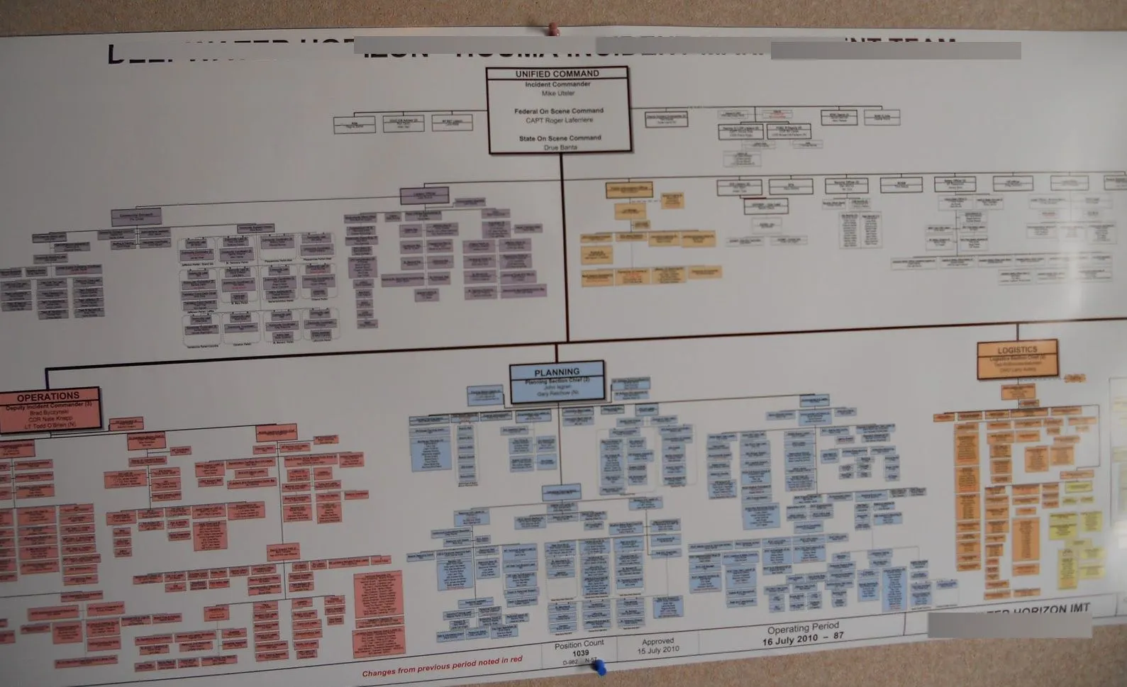
When your organization chart becomes too large and complex like the one above, it can be split into smaller charts. You can split it by department, project, site, region, etc.
Whatever it is that makes sense to others in your organization. This makes it easier for the viewer to understand the responsibilities or the expectations of each department.
Breaking down the org chart into small charts makes it becomes much easier to monitor the progress or workload of employees. So that it can be easier to spread work among workers with less load. It also makes it very easier to do a comparative analysis of a situation so that resource allocation can be streamlined to meet the demands of different situations.
Org Chart Software
There are many org chart software available both online and offline that facilitate the creation of various types of organization charts .

When large organizations have multiple organization charts covering their sub-units it is likely to be difficult to study them together at a glance.
With a chart covering several pages it can also be confusing working out the connections between each entity shown in the chart. With Creately as your organization chart diagramming tool , you can avoid this issue using the diagram linking feature. This allows viewers of the chart to see the connections between charts, navigate between the different charts and possibly like to individual employee profiles.
For example, take a look at the below org chart. It shows the top hierarchy of the company. Now click on the highlighted box (the blue right-hand CEO box) and it will take you down to another org chart that further breaks down that department. You can quickly move back to the original chart by clicking the arrow buttons in the bottom toolbar. Go ahead and try it yourself.
Make Sensible Groupings
When organization charts are being broken down into sub-charts, sensible grouping and linking is a must since the connection of each chart and the flow should be easily understandable to the viewer.
Sensible grouping is done based on how individuals, jobs, functions or activities are differentiated and aggregated. The information flow also requires optimizing within each group but at the same time clearly differentiating it from the other groups.
Structural Linking
Structural linking of the groups should be performed with an integration mechanism (eg: liaison roles, cross-unit groups, integrator roles or projects and dotted lines) to assist with coordinating and sharing of information across groups which will enable the organizations leadership to provide guidance and direction throughout the organization.
5 Types of Organization Structures
1. functional organizational structure.
The most common structure organized according to functions or departments. For example finance, marketing , sales etc. Suitable for small or single programmatic organizations that do not need to manage across a large geographic area.
Benefits of this model are;
• Develops depth of skills in a particular function or department (most jobs are functional in nature) • Promotes functional innovation, scale and lower costs • Is simple to do and easy for each department to understand their core responsibilities, and to hold them accountable
2. Geographic Organizational Structure
This structure is organized around major geographies. Suited to companies which are large with multiple programs that often differ across geographies where local differences are critical for success (e.g. regulation, fundraising, economics).
• Makes available the resources needed to succeed within a geography • Allows greater customization of programs or services by region • Enables clear focus with accountability for results by geography • Enables focus on geographic funding sources
3. Program Organizational Structure
This structure is organized around major projects. Suited for multi-service organizations and foundations, that has programs which are very different from one another (e.g. different customers, economics, etc.) and where the resources and skills needed to succeed by a program are very different as well. However, the factors for each program are similar across geographies.
• Promotes a depth of understanding within a particular program area and can promote program innovation • Makes available the resources needed to succeed within a program • Enables clear focus with accountability for program results • Enables focus on funding sources which are often program oriented
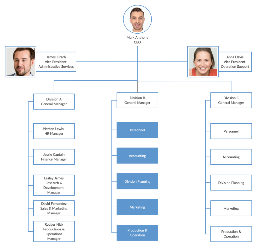
4. Customer/Market Organizational Structure
This structure is organized around customers/clients served by the organization. It is suitable for companies who have very different customers who have different service requirements (resulting in different programs provided).
• Provides focus to be put on the customer, therefore, enabling development of programs tailored to a population’s needs and ability to get “results” • Enables clear focus with accountability for results by customer group • Enables clear focus on most important customers and/or markets
5. Matrix Organizational Structure
This is a structure organized to manage multiple dimensions , e.g. program and geography. Due to the difficulty of managing, this model is NOT recommended to be used.
• Enables the organization to (at least theoretically) manage multiple organizational dimensions simultaneously
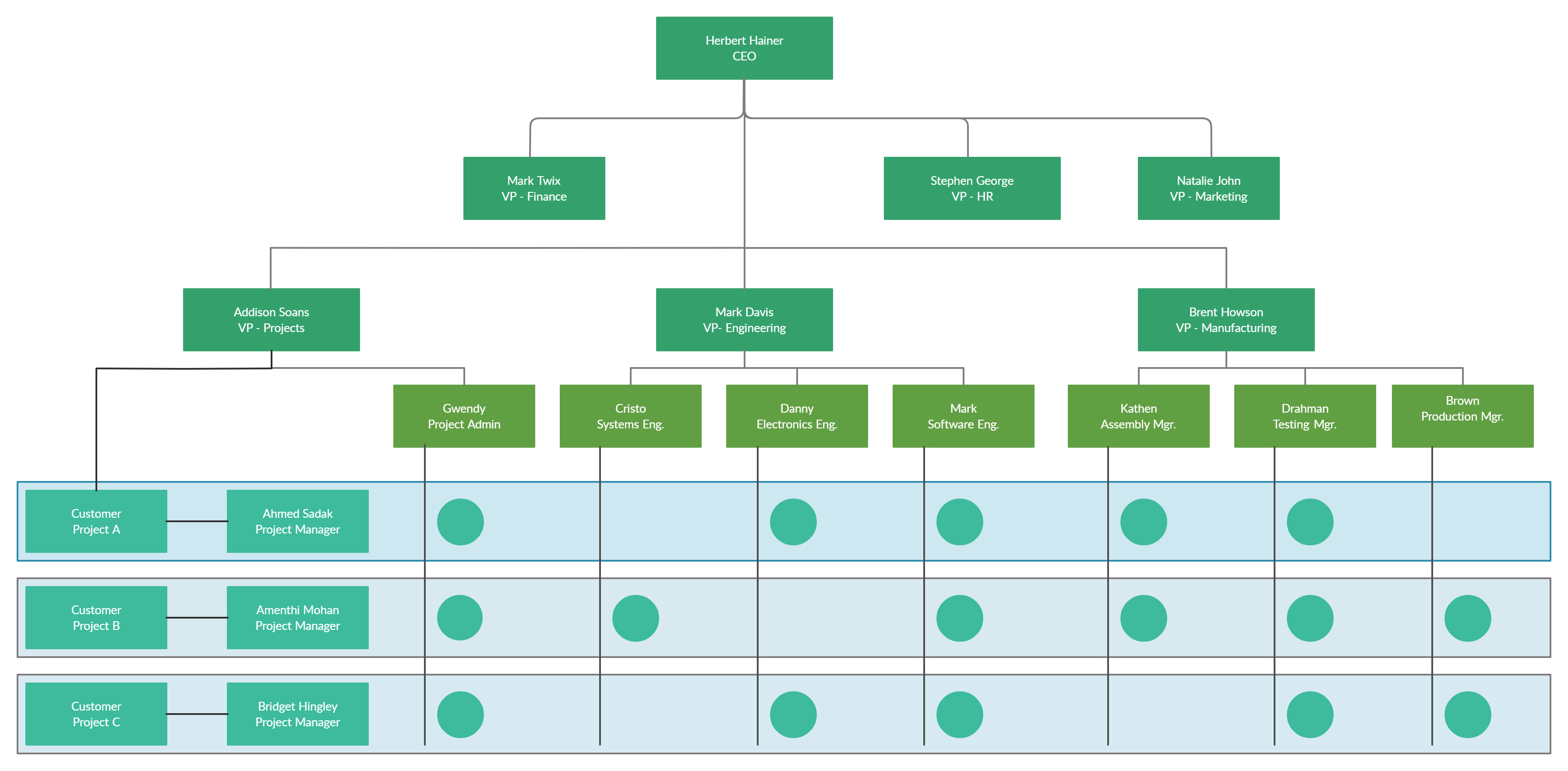
Some of these types can be found in our org chart examples .
Clear Reporting Path / Hierarchy
When drawing an organization chart that indicates the organizational hierarchy, clear reporting paths must be highlighted so that the viewer/employee gets a clear understanding of the reporting structure he/she should follow. One method to use would be using a color coding or visual queues to indicate the reporting path. When it comes to Matrix organization charts where the reporting relationships are set up as a grid, or matrix, rather than in the traditional hierarchy, indicating clear reporting path is critical for the success of the organization’s operation.
What Are Your Organizational Chart Best Practices?
Hope you found this article on organizational structure best practices useful and that it helped you to make much more effective org charts .
Join over thousands of organizations that use Creately to brainstorm, plan, analyze, and execute their projects successfully.
- A good org chart should be easy to read and understand. The information presented should be clear and concise, with a focus on the key roles and reporting lines within the organization.
- The org chart should accurately reflect the current structure and hierarchy of the organization. It should be updated regularly to reflect any changes in staffing or reporting lines.
- The org chart should be consistent in terms of formatting and design.
- The org chart should be easily accessible to all employees within the organization. This can be achieved through a variety of means, such as posting it on the company intranet or displaying it in a common area.
- The org chart should be flexible enough to accommodate changes within the organization, such as mergers, acquisitions, or restructuring.
- The first thing to consider is the overall structure of your company which includes the number of departments or teams, the roles and responsibilities of each team, and the reporting lines between them.
- The size of your company will also impact the design of your org chart. A smaller company may have a simpler org chart with fewer layers, while a larger company may require a more complex chart with multiple departments and teams.
- Your company culture may also play a role in the design of your org chart. For example, a company that values collaboration and teamwork may choose to emphasize cross-functional teams in the chart, while a more hierarchical company may focus on clear reporting lines and well-defined roles.
- Consider the communication needs of your company when designing your org chart. The chart should be easy to read and understand, and should clearly show how different teams and departments interact with each other.
- It’s important to consider future growth when creating your org chart. Make sure the chart can be easily updated as your company evolves, and that it can accommodate new departments or teams as needed.
- The chart should be organized in a hierarchical structure, with the highest level at the top and the lowest level at the bottom.
- Use consistent shapes and colors for each position on the chart to make it easy to read and understand.
- Clearly label each position on the chart with the job title and name of the person holding the position.
- Use lines to show the relationship between positions. For example, a solid line can be used to show a direct reporting relationship, while a dotted line can be used to show an indirect reporting relationship.
- Avoid making the chart too complex or cluttered. Use only the necessary information and keep the design simple.
More Related Articles
![org chart reporting lines Organizing for Success [3] : Map out your Organization Structure](https://creately.com/static/assets/guides/organizing-for-success/Organizational-Chart-Best-Practices-for-Meaningful-Org-Charts-header.webp)
Software engineer turned tech evangelist. I handle marketing stuff here at Creately including writing blog posts and handling social media accounts. In my spare time, I love to read and travel.
Module: Management
Reading: the organization chart and reporting structure, the organization chart.
Once an organization has set its structure, it can represent that structure in an organization chart : a diagram delineating the interrelationships of positions within the organization. Having decided on a functional structure, a company might create the organization chart shown in Figure 1.

Figure 1. Organization Chart
Using the figure above for reference you can complete a hypothetical organization chart. Begin by putting yourself at the top of the chart, as the company’s president. Then fill in the level directly below your name with the names and positions of the people who work directly for you —your accounting, marketing, operations, and human resources managers. The next level identifies the people who work for these managers. In this example, because you’ve started out small, neither your accounting manager nor your human resources manager currently manage anyone directly. Your marketing manager, however, oversees one person in advertising and a sales supervisor (who, in turn, oversees the sales staff). Your operations manager oversees two individuals—one to supervise notetakers and one to supervise people responsible for making copies.
Reporting Relationships
With these relationships in mind, you can now draw lines to denote reporting relationships , or patterns of formal communication. Because four managers report to you, you’ll be connected to four positions; that is, you’ll have four direct “reports.” Your marketing and operations managers will each be connected to two positions and their supervisors to one position each. The organization chart shows that if a member of the sales staff has a problem, he or she will report it to the sales supervisor. If the sales supervisor believes that the problem should be addressed at a higher level, then he or she will report it to the marketing manager.
Theoretically, you will communicate only with your four direct reports, but this isn’t the way things normally work. Behind every formal communication network there lies a network of informal communications—unofficial relationships among members of an organization. You might find that over time, you receive communications directly from members of the sales staff; in fact, you might encourage this line of communication.
Now let’s look at the chart of an organization that relies on a divisional structure based on goods or services produced—say, a theme park. The top layers of this company’s organization chart might look like the one in Figure 2a. We see that the president has two direct reports—a vice president in charge of rides and a vice president in charge of concessions. What about a bank that’s structured according to its customer base? The bank’s organization chart would begin like the one in Figure 2b. Once again, the company’s top manager has two direct reports, in this case a VP of retail-customer accounts and a VP of commercial-customer accounts.

Figure 2. Organization Charts for Divisional Structures
Over time, companies revise their organizational structures to accommodate growth and changes in the external environment. It’s not uncommon, for example, for a firm to adopt a functional structure in its early years. Then, as it becomes bigger and more complex, it might move to a divisional structure—perhaps to accommodate new products or to become more responsive to certain customers or geographical areas. Some companies might ultimately rely on a combination of functional and divisional structures. This could be a good approach for a credit card company that issues cards in both the United States and Europe. A skeleton of this firm’s organization chart might look like the one in Figure 3.

Figure 3. Organization Chart: Combination Divisional and Functional Structures
Lines of Authority
You can learn a lot about a firm’s reporting and authority relationships by looking at its organization chart. To whom does a particular person report? Does each person report to one or more supervisors? How many people does a manager supervise? How many layers are there, for example, between the top managerial position and the lowest managerial level?
Chain of Command
The vertical connecting lines in the organization chart show the firm’s chain of command : the authority relationships among people working at different levels of the organization. That is to say, they show who reports to whom . When you’re examining an organization chart, you’ll probably want to know whether each person reports to one or more supervisors: to what extent, in other words, is there unity of command ? To understand why unity of command is an important organizational feature, think about it from a personal standpoint. Would you want to report to more than one boss? What happens if you get conflicting directions? Whose directions would you follow?
There are, however, conditions under which an organization and its employees can benefit by violating the unity-of-command principle. Under a matrix structure , for example, employees from various functional areas (product design, manufacturing, finance, marketing, human resources, etc.) form teams to combine their skills in working on a specific project or product. This matrix organization chart might look like the one in the following figure.

Figure 4. Organization Chart: Matrix Structure
Nike sometimes uses this type of arrangement. To design new products, the company may create product teams made up of designers, marketers, and other specialists with expertise in particular sports categories—say, running shoes or basketball shoes. Each team member would be evaluated by both the team manager and the head of his or her functional department.
Span of Control
Another thing to notice about a firm’s chain of command is the number of layers between the top managerial position and the lowest managerial level. As a rule, new organizations have only a few layers of management—an organizational structure that’s often called flat . Let’s say, for instance, that a member of the sales staff wanted to express concern about slow sales among a certain group of customers. That person’s message would have to filter upward through only two management layers—the sales supervisor and the marketing manager—before reaching the president.
As a company grows, however, it tends to add more layers between the top and the bottom; that is, it gets taller . Added layers of management can slow down communication and decision making, causing the organization to become less efficient and productive. That’s one reason why many of today’s organizations are restructuring to become flatter.
There are trade-offs between the advantages and disadvantages of flat and tall organizations. Companies determine which trade-offs to make according to a principle called span of control , which measures the number of people reporting to a particular manager. If, for example, you remove layers of management to make your organization flatter, you end up increasing the number of positions reporting to a particular supervisor.
What’s better—a narrow span of control (with few direct reports) or a wide span of control (with many direct reports)? The answer to this question depends on a number of factors, including frequency and type of interaction, proximity of subordinates, competence of both supervisor and subordinates, and the nature of the work being supervised. For example, you’d expect a much wider span of control at a nonprofit call center than in a hospital emergency room.
Delegating Authority
Given the tendency toward flatter organizations and wider spans of control, how do managers handle increased workloads? They must learn how to handle delegation —the process of entrusting work to subordinates. Unfortunately, many managers are reluctant to delegate. As a result, they not only overburden themselves with tasks that could be handled by others, but they also deny subordinates the opportunity to learn and develop new skills.
Responsibility and Authority
As owner of a business an individual may want to control every aspect of the business, especially during the start-up stage. But as the organization grows, they will have to assign responsibility for performing certain tasks to other people. They will also have to accept the fact that responsibility alone—the duty to perform a task—won’t be enough to get the job done. They will need to grant subordinates the authority they require to complete a task—that is, the power to make the necessary decisions. (And they’ll also need sufficient resources.) Ultimately, the owner will also hold his/her subordinates accountable for their performance.
Centralization and Decentralization
If and when a company expands, the owner will have to decide whether most decisions should still be made by individuals at the top or delegated to lower-level employees. The first option, in which most decision making is concentrated at the top, is called centralization . The second option, which spreads decision making throughout the organization, is called decentralization . Naturally, there are some decisions—such as strategic planning—that won’t be delegated to lower-level employees, but others can be delegated, such as the management of copy-center operations. In fact, putting someone in charge of this function would probably improve customer satisfaction, because copy-center customers would be dealing directly with the manager. It would also give the manager valuable decision-making experience, and while he or she is busy making daily decisions about the copy center, upper level management and owners will have more time to work on higher-level tasks.
KEY TAKEAWAYS
- Managers coordinate the activities identified in the planning process among individuals, departments, or other units and allocate the resources needed to perform them.
- Typically, there are three levels of management: top managers , who are responsible for overall performance; middle managers , who report to top managers and oversee lower-level managers; and first-line managers , who supervise employees to make sure that work is performed correctly and on time.
- Management must develop an organizational structure , or arrangement of people within the organization, that will best achieve company goals.
- The process begins with specialization —dividing necessary tasks into jobs; the principle of grouping jobs into units is called departmentalization .
- Units are then grouped into an appropriate organizational structure. Functional organization groups people with comparable skills and tasks; divisional organization creates a structure composed of self-contained units based on product , customer , process , or geographical division . Forms of organizational division are often combined.
- An organization’s structure is represented in an organization chart —a diagram showing the interrelationships of its positions.
- This chart highlights the chain of command , or authority relationships among people working at different levels.
- It also shows the number of layers between the top and lowest managerial levels. An organization with few layers has a wide span of control , with each manager overseeing a large number of subordinates; with a narrow span of control, only a limited number of subordinates reports to each manager.
Check Your Understanding
Answer the question(s) below to see how well you understand the topics covered in this section. This short quiz does not count toward your grade in the class, and you can retake it an unlimited number of times.
Use this quiz to check your understanding and decide whether to (1) study the previous section further or (2) move on to the next section.
- Revision and adaptation. Authored by : Linda Williams and Lumen Learning. License : CC BY-NC-SA: Attribution-NonCommercial-ShareAlike
- An Introduction to Business. Authored by : Anonymous. Provided by : Anonymous. Located at : http://2012books.lardbucket.org/books/an-introduction-to-business-v2.0/s10-03-organizing.html . License : CC BY-NC-SA: Attribution-NonCommercial-ShareAlike

Organizational charts explained: a beginner’s guide
Make your company’s org chart work as hard as you do
By the team at Slack February 19th, 2024
An organizational chart maps out a company’s workforce, including its team structure, workers’ reporting relationships and employees’ responsibilities.
Done well, an org chart can be a lot more than just a map. A good organizational chart (org chart) can streamline business processes and help employees excel in their roles. It can be a resource for support, collaboration and team building.
Read on to take an in-depth look at org charts and to learn how to make a successful one for your company.
What is an organizational chart?

You might hear organizational charts referred to as org charts, organograms, organigrams or hierarchy charts. They all essentially refer to the same thing: a visual representation of a company’s internal structure.
An org chart maps out the employees within an organization, grouping them by team and showing how employees relate to each other.
Org charts illustrate reporting relationships and chains of command to give a simple overview of a company’s organizational structure, its hierarchy and how each employee fits into the big picture.
What should an org chart include?
An org chart contains information on verticals, teams, reporting relationships and individual employees. For each employee, an organizational chart might show their:
- Contact information
- Responsibility
The chart may use lines, arrows and other symbols to illustrate professional relationships and hierarchy among individual members.
Why are org charts important?
An org chart gets new hires up to speed, keeps longtime employees informed and builds confidence among investors. Having an organizational chart is particularly handy for companies with remote workers because it maps out the whole distributed workforce, including each remote employee’s role and the overall chain of command.
Any employee should be able to turn to the chart to answer questions such as:
- Who’s on the leadership team?
- How do I fit into my company’s organizational structure?
- Who can answer my questions about (insert specific subject)?
- Who reports to whom?
Organizational charts should also tell employees how downsizing, promotions and other organizational changes might affect them. When it’s designed well, a chart can even communicate a company’s values and philosophies, such as its positions on inclusivity, collaboration and hierarchy.
Limitations of organizational charts
- Org charts can easily become outdated as companies restructure and employees shift roles
- Charts may only show formal reporting relationships, excluding the nuances of informal professional relationships within a company
- Updating an org chart can be laborious, complex and time consuming, depending on the tool used to create it
- Organizational charts may not clarify management styles, communication methods and how each manager interacts with their team
Types of organizational charts
We all know how powerful graphics can be. A picture is worth a thousand words, right? (Well— if you use the right picture.)
To get the most out of an org chart, you must first decide on its design and how to visually represent your company’s organizational structure.
Hierarchical/top-down
This type of org chart starts with one person—typically the company’s president or CEO—at the top. It then takes on a pyramid shape that represents the workforce hierarchy. The higher you’re represented on the pyramid, the higher you are in the hierarchy.
- Pros: This format offers clarity on the lines of authority and communication. Employees can easily understand their roles, teammates and reporting relationships. A hierarchical org chart also provides employees with a defined path for professional growth.
- Cons: This structure offers limited flexibility in terms of hierarchy and may create silos that could hinder cross-functional collaboration and innovation.
Divisional structure
This layout is similar to the hierarchical chart but breaks down a large company’s structure by product line, geographic location or another grouping method. Large companies with independent departments that control their own resources often use divisional structure charts.
- Pros: Divisional structure provides more flexibility to respond to market changes. It also gives more autonomy to each division within a large company.
- Cons: Like top-down org charts, divisional structure charts could lead to siloing, hinder cross-functional collaboration, and make it difficult to spot duplication or overuse of resources.
A matrix org chart uses a grid to show relationships among cross-functional teams. This layout illustrates how employees work with others from different departments and how they report to multiple supervisors. It gives managers visibility to select people from different departments to work on a project.
- Pros: This structure helps break down silos and foster cross-department collaboration.
- Cons: Reporting to more than one manager or business unit can create confusion or conflict among employees.
Flat/horizontal
A flat or horizontal organizational chart takes the focus away from employee hierarchy. All members have a similar amount of power, with fewer hierarchical levels in the company. This design is most common among small businesses with simple structures, where employees often have more responsibility, wear many hats and are more directly involved in decision-making.
- Pros: This approach encourages closer relationships between executives and employees and empowers all team members to take leadership and be decisive.
- Cons: Companies have limited potential to scale within this structure. As organizations grow, they often move to hierarchical or matrix org charts.
How to create an organizational chart
Let’s run through the step-by-step process of creating an org chart for your company.
Determine your company’s organizational structure
Clarify your organization’s structure before you begin building a chart. Lay out how your company’s departments relate to each other on a high level.
Identify roles and relationships
Understand your company’s chain of command. Identify each employee’s span of control, and outline each business unit’s specialization. Then, map out reporting relationships among all employees. You can gather this information by surveying team members or working with the HR department.
Choose the right organizational chart type
Now that you understand your company’s structure on both a high level and an individual employee level, it’s time to pick an org chart design.
Your chart should mirror the organization’s reporting relationships, reflect decision-making processes, and comply with the company’s size and growth plan.
Know your audience
Understanding the audience for an org chart can help you decide how much detail to include. For example, an org chart containing details on each individual in the company may be limited to internal use. A simplified, high-level version might be more suitable for external parties.
Best practices for designing org charts
Keep your org chart simple, uncluttered and easy to understand. Use shapes, colors and line styles to distinguish hierarchy, relationships and process flows.
Highlight key roles and functions to help readers quickly identify critical personnel and understand the company’s organizational structure. Regularly update the org chart as the team and structure evolve. An outdated chart could cause confusion and errors.
Best tools and software for creating org charts
Various tools and applications can help you build and maintain an org chart. Any tool you use should integrate with your company’s existing productivity platform to ensure that everyone has access to the org chart for efficient communication and collaboration.
- BambooHR works well for small businesses and HR departments
- ClickUp incorporates an org chart tool into its management platform
- Deel lets users apply filters to understand how teams work together and who can answer their questions
- Lucidchart offers intuitive features and is best for large organizations
- Slack Atlas uses profile pictures, location information and fun facts to build a well-rounded portrait of each member of a Slack workspace .
How to use an org chart
A good organizational chart promotes collaboration and makes it easy for colleagues to find and understand each other’s roles. You can use a well-made org chart to:
- Onboard new employees : Demonstrate employee responsibilities and reporting relationships to new hires
- Manage growth and change: Visualize how teams grow and interact to inform hiring decisions
- Improve clarity: Understand how employees fit and interact within their company’s organizational structure
- Enhance communication: Empower team members to ask questions and take initiative by providing a deep understanding of various roles and reporting relationships
- Facilitate resource allocation: Allocate resources based on team structure and capabilities
- Streamline processes: Identify redundancies and inefficiencies in the organizational structure
Maximizing the power of organizational charts with Slack
Organizational charts do more than map out a company’s workforce. They can provide powerful context to help employees collaborate and communicate effectively.
Providing context with Slack Atlas
Slack Atlas uses profile pictures, location information and fun facts to build a well-rounded portrait of each member of a Slack workspace . Employees can use Atlas to learn about a colleague before direct-messaging them on Slack . Informing employees about one another helps build strong professional relationships in remote workplaces , boosting both morale and productivity.
Integrating organizational charts in Slack
Atlas provides searchable profile information and a dynamic org chart to encourage connection and promote transparent collaboration in Slack. Employees can learn about their colleagues and their company’s organizational structure right in Slack, where they’re already working.
Tracking org chart changes and updates in Slack
Atlas syncs with HR tools to populate employee information via Slack’s SCIM API , ensuring that every profile stays accurate and up to date. Workspace administrators can make specific profile fields editable for employees to add their unique spin.
Org chart security in Slack
When you’re handling employee information, data security is a must. Atlas uses the same enterprise-grade security and identity-management capabilities central to the Slack platform, focusing on security governance and risk management.
The power of an org chart at your fingertips
Slack Atlas is available in all markets and languages supported by Slack. You can access Slack Atlas on the Enterprise Grid plan at no additional cost. It’s also available as a paid add-on to the Business+ plan. Learn more and start using Atlas today .
- Communication
Was this post useful?
Thanks so much for your feedback!
Thanks for your feedback.
Oops! We're having trouble. Please try again later!
Keep reading
10 tips for mastering time management at work.
Time management at work is key to optimizing productivity
The best video conferencing platform for remote and hybrid teams
Find the right video conferencing platform based on your team’s unique needs
Maximizing productivity with knowledge management tools and solutions
Take your team’s performance to the next level with a strong knowledge management system
Instant messaging and beyond: transforming how we talk at work
From digital watercooler chats to asynchronous collaboration, instant messaging platforms are reshaping the workplace
Try Slack with your team for free

- Org Chart Templates
- Documentation
- Terms and Privacy

Organization Charts: The Complete Guide
An organization chart is a subclass of a company structure chart . An organization chart shows management reporting relationships within a business.
There are three types of company structure charts :
- Governance, and
- Management.
This article discusses management organizational structures and corresponding org charts.
Types of organizational structures
How many organizational structures exist? 3, 7, 9? At the end of this article, we will give away the answer, but for now we can group organizational structures into three categories:
Hierarchical organization structure
What is an organizational hierarchy? An org chart hierarchy is made of three building blocks:
- a subordinate, and
- a reporting relationship between the two.
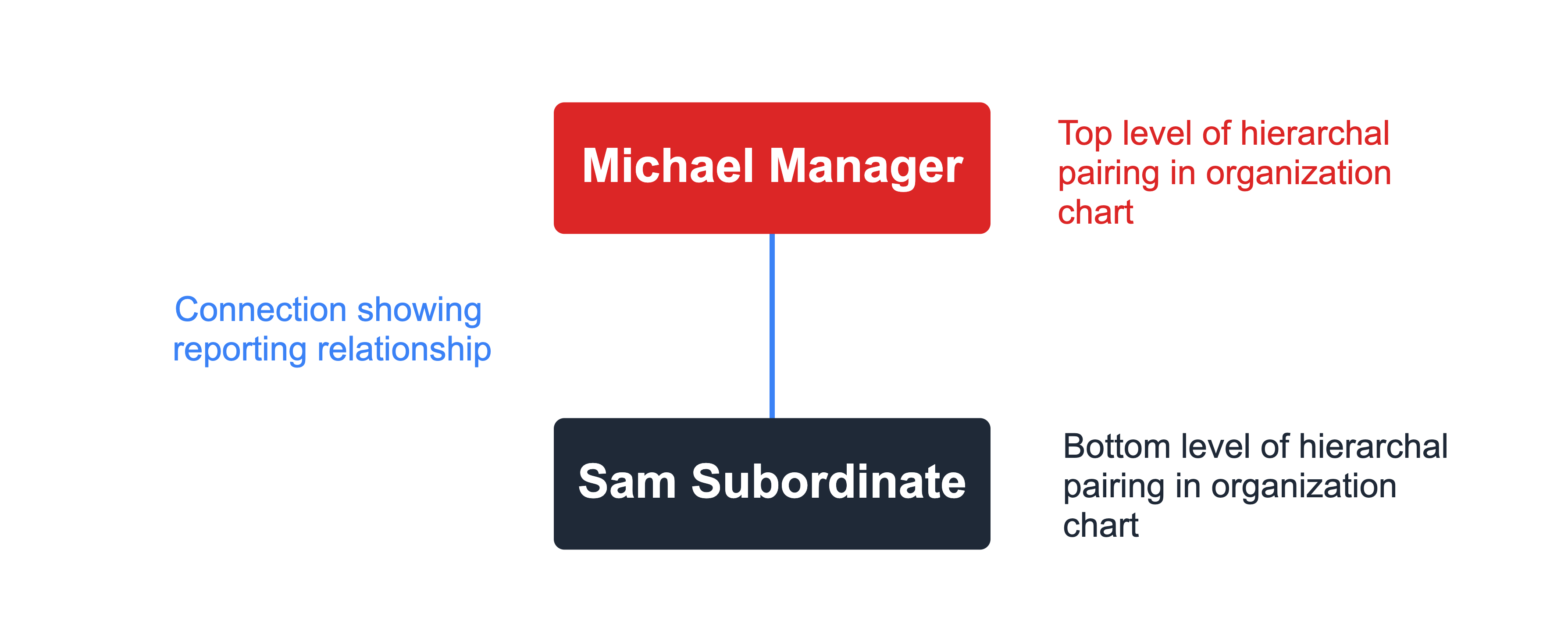
With those elements you can create an org chart of any complexity or size.
There are several types of organizational structure within the category of a hierarchy chart. The most common types of organizational hierarchy are:
- Functional ,
- Division, and
Functional organization structure
What is a functional organization structure?
A functional organization structure prioritizes the type of work in management reporting. A functional organization chart typically shows departments reporting to a top level executive or manager.
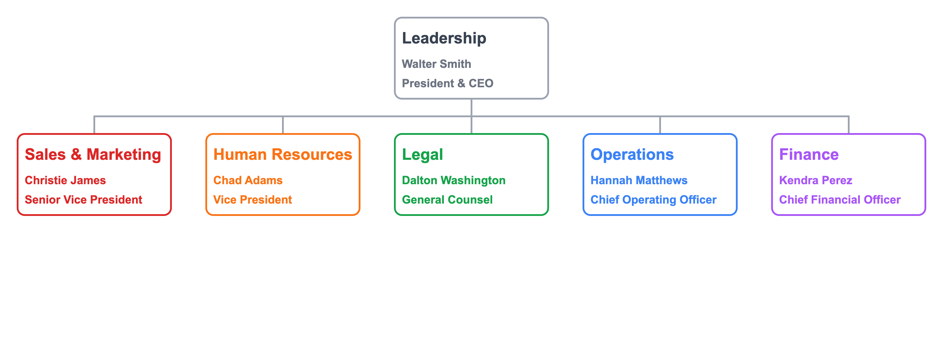
Creating a functional org chart can extend to any layer of the organization.

People are organized by the type of work required by the position.
Flat organization structure
A flat organizational structure reduces the layers of management in an organization chart. It is attractive because it sounds like it eliminates unnecessary layers of management.
From the perspective of making an org chart, however, a flat organizational structure is still hierarchical. There are just fewer layers so the staff-to-manager ratio is higher.

In this example, two managers from Sales & Marketing are removed with the remaining employees reporting directly to the head of Sales & Marketing. That department is using a flat organization structure .
Division organization structure
A division organization structure , or business unit structure, creates an org chart around self-contained parts of the business. The leadership of a division often has profit-and-loss responsibility. Each division, or business unit, contains its own functional structure so it can control its own destiny. How far this self-contained principle goes varies.
Organizations might adopt a "shared services" model where one group provide corporate functions, like legal, finance, and human resources to all divisions. Each division has its own sales, marketing, and operational teams.
Divisions might be legal entities from an acquisition (see company structure charts ) or part of a company strategy.
A divisional organization structure might use geography to divide up the business.

In this example, each geographical unit uses an organizational structure best suited to its business and objectives. Geographical units might or might not share corporate services.
Create your free org chart today
Lexchart is fast, accurate, and includes a free trial. no credit card required., team organizational structure.
A team organizational structure is a variation on the divisional structure. The team as an organizational unit does not have P&L responsibilities and does not include corporate functions, unless those functions are an essential element of the team.
A multi-line product company might create a team organizational structure around each product.
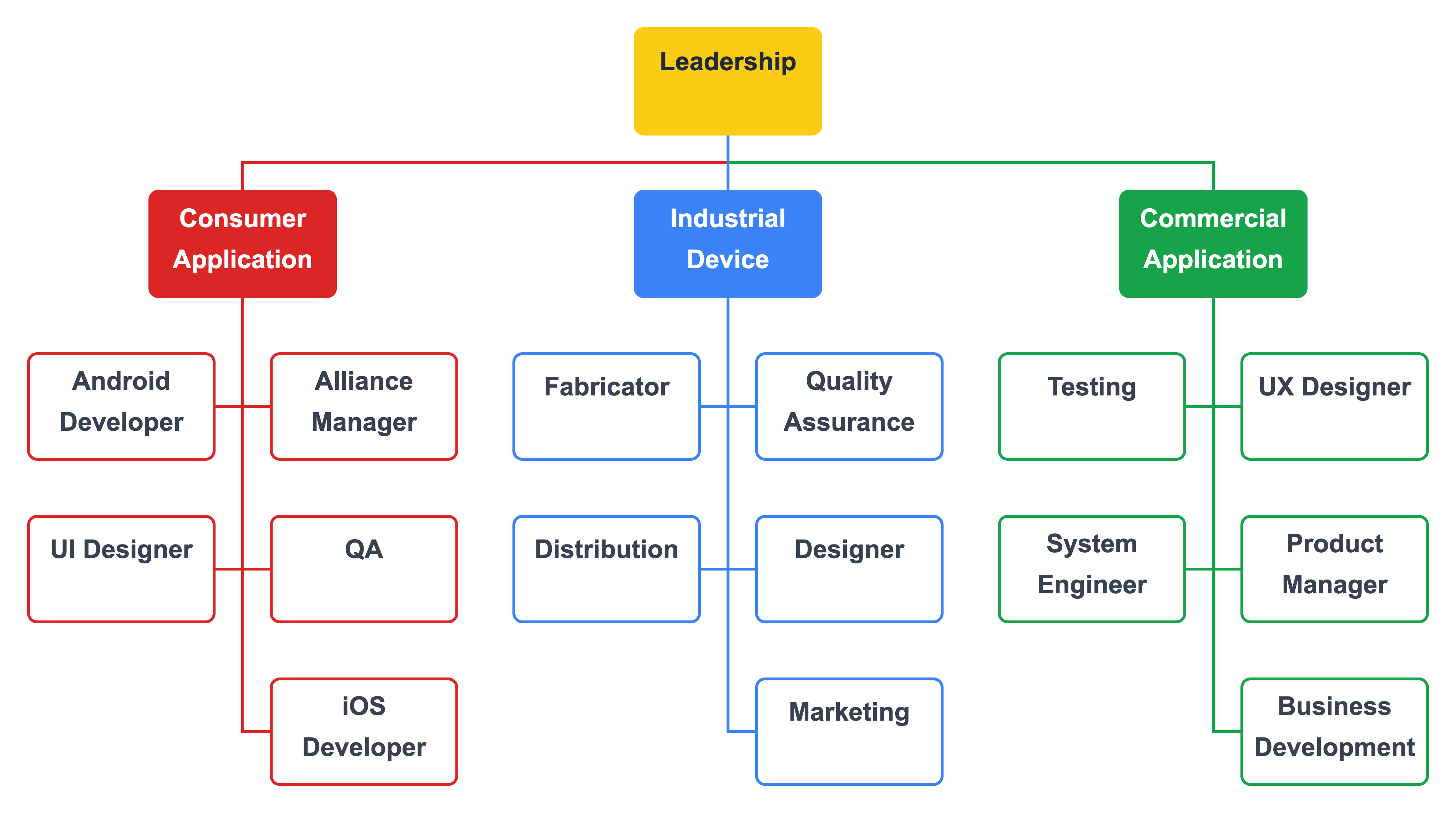
Notice these teams are cross-functional ; they include people from multiple disciplines. Read more about team organization structures . You can get the team org chart template for free.
Matrix organizational structure
A matrix organizational structure attempts to combine a functional structure with a team structure . Staff have direct reporting relationships to functional managers. Staff then have a second reporting relationship to a project manager that crosses functional silos.
This image of a matrix structure alternates between elbow and curved connectors to distinguish the dual reporting lines for each staff member.
There are three variations of a matrix organizational structure:
- Weak matrix structure,
- Balanced matrix structure, and
- Strong matrix structure.
Each variation attempts to resolve the tension created by having two managers. Who has responsibility over the project?
Weak matrix structure
In a weak matrix structure , decision making over the project rests with the functional manager. The problem is that each functional manager can then work at cross purposes to the project.
Balanced matrix structure
The theory behind a balanced matrix structure is that the functional and project managers have an equal say in the project.
Strong matrix structure
A strong matrix structure assigns primary responsibility and authority over the project to the project manager. For a strong matrix structure org chart, you might make the lines between the project manager and team members solid; the lines between the functional managers and team members dotted.
A messy organization chart might indicate a messy organizational structure. There are, however, intentionally messy org charts that illustrate a category of purpose built organizational structures .
The Society of Human Resources Management ( SHRM ) calls these open boundary structures . SHRM identifies three types of open boundary structures:
- Modular virtual, and
These structures have drawbacks for running a business. Set those aside for a moment. The reason the org charts for open boundary structures are messy is that it is difficult for org chart makers to visualize the optimal layout of the chart. See for example, " Why are Company Structure Charts So Hard? "
The artificial intelligence of Lexchart analyzes all the combinations of reporting relationships to present a clean, readable organization chart, even an open boundary org chart.
Purpose of organization charts
Each business has a unique organizational structure. The purpose of an organization chart , and by extension org chart software , is to present the organizational structure of a business visually.
Why does an org chart matter? There are two reasons to use management org charts:
- To communicate authority and responsibility for work, and
- To experiment with organizational change in a low-risk environment.
Org charts for communication
Org charts communicate who authorizes and is responsible for work . The pairing of authority and responsibility is not solely about managers and executives. Staff level employees have authority over and responsibility for their own work in context.
While large organizations and innovative startups have blurred the boundaries of authority and responsibility, a manager is primarily responsible for, at least, influencing compensation and work assignments for staff. An effective org chart shows those relationships.
Org charts for acquisitions, reorganizations, and change
A single org chart is of little value. Changes in organizational structure inevitably render a pretty org chart outdated. Many external forces can reshape an organization. Two common examples are reorganizations and acquisitions .
From the perspective of an org chart maker , a reorganization occurs when a branch of the organizational structure is modified in its entirety, such as:
- A department reports to a new executive,
- Staff are reassigned to new managers, or
- Departments are collapsed.
Org chart software powered by automatic layout algorithms makes it easy to explore different organizational structures.
Acquisitions are elaborate reorganizations. Departments, teams, and individuals are moved between companies, not within a single company structure. Lexchart supports multiple org charts on a single canvas to model staffing changes from acquisitions.
How to create an org chart
There are three ways to create an org chart. Each method begins with the same building blocks: a manager, a subordinate, and a reporting relationship.
Let Lexchart handle difficult chart layouts.
The three techniques for creating an org chart are:
- Import from a spreadsheet,
- Use the Chart feature in Lexchart, and
- Use the Link feature in Lexchart.
Make an org chart from a spreadsheet
Check out the tutorial, Create an Org Chart from Excel (5 easy steps) , for an in-depth guide.
When you start with a spreadsheet, there should be one column for managers and one column for staff. What about managers who report to a manager? Easy, they go in both columns.
In this example, Christie James will appear at the top of the org chart. She will have one employee, Michael Johnson, who will in turn have one employee, Sally Abrams.
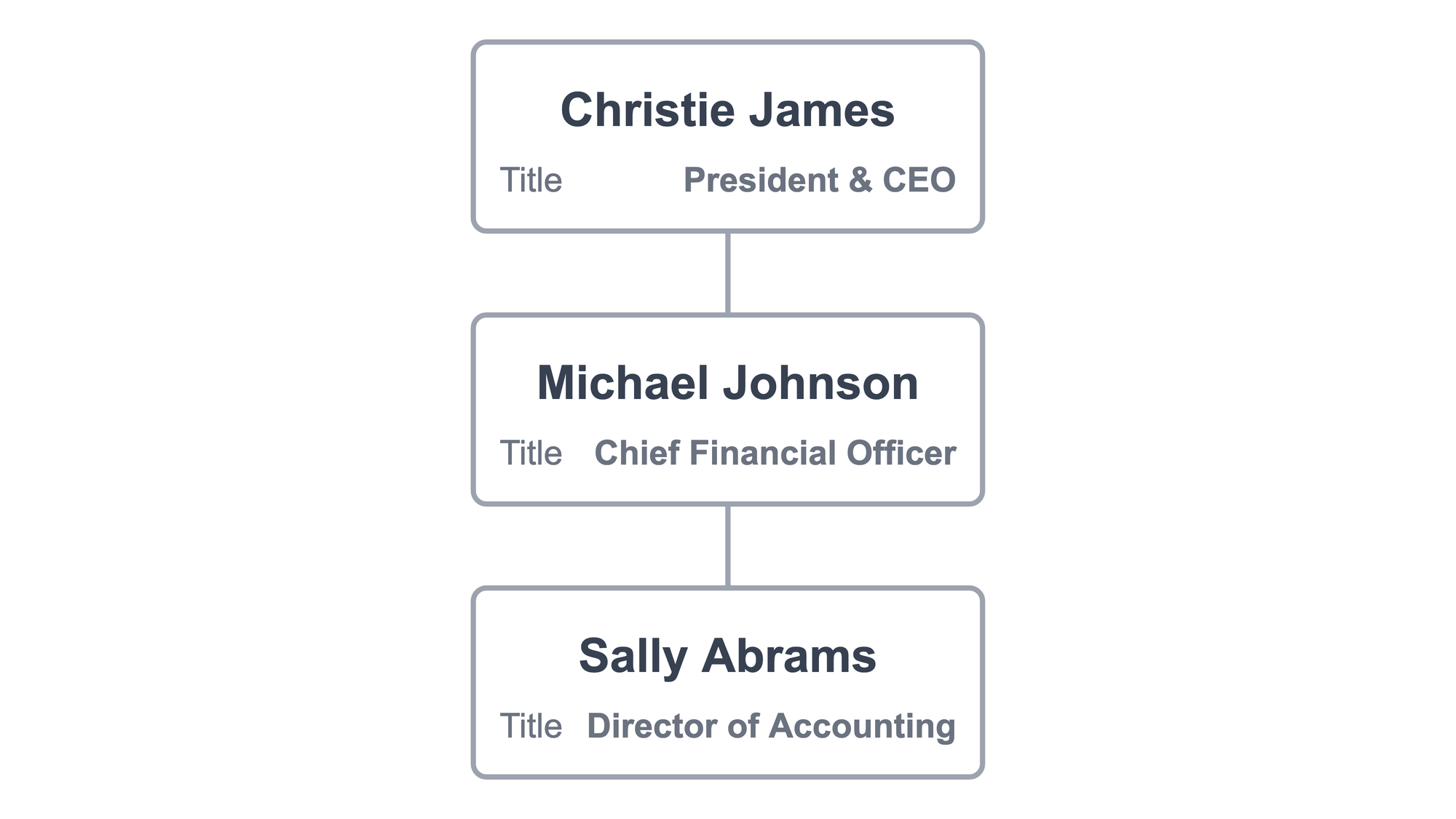
Michael appears in the table twice: once as a manager; once as a subordinate. After the import, he shows once on the chart. Lexchart has figured out the hierarchy of the pairing automatically.
To add job titles and other data about each person, extend the table.
There is a new column for job titles . There is a new row to show that Christie reports to the Board of Directors. The final change is that Christie has a second direct report in Rose Perez, General Counsel.
The result of this import might look like this:
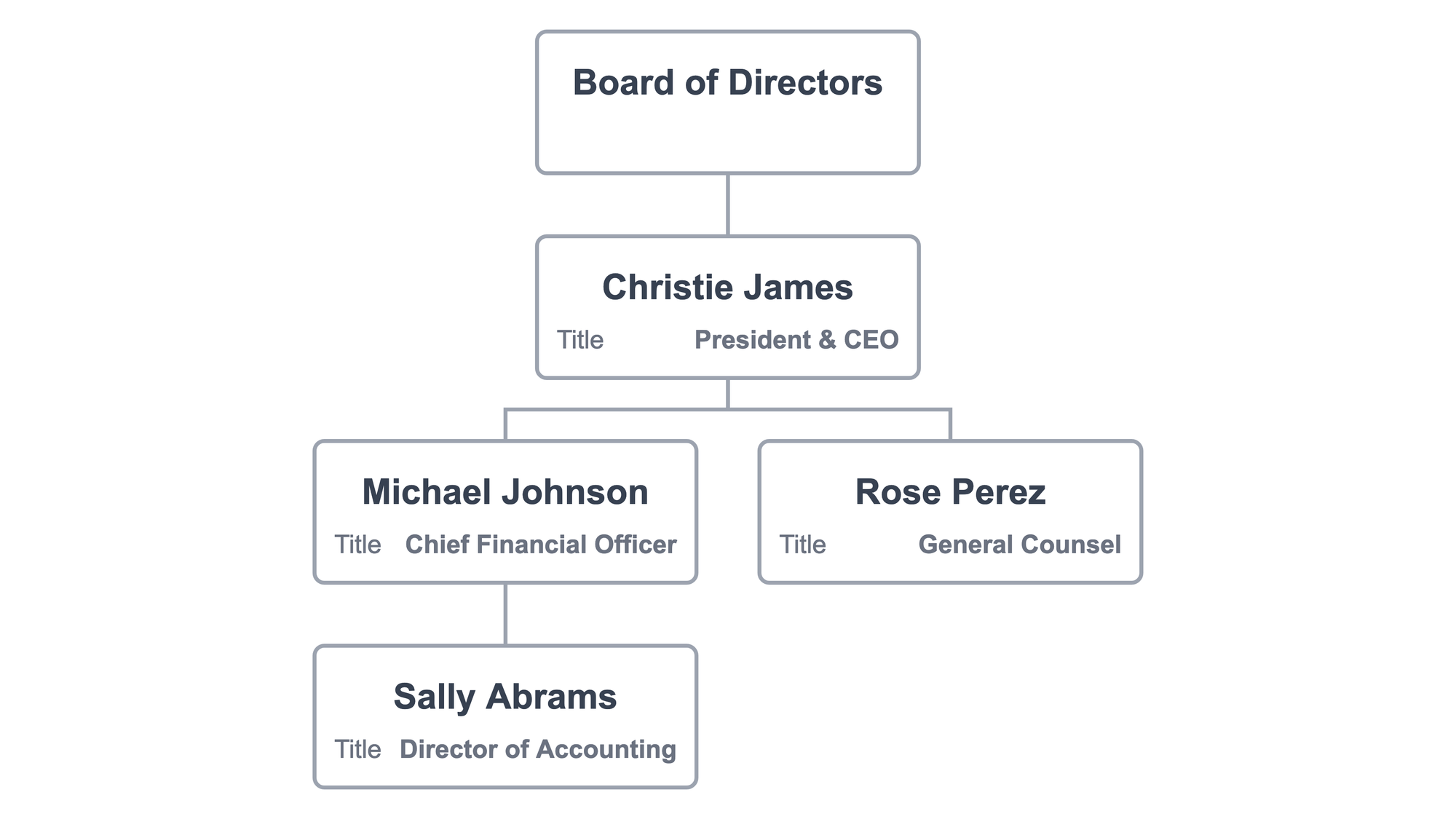
Once the data is imported, all the formatting controls are available to design the org chart .
Make an org chart with the Chart feature
Lexchart has the most exciting feature for creating hierarchy charts quickly: the Chart window. A full tutorial of the Chart window is available.
In this example, a collection of employees and the Board of Directors have no relationships. The Chart feature in Lexchart creates those connections with ease.
The Chart window allows you to navigate anywhere in the chart. You can change your mind, assembling new connections as you go.
Make an org chart from scratch
Sometimes you want to start with a blank canvas. Lexchart provides features to add managers and staff one at a time. You can link managers and employees when you are ready to create the right structure.
How to design an organization chart
To this point, the focus has been designing an organizational structure, not designing an organizational char
Choose the design mode
There are two design modes unique to Lexchart: auto mode and manual mode .
Auto mode uses artificial intelligence to create hierarchical org charts automatically .
To achieve a clear, well-structured org chart, we recommend starting with auto mode and use it as much as possible.
Manual mode allows you to place any element on the chart where you want, while maintaining the links between managers and employees. In the management org chart context, a good use of manual mode is to add an assistant off to the side, instead of among the other direct reports.
You can use manual mode to move cards to other locations on the canvas.
Focus attention with format tools
Lexchart gives you control of color, font size, line type, and much more. Explore the tutorials and documentation to create visually engaging org charts.
There are many org chart examples and templates.
How to present an organization chart
How to show your clear and compelling org chart? There are several options depending on your needs.
Present an org chart for collaboration on changes
If you are working with colleagues to create the org chart, then the best way is to share the org chart from within Lexchart. This option is the most secure and confidential.
The Share feature in Lexchart allows you to specify whether your contributors can edit the chart or merely view it.
Present the org chart with the Viewer
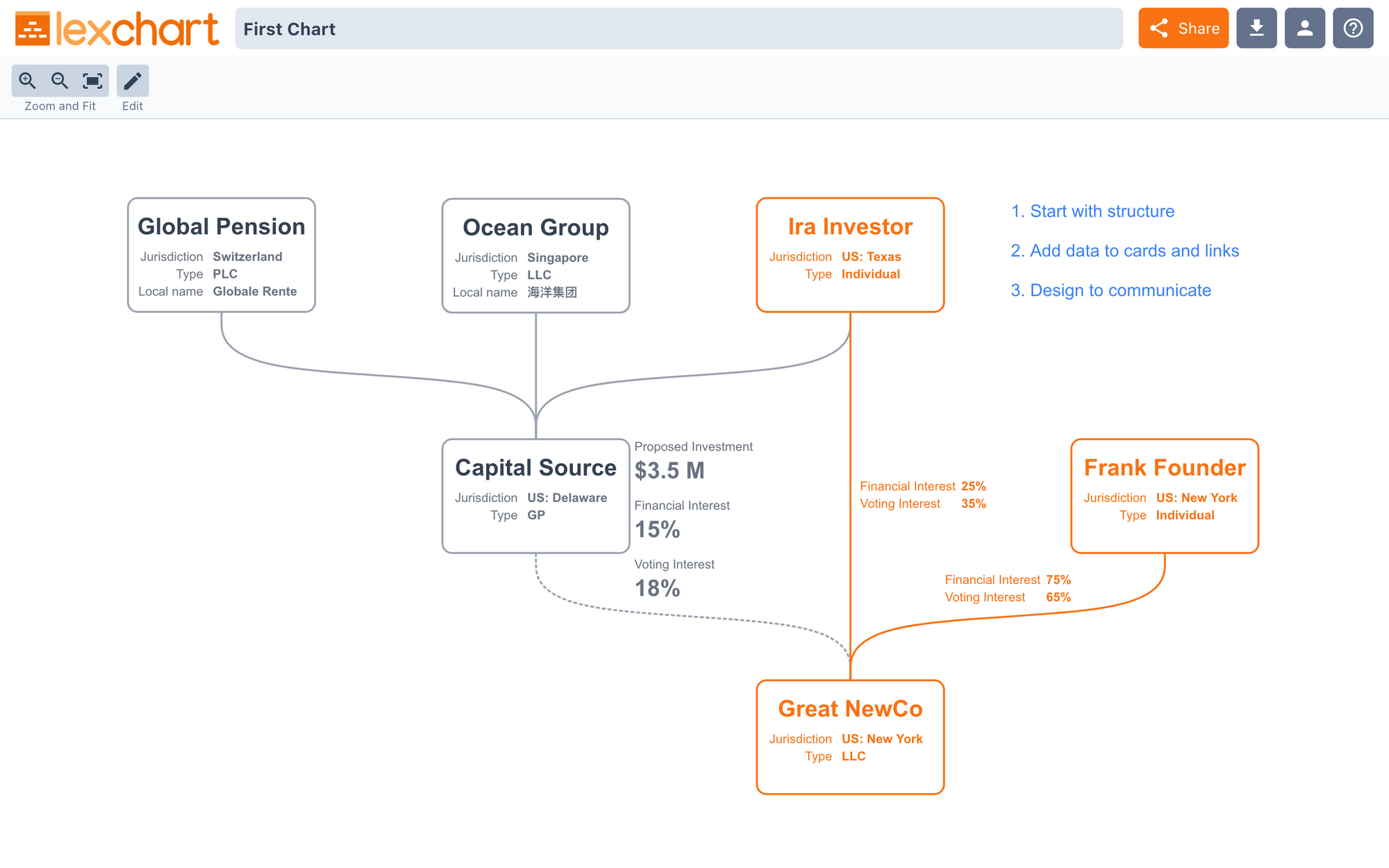
To discuss the org chart with an audience, online or in person, use the Lexchart Viewer . The Viewer allows you to pan and zoom around the chart while hiding all the edit and design features. You can access the Designer from the Viewer if necessary.
Embed the org chart in PowerPoint
You can download an org chart as a PDF, JPEG (JPG), PNG, or SVG. You can then embed the file into Microsoft PowerPoint or Google Slides.
Our article, Create a better organization chart in PowerPoint in 2022 (3 easy steps) , shows all the ways to use Lexchart with your favorite presentation software.
Download and send it around
You can always download the org chart and send the file directly in email, Slack, or your favorite communication application.
All organization charts share two characteristics, big or small, simple or complex, local or global: org charts are hierarchical and unique .
Distill any organizational design approach to find they are all built on the same building blocks: a manager, a subordinate, and a reporting relationship. From those building blocks you can create any type of org chart in Lexchart.
Your organizational structure is unique to your company. The structure changes and evolves. You need powerful and easy-to-use tools to communicate the structure at any given time and to think through future changes. Lexchart does that for you.
There is only one type of organizational structure: yours (and it is a hierarchy).
Create your org chart. Free.
Design your organizational structure with lexchart.
Receive occasional updates on all things hierarchy charts.
Organizational Structure
What Does a Typical Reporting Structure Look Like?
Last updated: Feb 15, 2023
Table of contents
What is a company reporting structure?
What is a typical reporting structure, what are the different types of reporting structures, hierarchical, how to choose the right reporting structure.
A reporting structure—sometimes known as employee structure—is how a company organizes and distributes responsibilities, including employee supervision. Every company is different, but let's break down the most common structure used at startups.

When you look at a company’s organizational chart, you are also looking at that company’s reporting structure. How a company organizes its people and distributes responsibility is a defining factor for its success.
Without the right structure, organizations can suffer from miscommunication, reduced productivity and inefficient workflows.
While it may seem pretty straightforward, there is not a one-size-fits-all approach to internal reporting structures. Finding the one that executes your business strategy and matches your company culture is an important step in building a business.
Get in front of millions of visitors and job seekers.
- Showcase your company culture to a vast community of professionals
- Host your team on a free org chart to keep employees aligned
- Post jobs on our free job platform for high growth startups
Learn more →
A reporting structure—sometimes known as employee structure—is how a company organizes and distributes responsibilities, including employee supervision. The goal of a good reporting structure is to create a workflow that helps a company execute its business strategy and reach its goals.
A reporting structure can also help guide employees on who to turn to if they have questions, ideas or face challenges. Think of it as a roadmap to people and relationships inside your organization.
The most typical reporting structure is the hierarchical org chart. It’s the one that looks like a pyramid, and the one you are probably most familiar with.
In this structure, the person with the most responsibility (usually the CEO) sits at the top. Their direct reports make up the C-suite, and each C-suite executive runs their own chain of command.
Hierarchical structures are the most common because they are the easiest to visualize and are familiar to almost all employees. There are also different kinds of hierarchical structures that are more flexible and can adapt to a growing company.
The five most common types of company reporting structures are:
- Hierarchical or vertical
- Flat or horizontal
Let’s break down the different types and go through how they might be a good fit for your organization.
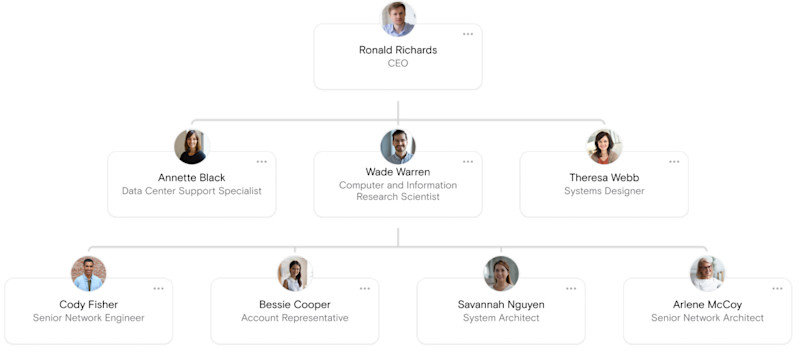
A traditional hierarchical structure looks like a pyramid with the CEO at the top, followed by C-level executives. These C-level executives are the ones who report to the CEO in this organizational structure. Each executive has their own direct reports, and the chain of command goes down from there. This is also known as a traditional vertical structure.
- Clear definition of levels and authority
- Each person knows who they report to and who they can talk to about specific projects
- Motivates employees with clear career paths and chances for promotion
- Creates a sense of community with employees in the same department
- Long chains of command increases bureaucracy and slows down innovation
- Slow speed of information can inhibit leadership’s ability to make quick decisions
- Lower level employees can’t easily express ideas and contribute to the whole company
- Employees can act in interest of their department rather than the whole company
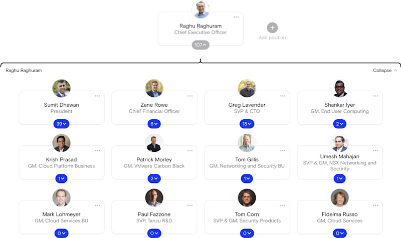
Similar to hierarchical, a functional reporting structure organizes employees into departments based on their functions or skills. Common functions include marketing, sales, operations, human resources and legal.
For example, a Vice President could have authority over the marketing, sales and business development teams.
- Encourages specialization
- Easy to scale in a company of any size
- Allows employees to have greater focus in their tasks
- Can create silos within organization
- Inhibits interdepartmental communication
- Obscures processes and strategies for different products or services within an organization
Divisional org structures are separated by “divisions” which can include different markets, products or locations. This works particularly well for large companies (such as Walmart ) that might want to separate its consumer goods from its logistics division.
These structures work differently from the others on this list because each division can have their own functional teams. For example, one market division may have their own marketing, sales or IT team that is separate from another division.
- Divisions help large companies stay flexible
- Quicker responses within individual markets or to customer needs
- Promotes autonomy and independence within the divisions
- Much easier to duplicate resources or costs
- Higher chance of miscommunication between divisions and the main company
- Can result in a company competing with itself
Here are three examples of divisional reporting structures.
- Market-based

Divisions split by markets are common in companies who have multiple brands or target markets for their products.
- Product-based
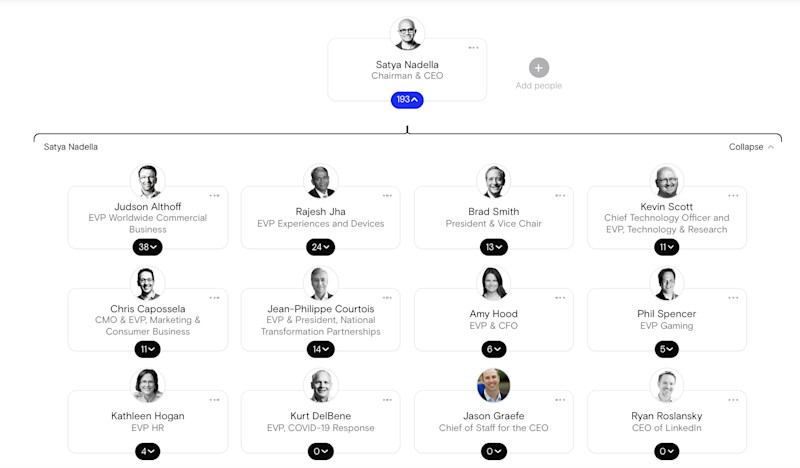
Product-based divisions are created to focus on different products. This is common in companies whose products require substantial research and development.
- Geographically based

Geographically based divisions are created based on different geographic regions. This can be global, such as the United States, Europe and South America, or can be national or local regions.
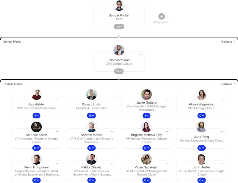
Also known as “horizontal” or “flatarchy,” flat reporting structures have little to no middle management positions, creating little distance between employees and company leaders.
- Employees have much more responsibility and autonomy
- More open communication
- Faster speed of ideas and innovations
- Easy to understand
- Don’t adjust well to growth
- Can produce employees with more generalized skills
- Can create confusion among employees without a clear supervisor to report to
READ MORE: What are Flat Organizational Structures and How Do They Work
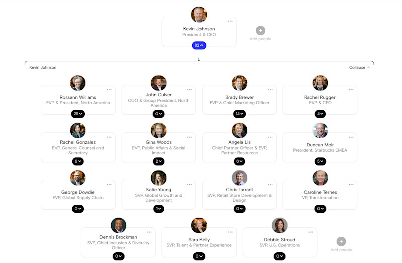
One of the most complex structures is a matrix org chart. Companies that follow a matrix structure involve two different reporting relationships for employees: one with product development and the other with their business function. Employees then report to a product manager and a business manager.
- Encourages collaboration across teams
- Allows supervisors to easily choose employees based on the need for a project
- Confusing lines of reporting
- Work can easily be duplicated or costly
- Can lead to conflict between two managers or employees

A holacracy is a decentralized reporting structure. It has self-managing teams that are responsible and accountable for their actions and decisions.
This is not a common structure as it can require radical changes. Zappos is one of the handful of companies that has shifted to this type of structure. They have adopted this structure to allow for a more distributed decision-making process. People can also work in departments where their talents are most useful.
Reporting to the CEO in a holacracy does not follow a structure. Instead, information is open, accessible and discussed during meetings. Small to medium-sized organizations can benefit from this type of company reporting structure.
In smaller startups, the reporting structure may seem obvious as everyone reports directly to the CEO or founder. But as a company starts to scale and more employees are hired, installing a framework of responsibility will become useful.
Consider the following before deciding on one or the other.
- Examine company goals and strategies
It’s always imperative to look at what you have now before you set something up for the future. Ask yourself what is your business strategy and what your workforce currently looks like. Carve out long term business goals and key business metrics. Think about what function of the business is most vital to reaching those long term goals.
- Consider how the company might grow
What's your company’s growth plan? How much will you realistically scale to in the next year, two years or five years? Consider a structure that will easily allow you to add new members and new responsibilities as you grow.
- Craft a transition plan
Once you’ve settled on a structure that fits your startup’s business strategies, visions and goals, it’s time to make a transition plan. Things to consider for a transition plan are:
- An accurate timeline of when you expect the new roles to start
- Expectations for supervisors and employees
- Handoff meetings between former supervisors and new supervisors
- Explanation of how the reporting structure is aligned with the business strategy and how it works best for the company
- Clear communication plan to the rest of the company. This should include a space for employees to ask questions
If you are working within a larger company, switching to a new reporting structure is an example of a reorganization—which includes a few extra things to keep in mind.
The easiest way to understand a reporting structure is to visualize it. Creating an org chart will give you a bird’s-eye view of exactly how your company is structured—and how it could be improved.
Just click here , and we’ll guide you through the process of setting up your very own org chart today.

The ORG helps you hire great candidates
Free to use – try today
Which Org Structure Fits You?
Matrix organizational structure, flat organizational structure, functional organizational structure.
Everything that you need to know to start your own business. From business ideas to researching the competition.
Practical and real-world advice on how to run your business — from managing employees to keeping the books.
Our best expert advice on how to grow your business — from attracting new customers to keeping existing customers happy and having the capital to do it.
Entrepreneurs and industry leaders share their best advice on how to take your company to the next level.
- Business Ideas
- Human Resources
- Business Financing
- Growth Studio
- Ask the Board
Looking for your local chamber?
Interested in partnering with us?
Run » human resources, building your team: how to create an effective company reporting structure.
There are many organizational models you can use to establish your reporting structure, depending on the maturity and goals of your business.

A company reporting or organizational (org) structure helps employees stay organized, work productively and coordinate to achieve the overall mission of the business. The reporting structure provides clarity when an employee faces an issue: who should they go to for help? Who should they approach for a key decision?
An effective reporting structure also creates checks and balances to help ensure the business is compliant and staying on budget. Here’s how to set up a reporting structure that is clear and efficient and keeps your business running smoothly.
[Read more: How to Structure Your Management Team ]
Define how you want your business to run
There are many ways to structure your chain of command. Understanding which model works best for your business requires zooming out on the big picture. The purpose of an organizational structure is to help you define how your business is going to run — starting with three key elements :
- Chain of command : How are tasks delegated, and how is work approved?
- Span of control : Who manages which employees, and what tasks fall under that department’s responsibilities?
- Centralization : Where are decisions made? Which people and departments have a say in each decision?
Considering each of these questions for your business can help you determine the type of reporting structure that will work for your specific business. For instance, if you work in a highly regulated industry, you may decide to keep decision-making centralized to the most senior staff: the C-suite or director-level employees who have the most industry experience.
[Read more: Executive Job Titles: What Do They Mean? ]
Consider different org models
There are many organizational structures you can implement with these three elements in mind. Options include a flat reporting structure, product reporting structure, line-and-staff reporting structure and network organization structure, for example.
Generally, most org models fall on the spectrum between " mechanistic " and “organic." Mechanistic reporting structures tend to be more hierarchical, taking a top-down traditional approach to reporting, managing and delegating. Organic structures are more collaborative and flexible.
There are pros and cons to each. As you design your reporting structure, think about your company goals. A startup aiming to quickly develop a new product will require a different reporting structure than a more established company that is focused on daily sales. Your organizational structure should consider how communication will flow to ease the completion of tasks and operations. “For example, a vertical structure can ensure that all your retail store employees know and do their assigned work efficiently,” noted Indeed .
This transparency saves time and increases efficiency, as workers can consult your organizational chart and determine exactly who to speak with when faced with a given issue.
Document roles and responsibilities clearly
No matter which type of structure you choose, it’s paramount to make sure your reporting structure is clear. An official organization chart allows you to officially distribute tasks and establish a reporting structure so that each role knows its purpose in the organization.
This clarity helps avoid confusion as the business grows and makes it easier for new employees to understand where they fit in. “This transparency saves time and increases efficiency, as workers can consult your organizational chart and determine exactly who to speak with when faced with a given issue,” wrote Nerdwallet .
Documenting your reporting structure also makes it easy to spot where there’s a bottleneck due to the lack of resources or an overloaded manager. Reporting structures should be revisited from time to time as the business grows. Don’t be afraid to differentiate functions into divisions to allow members to work productively. A marketing team, for instance, can be divided into design and SEO, with two separate managers to oversee those specialized functions.
Integrate tools to enable cross-functional communication
The right tools can help teams collaborate more easily. Whether you choose a vertical reporting structure or a flat reporting structure, you’ll need a way to organize tasks and give every team member visibility into the company workflow. Project management tools such as Asana, Trello, and Jira help keep every team aligned. Slack, Teams and other chat options can also make it easy for managers to check in with their direct reports throughout the day.
CO— aims to bring you inspiration from leading respected experts. However, before making any business decision, you should consult a professional who can advise you based on your individual situation.
Follow us on Instagram for more expert tips & business owners’ stories.
CO—is committed to helping you start, run and grow your small business. Learn more about the benefits of small business membership in the U.S. Chamber of Commerce, here .

Subscribe to our newsletter, Midnight Oil
Expert business advice, news, and trends, delivered weekly
By signing up you agree to the CO— Privacy Policy. You can opt out anytime.
For more HR tips
How to leverage a peo to help grow your small business, best applicant tracking systems for small business recruiting, how to write an effective part-time job description.
By continuing on our website, you agree to our use of cookies for statistical and personalisation purposes. Know More
Welcome to CO—
Designed for business owners, CO— is a site that connects like minds and delivers actionable insights for next-level growth.
U.S. Chamber of Commerce 1615 H Street, NW Washington, DC 20062
Social links
Looking for local chamber, stay in touch.

Work Life is Atlassian’s flagship publication dedicated to unleashing the potential of every team through real-life advice, inspiring stories, and thoughtful perspectives from leaders around the world.

Contributing Writer
Work Futurist

Senior Quantitative Researcher, People Insights
Principal Writer

9 common organizational charts, demystified
Ever wonder how companies get it all done? A lot of it has to do with the structure of their org chart.

Content Strategist, HubSpot
Choosing the best organizational structure for your company, division, or team is a lot like picking out a new car.
At the most basic level, you’re always looking for something road-worthy – something that can take you (and your passengers) from point A to point B without a hitch. But beyond that, there are many other options to consider. Automatic or manual? Four-wheel drive? Built-in GPS? Leather interior?
In the world of organizational structures, the options you have to choose from include things like chain of command (long or short?), span of control (wide or narrow?), and centralization (centralized or decentralized decision-making?), just to name a few.
What is organizational structure?
An organizational structure is a visual diagram of a company that describes what employees do, whom they report to, and how decisions are made across the business. Organizational structures can use functions, markets, products, geographies, or processes as their guide, and cater to businesses of specific sizes and industries.
What’s the point of an organizational structure? As a business leader, do you even need one? As mentioned above, org structures help you define at least three key elements of how your business runs.
Chain of Command
Your chain of command is how tasks are delegated and work is approved. An org structure allows you to define how many “ rungs of the ladder ” a particular department or business line should have. In other words, who directs whom? And how are issues, requests, and proposals communicated up and down that ladder?
Span of Control
Your span of control can represent two things: who falls under a manager’s, well, management … and which tasks fall under a department’s responsibility.
Centralization
Centralization describes where decisions are ultimately made. Once you’ve established your chain of command, you’ll need to consider which people and departments have a say in each decision. A business can lean toward centralized, where final decisions are made by just one or two entities; or decentralized, where final decisions are made within the team or department in charge of carrying out that decision.
You might not need an org structure right away, but the more products you develop and people you hire, the harder it’ll be to lead your company without this crucial diagram.
In this post, we’ll explore how you can combine components to form different types of organizational structures. We’ll also highlight the benefits and drawbacks of different structure types so you can evaluate which is the best option for your company, division, or team.
Mechanistic vs. organic organizational structures
Organizational structures fall on a spectrum, with “mechanistic” at one end and “organic” at the other.
Take a look at the diagram below. As you’ll probably be able to tell, the mechanistic structure represents the traditional, top-down approach to organizational structure, whereas the organic structure represents a more collaborative, flexible approach.
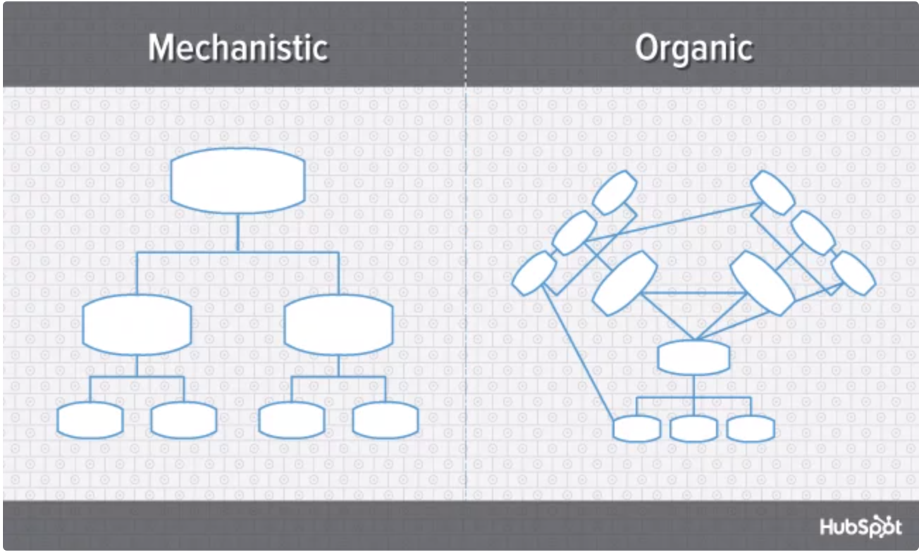
Here’s a breakdown of both ends of the structural spectrum, their advantages and disadvantages, and which types of businesses are suited for them.
Mechanistic structure
Mechanistic structures, also called bureaucratic structures , are known for having narrow spans of control, as well as high centralization, specialization, and formalization. They’re also quite rigid in what specific departments are designed and permitted to do for the company.
Get stories like this in your inbox
This organizational structure is much more formal than organic structure, using specific standards and practices to govern every decision the business makes. And while this model does hold staff more accountable for their work, it can become a hindrance to the creativity and agility the organization needs to keep up with random changes in its market.
As daunting and inflexible as mechanistic structure sounds, the chain of command, whether long or short, is always clear under this model. As a company grows, it needs to make sure everyone (and every team) knows what’s expected of them. Teams collaborating with other teams as needed might help get a business off the ground in its early stages, but sustaining that growth – with more people and projects to keep track of – will eventually require some policymaking. In other words, keep mechanistic structure in your back pocket because you never know when you’ll need it.
Organic structure
Organic structures (also known as “flat” structures) are known for their wide spans of control, decentralization, low specialization, and loose departmentalization. What’s that all mean? This model might have multiple teams answering to one person and taking on projects based on their importance and what the team is capable of – rather than what the team is designed to do.
As you can probably tell, this organizational structure is much less formal than mechanistic, and takes a bit of an ad-hoc approach to business needs. This can sometimes make the chain of command, whether long or short, difficult to decipher. And as a result, leaders might give certain projects the green light more quickly but cause confusion in a project’s division of labor.
Nonetheless, the flexibility that an organic structure allows for can be extremely helpful to a business that’s navigating a fast-moving industry, or simply trying to stabilize itself after a rough quarter. It also empowers employees to try new things and develop as professionals, making the organization’s workforce more powerful in the long run.
Now, let’s uncover more specific types of organizational structures, most of which fall on the more traditional, mechanistic side of the spectrum.
Types of organizational structure
- Functional organizational structure
- Product-based divisional structure
- Market-based divisional structure
- Geographical divisional structure
- Process-based structure
- Matrix structure
- Circular structure
- Flat structure
- Network structure
1. Functional organizational structure
One of the most common types of organizational structures, the functional structure departmentalizes an organization based on common job functions.
An organization with a functional org structure, for instance, would group all of the marketers together in one department, group all of the salespeople together in a separate department, and group all of the customer service people together in a third department.
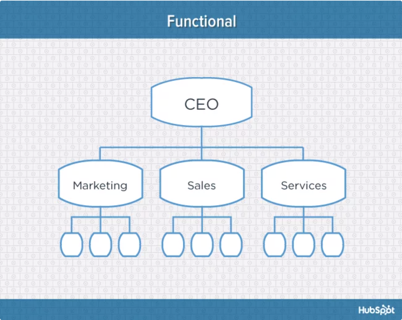
The functional structure allows for a high degree of specialization for employees, and is easily scalable should the organization grow. Also this structure is mechanistic in nature, which has the potential to inhibit an employee’s growth. But putting staff in skill-based departments can still allow them to delve deep into their field and find out what they’re good at.
Disadvantages
Functional structure also has the potential to create barriers between different functions – and it can be inefficient if the organization has a variety of different products or target markets. The barriers created between departments can also limit peoples’ knowledge of and communication with other departments, especially those that depend on other departments to succeed.
2. Product-based divisional structure
A divisional organizational structure is comprised of multiple, smaller functional structures. That is, each division within a divisional structure can have its own marketing team, its own sales team, and so on. In this case – a product-based divisional structure – each division within the organization is dedicated to a particular product line.
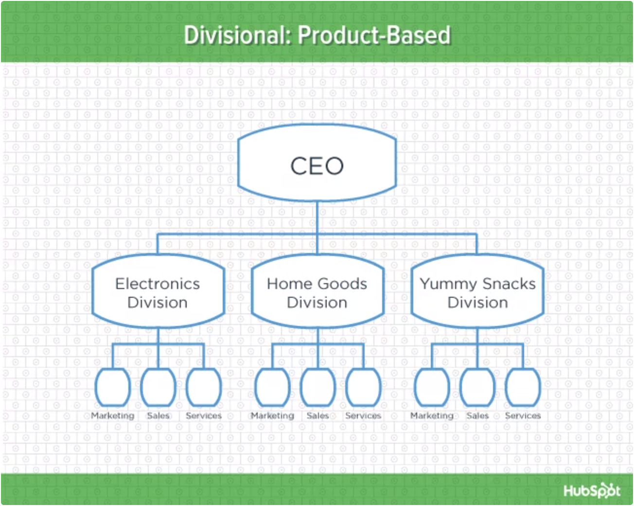
This type of structure is ideal for organizations with multiple products and can help shorten product development cycles. This allows small businesses to go to market with new offerings fast.
It can be difficult to scale under a product-based divisional structure, and the organization could end up with duplicate resources as different divisions strive to develop new offerings.
3. Market-based divisional structure
Another variety of the divisional organizational structure is the market-based structure, wherein the divisions of an organization are based around markets, industries, or customer types.
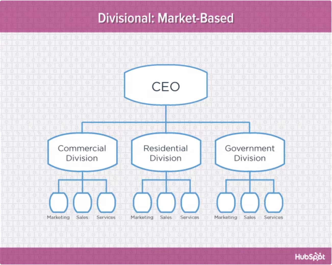
The market-based structure is ideal for an organization that has products or services that are unique to specific market segments, and is particularly effective if that organization has advanced knowledge of those segments. This organizational structure also keeps the business constantly aware of demand changes among its different audience segments.
Too much autonomy within each market-based team can lead to divisions developing systems that are incompatible with one another. Divisions might also end up inadvertently duplicating activities that other divisions are already handling.
4. Geographical divisional structure
The geographical organizational structure establishes its divisions based on – you guessed it – geography. More specifically, the divisions of a geographical structure can include territories, regions, or districts.
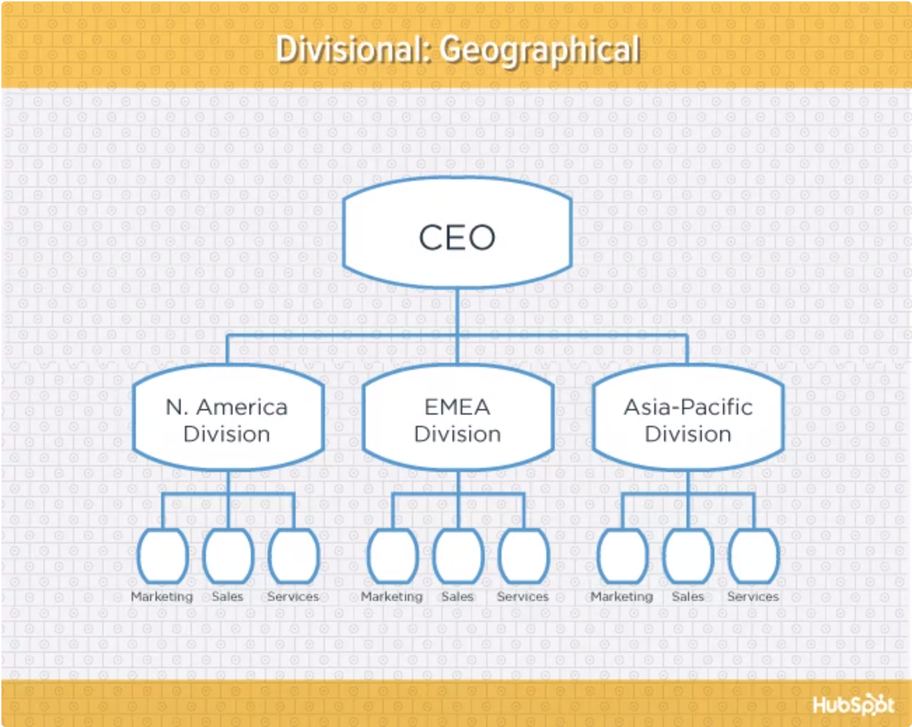
This type of structure is best-suited to organizations that need to be near sources of supply and/or customers (e.g. for deliveries or for on-site support). It also brings together many forms of business expertise, allowing each geographical division to make decisions from more diverse points of view.
The main downside of a geographical org structure: It can be easy for decision making to become decentralized, as geographic divisions (which can be hundreds, if not thousands of miles away from corporate headquarters) often have a great deal of autonomy. And when you have more than one marketing department – one for each region – you run the risk of creating campaigns that compete with (and weaken) other divisions across your digital channels.
5. Process-based structure
Process-based organizational structures are designed around the end-to-end flow of different processes, such as “Research & Development,” “Customer Acquisition,” and “Order Fulfillment.” Unlike a strictly functional structure, a process-based structure considers not only the activities employees perform, but also how those different activities interact with one another.
In order to fully understand the diagram below, you need to look at it from left to right: The customer acquisition process can’t start until you have a fully developed product to sell. By the same token, the order fulfillment process can’t start until customers have been acquired and there are product orders to fill.
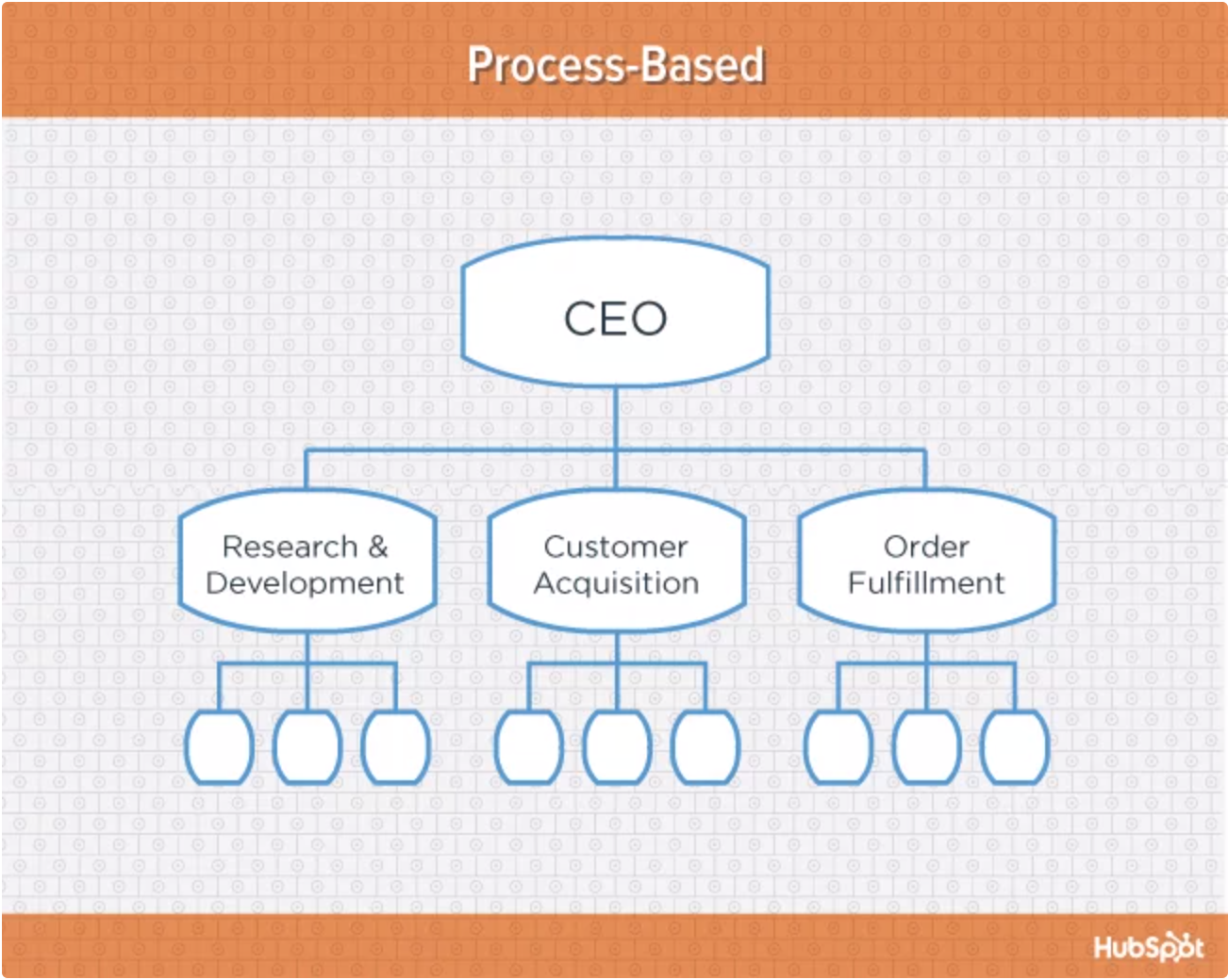
Process-based organizational structure is ideal for improving the speed and efficiency of a business, and is best-suited for those in rapidly changing industries, as it is easily adaptable.
Similar to a few other structures on this list, process-based structure can erect barriers between the different process groups. This leads to problems communicating and handing off work to other teams and employees.
6. Matrix structure
Unlike the other structures we’ve looked at so far, a matrix organizational structure doesn’t follow the traditional, hierarchical model. Instead, all employees (represented by the green boxes) have dual reporting relationships. Typically, there is a functional reporting line (shown in blue) as well as a product- based reporting line (shown in yellow).
When looking at a matrix structure org chart, solid lines represent strong, direct-reporting relationships, whereas dotted lines indicate that the relationship is secondary, or not as strong. In our example below, it’s clear that functional reporting takes precedence over product-based reporting.
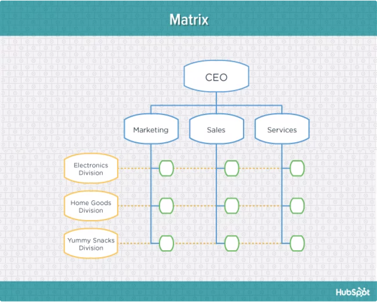
The main appeal of the matrix structure is that it can provide both flexibility and more balanced decision-making (as there are two chains of command instead of just one). Having a single project overseen by more than one business line also creates opportunities for these business lines to share resources and communicate more openly with one another – things they might not otherwise be able to do regularly.
The primary pitfall of the matrix organizational structure? Complexity. The more layers of approval employees have to go through, the more confused they can be about who they’re supposed to answer to. This confusion can ultimately cause frustration over who has authority over which decisions and products – and who’s responsible for those decisions when things go wrong.
7. Circular structure
While it might appear drastically different from the other organizational structures highlighted in this section, the circular structure still relies on hierarchy, with higher-level employees occupying the inner rings of the circle and lower-level employees occupying the outer rings.
That being said, the leaders or executives in a circular organization aren’t seen as sitting atop the organization, sending directives down the chain of command. Instead, they’re at the center of the organization, spreading their vision outward.
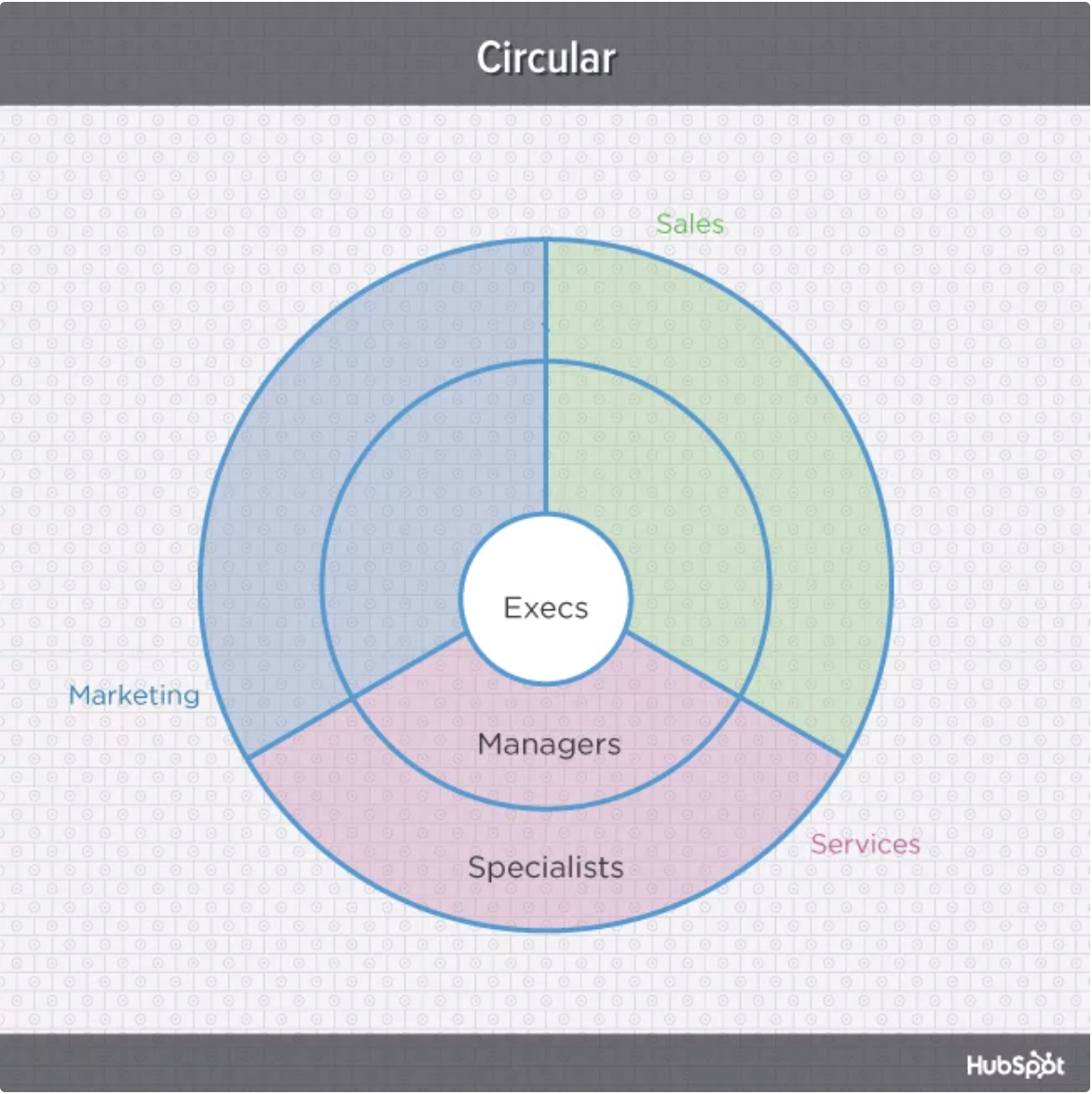
From an ideological perspective, a circular structure is meant to promote communication and the free flow of information between different parts of the organization. Whereas a traditional structure shows different departments or divisions as occupying individual, semi-autonomous branches, the circular structure depicts all divisions as being part of the same whole.
From a practical perspective, the circular structure can be confusing, especially for new employees. Unlike with a more traditional, top-down structure, a circular structure can make it difficult for employees to figure out who they report to and how they’re meant to fit into the organization.
8. Flat structure
While a more traditional organizational structure might look more like a pyramid, with multiple tiers of supervisors, managers and directors between staff and leadership, the flat structure limits the levels of management so all staff are only a few steps away from leadership. It also might not always take the form or a pyramid, or any shape for that matter. As we mentioned earlier, It’s also a form of the “Organic structure” we noted above.

This structure is probably one of the most detailed, It’s also thought that employees can be more productive in an environment where there’s less hierarchy-related pressures . This structure might also make staff feel like the managers they do have are more like equals or team members rather than intimidating superiors.
If there’s a time when teams in a flat organization disagree on something, such as a project, it can be hard to get aligned and back on track without executive decisions from a leader or manager. Because of how complicated the structure’s design is, it can be tricky to determine which manager an employee should go to if they need approval or an executive decision for something. So if you do choose to have a flat organization, you should have a clearly marked tier of management or path that employers can refer to when they run into these scenarios.
9. Network structure
A network structure is often created when one company works with another to share resources, or if your company has multiple locations with different functions and leadership. You might also use this structure to explain your company workflows if much of your staffing or services is outsourced to freelancers or multiple other businesses.
The structure looks nearly the same as the Divisional structure, shown above. However, instead of offices, it might list outsourced services or satellite locations outside of the office.
If your company doesn’t do everything under one roof, this is a great way to show employees or stakeholders how outsourcing of off-site processes work. For example, if an employee needs help from a web developer for a blogging project and the company’s web developers are outsourced, the could look at this type of chart and know which office or which person to contact outside of their own work location.
The shape of the chart can vary based on how many companies or locations you’re working with. If it’s not kept simple and clear, there may be a lot of confusion if multiple offices or freelancers do similar things. If you do outsource or have multiple office locations, make sure your org chart clearly states where each specific role and job function lies so someone can easily understand your basic company processes.
Navigating organizational structures
Keep in mind that what we’ve just looked at are simply archetypes. In real-world applications, organizations often use hybrid structures which can borrow elements from multiple structure types.
Want to dive deeper into org charts and how you should create yours? Download HubSpot’s complete resource: An Illustrated Guide to Organizational Structures .
Advice, stories, and expertise about work life today.
.css-s5s6ko{margin-right:42px;color:#F5F4F3;}@media (max-width: 1120px){.css-s5s6ko{margin-right:12px;}} Join us: Learn how to build a trusted AI strategy to support your company's intelligent transformation, featuring Forrester .css-1ixh9fn{display:inline-block;}@media (max-width: 480px){.css-1ixh9fn{display:block;margin-top:12px;}} .css-1uaoevr-heading-6{font-size:14px;line-height:24px;font-weight:500;-webkit-text-decoration:underline;text-decoration:underline;color:#F5F4F3;}.css-1uaoevr-heading-6:hover{color:#F5F4F3;} .css-ora5nu-heading-6{display:-webkit-box;display:-webkit-flex;display:-ms-flexbox;display:flex;-webkit-align-items:center;-webkit-box-align:center;-ms-flex-align:center;align-items:center;-webkit-box-pack:start;-ms-flex-pack:start;-webkit-justify-content:flex-start;justify-content:flex-start;color:#0D0E10;-webkit-transition:all 0.3s;transition:all 0.3s;position:relative;font-size:16px;line-height:28px;padding:0;font-size:14px;line-height:24px;font-weight:500;-webkit-text-decoration:underline;text-decoration:underline;color:#F5F4F3;}.css-ora5nu-heading-6:hover{border-bottom:0;color:#CD4848;}.css-ora5nu-heading-6:hover path{fill:#CD4848;}.css-ora5nu-heading-6:hover div{border-color:#CD4848;}.css-ora5nu-heading-6:hover div:before{border-left-color:#CD4848;}.css-ora5nu-heading-6:active{border-bottom:0;background-color:#EBE8E8;color:#0D0E10;}.css-ora5nu-heading-6:active path{fill:#0D0E10;}.css-ora5nu-heading-6:active div{border-color:#0D0E10;}.css-ora5nu-heading-6:active div:before{border-left-color:#0D0E10;}.css-ora5nu-heading-6:hover{color:#F5F4F3;} Register now .css-1k6cidy{width:11px;height:11px;margin-left:8px;}.css-1k6cidy path{fill:currentColor;}
- Business strategy |
- How to create an organizational chart ( ...
How to create an organizational chart (with free examples)

An organizational chart outlines how your company functions in real time. This diagram shows the reporting relationships between job titles and the roles in your organization. We’ll explain the different types of organizational charts and provide free templates for you to customize your own.
You’re having a family dinner when your grandma pulls out the family tree. She uncrinkles the piece of paper and traces her name down the line. As she searches, her finger lands on a name. “See! There he is, right next to your cousin Charles!” She points to the name of your third cousin, proving that this name matches that of a famous poet.
In this guide, we’ll explain how to make an org chart, the different types of organizational charts, and provide free templates so you can customize and build your own.
How to make an organizational chart
An organizational chart is a way to visualize your company’s structure. To create an org chart, you’ll need to gather team member information and decide how you’d like to build the chart.
As you consider the reporting relationships in your organization, you can plan your chart from top to bottom.
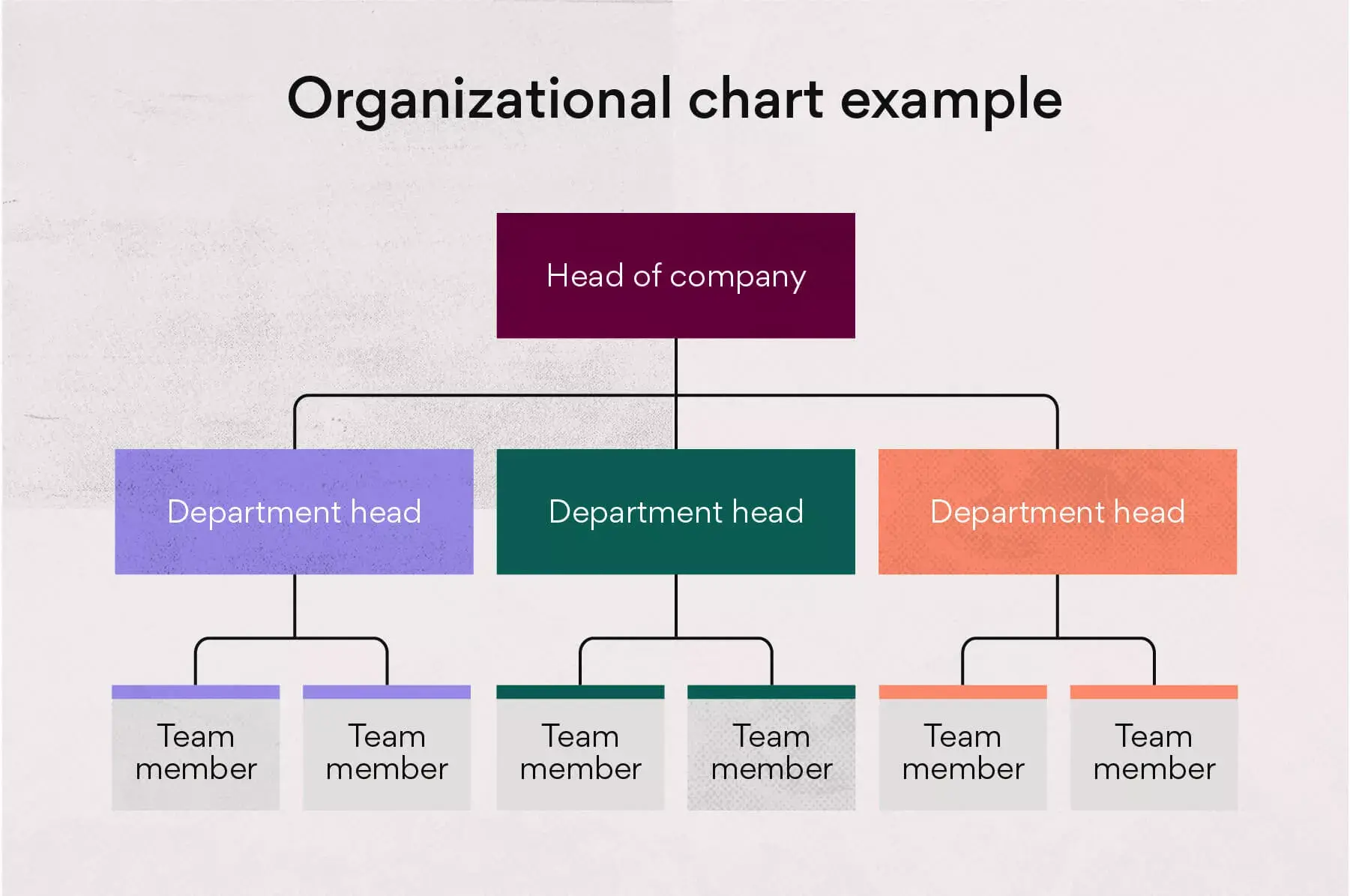
1. Define scope
You can treat your organizational chart like any other new project you work on. Defining the scope of your org chart can help ensure it clearly represents your team structure . The scope will determine the overall purpose of your organizational chart.
Consider these questions to get started:
Will your org chart act as a resource for team members to know who’s who within the company?
Will you share your organizational chart with external stakeholders or partners?
Will you need multiple charts for different levels of the company?
Asking these questions from the start can help you gather the right information and map out your chart.
2. Gather information
Gathering information is the most important step of making an organizational chart because without the right information, you won’t be able to proceed. You can gather information by surveying individual team members through email or working with your HR department.
You’ll need up-to-date information about the people in your company, including employee names and their latest job titles. You’ll also need to understand reporting relationships throughout your company, such as the hierarchy between managers and direct reports. Consider gathering headshots of your team for added personalization.
3. Decide how to build your chart
Deciding how to build your organizational chart is crucial because different tools can make the process easier. Drawing out your org chart by hand isn’t time efficient and will make your results hard to share, so consider harnessing the power of a tool for this process.
Using an editable PDF can save you time because the template is pre-built with placeholders. You can then easily share the PDF with the rest of your company.
4. Plan for updates
After creating your org chart, use a team calendar to plan for regular updates. After all, it’s likely that your company structure and team dynamics will change often.
People switch in and out of positions, new employees are hired, and reporting relationships change. With a digital org chart, it’s easy to update the structure and redistribute it to team members.
Organizational chart templates
Creating an organizational chart can be easier when building from an org chart template. Most companies follow similar structures, whether it’s a top-down structure or a matrix structure.
You can use the org chart examples below as jumping-off points. To create your custom org chart, determine which organizational type best represents your company structure. Then, update the template to fit your unique team needs.
Types of organizational charts
There are four common org chart types. Each one of these charts uses a different chart design and represents a different way that a company might function. Since an organizational chart is basically a hierarchy chart—a visual translation of your company’s internal structure—the chart type you use should mirror your organization’s reporting relationships and decision-making procedures.
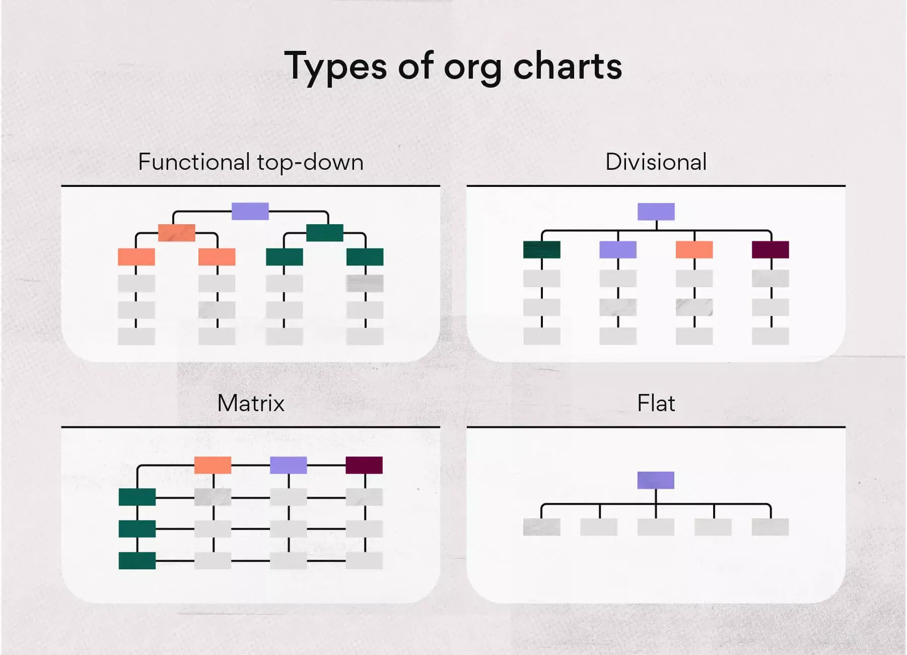
1. Functional top-down
A functional top-down org chart is the most common structure, with the company functioning as a hierarchy. At the top of this organizational structure there is one team member, who usually has the title of president or CEO.
Branching off from that team member are the leaders who are next in charge, like the company vice presidents. The organizational hierarchy extends further into departments and eventually branches into teams.
2. Matrix organizational chart
The matrix organization is a more complex structure than the traditional top-down design. If your company uses this reporting structure, team members report to multiple managers.
While employees likely have a primary manager they report to for their department, they may also report to a project manager . These secondary project managers also have department managers they report to, which makes the matrix org chart look rectangular instead of tree-like.
3. Divisional structure
A divisional organizational structure is a high-level version of the traditional hierarchical structure. Divisional structures make sense for companies that have departments working independently from one another.
For example, companies with separate product lines may work in divisional structures because each product line has separate IT, marketing, and sales departments.
4. Flat organizational chart
The flat organizational chart is unique because it shows few or no levels of management. This type of organizational structure may be present in a small business or a modern business that’s experimenting with no chain of command.
With this type of organizational structure, the company promotes wide-spread team member self-management and decision-making.
How to use an org chart
You can benefit your company by using an organizational structure because it provides a visual representation of different departments and job titles in action. This chart can help team members understand how to collaborate with one another and feel confident in their role and responsibilities.
Visualize reporting relationships
As a manager, you may use an org chart to show work responsibilities and reporting relationships to new team members. When onboarding new hires, the org chart helps team members get to know their fellow teammates and what they do. It also helps new team members remember who’s who within the company.
Manage growth and change
Organizational charts can also help the leadership team stay organized and manage growth or change within the company. For example, if a department head notices that one team has become larger than other teams, they can shift or hire new team members to create balance.

See where everyone fits
An org chart creates clarity by showing everyone in the company where they fit in the organizational structure. If a new member joins the team, they can glance at the organizational chart and understand that they have five other members on their team, two assistants below them, and a project manager above them. They can also see that their project manager reports to a department manager.
Improve communication
Having an established organizational structure for your company can improve communication because it makes reporting relationships clear. Without an organizational chart in place, team members may not know who to go to when they have questions. The org chart makes it clear who leads what, so team members can feel empowered to ask questions and collaborate with others.
Create visual directory
An org chart is essentially a visual directory of your organization. You can update the chart when team members get promoted or when they leave. Keeping a visual directory up to date keeps everyone informed of who’s working at the company and what their current position is.
Limitations of using an org chart
While organizational charts can increase communication among teams, there are limitations of using them. Knowing these limitations can help you find solutions to any potential issues before they occur.
Can get outdated quickly
Org charts can get outdated quickly as companies restructure and shift team roles. Team members must be mindful and keep the org chart updated with current company structure and staff names.
Solution: Assign someone to regularly update and redistribute your organizational chart in order to maintain this valuable resource.
Only shows formal relationships
The organizational chart is a one-dimensional document, so it doesn’t offer much explanation beyond the reporting structure it provides. While it’s useful in visualizing the basic company structure, it only shows formal relationships. Many companies function and thrive on various informal reporting relationships that wouldn’t show up on a traditional org chart.
Solution: Use an org chart as a jumping off point, but keep in mind there may be other working relationships that the org chart doesn’t capture.
Doesn’t display management style
While the org chart shows managers and the team members that report to them, it won’t show what each manager is like. For example, the org chart may show that one manager has two team members and another manager has five team members. Assumptions may be made that the manager with more team members is a stronger leader, but the org chart won’t show that the manager with less team members has a more hands-on management style .
Solution: Use your org chart as a first point of reference, but be mindful that face to face contact is the best way to understand reporting relationships among internal teams.
Can be difficult to update
Not only can printable org chart worksheets or drawn-out organization charts become outdated quickly, they can also be difficult to update. After all, if your chart is created in a static tool, you’ll have to start from scratch every time your organization’s structure changes.
Solution: Instead of creating your chart in a fixed workspace, opt for a dynamic tool. Platforms like Microsoft Word, PowerPoint, and Excel are easily updated. Or, take it one step further with org chart software or a project management tool that uses integrations and apps to connect your team to data visualizers that map out workflows, like LucidChart and Miro .
Streamline your organizational structure with a chart
While there are limitations to organizational charts, these charts offer a helpful way to understand your company structure. It can also improve communication with upper management by clarifying roles and responsibilities. To build an organizational chart for your company, use our free editable PDFs and customize them as you see fit.
Need help streamlining teamwork? Find out how Asana helps teams communicate effectively.
Related resources

Unmanaged business goals don’t work. Here’s what does.

How Asana uses work management to effectively manage goals

Beat thrash for good: 4 organizational planning challenges and solutions

How Asana uses work management to streamline project intake processes
- Get started Get started for free
Figma design
Design and prototype in one place

Collaborate with a digital whiteboard

Translate designs into code

Get the desktop, mobile, and font installer apps
See the latest features and releases
- Prototyping
- Design systems
- Wireframing
- Online whiteboard
- Team meetings
- Strategic planning
- Brainstorming
- Diagramming
- Product development
- Web development
- Design handoff
- Product managers
Organizations
Config 2024
Register to attend in person or online — June 26–27

Creator fund
Build and sell what you love
User groups
Join a local Friends of Figma group
Learn best practices at virtual events
Customer stories
Read about leading product teams
Stories about bringing new ideas to life

Get started
- Developer docs
- Best practices
- Reports & insights
- Resource library
- Help center
How to make an effective organizational chart
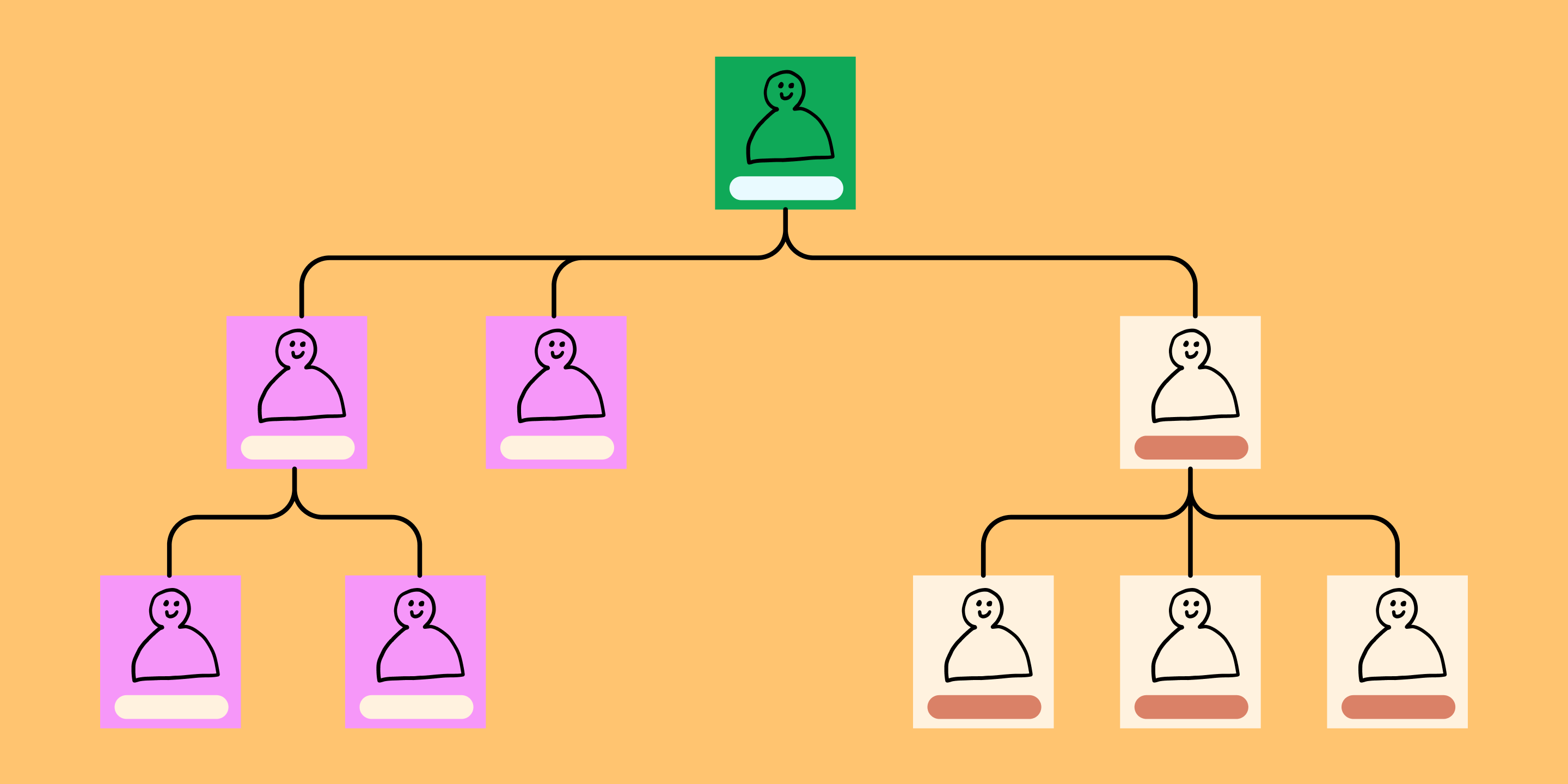
No matter what design challenge you're taking on, your team needs context—starting with organizational structure. Once you understand organizational roles and responsibilities, you can achieve efficient workflow, clear communication, and informed decision-making. But with many companies shifting to hybrid remote and in-person teams, it's not always easy to tell who's doing what on a project.
Organizational charts can help dynamic teams flex roles and navigate responsibilities. Read on to find out:
- What is an organizational chart and when to use one
- Key benefits of organizational charts
- How to make your own with FigJam's organizational chart templates
What is an organizational chart?
An organizational chart (also known as an org chart, organogram, or organigram) is a visual representation of a company's internal structure. At a glance, you can see roles, responsibilities, and relationships across an organization.
Org charts came into use during the industrial revolution, and they're still evolving to reflect new types of organizational structures. Picture a startup where everyone pitches in when needed, no matter their rank. A flat organizational chart sharing team roles can boost collaboration and prevent overlap.
Design your organizational chart in FigJam
FigJam's free org chart template makes it easy to get started.
4 key benefits of organizational charts
Getting a bird's eye view of your company structure helps you understand the chain of command for decision-making. That way, you can involve key players and communicate across different departments. Updated organizational charts help capture changing players and roles in real time, helping your team in four key ways.
- Clarify the chain of command: Hierarchical structures aren't always obvious in modern organizations. But to get approvals, you need to know who's in charge of what. Org charts get everyone on the same page, in large organizations and small startups alike.
- Promote communication: With teams spread out across offices and time zones, you might not know who to go to for what. Org charts capture names, roles, and contact information, facilitating effective communication.
- Aid decision-making: Leaders can consult org charts to make informed choices when delegating work, distributing resources, and managing performance.
- Capture changes in reporting relationships: When a company is restructuring or expanding, org charts can capture how these changes impact employee roles and responsibilities. Clear, updated org charts help make transitions smoother and more transparent.
When to use organizational charts
Organizational charts make team planning and collaboration easier, especially at four crucial moments.
- For budgeting: Say your team takes on a new project. Who on your team has bandwidth for extra work? Do you need to hire contractors or outsource work? A glance at an org chart can help you see who you need to fill key roles, so you can allocate resources to meet project goals.
- During hiring and onboarding: An organizational chart helps human resources teams spot staffing gaps and hire new employees to meet changing needs. During onboarding, these visual aids help new hires understand their responsibilities, meet their teams, and settle into their roles.
- In project management: Project managers use organizational charts to manage resources across projects. Org charts help managers figure out who's the best fit for tasks, who reports to whom, and who grants approvals.
- In company restructuring: Updated organizational charts are crucial to guide teams through major changes. Teams rely on them to grasp their changing responsibilities, new reporting relationships, and how they fit into the big picture.
4 key types of organizational charts for modern organizations
What type of org chart is the best fit for your organizational structure? That depends on your company’s size, goals, and culture. Try on the four popular org chart examples below, and you may find a close fit.
1. Hierarchical org chart
Hierarchical organizational charts are especially common in large companies and government departments. Here the flow of authority and responsibility is often top-down—from the C-suite to the most junior employees, and from the presidential cabinet to aides. Leaders sit at the top, with support staff ranked in tiers below.
2. Flat org chart
Flat or horizontal organizations typically have fewer layers of middle management, so their charts have fewer layers and employees have more autonomy. Flat org charts are popular among startups and small businesses for tight teamwork and quick pivots. Entry-level employees may report directly to top management and have direct relationships with vendors.
3. Matrix org chart
A matrix organizational chart groups employees into departments by skill and role. A matrix structure makes sense for many creative teams, who handle multiple projects simultaneously for different teams and project managers. In these cases, rank and title are less relevant than skillsets and assignments. For example, a designer’s time may be allocated by a creative director to projects across departments, from product to marketing.
4. Divisional org chart
A divisional structure (or multi-divisional form ) is often divided into geographic regions or product lines. Each division has autonomy, while still working towards shared organizational goals. For example, a global brand could have international divisions with unique org charts, while maintaining global brand standards and company values.
How to make an organizational chart in 5 steps
Create an organizational chart to understand roles and manage resources with this step-by-step guide.
Step 1: Define the purpose of your org chart.
Is your goal to improve communication, streamline decision-making, or manage organizational change? Jot down your goal as a reminder of what you're trying to capture and why.
Step 2: Choose the appropriate org chart type.
Browse org chart templates to find the best fit for your project purpose and organization's structure. Choose from hierarchical, flat, matrix, or divisional structures.
Step 3: Collect organizational data.
Gather names, job titles, and reporting relationships to fill in your template with key details. Job descriptions, the employee directory, and previous organizational charts can help.
Step 4: Get creative with online tools.
Make your org chart modern and memorable with online tools, including this popular org chart widget .
Step 5: Update regularly.
Keep your org chart current to reflect changes in your organization. An outdated chart can lead to confusion, while an updated one promotes transparency.
Pro tips for an effective organizational chart
Apply these tips to excel at org charts:
- Incorporate handy details. Boost transparency and usability with useful employee info, such as contact information, photos, and department functions.
- Use color coding. This simple trick makes departments and roles easy to tell apart at a glance—and makes your chart more memorable and appealing.
- Make it easy to find. Upload your org chart to a shared drive, intranet, or a tool like FigJam .
Jumpstart your organizational chart with FigJam
Boost transparency and collaboration with compelling, accurate organizational charts created with FigJam's online collaborative whiteboard . Use it to:
- Brainstorm , design, and chart reporting structures
- Guide project team members to success with clear roles and reporting lines
- Explore design options to add brand elements to your organizational chart
- Browse org chart examples from the Figma community
Ready to design clearer roles and responsibilities?

- school Campus Bookshelves
- menu_book Bookshelves
- perm_media Learning Objects
- login Login
- how_to_reg Request Instructor Account
- hub Instructor Commons
- Download Page (PDF)
- Download Full Book (PDF)
- Periodic Table
- Physics Constants
- Scientific Calculator
- Reference & Cite
- Tools expand_more
- Readability
selected template will load here
This action is not available.

16.5: Reading- The Organization Chart and Reporting Structure
- Last updated
- Save as PDF
- Page ID 65946
The Organization Chart
Once an organization has set its structure, it can represent that structure in an organization chart : a diagram delineating the interrelationships of positions within the organization. Having decided on a functional structure, a company might create the organization chart shown in Figure \(\PageIndex{1}\).
Using the figure above for reference you can complete a hypothetical organization chart. Begin by putting yourself at the top of the chart, as the company’s president. Then fill in the level directly below your name with the names and positions of the people who work directly for you —your accounting, marketing, operations, and human resources managers. The next level identifies the people who work for these managers. In this example, because you’ve started out small, neither your accounting manager nor your human resources manager currently manage anyone directly. Your marketing manager, however, oversees one person in advertising and a sales supervisor (who, in turn, oversees the sales staff). Your operations manager oversees two individuals—one to supervise notetakers and one to supervise people responsible for making copies.
Reporting Relationships
With these relationships in mind, you can now draw lines to denote reporting relationships , or patterns of formal communication. Because four managers report to you, you’ll be connected to four positions; that is, you’ll have four direct “reports.” Your marketing and operations managers will each be connected to two positions and their supervisors to one position each. The organization chart shows that if a member of the sales staff has a problem, he or she will report it to the sales supervisor. If the sales supervisor believes that the problem should be addressed at a higher level, then he or she will report it to the marketing manager.
Theoretically, you will communicate only with your four direct reports, but this isn’t the way things normally work. Behind every formal communication network there lies a network of informal communications—unofficial relationships among members of an organization. You might find that over time, you receive communications directly from members of the sales staff; in fact, you might encourage this line of communication.
Now let’s look at the chart of an organization that relies on a divisional structure based on goods or services produced—say, a theme park. The top layers of this company’s organization chart might look like the one in Figure 2a. We see that the president has two direct reports—a vice president in charge of rides and a vice president in charge of concessions. What about a bank that’s structured according to its customer base? The bank’s organization chart would begin like the one in Figure \(\PageIndex{2}\)b. Once again, the company’s top manager has two direct reports, in this case a VP of retail-customer accounts and a VP of commercial-customer accounts.
Over time, companies revise their organizational structures to accommodate growth and changes in the external environment. It’s not uncommon, for example, for a firm to adopt a functional structure in its early years. Then, as it becomes bigger and more complex, it might move to a divisional structure—perhaps to accommodate new products or to become more responsive to certain customers or geographical areas. Some companies might ultimately rely on a combination of functional and divisional structures. This could be a good approach for a credit card company that issues cards in both the United States and Europe. A skeleton of this firm’s organization chart might look like the one in Figure \(\PageIndex{3}\).

Lines of Authority
You can learn a lot about a firm’s reporting and authority relationships by looking at its organization chart. To whom does a particular person report? Does each person report to one or more supervisors? How many people does a manager supervise? How many layers are there, for example, between the top managerial position and the lowest managerial level?
Chain of Command
The vertical connecting lines in the organization chart show the firm’s chain of command : the authority relationships among people working at different levels of the organization. That is to say, they show who reports to whom . When you’re examining an organization chart, you’ll probably want to know whether each person reports to one or more supervisors: to what extent, in other words, is there unity of command ? To understand why unity of command is an important organizational feature, think about it from a personal standpoint. Would you want to report to more than one boss? What happens if you get conflicting directions? Whose directions would you follow?
There are, however, conditions under which an organization and its employees can benefit by violating the unity-of-command principle. Under a matrix structure , for example, employees from various functional areas (product design, manufacturing, finance, marketing, human resources, etc.) form teams to combine their skills in working on a specific project or product. This matrix organization chart might look like the one in the following figure.
Nike sometimes uses this type of arrangement. To design new products, the company may create product teams made up of designers, marketers, and other specialists with expertise in particular sports categories—say, running shoes or basketball shoes. Each team member would be evaluated by both the team manager and the head of his or her functional department.
Span of Control
Another thing to notice about a firm’s chain of command is the number of layers between the top managerial position and the lowest managerial level. As a rule, new organizations have only a few layers of management—an organizational structure that’s often called flat . Let’s say, for instance, that a member of the sales staff wanted to express concern about slow sales among a certain group of customers. That person’s message would have to filter upward through only two management layers—the sales supervisor and the marketing manager—before reaching the president.
As a company grows, however, it tends to add more layers between the top and the bottom; that is, it gets taller . Added layers of management can slow down communication and decision making, causing the organization to become less efficient and productive. That’s one reason why many of today’s organizations are restructuring to become flatter.
There are trade-offs between the advantages and disadvantages of flat and tall organizations. Companies determine which trade-offs to make according to a principle called span of control , which measures the number of people reporting to a particular manager. If, for example, you remove layers of management to make your organization flatter, you end up increasing the number of positions reporting to a particular supervisor.
What’s better—a narrow span of control (with few direct reports) or a wide span of control (with many direct reports)? The answer to this question depends on a number of factors, including frequency and type of interaction, proximity of subordinates, competence of both supervisor and subordinates, and the nature of the work being supervised. For example, you’d expect a much wider span of control at a nonprofit call center than in a hospital emergency room.
Delegating Authority
Given the tendency toward flatter organizations and wider spans of control, how do managers handle increased workloads? They must learn how to handle delegation —the process of entrusting work to subordinates. Unfortunately, many managers are reluctant to delegate. As a result, they not only overburden themselves with tasks that could be handled by others, but they also deny subordinates the opportunity to learn and develop new skills.
Responsibility and Authority
As owner of a business an individual may want to control every aspect of the business, especially during the start-up stage. But as the organization grows, they will have to assign responsibility for performing certain tasks to other people. They will also have to accept the fact that responsibility alone—the duty to perform a task—won’t be enough to get the job done. They will need to grant subordinates the authority they require to complete a task—that is, the power to make the necessary decisions. (And they’ll also need sufficient resources.) Ultimately, the owner will also hold his/her subordinates accountable for their performance.
Centralization and Decentralization
If and when a company expands, the owner will have to decide whether most decisions should still be made by individuals at the top or delegated to lower-level employees. The first option, in which most decision making is concentrated at the top, is called centralization . The second option, which spreads decision making throughout the organization, is called decentralization . Naturally, there are some decisions—such as strategic planning—that won’t be delegated to lower-level employees, but others can be delegated, such as the management of copy-center operations. In fact, putting someone in charge of this function would probably improve customer satisfaction, because copy-center customers would be dealing directly with the manager. It would also give the manager valuable decision-making experience, and while he or she is busy making daily decisions about the copy center, upper level management and owners will have more time to work on higher-level tasks.
KEY TAKEAWAYS
- Managers coordinate the activities identified in the planning process among individuals, departments, or other units and allocate the resources needed to perform them.
- Typically, there are three levels of management: top managers , who are responsible for overall performance; middle managers , who report to top managers and oversee lower-level managers; and first-line managers , who supervise employees to make sure that work is performed correctly and on time.
- Management must develop an organizational structure , or arrangement of people within the organization, that will best achieve company goals.
- The process begins with specialization —dividing necessary tasks into jobs; the principle of grouping jobs into units is called departmentalization .
- Units are then grouped into an appropriate organizational structure. Functional organization groups people with comparable skills and tasks; divisional organization creates a structure composed of self-contained units based on product , customer , process , or geographical division . Forms of organizational division are often combined.
- An organization’s structure is represented in an organization chart —a diagram showing the interrelationships of its positions.
- This chart highlights the chain of command , or authority relationships among people working at different levels.
- It also shows the number of layers between the top and lowest managerial levels. An organization with few layers has a wide span of control , with each manager overseeing a large number of subordinates; with a narrow span of control, only a limited number of subordinates reports to each manager.
Check Your Understanding
Answer the question(s) below to see how well you understand the topics covered in this section. This short quiz does not count toward your grade in the class, and you can retake it an unlimited number of times.
Use this quiz to check your understanding and decide whether to (1) study the previous section further or (2) move on to the next section.
https://assessments.lumenlearning.com/assessments/200
Contributors and Attributions
- Revision and adaptation. Authored by : Linda Williams and Lumen Learning. License : CC BY-NC-SA: Attribution-NonCommercial-ShareAlike
- An Introduction to Business. Authored by : Anonymous. Provided by : Anonymous. Located at : http://2012books.lardbucket.org/books/an-introduction-to-business-v2.0/s10-03-organizing.html . License : CC BY-NC-SA: Attribution-NonCommercial-ShareAlike
Diagramming Build diagrams of all kinds from flowcharts to floor plans with intuitive tools and templates.
Whiteboarding collaborate with your team on a seamless workspace no matter where they are., data generate diagrams from data and add data to shapes to enhance your existing visuals., enterprise friendly easy to administer and license your entire organization., security see how we keep your data safe., apps & integrations connect to all the tools you use from microsoft, google workspace, atlassian, and more..
- What's New Read about new features and updates.
Product Management Roadmap features, brainstorm, and report on development, so your team can ship features that users love.
Software engineering design and maintain complex systems collaboratively., information technology visualize system architecture, document processes, and communicate internal policies., sales close bigger deals with reproducible processes that lead to successful onboarding and training..
- Getting Started Learn how to make any type of visual with SmartDraw. Familiarize yourself with the UI, choosing templates, managing documents, and more.
- Templates get inspired by browsing examples and templates available in SmartDraw.
Diagrams Learn about all the types of diagrams you can create with SmartDraw.
Whiteboard learn how to combine free-form brainstorming with diagram blueprints all while collaborating with your team., data visualizers learn how to generate visuals like org charts and class diagrams from data., development platform browse built-in data visualizers and see how you can build your own custom visualization., open api the smartdraw api allows you to skip the drawing process and generate diagrams from data automatically., shape data add data to shapes, import data, export manifests, and create data rules to change dashboards that update..
- Explore SmartDraw Check out useful features that will make your life easier.
- Blog Read articles about best practices, find tips on collaborating, learn to give better presentations and more.
Support Search through SmartDraw's knowledge base, view frequently asked questions, or contact our support team.
Site license site licenses start as low as $2,995 for your entire organization..
- Team License The SmartDraw team License puts you in control with powerful administrative features.
Apps & Integrations Connect to all the tools you use.
- Contact Sales
What's New?
Solutions By Team
Save money, reduce hassle, and get more.
Unleash your team's productivity by combining enterprise-class diagramming, whiteboarding, and data while saving 10x over Visio and Lucidchart!
Getting Started Learn to make visuals, familiarize yourself with the UI, choosing templates, managing documents, and more.
Templates get inspired by browsing examples and templates available in smartdraw., developer resources, additional resources.

Team License The SmartDraw Team License puts you in control with powerful administrative features.
Solutions for your team.
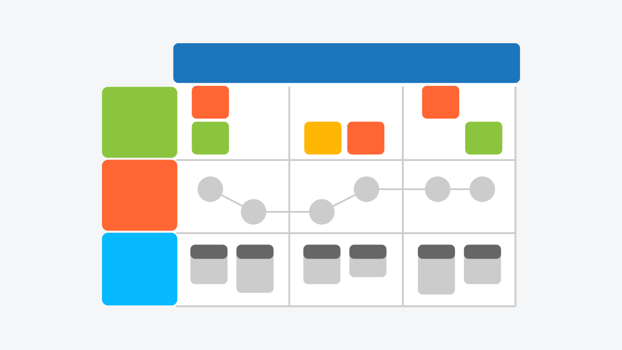
Organizational Chart
Visualize employee information quickly from templates or data, what is an organizational chart, organizational chart templates, organization chart types, 10 tips for perfect org charts, how to make an organizational chart, org chart tutorial, rules for formatting org charts, with smartdraw, you can create many different types of diagrams, charts, and visuals.
The definition of an organization chart or "org chart" is a diagram that displays a reporting or relationship hierarchy. The most frequent application of an org chart is to show the structure of a business, government, or other organization.
Org charts have a variety of uses, and can be structured in many different ways. They might be used as a management tool, for planning purposes, or as a personnel directory, for example. Perhaps your organization doesn't operate in a "command and control" style, but instead relies on teams.
Here are some ideas and examples to help you design the perfect organizational chart for your needs.
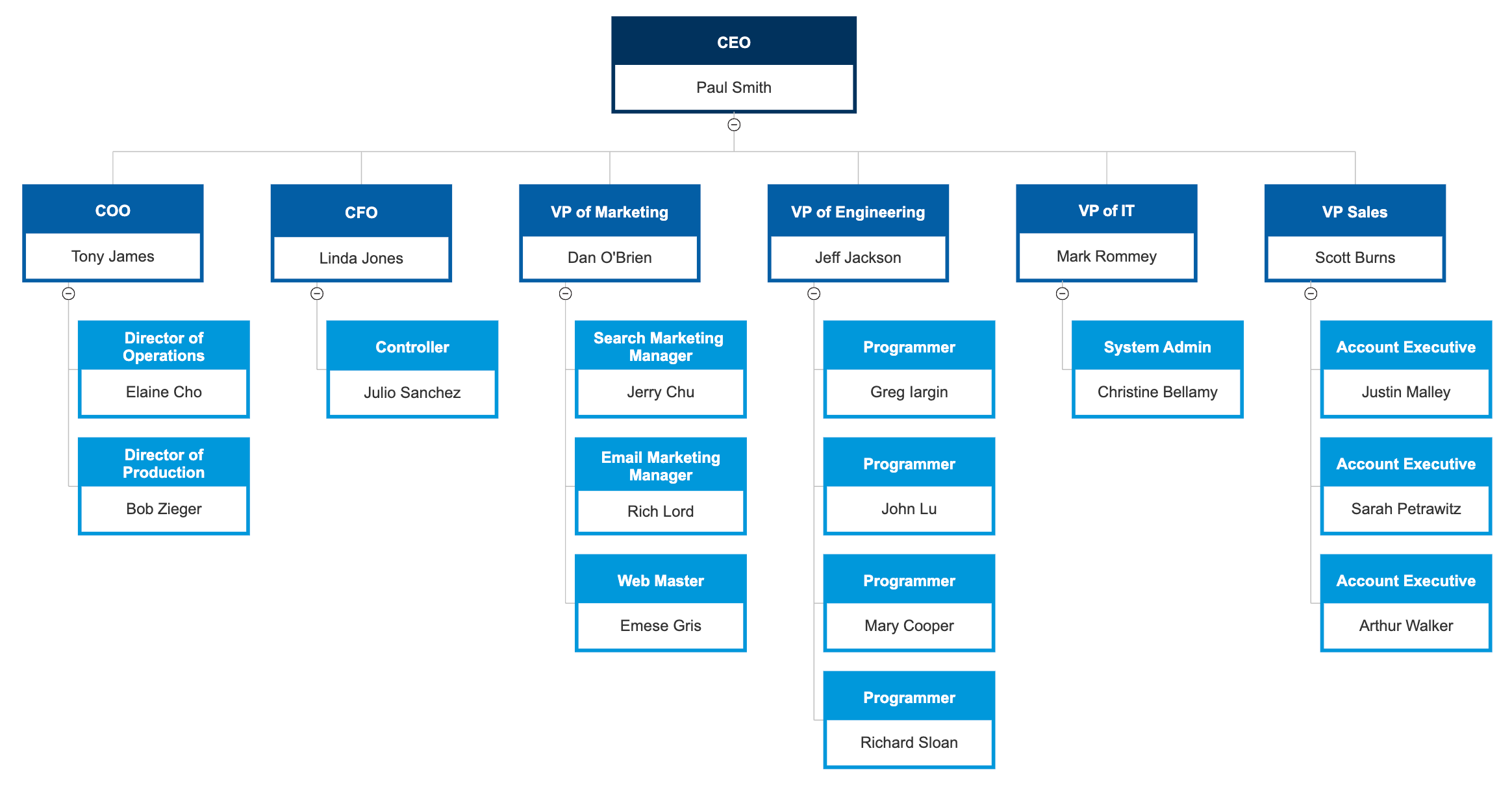
How Organization Charts Are Used
Organizational charts are useful in a number of ways. Here are a few of the ways your company or group can benefit from an org chart.
- Show work responsibilities and reporting relationships.
- Allow leadership to more effectively manage growth or change.
- Allow employees to better understand how their work fits into the organization's overall scheme.
- Improve lines of communication.
- Create a visual employee directory.
- Present other types of information, such as business entity structures and data hierarchies.
The type of organization chart you make should mirror the management philosophy and organizational structure of your company.
There are four basic types of organizational charts:
- Functional Top-Down
- Divisional Structure
- Matrix Organizational Chart
- Flat Organizational Chart
Learn more about organizational chart types .
Tips For Making Org Charts
Creating a perfectly formatted, professional-looking organization chart doesn't require special skill, but it also doesn't happen by accident. Here are 10 helpful tips for creating a perfect org chart.
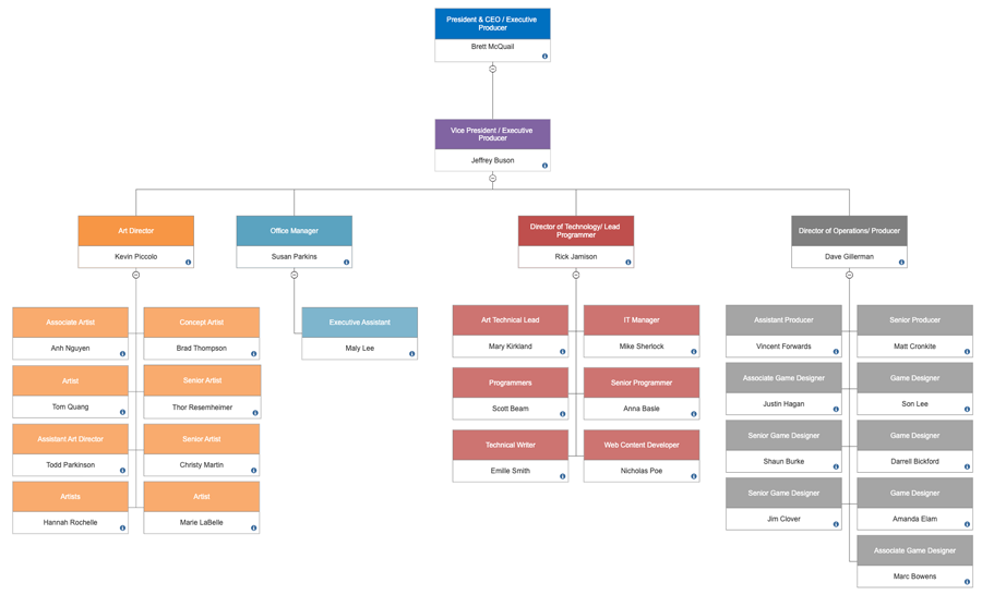
How to Make an Organizational Chart
We usually think of an organization chart of having a fairly rigid, top-down structure. Here's the format of a basic three-level org chart.
But just as one size business suit doesn't fit everyone, the same can be said of an organizational chart. You'll want to custom-tailor an org chart to fit the needs of your organization. There are a lot of factors to consider. What type of information should be included in each box? Should the chart flow top-down or in another direction? What if there are people with multiple roles?
The answers to these and other questions will help you decide how to create an organizational chart to fit your unique situation.
Additional Org Chart Resources
Video: how to make an org chart with smartdraw.
This informational video offers a brief overview of how to get started making an org chart with SmartDraw. Starting with an org chart template, this video takes you through the basics of creating a SmartDraw org chart. In less than four minutes, it shows you how to make an org chart that looks professionally produced.
Using Org Charts Online
Go beyond the printed org chart. Online org charts are interactive. They let you create hyperlinks to other information and resources. They are easy to share and distribute within or outside your organization. Plus, an online org chart doesn't have to be reprinted and redistributed, so it's much easier to keep up to date.
Org Charts and Microsoft Office ®
More than 90 percent of organizations supply Microsoft Office ® to their workers. Many try to make an org chart using Smart Art, and find it frustrating. Fortunately, SmartDraw integrates easily with the Microsoft Office ® suite, as well as with other popular services such as Dropbox ® , Google Drive ™ , and OneDrive ® . Not only is it easier to create an org chart in SmartDraw, but learn how easy it is to transfer an organizational chart created in SmartDraw to any Microsoft Office ® product.
Create an Organizational Chart from Imported Data
Perhaps the easiest way to create an org chart is to generate it automatically from a data file that lists all of the employees and who they report to. Learn how here .
Organizational Chart Examples
The best way to understand organizational charts is to look at some examples of organizational charts.
Org chart templates can give you a good starting point for making an org chart. Browse and edit popular org chart templates .
Click on any of these organizational charts included in SmartDraw and edit them:
Browse SmartDraw's entire collection of org chart examples and templates
More Organizational Chart Information
- Org chart software and maker
- Org chart for Mac
- Organizational chart and Microsoft Office ®
- Online org chart and web app
- OrgPlus ® alternative
- Org charts templates for Excel®
- SmartDraw reviews
- Organizational templates for Word ® , PowerPoint ® , Excel ®
- Organigram software
- Hierarchy chart software
- Organigramas
- Organogram template maker
- Lucidchart alternative
- Visio ® for Mac
Try SmartDraw's Organizational Chart Software Free
Discover why SmartDraw is the best organizational chart software today.
What is an Organizational Chart
What do you want to do with organization charts.
An organizational chart shows the internal structure of an organization or company. The employees and positions are represented by boxes or other shapes, sometimes including photos, contact information, email and page links, icons and illustrations. Straight or elbowed lines link the levels together. With our org chart software, this creates a clear visual depiction of the hierarchy and ranks of different people, jobs, and departments that make up the organization.
Organization Charts, Org Charts, Organograms, Organogram Charts
Organigrams, organigrammes, hierarchy charts.
8 minute read
Do you want to create your own organization chart? Try Lucidchart. It's fast, easy, and totally free.
In 1855, railway general superintendent Daniel McCallum (1815-1878) designed what is thought to be the first modern organizational chart. It was an illustrated diagram of the New York and Erie Railway. McCallum had it drawn up by draftsman and civil engineer George Holt Henshaw (1831-1891). McCallum, born in Scotland, also served as a Union major general in the Civil War. Henshaw, a Canadian, worked for waterworks and railway companies in Canada, the United States and Denmark.
The term “organizational chart” took another 50 to 60 years to come into common use. Consulting engineer Willard C. Brinton used the term in his 1914 textbook, Graphic Methods for Presenting Facts. He touted the value of the charts and said they should be more widely used. The charts were mainly used in engineering circles until the 1920s, when they began to find their way into the business world.
The lesser-known synonyms “Organigram” and “Organogram” came into use in the 1960s.
Organigraph
Types of organizational charts, hierarchical, matrix, hierarchical org chart, hierarchy chart, matrix org chart.

Flat Org Chart
Horizontal org chart, line relationships, chain of command, lateral relationships, solid lines, dotted lines, pros and cons of different organization types.
The types of organizations reflected in these chart types have advantages and disadvantages. In a nutshell:
hierarchical, vertical, top-down organization
Matrixed organization, flat, horizontal structure, uses of org charts.
What is the best use for an organizational chart? No matter which layout you choose to use, Org Charts are useful for laying out relationships in your organization and ensuring that everyone knows how to communicate essential information.
You can use org charts for:
Organizational and supervisory communication
Restructuring, workforce planning, resource planning, getting more visual with organizational charts.
There are few rules with org charts, so any visual elements that help to communicate are fair game.
Using photos
Using different shapes and/or colors, using company logos or icons, using animations in powerpoint, using 3d shapes.
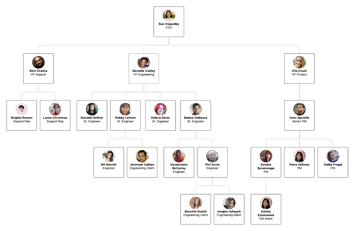
Limitations of org charts
They can quickly become out of date,, they show only formal relationships, they don’t reflect management style, organigraphs, the close relative of org charts, how to plan and draw a basic organizational chart / organogram, define your purpose and scope, gather the information, determine what platform you plan to use to build your chart, and how you plan to display it., plan for ongoing updates to the chart., more tips for organizational charts / organograms, try breaking down your org chart, the details of people or departments, you might use colors or shapes, use lucidchart's org chart import , how to make an org chart with lucidchart.
Want to create org charts that highlight your company’s culture? Choose a layout that works best for your structure, update a design with your company colors, and add employee photos to each role. You can even add links and videos to your document for some extra pizzazz. Try clicking on our org chart templates and make it your own.
For a truly dynamic experience
Helpful resources.
- What is an org chart and how to create one
- How to make an org chart in Excel
- How to make an organizational chart
- How to make an org chart in Word
With drag-and-drop shapes, real-time collaboration and advanced sharing features, Lucidchart makes it easy to create your own org chart.
- Search Search Please fill out this field.
What Is an Organizational Chart?
- How It Works
Hierarchical Organizational Chart
- Other Types
- Organizational Chart FAQs
The Bottom Line
- Business Essentials
Organizational Chart Types, Meaning, and How It Works
James Chen, CMT is an expert trader, investment adviser, and global market strategist.
:max_bytes(150000):strip_icc():format(webp)/photo__james_chen-5bfc26144cedfd0026c00af8.jpeg)
Erika Rasure is globally-recognized as a leading consumer economics subject matter expert, researcher, and educator. She is a financial therapist and transformational coach, with a special interest in helping women learn how to invest.
:max_bytes(150000):strip_icc():format(webp)/CSP_ER9-ErikaR.-dce5c7e19ef04426804e6b611fb1b1b4.jpg)
Investopedia / Yurle Villegas
An organizational chart is a diagram that visually conveys a company's internal structure by detailing the roles, responsibilities, and relationships between individuals within an entity. It is one way to visualize a bureaucracy .
Organizational charts are alternatively referred to as "org charts" or "organization charts."
Key Takeaways
- An organizational chart graphically represents an organization's structure, highlighting the different jobs, departments, and responsibilities that connect the company's employees to each other and to the management team.
- Organizational charts can be broad-based, depicting the overall company, or can be department- or unit-specific, focusing on one spoke on the wheel.
- Most org charts are structured by using the "hierarchical" model, which shows management or other high-ranking officials on top, and lower-level employees beneath them.
- Other types of charts include the flat org chart, the matrix chart, and the divisional org chart.
Understanding Organizational Charts
Organizational charts either broadly depict an enterprise organization-wide, or drill down to a specific department or unit.
Organizational charts graphically display an employee's hierarchical status relative to other individuals within the company. For example, an assistant director will invariably fall directly below a director on the chart, indicating that the former reports to the latter. Organizational charts use simple symbols such as lines, squares, and circles to connect different job titles that relate to each other.
Regardless of an organization's structure, org charts are extraordinarily useful when an entity is contemplating restructuring its workforce or changing its management complex. Most importantly, org charts let employees transparently see how their roles fit into the overall company structure.
This most common model situates the highest-ranking individuals atop the chart and positions lower-ranking individuals below them. Organizational hierarchies generally depend on the industry, geographical location, and company size.
For example, a public company typically shows shareholders in the highest box, followed by the following in descending vertical order:
- Chair of the board of directors
- Vice-chair of the board
- Board members
- Chief executive officer ( CEO )
- Other C-suite executives (joined to one another by horizontal lines)
Other job titles that may follow c-suite execs include:
- Senior vice president
- Vice president
- Assistant vice president
- Senior director
- Assistant director
- Assistant manager
- Full-time employees
- Part-time employees
- Contractors
Many formal organizations are organized hierarchically and can be shown in chart form. These include corporations but also nonprofits, governments, schools & universities, and the military (as the chart below illustrates).
There is no single correct way to fashion an organization chart, as long as it identifies the officials, employees, departments, and functions of the firm, and how they interact with each other.
Other Types of Organization Charts
- Flat — also known as a "horizontal" chart, the flat org chart positions individuals on the same level or only a few levels, indicating more power equality and autonomous decision-making ability than is typical with employees in hierarchical corporations.
- Matrix — This more complicated organizational structure groups individuals by their common skill-sets, the departments in which they work, and the people they may report to. Matrix charts often interconnect employees and teams with more than one manager, such as a software developer who is working on two projects—one with their regular team manager, and another with a separate product manager. In this scenario, the matrix chart would connect the software developer to each manager they are working with, with vertical lines.
- Divisional — This chart subdivides the company based on some specific criteria. It could be by product lines offered or geographic regions. An example would be an auto manufacturer organizing its company by product type. The respective divisions would have a certain autonomy but this would likely incur additional overhead cost.
What Should an Organizational Chart Show?
An organizational chart should visually show what the hierarchical status of a particular employee relative to other individuals within the company. For example, an assistant director will invariably fall directly below a director on the chart, indicating that the former reports to the latter.
Why Is an Organizational Chart Important?
Org charts depict an organization's hierarchy, which can clearly identify seniority and lines of authority that ought to be followed. It can also show which roles are responsible for what tasks, divisions, departments, or regions. This can remove ambiguity and improve communication.
What Are the Most Commonly Used Organizational Charts?
The two types of organizational chart formats that are most often used are hierarchical and flat. Hierarchical is the most common and it shows the ranking of individuals based on their role in the company in a descending vertical order. A flat format, also known as a "horizontal" organizational chart, places all individuals on only a few levels or just one level, and is indicative of an autonomous decision-making ability where this power is equally shared.
How Do I Make an Organizational Chart?
There are software packages and web templates available to help make an organizational chart. You can even produce one by hand. The key is to depict the organization's hierarchy, with more senior positions at the top. Underneath each position should be subordinate positions and roles, which may be segregated by division or department. Depending on how the organization is structured in reality, the chart should approximate it.
What Are Other Types of Organizational Charts?
Less commonly used, but still effective in defining roles, are the matrix and divisional organizational charts. The matrix organizational chart groups individuals by their common skill-sets, the departments in which they work, and the people they report to. It is dubbed "matrix" as it shows employees and teams interconnecting with more than one manager. Divisional would show the organization of a company based on some specific criteria, say a product line or geographical area. For example, an auto manufacturer might be organized based on the different types of products they offer.
Organizational charts allow one to visually understand an organization's structure and hierarchy. This can give an overview of how information and instructions are deployed through organizations, which can range from government bodies to corporations to the military. The most senior positions appear at the top of the chart with subordinate roles falling under them. The chart's appearance and flow will vary depending on an organization's size and how its roles are arranged.
:max_bytes(150000):strip_icc():format(webp)/organizationalstructure-final-5d4f333cdb174faea796402175ff305b.png)
- Terms of Service
- Editorial Policy
- Privacy Policy
- Your Privacy Choices
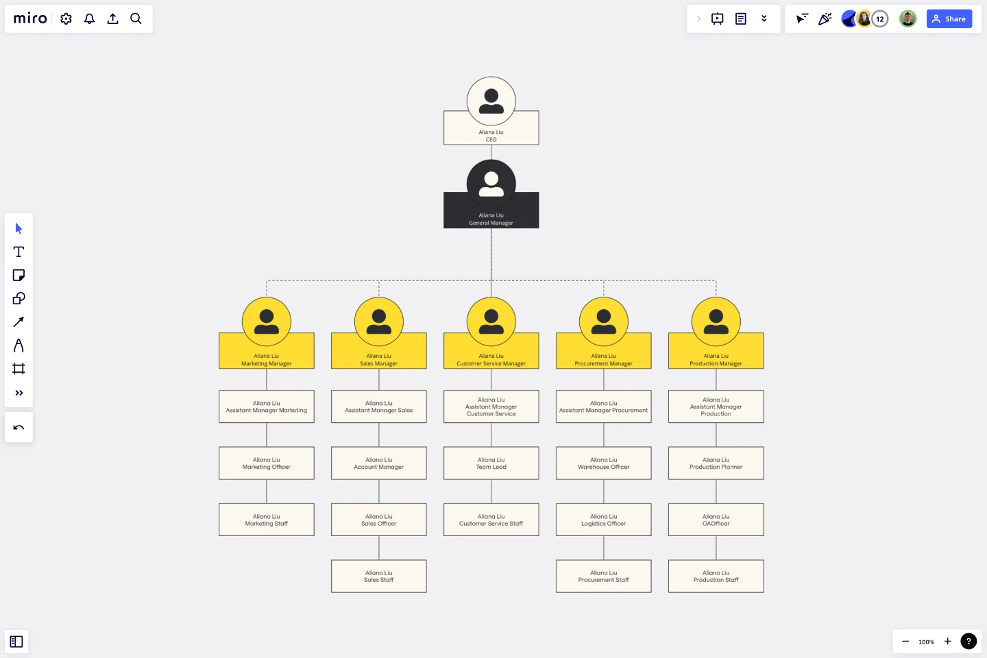
Dotted Line Org Chart Template
Navigate the complex web of your organization's relationships with the dotted line org chart template.
Trusted by 65M+ users and leading companies
About the Dotted Line Org Chart Template
The dotted line org chart template helps you navigate the complex web of organizational relationships. This template is designed to streamline hierarchical structures and visually represent reporting lines, responsibilities, and connections within a team or company. Whether mapping out a startup's structure or improving communication in an established corporation, the dotted line org chart template is your go-to solution for promoting clarity and collaboration.
Understanding the dotted line org chart
The template helps you illustrate reporting structures, showcasing the interconnections between organizational roles. The template includes key elements:
Roles and positions: Clearly define each role within the organization, illustrating the hierarchical order and reporting lines.
Dotted lines: These dotted lines represent secondary or indirect reporting relationships, commonly known as dotted line reporting. They emphasize connections that may be outside the traditional hierarchical structure.
Connectors: Use connectors to link roles and positions, visually representing the reporting relationships and dependencies within the organization.
Labels and descriptions: Enhance clarity by adding labels and descriptions to each position, providing context for the responsibilities associated with each role.
How to use the dotted line org chart template
Drag and drop shapes: Add positions and roles by dragging and dropping shapes onto the board. Arrange them according to your organizational structure.
Connect with dotted lines: Create dotted lines using connectors to represent indirect reporting relationships. Customize the length and style of the lines to suit your preferences.
Automated diagramming: Expand your chart effortlessly. Add more shapes and connectors with just a few clicks, ensuring your org chart remains dynamic and up-to-date.
Add context: Enhance your org chart with additional context by adding artifacts such as documents, images, or notes directly onto the Miro board. Provide a comprehensive view of each role's responsibilities and contributions.
Why use a dotted line org chart template?
Clarity and transparency: Provide a clear visual representation of reporting relationships, minimizing confusion and fostering transparency.
Enhanced communication: Facilitate better communication by showcasing direct and dotted line reporting, ensuring everyone understands the interconnectedness within the organization.
Effortless updates: Easily adapt to changes in the organizational structure by using Miro's automated diagramming features to update the org chart with minimal effort.
Collaborative decision-making: Encourage collaborative decision-making by offering a comprehensive overview of roles and responsibilities, enabling teams to work more cohesively.
Strategic planning: Use the dotted line org chart template to inform strategic planning, helping leadership identify areas for improvement and optimize team dynamics.
Can I customize the appearance of the org chart?
Miro allows you to customize the appearance of the org chart by adjusting shapes, colors, and styles to align with your organization's branding or preferences. Use the menu context bar by selecting the shape you want to edit.
Can I add more details to each role on the org chart?
You can enhance each role by adding labels, and descriptions or even attaching documents directly to the org chart for a more comprehensive view.
Get started with this template right now.
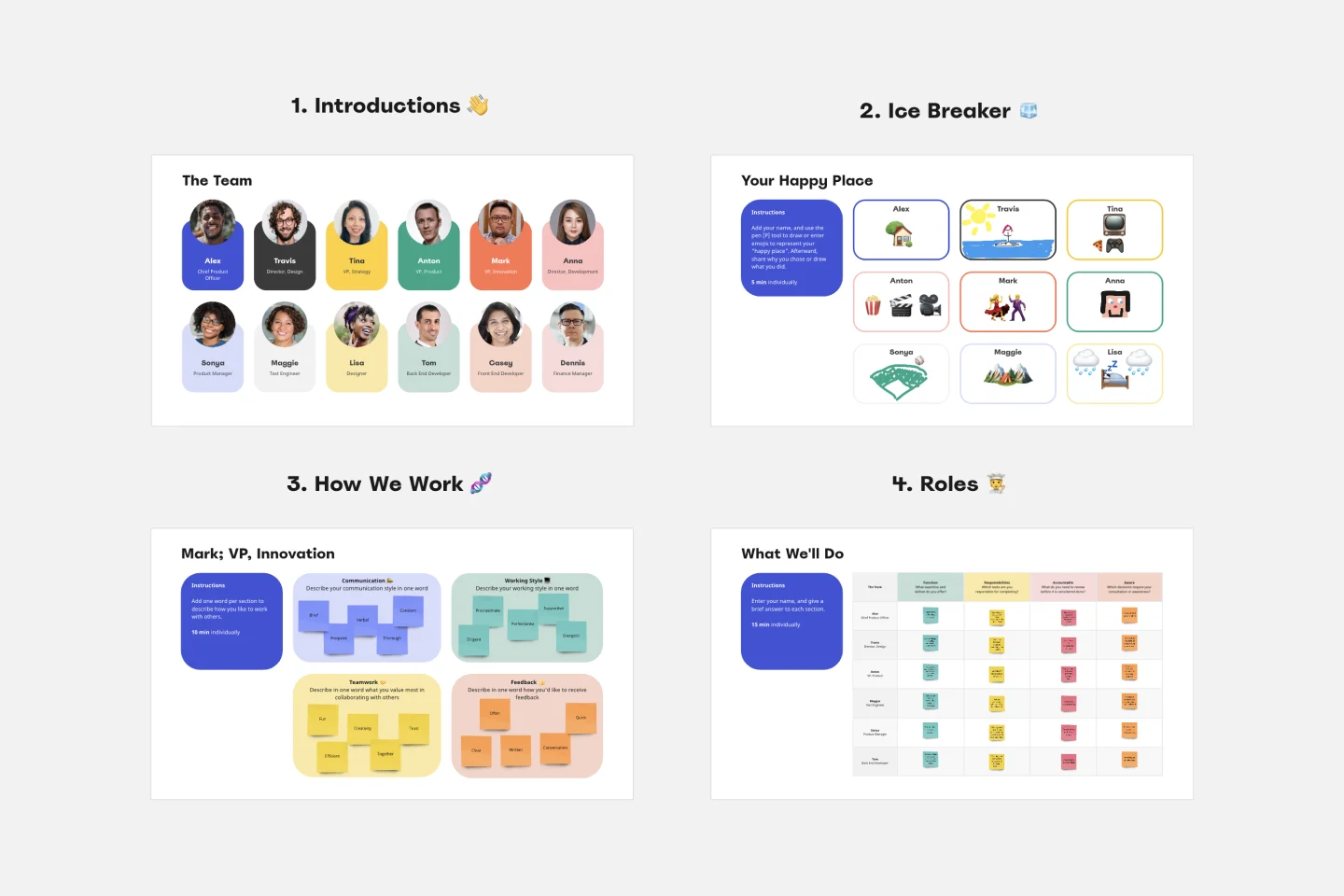
Meet the Team Template
Works best for:.
Documentation, Org Charts, Team Meetings
A Meet the Team page is the best way to introduce each member of the team or organizational leaders. It includes profile pictures and bios with their work experience, achievements, and social media links. The Meet the Team Template helps you design a page that genuinely reflects your team.
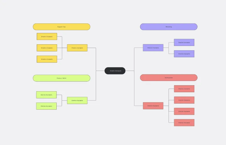
Flat Org Chart Template
Organizational Chart, Diagramming
The flat org chart template provides a clear and visual representation of modern organizational structures that prioritize collaboration and horizontal relationships over complex hierarchical chains of command. One of the major advantages of using this template is that it promotes clarity and transparency, making it easy for organizations to showcase team configurations and ensure that all team members understand their roles in the larger context. This clarity fosters a more inclusive and collaborative environment, which aligns perfectly with contemporary organizational values. The template is a great tool for promoting effective communication and teamwork.
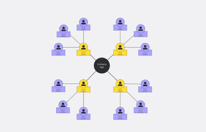
Circular Org Chart Template
Diagramming, Organizational Chart
The Circular Org Chart Template is an innovative solution that helps represent and visualize complex organizational structures with ease. The key advantage of this template is its ability to present complex hierarchies in a visually appealing and easy-to-understand format. By adopting a circular arrangement, the template provides a comprehensive and holistic view of the organization, making it effortless for teams to comprehend reporting relationships at a glance. The visual clarity offered by this template fosters efficient communication and decision-making, offering a seamless experience for teams to understand their organizational structure. The template's intuitive design and emphasis on visual representation significantly enhance transparency, promoting a deeper understanding of organizational roles and relationships.
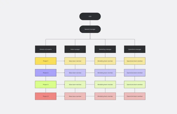
Matrix Org Chart
Organizational Charts, Diagramming
The matrix org chart template organizes teams efficiently and promotes effective communication. It is an essential tool for businesses that require complex decision-making capabilities and rapid response times. With this template, people can easily visualize their roles, responsibilities, and relationships within the organization, leading to improved alignment and performance.
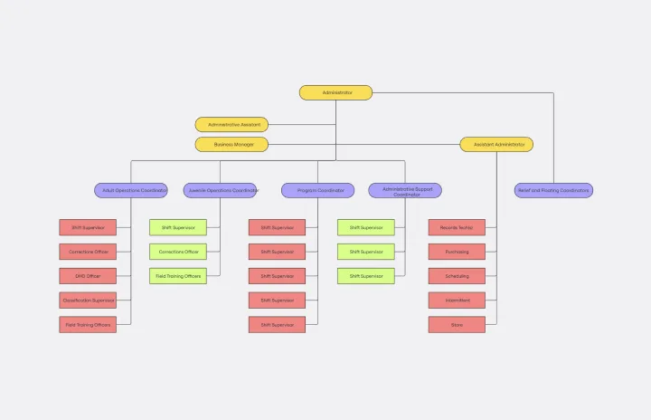
Chain of Command Template
Organizational design, Org chart
The Chain of Command Template represents an organization's hierarchical structure, paving the way for enhanced clarity in roles and responsibilities. One of its standout benefits is the promotion of efficient communication. By clearly delineating the channels of authority and the reporting structure, team members can effortlessly identify the right people to approach with specific queries, concerns, or updates. This streamlined communication fosters better team collaboration and ensures that pivotal information reaches its intended destination promptly, driving overall organizational efficiency.
Filter by Keywords
People Management
Dotted line reporting: guidelines, tips, and tools for teams.
ClickUp Contributor
January 24, 2024
Who doesn’t like a neat organizational map? Clear roles and responsibilities, orderly teams, and well-defined hierarchies are supposed to be at the heart of successful organizations, aren’t they? But teamwork and collaboration are often more complex than that.
Sometimes, you may have situations where traditional managerial hierarchies and solid reporting structures just don’t work. For instance, you may have a manager leading a cross-functional team. Or you may have one employee reporting to multiple functional managers.
These situations may look confusing but they are great for channeling productive collaboration across teams and departments.
As companies redefine the way they deal with responsibilities, visionary leaders are motivated to explore innovative methods.
One such corporate strategy is dotted line reporting —a method where the same human resources are shared among different teams.
However, cracking this approach can be tough.
Employees often deal with conflicting priorities, trying to please two bosses with different expectations and working styles .
So, we’ve compiled a handy guide to help you reap the benefits of dotted line reporting without succumbing to its challenges. Let’s dive straight in!
What is solid line reporting, and how is it different from dotted line reporting
When to use dotted line reporting, 1. confusing roles and miscommunication, 2. balancing priorities, 3. managing time, 4. resolving conflicts, 5. losing productivity and accountability, tips for successful dotted line reporting, simplify dotted line reporting with clickup, common faqs.
What Is Dotted Line Reporting?
Dotted line reporting refers to a management structure where an employee has two reporting relationships—one with a primary boss and another with a secondary boss.
The employee’s primary boss is their direct supervisor or manager. Meanwhile, the secondary boss is a different manager, usually from another department. So, with dotted line management, the company structure seems more like a web than a flowchart.
For example, suppose a marketing director needs a content strategist, and another marketing director needs a part-time graphic designer on a tight budget. In that case, they may hire a content strategist who would officially report to the former director but also work under the latter for graphic design.
The main manager usually handles things like day-to-day supervision, performance reviews, and overall employee guidance, while the secondary manager oversees only a particular set of goals.
This way, the org stays within the budget, while making sure no department suffers from a lack of staff.
In a solid line reporting relationship, an employee has a direct and formal reporting relationship with only one supervisor or manager.
Solid line reporting is more traditional than dotted line reporting, with a clear chain of command.
Org charts use solid lines to indicate relationships with immediate supervisors and dotted lines to signify secondary managers, hence the names.
The decision to use dotted line reporting depends on your company’s specific needs and dynamics. However, there are some scenarios where it can be a great fit:
- Cross-departmental collaboration: Dotted line reporting encourages smooth communication and team collaboration across diverse functional silos. Because employees work with other teams while maintaining a clear reporting structure within their home department, dotted line reporting makes cross-departmental collaboration simpler
- Matrix organizations: In a matrix organizational structure , dotted line reporting enhances flexibility and collaboration. Maintaining a dual connection allows employees to contribute to multiple projects without solely reporting to the project manager
- Shared resources and tight budgets: When two departments share a tight budget, a dotted line allows an employee to contribute to both without needing two separate roles. It’s a smart move to work around budget limits while making sure your resources are shared efficiently across teams
- Remote and multinational organizations: Employees can maintain a solid line relationship with local managers while establishing a dotted line of reporting to global or cross-regional teams. It allows operations in diverse geographic locations, enhances coordination, and maintains consistent communication among team members across the globe
- Mentoring opportunities: A dotted line role lets employees get guidance not only from their immediate team but also from mentors in other areas, helping them build a broader skillset
The Challenges of Dotted Line Reporting
While dotted line reporting enhances flexibility and collaboration, it also presents several challenges:
Roles can get confusing in a dotted line reporting structure. With dual reporting connections and different expectations from dotted line managers, employees might not know what aspects or jobs to focus on, and when.
Things become worse when there’s a lack of communication between the managers themselves. Such a situation can blur authority boundaries and confuse employees even more. They might struggle to follow instructions from both managers, affecting how well they understand and carry out tasks.
To fix these problems, it’s essential to communicate clearly and ensure everyone knows exactly what they’re responsible for in both reporting relationships.

ClickUp’s Communications RACI Chart Template can be a savior in such cases. It specifically reduces confusion by helping you clarify who is responsible for a task, who needs to be held accountable for it, who needs to be consulted with, and who should be informed of it.
It has custom features to create a straightforward workflow chart, significantly improving project transparency . It also has collaboration tools like comments, file attachments, and mentions to ensure everyone stays on track.
You can choose to view all relevant information the way you like, with three views: the RACI Matrix, the Project Team, and the Matrix.
In dotted line reporting, employees juggle tasks from their direct line manager and extra duties assigned by their dotted line manager. Plus, with dotted line relationships, there is often less central coordination between managers, who may end up competing for the employee’s time and resources. As a result, priority management by the employees becomes crucial.
For instance, a content marketer whose primary responsibility is content creation and distribution may end up acting as a project coordinator with a dotted line to a project team working on a website revamp for a brand. They will need to split their time to effectively handle different demands, aligning marketing goals with the project aims.
Handling these two sets of priorities needs good time management, communication, and teamwork skills. It’s important to do both sets of tasks well without hampering the overall productivity.

How can you help your dotted line employees prioritize tasks?
With ClickUp! Setting priority levels has never been simpler than with ClickUp Task Priorities . Tag your tasks with four color-coded flags: a red ‘urgent’ flag for tasks that need to be done right away, a yellow ‘high’ flag for tasks that need to be completed soon, a blue ‘normal’ flag for tasks that are on low priority, and a grey ‘low’ flag for tasks that your employees can do once everything else is done.
You can also add filters and dependencies to each task and help your employees plan their workday accordingly.
Balancing time in dotted line reporting is tricky as employees handle tasks from their main and secondary supervisors. But at the same time, doing so is essential to avoid conflicts, missed deadlines, and overwhelm.
If a marketing specialist has a dotted line to a project team, they must divide time wisely between regular marketing work and project tasks. This means deciding what’s most important, talking about deadlines, and coordinating with both supervisors to keep a good balance.
When employees manage time well, they can handle both sets of tasks without sacrificing the quality and timeliness of their work.

One way to do so is through ClickUp’s Time Estimates . Set clear timelines, distribute tasks among team members, and even break down time estimates with this feature. This also makes comparing actual time with predictions and the total time needed for better project planning easier.
Additionally, you can see your team’s daily capacity in the Workload view, schedule estimates in the Calendar view, and monitor task progress in the Box view. Stay on top of your team’s availability, track your goals, and quickly export time estimate data for your reports.
In dotted line reporting, conflicts can occur when bosses have different expectations. This can make work challenging for employees, causing loyalty issues and power struggles.
To handle these conflicts, everyone needs to talk openly. Sometimes, higher-ups can help mediate and make clear rules about who decides what. Encouraging managers to work together and resolve issues more effectively is also crucial.
Resolving conflicts well ensures everyone works in a peaceful, psychologically safe environment that boosts productivity.
An excellent tool for this is the ClickUp Corrective Action Plan Template . The template details improvement areas, issues, root causes, possible solutions, and success metrics for situations of disagreements and conflict.
By recording this information, you can ensure employees understand what corrective actions are needed and can track progress over time.
You already know that balancing two roles can quickly become confusing and affect task completion. Without a clear set of rules, employees may struggle to prioritize, impacting efficiency.
The split reporting structure might even dilute accountability and make employees feel less responsible for outcomes in their secondary role.

To fix this, it’s crucial to set clear expectations, encourage communication, and define roles as transparently as possible. Let ClickUp and its arsenal of tools help you achieve that.
ClickUp has everything to set you up for success in a dotted line reporting structure.
ClickUp Dashboards use charts and graphs to give you complete visibility into the status of your project, team effort, and pending tasks.
Set your team goals using ClickUp Goals ; manage, assign, and prioritize tasks with ClickUp Tasks ; and enhance accountability through ClickUp Time Tracking . With ClickUp your dotted line employees never have to compromise on accountability or productivity.
Using dotted line reporting can be tricky, but if you do it right, your company can progress even within a limited budget. Here are some tips to make dotted line relationships work well:
- Establish crystal-clear communication between managers and employees: Encourage managers to have regular one-on-one meetings with employees and share timely updates to keep expectations and responsibilities aligned
- Align on time, priorities, and expectations: Set clear priorities and time commitments to avoid overloading your employees. As priorities change, keep clarifying and renegotiating expectations. This ongoing adjustment can improve daily operations significantly
- Encourage employees to set boundaries and limitations initially: An employee needs to be able to discuss concerns about urgent requests that disrupt their priorities, without giving way to conflicts. They can create a system with their main manager’s support to establish healthy boundaries—like completing critical tasks in two days instead of immediately.
- Have a support system employees can rely on : A support system helps leaders handle challenges. It’s essential to have a coach who can assist employees with dotted line challenges, guiding communication, expectations, and limits
- Establish a feedback mechanism: Dotted line reporting works well when employees gather 360° feedback from everyone involved to understand performance better. Feedback from secondary managers adds different viewpoints to the employee’s review, boosting growth. This approach improves relationships and coordination between different reporting lines, elevating the quality of the work environment
At a glance, dotted line reporting can seem like a beacon of confusion and chaos.
But with proper planning and tools, it can greatly boost teamwork and project efficiency in your company. It helps you stay within budget without compromising on the quality of work and deliverables.
An all-rounder tool like ClickUp makes managing tasks, priorities, and goals easy. You can easily manage accountability, track progress, and resolve issues that get in the way of a smooth dual-reporting structure. ClickUp also makes your employees’ work easier and keeps them engaged and motivated to do their best.
Don’t let the challenges of a dotted line reporting relationship scare you! Get started with ClickUp today for free, and navigate dotted line reporting confidently.
Need more answers on dotted line reporting? These FAQs should help.
1. What does a dotted line mean in an org chart?
In an org chart, a dotted line signifies an indirect or secondary reporting relationship.
It means the employee does not directly report to the manager connected by the dotted line but still receives some direction or guidance from that manager. The employee primarily reports to the main manager, with whom they are connected by a solid line.
So, a dotted line shows an additional level of guidance and direction but the solid line manager retains primary oversight.
2. How does dotted line reporting affect communication?
If implemented correctly, dotted line reporting can positively impact communication within a company.
- Promotes collaboration: It encourages teams from different departments to work together
- Encourages flow of information: Employees share information more freely across reporting lines
- Makes communication flexible: It allows for a more flexible exchange of ideas and updates
- Strengthens relationships: Employees build relationships with colleagues beyond their immediate teams
- Facilitates cross-functional understanding: Teams gain a better understanding of the roles and responsibilities of colleagues in other areas
However, if it isn’t implemented well, then dotted line reporting can invite more challenges than solutions.
3. What are the potential challenges of dotted line reporting?
Dotted line reporting is a tricky structure. If you’re not careful and well-planned, it might pose the following challenges:
- Confusion with priorities: Employees may feel confused about their priorities and responsibilities with two managers
- Ambiguous roles: The dual reporting structure can lead to uncertainty about which manager’s instructions to follow
- Communication gaps: Without clear communication, there might be gaps or misunderstandings that hamper successful outcomes
- Overload from poor time management: Employees could face challenges completing tasks assigned by two managers, leading to potential overload and poor time management
- Conflicts due to tension: Tension between managers and employees may give rise to conflicts
Questions? Comments? Visit our Help Center for support.
Receive the latest WriteClick Newsletter updates.
Thanks for subscribing to our blog!
Please enter a valid email
- Free training & 24-hour support
- Serious about security & privacy
- 99.99% uptime the last 12 months

There is unequivocal evidence that Earth is warming at an unprecedented rate. Human activity is the principal cause.

- While Earth’s climate has changed throughout its history , the current warming is happening at a rate not seen in the past 10,000 years.
- According to the Intergovernmental Panel on Climate Change ( IPCC ), "Since systematic scientific assessments began in the 1970s, the influence of human activity on the warming of the climate system has evolved from theory to established fact." 1
- Scientific information taken from natural sources (such as ice cores, rocks, and tree rings) and from modern equipment (like satellites and instruments) all show the signs of a changing climate.
- From global temperature rise to melting ice sheets, the evidence of a warming planet abounds.
The rate of change since the mid-20th century is unprecedented over millennia.
Earth's climate has changed throughout history. Just in the last 800,000 years, there have been eight cycles of ice ages and warmer periods, with the end of the last ice age about 11,700 years ago marking the beginning of the modern climate era — and of human civilization. Most of these climate changes are attributed to very small variations in Earth’s orbit that change the amount of solar energy our planet receives.
The current warming trend is different because it is clearly the result of human activities since the mid-1800s, and is proceeding at a rate not seen over many recent millennia. 1 It is undeniable that human activities have produced the atmospheric gases that have trapped more of the Sun’s energy in the Earth system. This extra energy has warmed the atmosphere, ocean, and land, and widespread and rapid changes in the atmosphere, ocean, cryosphere, and biosphere have occurred.
Earth-orbiting satellites and new technologies have helped scientists see the big picture, collecting many different types of information about our planet and its climate all over the world. These data, collected over many years, reveal the signs and patterns of a changing climate.
Scientists demonstrated the heat-trapping nature of carbon dioxide and other gases in the mid-19th century. 2 Many of the science instruments NASA uses to study our climate focus on how these gases affect the movement of infrared radiation through the atmosphere. From the measured impacts of increases in these gases, there is no question that increased greenhouse gas levels warm Earth in response.
Scientific evidence for warming of the climate system is unequivocal.

Intergovernmental Panel on Climate Change
Ice cores drawn from Greenland, Antarctica, and tropical mountain glaciers show that Earth’s climate responds to changes in greenhouse gas levels. Ancient evidence can also be found in tree rings, ocean sediments, coral reefs, and layers of sedimentary rocks. This ancient, or paleoclimate, evidence reveals that current warming is occurring roughly 10 times faster than the average rate of warming after an ice age. Carbon dioxide from human activities is increasing about 250 times faster than it did from natural sources after the last Ice Age. 3
The Evidence for Rapid Climate Change Is Compelling:

Global Temperature Is Rising
The planet's average surface temperature has risen about 2 degrees Fahrenheit (1 degrees Celsius) since the late 19th century, a change driven largely by increased carbon dioxide emissions into the atmosphere and other human activities. 4 Most of the warming occurred in the past 40 years, with the seven most recent years being the warmest. The years 2016 and 2020 are tied for the warmest year on record. 5 Image credit: Ashwin Kumar, Creative Commons Attribution-Share Alike 2.0 Generic.

The Ocean Is Getting Warmer
The ocean has absorbed much of this increased heat, with the top 100 meters (about 328 feet) of ocean showing warming of 0.67 degrees Fahrenheit (0.33 degrees Celsius) since 1969. 6 Earth stores 90% of the extra energy in the ocean. Image credit: Kelsey Roberts/USGS

The Ice Sheets Are Shrinking
The Greenland and Antarctic ice sheets have decreased in mass. Data from NASA's Gravity Recovery and Climate Experiment show Greenland lost an average of 279 billion tons of ice per year between 1993 and 2019, while Antarctica lost about 148 billion tons of ice per year. 7 Image: The Antarctic Peninsula, Credit: NASA

Glaciers Are Retreating
Glaciers are retreating almost everywhere around the world — including in the Alps, Himalayas, Andes, Rockies, Alaska, and Africa. 8 Image: Miles Glacier, Alaska Image credit: NASA

Snow Cover Is Decreasing
Satellite observations reveal that the amount of spring snow cover in the Northern Hemisphere has decreased over the past five decades and the snow is melting earlier. 9 Image credit: NASA/JPL-Caltech

Sea Level Is Rising
Global sea level rose about 8 inches (20 centimeters) in the last century. The rate in the last two decades, however, is nearly double that of the last century and accelerating slightly every year. 10 Image credit: U.S. Army Corps of Engineers Norfolk District

Arctic Sea Ice Is Declining
Both the extent and thickness of Arctic sea ice has declined rapidly over the last several decades. 11 Credit: NASA's Scientific Visualization Studio

Extreme Events Are Increasing in Frequency
The number of record high temperature events in the United States has been increasing, while the number of record low temperature events has been decreasing, since 1950. The U.S. has also witnessed increasing numbers of intense rainfall events. 12 Image credit: Régine Fabri, CC BY-SA 4.0 , via Wikimedia Commons

Ocean Acidification Is Increasing
Since the beginning of the Industrial Revolution, the acidity of surface ocean waters has increased by about 30%. 13 , 14 This increase is due to humans emitting more carbon dioxide into the atmosphere and hence more being absorbed into the ocean. The ocean has absorbed between 20% and 30% of total anthropogenic carbon dioxide emissions in recent decades (7.2 to 10.8 billion metric tons per year). 1 5 , 16 Image credit: NOAA
1. IPCC Sixth Assessment Report, WGI, Technical Summary . B.D. Santer et.al., “A search for human influences on the thermal structure of the atmosphere.” Nature 382 (04 July 1996): 39-46. https://doi.org/10.1038/382039a0. Gabriele C. Hegerl et al., “Detecting Greenhouse-Gas-Induced Climate Change with an Optimal Fingerprint Method.” Journal of Climate 9 (October 1996): 2281-2306. https://doi.org/10.1175/1520-0442(1996)009<2281:DGGICC>2.0.CO;2. V. Ramaswamy, et al., “Anthropogenic and Natural Influences in the Evolution of Lower Stratospheric Cooling.” Science 311 (24 February 2006): 1138-1141. https://doi.org/10.1126/science.1122587. B.D. Santer et al., “Contributions of Anthropogenic and Natural Forcing to Recent Tropopause Height Changes.” Science 301 (25 July 2003): 479-483. https://doi.org/10.1126/science.1084123. T. Westerhold et al., "An astronomically dated record of Earth’s climate and its predictability over the last 66 million years." Science 369 (11 Sept. 2020): 1383-1387. https://doi.org/10.1126/science.1094123
2. In 1824, Joseph Fourier calculated that an Earth-sized planet, at our distance from the Sun, ought to be much colder. He suggested something in the atmosphere must be acting like an insulating blanket. In 1856, Eunice Foote discovered that blanket, showing that carbon dioxide and water vapor in Earth's atmosphere trap escaping infrared (heat) radiation. In the 1860s, physicist John Tyndall recognized Earth's natural greenhouse effect and suggested that slight changes in the atmospheric composition could bring about climatic variations. In 1896, a seminal paper by Swedish scientist Svante Arrhenius first predicted that changes in atmospheric carbon dioxide levels could substantially alter the surface temperature through the greenhouse effect. In 1938, Guy Callendar connected carbon dioxide increases in Earth’s atmosphere to global warming. In 1941, Milutin Milankovic linked ice ages to Earth’s orbital characteristics. Gilbert Plass formulated the Carbon Dioxide Theory of Climate Change in 1956.
3. IPCC Sixth Assessment Report, WG1, Chapter 2 Vostok ice core data; NOAA Mauna Loa CO2 record O. Gaffney, W. Steffen, "The Anthropocene Equation." The Anthropocene Review 4, issue 1 (April 2017): 53-61. https://doi.org/abs/10.1177/2053019616688022.
4. https://www.ncei.noaa.gov/monitoring https://crudata.uea.ac.uk/cru/data/temperature/ http://data.giss.nasa.gov/gistemp
5. https://www.giss.nasa.gov/research/news/20170118/
6. S. Levitus, J. Antonov, T. Boyer, O Baranova, H. Garcia, R. Locarnini, A. Mishonov, J. Reagan, D. Seidov, E. Yarosh, M. Zweng, " NCEI ocean heat content, temperature anomalies, salinity anomalies, thermosteric sea level anomalies, halosteric sea level anomalies, and total steric sea level anomalies from 1955 to present calculated from in situ oceanographic subsurface profile data (NCEI Accession 0164586), Version 4.4. (2017) NOAA National Centers for Environmental Information. https://www.nodc.noaa.gov/OC5/3M_HEAT_CONTENT/index3.html K. von Schuckmann, L. Cheng, L,. D. Palmer, J. Hansen, C. Tassone, V. Aich, S. Adusumilli, H. Beltrami, H., T. Boyer, F. Cuesta-Valero, D. Desbruyeres, C. Domingues, A. Garcia-Garcia, P. Gentine, J. Gilson, M. Gorfer, L. Haimberger, M. Ishii, M., G. Johnson, R. Killick, B. King, G. Kirchengast, N. Kolodziejczyk, J. Lyman, B. Marzeion, M. Mayer, M. Monier, D. Monselesan, S. Purkey, D. Roemmich, A. Schweiger, S. Seneviratne, A. Shepherd, D. Slater, A. Steiner, F. Straneo, M.L. Timmermans, S. Wijffels. "Heat stored in the Earth system: where does the energy go?" Earth System Science Data 12, Issue 3 (07 September 2020): 2013-2041. https://doi.org/10.5194/essd-12-2013-2020.
7. I. Velicogna, Yara Mohajerani, A. Geruo, F. Landerer, J. Mouginot, B. Noel, E. Rignot, T. Sutterly, M. van den Broeke, M. Wessem, D. Wiese, "Continuity of Ice Sheet Mass Loss in Greenland and Antarctica From the GRACE and GRACE Follow-On Missions." Geophysical Research Letters 47, Issue 8 (28 April 2020): e2020GL087291. https://doi.org/10.1029/2020GL087291.
8. National Snow and Ice Data Center World Glacier Monitoring Service
9. National Snow and Ice Data Center D.A. Robinson, D. K. Hall, and T. L. Mote, "MEaSUREs Northern Hemisphere Terrestrial Snow Cover Extent Daily 25km EASE-Grid 2.0, Version 1 (2017). Boulder, Colorado USA. NASA National Snow and Ice Data Center Distributed Active Archive Center. doi: https://doi.org/10.5067/MEASURES/CRYOSPHERE/nsidc-0530.001 . http://nsidc.org/cryosphere/sotc/snow_extent.html Rutgers University Global Snow Lab. Data History
10. R.S. Nerem, B.D. Beckley, J. T. Fasullo, B.D. Hamlington, D. Masters, and G.T. Mitchum, "Climate-change–driven accelerated sea-level rise detected in the altimeter era." PNAS 15, no. 9 (12 Feb. 2018): 2022-2025. https://doi.org/10.1073/pnas.1717312115.
11. https://nsidc.org/cryosphere/sotc/sea_ice.html Pan-Arctic Ice Ocean Modeling and Assimilation System (PIOMAS, Zhang and Rothrock, 2003) http://psc.apl.washington.edu/research/projects/arctic-sea-ice-volume-anomaly/ http://psc.apl.uw.edu/research/projects/projections-of-an-ice-diminished-arctic-ocean/
12. USGCRP, 2017: Climate Science Special Report: Fourth National Climate Assessment, Volume I [Wuebbles, D.J., D.W. Fahey, K.A. Hibbard, D.J. Dokken, B.C. Stewart, and T.K. Maycock (eds.)]. U.S. Global Change Research Program, Washington, DC, USA, 470 pp, https://doi.org/10.7930/j0j964j6 .
13. http://www.pmel.noaa.gov/co2/story/What+is+Ocean+Acidification%3F
14. http://www.pmel.noaa.gov/co2/story/Ocean+Acidification
15. C.L. Sabine, et al., “The Oceanic Sink for Anthropogenic CO2.” Science 305 (16 July 2004): 367-371. https://doi.org/10.1126/science.1097403.
16. Special Report on the Ocean and Cryosphere in a Changing Climate , Technical Summary, Chapter TS.5, Changing Ocean, Marine Ecosystems, and Dependent Communities, Section 5.2.2.3. https://www.ipcc.ch/srocc/chapter/technical-summary/
Header image shows clouds imitating mountains as the sun sets after midnight as seen from Denali's backcountry Unit 13 on June 14, 2019. Credit: NPS/Emily Mesner Image credit in list of evidence: Ashwin Kumar, Creative Commons Attribution-Share Alike 2.0 Generic.
Discover More Topics From NASA
Explore Earth Science

Earth Science in Action

Earth Science Data

Facts About Earth


March 2023 global poverty update from the World Bank: the challenge of estimating poverty in the pandemic
Samuel kofi tetteh baah, r. andres castaneda aguilar, carolina diaz-bonilla, christoph lakner, minh cong nguyen, martha viveros.
Global poverty estimates were updated today on the Poverty and Inequality Platform (PIP) . This update includes new regional poverty aggregates in 2020 and 2021 for Latin America and the Caribbean, and in 2020 for Europe and Central Asia, and the group of advanced countries. These are the regions for which we now have sufficient survey data available during the COVID-19 pandemic. In total, 113 new country-years have been added, bringing the total number of surveys to more than 2,100.
This update also incorporates the usual changes to the input data, including revisions to existing welfare distributions, the inclusion of new welfare distributions, and revisions to price, national accounts, and population data used for global poverty monitoring (more details here ). Overall, these changes have resulted in minor revisions in global and regional poverty estimates.
Table 1 summarizes the revisions to the regional and global poverty estimates between the September 2022 data vintage and the March 2023 data vintage for the 2019 reference year at all three poverty lines. The global poverty headcount ratio at $2.15 is revised slightly up by 0.1 percentage points to 8.5 percent, resulting in a revision in the number of poor people from 648 to 659 million. This revision represents 11 million more people living in extreme poverty, largely driven by South Asia (5 million) and the Middle East and North Africa (4 million).
Table 1 Poverty estimates for reference year 2019, changes between September 2022 and March 2023 vintage by region and poverty lines
Similar limited changes in poverty estimates are observed at the higher lines of $3.65 and $6.85, which are typically used for measuring poverty in lower-middle- and upper-middle-income countries, respectively. At $3.65, the global poverty headcount ratio increases by 0.1 percentage points to 23.6 percent, representing 28 million more people living in poverty. At $6.85, the global poverty rate increases by 0.2 percentage points to 46.9 percent, representing 44 million people living in poverty. The upward revisions in poverty estimates at the higher lines are largely driven by South Asia and Sub-Saharan Africa.
This March 2023 global poverty update from the World Bank revises the previously published global and regional estimates from 1981 to 2019. Regional poverty estimates are now reported up to 2021, depending on sufficient data coverage over the period of the COVID-19 pandemic. Poverty data are reported for Europe and Central Asia until 2020, and Latin America and the Caribbean until 2021. For all other developing regions, poverty data are reported for pre-pandemic years (see Figure 1). More details are available here on how we have determined those regions for which to report post-2019 estimates.
Figure 1: Global and regional poverty estimates, 1990 - 2021
The data published in this PIP update, while incorporating more recent input data, do not change the overall perceptions about global poverty trends and the regional distribution of poverty. It is still the case that global poverty has been falling since the 1990s, and at a slower rate since 2014 ( World Bank 2022 ). Extreme poverty has been falling in all regions, except the Middle East and North Africa due to conflict and fragility ( World Bank 2020 ). Roughly 60% of the world’s extreme poor in 2019 lived in Sub-Saharan Africa alone, while 81% of the global poor at the poverty line of $3.65 lived in Sub-Saharan Africa or South Asia.
The authors gratefully acknowledge financial support from the UK Government through the Data and Evidence for Tackling Extreme Poverty (DEEP) Research Program.
- The World Region

Economist, Global Poverty and Inequality Data (GPID), Development Data Group, World Bank

Economist, Development Data Group, World Bank

Senior Economist, Poverty and Equity Global Practice, World Bank

Data Scientist

Program Manager, Development Data Group, World Bank

Senior Data Scientist, Poverty and Equity Global Practice, World Bank

Consultant, Development Data Group, World Bank
Join the Conversation
- Share on mail
- comments added

Unitar Around the World
- New york office
- Hiroshima office
- Bonn office
- About UNITAR
- News and Stories
- Press releases
Global e-Waste Monitor 2024: Electronic Waste Rising Five Times Faster than Documented E-waste Recycling

- A record 62 million tonnes (Mt) of e-waste was produced in 2022, Up 82% from 2010;
- On track to rise another 32%, to 82 million tonnes, in 2030;
- Billions of dollars worth of strategically-valuable resources squandered, dumped;
- Just 1% of rare earth element demand is met by e-waste recycling .
Contacts: Ruediger Kuehr, SCYCLE, UNITAR, +49 228 815 0213/4, [email protected] David Hirsch, ITU, +41 22 730 5092; [email protected] Terry Collins, +1 416 878 8712; [email protected] The full Global E-waste Monitor report is available at: www.globalewaste.org
20 March 2024, Geneva / Bonn - The world’s generation of electronic waste is rising five times faster than documented e-waste recycling, the UN’s fourth Global E-waste Monitor (GEM) reveals today. The 62 million tonnes of e-waste generated in 2022 would fill 1.55 million 40-tonne trucks, roughly enough trucks to form a bumper-tobumper line encircling the equator, according to the report from ITU and UNITAR.
Meanwhile, less than one quarter (22.3%) of the year’s e-waste mass was documented as having been properly collected and recycled in 2022, leaving US $62 billion worth of recoverable natural resources unaccounted for and increasing pollution risks to communities worldwide. Worldwide, the annual generation of e-waste is rising by 2.6 million tonnes annually, on track to reach 82 million tonnes by 2030, a further 33% increase from the 2022 figure. E-waste, any discarded product with a plug or battery, is a health and environmental hazard, containing toxic additives or hazardous substances such as mercury, which can damage the human brain and coordination system.
The report foresees a drop in the documented collection and recycling rate from 22.3% in 2022 to 20% by 2030 due to the widening difference in recycling efforts relative to the staggering growth of e-waste generation worldwide. Challenges contributing to the widening gap include technological progress, higher consumption, limited repair options, shorter product life cycles, society’s growing electronification, design shortcomings, and inadequate e-waste management infrastructure.
The report underlines that if countries could bring the e-waste collection and recycling rates to 60% by 2030, the benefits - including through minimizing human health risks - would exceed costs by more than US $38 billion. It also notes that the world “remains stunningly dependent” on a few countries for rare earth elements, despite their unique properties crucial for future technologies, including renewable energy generation and e-mobility.
Selected report infographics
Amidst the hopeful embrace of solar panels and electronic equipment to combat the climate crisis and drive digital progress, the surge in e-waste requires urgent attention. Nikhil Seth , Executive Director, UNITAR
From discarded televisions to dumped telephones, an enormous amount of ewaste is generated around the world. The latest research shows that the global challenge posed by e-waste is only going to grow. With less than half of the world implementing and enforcing approaches to manage the problem, this raises the alarm for sound regulations to boost collection and recycling. The Global E-waste Monitor is the world’s foremost source for e-waste data allowing us to track progress overtime and to make critical decisions when it comes to transitioning to a circular economy for electronics. Cosmas Luckyson Zavazava , Director, ITU Telecommunication Development Bureau
No more than 1% of demand for essential rare earth elements is met by e-waste recycling. Simply put: Business as usual can’t continue. This new report represents an immediate call for greater investment in infrastructure development, more promotion of repair and reuse, capacity building, and measures to stop illegal e-waste shipments. And the investment would pay for itself in spades. Kees Baldé , lead author, UNITAR
Many in today’s society use multiple computers and phones, an ever-growing number of new appliances, monitors and sensors, e-bikes, e-scooters, clothes, toys, and furniture with embedded electronics, electric tools, and energy-saving equipment such as LEDs, photovoltaics, and heat pumps. Urban and remote areas are increasingly connected to the Internet, and a growing number of data centers cater to the needs of the digital transformation. In the face of all this, concrete steps are urgently needed to address and reduce e-waste. Improved ewaste management could result in a global net positive of US $38 billion, representing a significant economic opportunity while addressing climate change and health impacts. Ruediger Kuehr , Senior Manager, Sustainable Cycles (SCYCLE), Programme, UNITAR / Adjunct Professor, University of Limerick (Ireland)
The Global E-waste Monitor shows that we are currently wasting US $91 billion in valuable metals due to insufficient e-waste recycling. We must seize the economic and environmental benefits of proper e-waste management; otherwise, the digital ambitions of our future generations will face significant risks. Vanessa Gray, Head, Environment & Emergency Telecommunications Division, ITU Telecommunication Development Bureau
By the numbers
- 62 million tonnes: e-waste generated in 2022, equal to the weight of 107,000 of world’s largest (853-seat), heaviest (575 tonne) passenger aircraft – enough to form an unbroken queue from New York to Athens, from Nairobi to Hanoi, or from Hong Kong to Anchorage
- 14 million tonnes (22.3%): estimated mass of e-waste trashed, mostly landfilled, in 2022
- 31 million tonnes: estimated weight of metals embedded in e-waste in 2022, along with 17 million tonnes of plastics and 14 million tonnes of other materials (minerals, glass, composite materials, etc.)
- US $91 billion: The value of metals embedded in 2022 e-waste, including
- US $19 billion in copper, US $15 billion in gold, and US $16 billion in iron.
- US $28 billion: value of secondary raw materials (mostly iron) reclaimed by “urban mining” of e-waste in 2022
- 900 million tonnes: Primary ore extraction avoided by reclaiming materials through documented e-waste recycling
- 93 million tonnes: CO2-equivalent emissions avoided by formal e-waste management – recaptured refrigerants (41 million tonnes), avoided metals mining (52 million tonnes)
Recycling rates
- 42.8%: Formally documented collection and recycling rates in Europe
- <1%: Formally recycled e-waste in African countries
- ~50% (30 million tonnes): E-waste generated by Asian countries (of which relatively few have enacted legislation or established clear e-waste collection targets)
- 17.6 kg: Per capita e-waste generation in Europe, followed by Oceania (16.1 kg) and the Americas (14.1 kg). These regions also have the highest documented per capita collection and recycling rates (7.5 kg in Europe, 6.7 kg in Oceania and 4.2 kg in the Americas)
- 16 million tonnes: e-waste collected and recycled outside of formal systems in high- and upper-middle income countries that have developed e-waste management infrastructure.
- 18 million tonnes: e-waste managed mostly by the informal sector in low and lower-middle income countries with no e-waste management infrastructure. Any material values recovered by the informal sector are largely (perhaps more than) offset by extremely high health and environmental costs
- 5.1 million tonnes (8.2% of the global total): e-waste shipped across borders in 2022, of which ~3.3 million tonnes (65%) was shipped from high-income to middle- and low-income countries through uncontrolled, undocumented
E-waste by category, selected examples
- 33% (20.4 million tonnes): Proportion of e-waste made up of small devices (e.g. toys, microwave ovens, vacuum cleaners, e-cigarettes), of which 12% are recycled
- 4.6 million tonnes: e-waste in the small IT and telecommunication equipment category (e.g. laptops, mobile phones, GPS devices, routers), with only 22% documented collection and recycling rate
- 2.4 million tonnes: Expected mass of retired photovoltaic panels in 2030, four times as much as the 600,000 tonnes in 2022
Among the report’s many observations
- Typically, collection and recycling rates are highest for heavier and bulkier equipment categories, such as large devices, temperature exchange equipment, screens and monitors
- 81 countries had e-waste legislation in 2023, up from 78 in 2019. Of the 81 countries, 67 had a legal instrument governing e-waste management with provisions promoting extended producer responsibility (EPR)
- The enforcement of e-waste policy, legislation, and regulation “remains a genuine challenge globally, and the stagnation of the global e-waste collection and recycling rate is likely exacerbated by the fact that only 46 countries have collection rate targets and only 36 have recycling rate targets.”
The Global E-waste Monitor
Since 2014, the Global E-waste Monitor ( www.globalewaste.org ) has been the world’s foremost source of up-to-date data and reporting on progress in policy, regulation, and offering projections. The 2024 edition is a collaborative product of the Global E-waste Statistics Partnership with support from the Fondation Carmignac.
Earlier global and regional reports: https://ewastemonitor.info
Join the conversation on social media using hashtag #eWaste
The United Nations Institute for Training and Research (UNITAR)
As a dedicated training arm of the United Nations System, the United Nations Institute for Training and Research (UNITAR) provides innovative learning solutions to individuals, organizations and institutions to enhance global decision-making and support country-level action for shaping a better future. UNITAR was created in 1963 to train and equip young diplomats from newly independent UN Member States with the knowledge and skills needed to navigate through the diplomatic environment. Over the years, UNITAR has acquired unique expertise and experience in designing and delivering a variety of training and learning activities, benefiting learners mainly from developing countries. With the strategy fully aligned with the 2030 Agenda, we support Governments and other stakeholders to achieve Sustainable Development Goals.
The Bonn, Germany-based Sustainable Cycles (SCYCLE) Programme, hosted by UNITAR, provides world-class research and action on e-waste. SCYCLE aims to enable societies to reduce the environmental burden caused by the production, consumption and disposal of ubiquitous goods.
The International Telecommunication Union
The International Telecommunication Union (ITU) is the United Nations specialized agency for information and communication technologies (ICTs), driving innovation in ICTs together with 193 Member States and a membership of over 1,000 companies, universities, and international and regional organizations. Established in 1865, it is the intergovernmental body responsible for coordinating the shared global use of the radio spectrum, promoting international cooperation in assigning satellite orbits, improving communication infrastructure in the developing world, and establishing the worldwide standards that foster seamless interconnection of a vast range of communications systems. From broadband networks to cutting-edge wireless technologies, aeronautical and maritime navigation, radio astronomy, oceanographic and satellite-based earth monitoring as well as converging fixed-mobile phone, Internet and broadcasting technologies, ITU is committed to connecting the world.
Fondation Carmignac
fondationcarmignac.com
Fondation Carmignac was founded in 2000 by Edouard Carmignac, a French entrepreneur, CEO and Chairman of asset management company Carmignac. Today, it is structured around three main pillars: the Carmignac Photojournalism Award, which annually funds the production of investigative photo reportage on human rights violations and geo-strategic issues, the Carmignac Collection, which has over 300 works of contemporary art, and Villa Carmignac, an art venue offering annual exhibitions and a rich cultural programme in a 2000-square-meter gallery set in a 15-hectare estate at the heart of a protected site on Porquerolles island.
Fondation Carmignac contributes to the Global E-waste Monitor photographs by laureates of the 13th edition of the Carmignac Photojournalism Award. Investigative journalist Anas Aremeyaw Anas and photojournalists Muntaka Chasant and Bénédicte Kurzen explore the complexities of e-waste trafficking from European ports to Ghana scrapyards, revealing its complex, globalized cycle and highlighting the opportunities and environmental impact of the e-waste economy.
photo / video contributions from Fondation Carmignac
a free public exhibition of Carmignac Photojournalism Award images
In partnership with the City of Paris, a free public exhibition of Carmignac Photojournalism Award images will take place 16 May to 16 June, 2024: Port de Solférino, Quai Anatole, France (opposite the Musée d'Orsay)
According to the 2024 Global Environmental Monitor:
“As a result of improvements in enforcement and regional collaboration, progress has been reported in the control of illegal shipments of e-waste in West Africa. However, in January 2023, an organized crime group was caught smuggling over 5 million kg (331 containers) of e-waste from the Canary Islands to Ghana, Mauritania, Nigeria, and Senegal. Furthermore, in 2020, the Spanish authorities intercepted a network responsible for shipping 2.5 billion kg of material to several countries in Africa, including 750,000 kg of falsely certified e-waste. Even though the import of e-waste into Africa is being monitored, it is notoriously difficult to control." “Three of Africa’s most active ports—Durban (South Africa), Bizerte (Tunisia), and Lagos (Nigeria)—have all been identified as major ports of entry for used EEE, suggesting that e-waste shipments continue to circumvent the Basel and Bamako Conventions. A study in Ireland that used the StEP Initiative person-in-the-port methodology found that roll-on/roll-off vehicles, rather than containers, were the main carriers of used EEE from Ireland to West Africa. The study, which involved vehicle and enforcement document inspections at Ringaskiddy port in Ireland, scaled sampling data to annual shipment figures and estimated that 17,319 kg of used EEE were exported from Ireland annually, and around 1 in 5 vehicles exported contained used EEE. In response to findings like these, countries in West Africa are taking steps to introduce better monitoring of used EEE and e-waste imports by strictly enforcing existing guidelines and conducting thorough physical inspections of import shipments.”
Informal e-waste recycling, Ghana, 2023 © Muntaka Chasant / Fondation Carmignac.

Read our research on: Abortion | Podcasts | Election 2024
Regions & Countries
What the data says about abortion in the u.s..
Pew Research Center has conducted many surveys about abortion over the years, providing a lens into Americans’ views on whether the procedure should be legal, among a host of other questions.
In a Center survey conducted nearly a year after the Supreme Court’s June 2022 decision that ended the constitutional right to abortion , 62% of U.S. adults said the practice should be legal in all or most cases, while 36% said it should be illegal in all or most cases. Another survey conducted a few months before the decision showed that relatively few Americans take an absolutist view on the issue .
Find answers to common questions about abortion in America, based on data from the Centers for Disease Control and Prevention (CDC) and the Guttmacher Institute, which have tracked these patterns for several decades:
How many abortions are there in the U.S. each year?
How has the number of abortions in the u.s. changed over time, what is the abortion rate among women in the u.s. how has it changed over time, what are the most common types of abortion, how many abortion providers are there in the u.s., and how has that number changed, what percentage of abortions are for women who live in a different state from the abortion provider, what are the demographics of women who have had abortions, when during pregnancy do most abortions occur, how often are there medical complications from abortion.
This compilation of data on abortion in the United States draws mainly from two sources: the Centers for Disease Control and Prevention (CDC) and the Guttmacher Institute, both of which have regularly compiled national abortion data for approximately half a century, and which collect their data in different ways.
The CDC data that is highlighted in this post comes from the agency’s “abortion surveillance” reports, which have been published annually since 1974 (and which have included data from 1969). Its figures from 1973 through 1996 include data from all 50 states, the District of Columbia and New York City – 52 “reporting areas” in all. Since 1997, the CDC’s totals have lacked data from some states (most notably California) for the years that those states did not report data to the agency. The four reporting areas that did not submit data to the CDC in 2021 – California, Maryland, New Hampshire and New Jersey – accounted for approximately 25% of all legal induced abortions in the U.S. in 2020, according to Guttmacher’s data. Most states, though, do have data in the reports, and the figures for the vast majority of them came from each state’s central health agency, while for some states, the figures came from hospitals and other medical facilities.
Discussion of CDC abortion data involving women’s state of residence, marital status, race, ethnicity, age, abortion history and the number of previous live births excludes the low share of abortions where that information was not supplied. Read the methodology for the CDC’s latest abortion surveillance report , which includes data from 2021, for more details. Previous reports can be found at stacks.cdc.gov by entering “abortion surveillance” into the search box.
For the numbers of deaths caused by induced abortions in 1963 and 1965, this analysis looks at reports by the then-U.S. Department of Health, Education and Welfare, a precursor to the Department of Health and Human Services. In computing those figures, we excluded abortions listed in the report under the categories “spontaneous or unspecified” or as “other.” (“Spontaneous abortion” is another way of referring to miscarriages.)
Guttmacher data in this post comes from national surveys of abortion providers that Guttmacher has conducted 19 times since 1973. Guttmacher compiles its figures after contacting every known provider of abortions – clinics, hospitals and physicians’ offices – in the country. It uses questionnaires and health department data, and it provides estimates for abortion providers that don’t respond to its inquiries. (In 2020, the last year for which it has released data on the number of abortions in the U.S., it used estimates for 12% of abortions.) For most of the 2000s, Guttmacher has conducted these national surveys every three years, each time getting abortion data for the prior two years. For each interim year, Guttmacher has calculated estimates based on trends from its own figures and from other data.
The latest full summary of Guttmacher data came in the institute’s report titled “Abortion Incidence and Service Availability in the United States, 2020.” It includes figures for 2020 and 2019 and estimates for 2018. The report includes a methods section.
In addition, this post uses data from StatPearls, an online health care resource, on complications from abortion.
An exact answer is hard to come by. The CDC and the Guttmacher Institute have each tried to measure this for around half a century, but they use different methods and publish different figures.
The last year for which the CDC reported a yearly national total for abortions is 2021. It found there were 625,978 abortions in the District of Columbia and the 46 states with available data that year, up from 597,355 in those states and D.C. in 2020. The corresponding figure for 2019 was 607,720.
The last year for which Guttmacher reported a yearly national total was 2020. It said there were 930,160 abortions that year in all 50 states and the District of Columbia, compared with 916,460 in 2019.
- How the CDC gets its data: It compiles figures that are voluntarily reported by states’ central health agencies, including separate figures for New York City and the District of Columbia. Its latest totals do not include figures from California, Maryland, New Hampshire or New Jersey, which did not report data to the CDC. ( Read the methodology from the latest CDC report .)
- How Guttmacher gets its data: It compiles its figures after contacting every known abortion provider – clinics, hospitals and physicians’ offices – in the country. It uses questionnaires and health department data, then provides estimates for abortion providers that don’t respond. Guttmacher’s figures are higher than the CDC’s in part because they include data (and in some instances, estimates) from all 50 states. ( Read the institute’s latest full report and methodology .)
While the Guttmacher Institute supports abortion rights, its empirical data on abortions in the U.S. has been widely cited by groups and publications across the political spectrum, including by a number of those that disagree with its positions .
These estimates from Guttmacher and the CDC are results of multiyear efforts to collect data on abortion across the U.S. Last year, Guttmacher also began publishing less precise estimates every few months , based on a much smaller sample of providers.
The figures reported by these organizations include only legal induced abortions conducted by clinics, hospitals or physicians’ offices, or those that make use of abortion pills dispensed from certified facilities such as clinics or physicians’ offices. They do not account for the use of abortion pills that were obtained outside of clinical settings .
(Back to top)
The annual number of U.S. abortions rose for years after Roe v. Wade legalized the procedure in 1973, reaching its highest levels around the late 1980s and early 1990s, according to both the CDC and Guttmacher. Since then, abortions have generally decreased at what a CDC analysis called “a slow yet steady pace.”
Guttmacher says the number of abortions occurring in the U.S. in 2020 was 40% lower than it was in 1991. According to the CDC, the number was 36% lower in 2021 than in 1991, looking just at the District of Columbia and the 46 states that reported both of those years.
(The corresponding line graph shows the long-term trend in the number of legal abortions reported by both organizations. To allow for consistent comparisons over time, the CDC figures in the chart have been adjusted to ensure that the same states are counted from one year to the next. Using that approach, the CDC figure for 2021 is 622,108 legal abortions.)
There have been occasional breaks in this long-term pattern of decline – during the middle of the first decade of the 2000s, and then again in the late 2010s. The CDC reported modest 1% and 2% increases in abortions in 2018 and 2019, and then, after a 2% decrease in 2020, a 5% increase in 2021. Guttmacher reported an 8% increase over the three-year period from 2017 to 2020.
As noted above, these figures do not include abortions that use pills obtained outside of clinical settings.
Guttmacher says that in 2020 there were 14.4 abortions in the U.S. per 1,000 women ages 15 to 44. Its data shows that the rate of abortions among women has generally been declining in the U.S. since 1981, when it reported there were 29.3 abortions per 1,000 women in that age range.
The CDC says that in 2021, there were 11.6 abortions in the U.S. per 1,000 women ages 15 to 44. (That figure excludes data from California, the District of Columbia, Maryland, New Hampshire and New Jersey.) Like Guttmacher’s data, the CDC’s figures also suggest a general decline in the abortion rate over time. In 1980, when the CDC reported on all 50 states and D.C., it said there were 25 abortions per 1,000 women ages 15 to 44.
That said, both Guttmacher and the CDC say there were slight increases in the rate of abortions during the late 2010s and early 2020s. Guttmacher says the abortion rate per 1,000 women ages 15 to 44 rose from 13.5 in 2017 to 14.4 in 2020. The CDC says it rose from 11.2 per 1,000 in 2017 to 11.4 in 2019, before falling back to 11.1 in 2020 and then rising again to 11.6 in 2021. (The CDC’s figures for those years exclude data from California, D.C., Maryland, New Hampshire and New Jersey.)
The CDC broadly divides abortions into two categories: surgical abortions and medication abortions, which involve pills. Since the Food and Drug Administration first approved abortion pills in 2000, their use has increased over time as a share of abortions nationally, according to both the CDC and Guttmacher.
The majority of abortions in the U.S. now involve pills, according to both the CDC and Guttmacher. The CDC says 56% of U.S. abortions in 2021 involved pills, up from 53% in 2020 and 44% in 2019. Its figures for 2021 include the District of Columbia and 44 states that provided this data; its figures for 2020 include D.C. and 44 states (though not all of the same states as in 2021), and its figures for 2019 include D.C. and 45 states.
Guttmacher, which measures this every three years, says 53% of U.S. abortions involved pills in 2020, up from 39% in 2017.
Two pills commonly used together for medication abortions are mifepristone, which, taken first, blocks hormones that support a pregnancy, and misoprostol, which then causes the uterus to empty. According to the FDA, medication abortions are safe until 10 weeks into pregnancy.
Surgical abortions conducted during the first trimester of pregnancy typically use a suction process, while the relatively few surgical abortions that occur during the second trimester of a pregnancy typically use a process called dilation and evacuation, according to the UCLA School of Medicine.
In 2020, there were 1,603 facilities in the U.S. that provided abortions, according to Guttmacher . This included 807 clinics, 530 hospitals and 266 physicians’ offices.
While clinics make up half of the facilities that provide abortions, they are the sites where the vast majority (96%) of abortions are administered, either through procedures or the distribution of pills, according to Guttmacher’s 2020 data. (This includes 54% of abortions that are administered at specialized abortion clinics and 43% at nonspecialized clinics.) Hospitals made up 33% of the facilities that provided abortions in 2020 but accounted for only 3% of abortions that year, while just 1% of abortions were conducted by physicians’ offices.
Looking just at clinics – that is, the total number of specialized abortion clinics and nonspecialized clinics in the U.S. – Guttmacher found the total virtually unchanged between 2017 (808 clinics) and 2020 (807 clinics). However, there were regional differences. In the Midwest, the number of clinics that provide abortions increased by 11% during those years, and in the West by 6%. The number of clinics decreased during those years by 9% in the Northeast and 3% in the South.
The total number of abortion providers has declined dramatically since the 1980s. In 1982, according to Guttmacher, there were 2,908 facilities providing abortions in the U.S., including 789 clinics, 1,405 hospitals and 714 physicians’ offices.
The CDC does not track the number of abortion providers.
In the District of Columbia and the 46 states that provided abortion and residency information to the CDC in 2021, 10.9% of all abortions were performed on women known to live outside the state where the abortion occurred – slightly higher than the percentage in 2020 (9.7%). That year, D.C. and 46 states (though not the same ones as in 2021) reported abortion and residency data. (The total number of abortions used in these calculations included figures for women with both known and unknown residential status.)
The share of reported abortions performed on women outside their state of residence was much higher before the 1973 Roe decision that stopped states from banning abortion. In 1972, 41% of all abortions in D.C. and the 20 states that provided this information to the CDC that year were performed on women outside their state of residence. In 1973, the corresponding figure was 21% in the District of Columbia and the 41 states that provided this information, and in 1974 it was 11% in D.C. and the 43 states that provided data.
In the District of Columbia and the 46 states that reported age data to the CDC in 2021, the majority of women who had abortions (57%) were in their 20s, while about three-in-ten (31%) were in their 30s. Teens ages 13 to 19 accounted for 8% of those who had abortions, while women ages 40 to 44 accounted for about 4%.
The vast majority of women who had abortions in 2021 were unmarried (87%), while married women accounted for 13%, according to the CDC , which had data on this from 37 states.
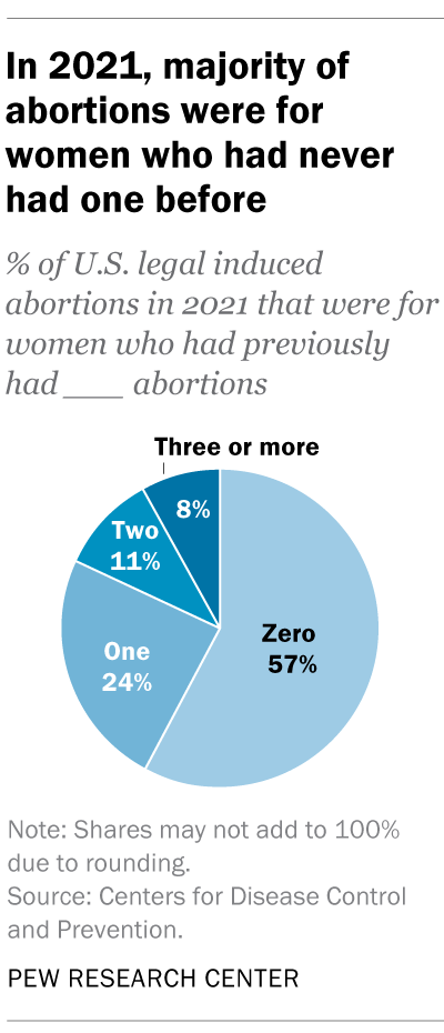
In the District of Columbia, New York City (but not the rest of New York) and the 31 states that reported racial and ethnic data on abortion to the CDC , 42% of all women who had abortions in 2021 were non-Hispanic Black, while 30% were non-Hispanic White, 22% were Hispanic and 6% were of other races.
Looking at abortion rates among those ages 15 to 44, there were 28.6 abortions per 1,000 non-Hispanic Black women in 2021; 12.3 abortions per 1,000 Hispanic women; 6.4 abortions per 1,000 non-Hispanic White women; and 9.2 abortions per 1,000 women of other races, the CDC reported from those same 31 states, D.C. and New York City.
For 57% of U.S. women who had induced abortions in 2021, it was the first time they had ever had one, according to the CDC. For nearly a quarter (24%), it was their second abortion. For 11% of women who had an abortion that year, it was their third, and for 8% it was their fourth or more. These CDC figures include data from 41 states and New York City, but not the rest of New York.
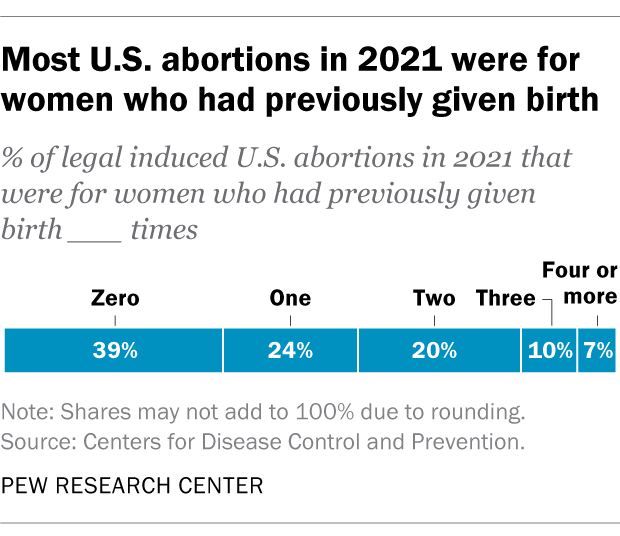
Nearly four-in-ten women who had abortions in 2021 (39%) had no previous live births at the time they had an abortion, according to the CDC . Almost a quarter (24%) of women who had abortions in 2021 had one previous live birth, 20% had two previous live births, 10% had three, and 7% had four or more previous live births. These CDC figures include data from 41 states and New York City, but not the rest of New York.
The vast majority of abortions occur during the first trimester of a pregnancy. In 2021, 93% of abortions occurred during the first trimester – that is, at or before 13 weeks of gestation, according to the CDC . An additional 6% occurred between 14 and 20 weeks of pregnancy, and about 1% were performed at 21 weeks or more of gestation. These CDC figures include data from 40 states and New York City, but not the rest of New York.
About 2% of all abortions in the U.S. involve some type of complication for the woman , according to an article in StatPearls, an online health care resource. “Most complications are considered minor such as pain, bleeding, infection and post-anesthesia complications,” according to the article.
The CDC calculates case-fatality rates for women from induced abortions – that is, how many women die from abortion-related complications, for every 100,000 legal abortions that occur in the U.S . The rate was lowest during the most recent period examined by the agency (2013 to 2020), when there were 0.45 deaths to women per 100,000 legal induced abortions. The case-fatality rate reported by the CDC was highest during the first period examined by the agency (1973 to 1977), when it was 2.09 deaths to women per 100,000 legal induced abortions. During the five-year periods in between, the figure ranged from 0.52 (from 1993 to 1997) to 0.78 (from 1978 to 1982).
The CDC calculates death rates by five-year and seven-year periods because of year-to-year fluctuation in the numbers and due to the relatively low number of women who die from legal induced abortions.
In 2020, the last year for which the CDC has information , six women in the U.S. died due to complications from induced abortions. Four women died in this way in 2019, two in 2018, and three in 2017. (These deaths all followed legal abortions.) Since 1990, the annual number of deaths among women due to legal induced abortion has ranged from two to 12.
The annual number of reported deaths from induced abortions (legal and illegal) tended to be higher in the 1980s, when it ranged from nine to 16, and from 1972 to 1979, when it ranged from 13 to 63. One driver of the decline was the drop in deaths from illegal abortions. There were 39 deaths from illegal abortions in 1972, the last full year before Roe v. Wade. The total fell to 19 in 1973 and to single digits or zero every year after that. (The number of deaths from legal abortions has also declined since then, though with some slight variation over time.)
The number of deaths from induced abortions was considerably higher in the 1960s than afterward. For instance, there were 119 deaths from induced abortions in 1963 and 99 in 1965 , according to reports by the then-U.S. Department of Health, Education and Welfare, a precursor to the Department of Health and Human Services. The CDC is a division of Health and Human Services.
Note: This is an update of a post originally published May 27, 2022, and first updated June 24, 2022.

Sign up for our weekly newsletter
Fresh data delivered Saturday mornings
Key facts about the abortion debate in America
Public opinion on abortion, three-in-ten or more democrats and republicans don’t agree with their party on abortion, partisanship a bigger factor than geography in views of abortion access locally, do state laws on abortion reflect public opinion, most popular.
About Pew Research Center Pew Research Center is a nonpartisan fact tank that informs the public about the issues, attitudes and trends shaping the world. It conducts public opinion polling, demographic research, media content analysis and other empirical social science research. Pew Research Center does not take policy positions. It is a subsidiary of The Pew Charitable Trusts .

IMAGES
VIDEO
COMMENTS
Reporting lines are elements of an organizational structure that specify how authority, accountability and responsibility are allocated in an organization. These are depicted as the lines in a organizational chart as follows. Solid Line A solid line relationship indicates that one person directly manages another. The person closest to the top ...
Solid Line Reporting. On the organizational chart, a solid line indicates a more traditional management relationship. The person at the head of the solid line is the permanent supervisory role for the employees underneath. The authority of that role is determined by the company. In some cases, that supervisor has hiring and firing rights, and ...
An organization chart is a graphical representation of relationships between an organization's departments, functions, and people. It can also indicate the flow of data, responsibility, and reporting from bottom-up or top-down. Its usage across the globe is a testament to its effectiveness. Below are some rules for drawing organizational ...
The organization chart shows that if a member of the sales staff has a problem, he or she will report it to the sales supervisor. If the sales supervisor believes that the problem should be addressed at a higher level, then he or she will report it to the marketing manager. Theoretically, you will communicate only with your four direct reports ...
An organizational chart is defined as a visual representation or diagram that depicts the structure of an organization. It provides a hierarchical view of the relationships and reporting lines between various individuals, departments, or units within an organization. Organizational charts are used for several purposes, including:
Hierarchical Organizational Chart: This is the most common type of org chart, representing the traditional top-down structure with clear reporting lines and levels of authority. Matrix Organizational Chart: Matrix charts depict a dual reporting structure, where employees report to both a functional manager and a project manager. This type of ...
Org charts illustrate reporting relationships and chains of command to give a simple overview of a company's organizational structure, its hierarchy and how each employee fits into the big picture. ... The chart may use lines, arrows and other symbols to illustrate professional relationships and hierarchy among individual members.
An organization chart shows management reporting relationships within a business. There are three types of company structure charts: Ownership, Governance, and; ... For a strong matrix structure org chart, you might make the lines between the project manager and team members solid; the lines between the functional managers and team members dotted.
When you look at a company's organizational chart, you are also looking at that company's reporting structure. ... Confusing lines of reporting; Work can easily be duplicated or costly; Can lead to conflict between two managers or employees; Holacracy. Zappos has switched to a holacracy in recent years. A holacracy is a decentralized ...
Click "Choose Field.". From the drop-down list, select the data point that you want to focus on. Click "Create Group View," and you're all set! Lucidchart automatically creates a new diagram—located on a new tab—arranged according to the field you selected (location, for example).
Consider different org models. There are many organizational structures you can implement with these three elements in mind. Options include a flat reporting structure, product reporting structure, line-and-staff reporting structure and network organization structure, for example. Generally, most org models fall on the spectrum between ...
Typically, there is a functional reporting line (shown in blue) as well as a product- based reporting line (shown in yellow). When looking at a matrix structure org chart, solid lines represent strong, direct-reporting relationships, whereas dotted lines indicate that the relationship is secondary, or not as strong.
An organizational chart is a way to visualize your company's structure. To create an org chart, you'll need to gather team member information and decide how you'd like to build the chart. As you consider the reporting relationships in your organization, you can plan your chart from top to bottom. 1.
Step 3: Collect organizational data. Gather names, job titles, and reporting relationships to fill in your template with key details. Job descriptions, the employee directory, and previous organizational charts can help. Step 4: Get creative with online tools. Make your org chart modern and memorable with online tools, including this popular ...
Dotted line reporting structures are often project based, or reflect temporary circumstances, but even in these cases they can wreak havoc on what would otherwise be a well organized, clearly understood organizational chart. Lets take a look at why this happens. Suppose there is a new project being undertaken at ABC company.
The Organization Chart. Once an organization has set its structure, it can represent that structure in an organization chart: a diagram delineating the interrelationships of positions within the organization. Having decided on a functional structure, a company might create the organization chart shown in Figure 16.5.1 16.5.
The definition of an organization chart or "org chart" is a diagram that displays a reporting or relationship hierarchy. The most frequent application of an org chart is to show the structure of a business, government, or other organization. Org charts have a variety of uses, and can be structured in many different ways.
An organizational chart shows the internal structure of an organization or company. The employees and positions are represented by boxes or other shapes, sometimes including photos, contact information, email and page links, icons and illustrations. Straight or elbowed lines link the levels together. With our org chart software, this creates a ...
See also: Dotted Line Reporting in Organizational Charts. Challenges in this type structure often lie, where one manager may give the performance reviews though another project manager can be responsible for their outputs for a project. If these leaders have different management styles, it can lead to confusion to those reporting, not having a ...
Organizational Chart: An organizational chart is a diagram that outlines the internal structure of a company. An organizational chart is the most common visual depiction of how an organization is ...
The dotted line org chart template helps you navigate the complex web of organizational relationships. This template is designed to streamline hierarchical structures and visually represent reporting lines, responsibilities, and connections within a team or company. Whether mapping out a startup's structure or improving communication in an ...
Incorporating dotted-line reporting into an organizational structure can be a strategic move, but it requires thoughtful implementation to be effective. there are a few best practices to consider before doing so. ... Our drag-and-drop org chart builder makes it easy to create your chart and illustrate the indirect reporting relationships that ...
Stay on top of your team's availability, track your goals, and quickly export time estimate data for your reports. 4. Resolving conflicts. In dotted line reporting, conflicts can occur when bosses have different expectations. This can make work challenging for employees, causing loyalty issues and power struggles.
Takeaways The rate of change since the mid-20th century is unprecedented over millennia. Earth's climate has changed throughout history. Just in the last 800,000 years, there have been eight cycles of ice ages and warmer periods, with the end of the last ice age about 11,700 years ago marking the beginning of the modern climate […]
Similar limited changes in poverty estimates are observed at the higher lines of $3.65 and $6.85, which are typically used for measuring poverty in lower-middle- and upper-middle-income countries, respectively. ... More details are available here on how we have determined those regions for which to report post-2019 estimates. Figure 1: Global ...
20 March 2024, Geneva / Bonn - The world's generation of electronic waste is rising five times faster than documented e-waste recycling, the UN's fourth Global E-waste Monitor (GEM) reveals today. The 62 million tonnes of e-waste generated in 2022 would fill 1.55 million 40-tonne trucks, roughly enough trucks to form a bumper-tobumper line encircling the equator, according to the report ...
The four reporting areas that did not submit data to the CDC in 2021 - California, Maryland, New Hampshire and New Jersey - accounted for approximately 25% of all legal induced abortions in the U.S. in 2020, according to Guttmacher's data. ... (The corresponding line graph shows the long-term trend in the number of legal abortions ...