- Philippines
- United Kingdom


Introducing the presentation medium selection framework
Adapting to audience needs: how mindful presentation choices elevate your data storytelling.
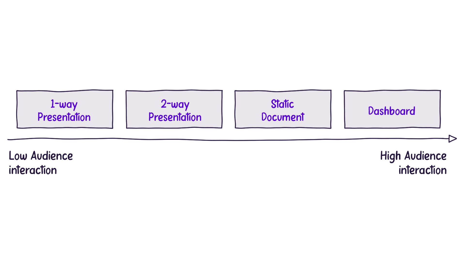
In data storytelling, it’s crucial to keep the audience at the heart of every design decision. One essential aspect to consider is the format of the presentation, which can be determined by asking, “How will our audience interact with our story?” Typically, the answer falls into one of four major categories.
Understanding the Four Presentation Medium Formats
One-Way Presentation: In this format, the presenter speaks, and the audience listens without interruption. Communication flows from the presenter to the audience, with no expectation for questions or comments. TED talks and keynote speeches are prime examples of one-way presentations.
Two-Way Presentation: Here, the presenter leads the discussion while allowing the audience to contribute with questions or comments. Most business presentations fall into this category.
Static Document: The audience consumes a document independently, without a live presentation to guide them. As a result, all necessary information must be included in the document itself. An example of this would be a company’s annual report.
Interactive Document: This type of presentation allows the audience to engage with the content in real-time, producing tailored views of the data. Interactive dashboards are a common example.
Evaluating Audience Control over Information Flow
To better understand the different formats, we can examine the levels of audience interaction, ranging from minimal control to maximum control over the information flow:
Balancing Information Density
When delivering a one-way presentation, presenters must be cautious not to overwhelm the audience with information. If a complex chart is presented without proper explanation, the audience may struggle to comprehend it, and they won’t have the opportunity to ask questions.
On the other hand, interactive dashboards offer the audience maximum control, as they can explore and manipulate the data at their own pace. Consequently, these presentations can contain more information, as the audience isn’t reliant on oral commentary to understand the content.
This brings us to the concept of “information density,” which refers to the amount of information packed into each slide, page, or screen. The less control the audience has over the information flow, the lower the information density should be to prevent overwhelming them. Conversely, as the audience gains more control and can consume content at their own pace, they can handle greater information density:
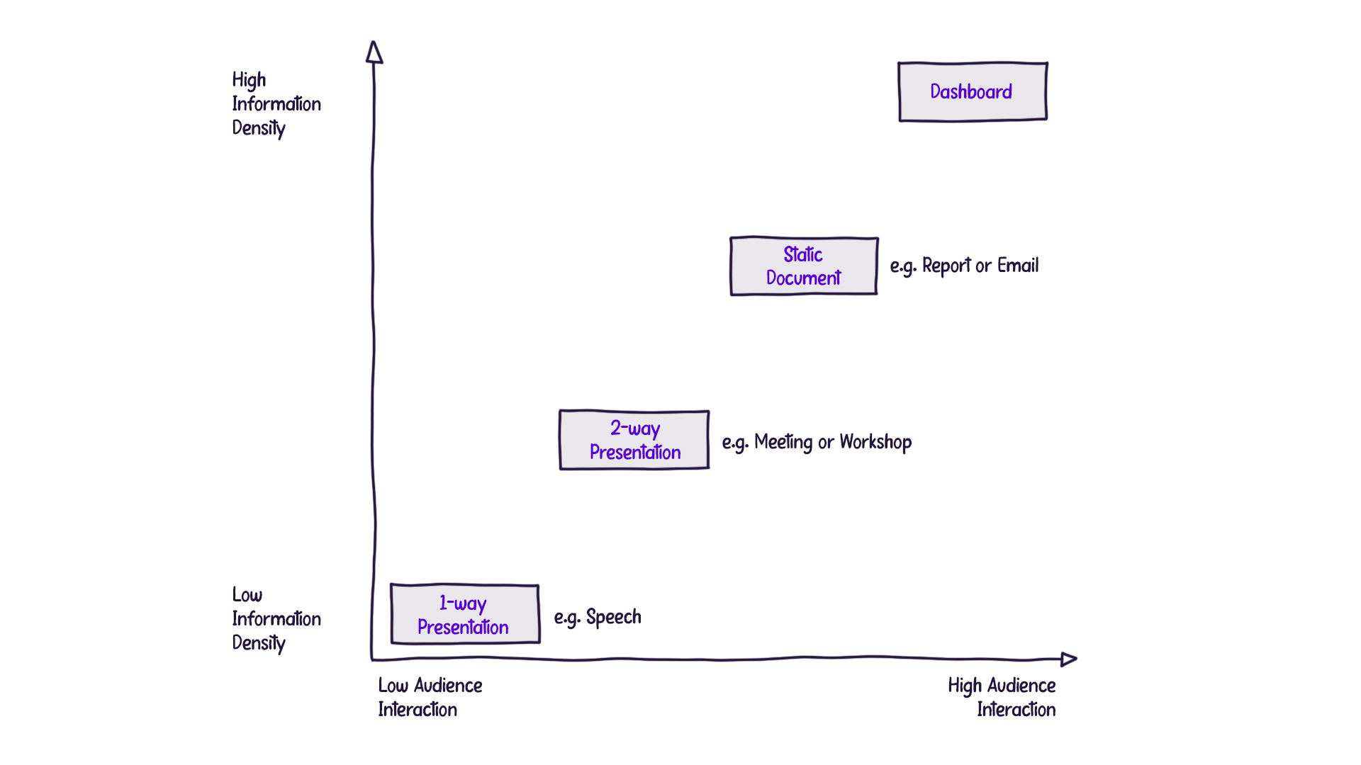
Understanding the four presentation formats and carefully considering audience control and information density creates a more effective data storytelling experience. The key is to tailor your approach based on the specific needs and expectations of your audience, ensuring that they can easily grasp the information being presented.
Similar posts

A data storyteller’s guide to better slide design
Elevate your slides - adopting design principles for better presentations.
Sign up to hear about our upcoming courses and events:
Click through the PLOS taxonomy to find articles in your field.
For more information about PLOS Subject Areas, click here .
Loading metrics
Open Access
Peer-reviewed
Research Article
Does a presentation’s medium affect its message? PowerPoint, Prezi, and oral presentations
* E-mail: [email protected]
Affiliations Department of Psychology, Harvard University, Cambridge, Massachusetts, United States of America, Harvard Initiative for Learning and Teaching, Harvard University, Cambridge, Massachusetts, United States of America
Affiliation Harvard Initiative for Learning and Teaching, Harvard University, Cambridge, Massachusetts, United States of America
Affiliation Minerva Schools at the Keck Graduate Institute, San Francisco, California, United States of America
- Samuel T. Moulton,
- Selen Türkay,
- Stephen M. Kosslyn
- Published: July 5, 2017
- https://doi.org/10.1371/journal.pone.0178774
- Reader Comments
12 Oct 2017: The PLOS ONE Staff (2017) Correction: Does a presentation's medium affect its message? PowerPoint, Prezi, and oral presentations. PLOS ONE 12(10): e0186673. https://doi.org/10.1371/journal.pone.0186673 View correction
Despite the prevalence of PowerPoint in professional and educational presentations, surprisingly little is known about how effective such presentations are. All else being equal, are PowerPoint presentations better than purely oral presentations or those that use alternative software tools? To address this question we recreated a real-world business scenario in which individuals presented to a corporate board. Participants (playing the role of the presenter) were randomly assigned to create PowerPoint, Prezi, or oral presentations, and then actually delivered the presentation live to other participants (playing the role of corporate executives). Across two experiments and on a variety of dimensions, participants evaluated PowerPoint presentations comparably to oral presentations, but evaluated Prezi presentations more favorably than both PowerPoint and oral presentations. There was some evidence that participants who viewed different types of presentations came to different conclusions about the business scenario, but no evidence that they remembered or comprehended the scenario differently. We conclude that the observed effects of presentation format are not merely the result of novelty, bias, experimenter-, or software-specific characteristics, but instead reveal a communication preference for using the panning-and-zooming animations that characterize Prezi presentations.
Citation: Moulton ST, Türkay S, Kosslyn SM (2017) Does a presentation’s medium affect its message? PowerPoint, Prezi, and oral presentations. PLoS ONE 12(7): e0178774. https://doi.org/10.1371/journal.pone.0178774
Editor: Philip Allen, University of Akron, UNITED STATES
Received: November 2, 2016; Accepted: May 18, 2017; Published: July 5, 2017
Copyright: © 2017 Moulton et al. This is an open access article distributed under the terms of the Creative Commons Attribution License , which permits unrestricted use, distribution, and reproduction in any medium, provided the original author and source are credited.
Data Availability: All data files are available from the Open Science Framework https://osf.io/fgf7c/ .
Funding: This research was supported by a grant from Prezi ( http://www.prezi.com ) to SMK. In the sponsored research agreement (which we are happy to provide) and in our conversations with Prezi leadership, they agreed to let us conduct the study as we wished and publish it no matter what the results revealed. Aside from funding the research, the only role that any employees of Prezi played was (as documented in the manuscript) 1) to provide us with a distribution list of Boston-area Prezi customers (8 of whom participated in the first experiment) and 2) as experts in Prezi, review the background questionnaire to ensure that we were accurately describing Prezi’s purported benefits and features (just as PowerPoint and oral presentation experts did the same). No employees at Prezi had any role in the study design, data collection and analysis, decision to publish, or preparation of the manuscript. None of the authors have any professional or financial connection to Prezi or personal relationships with any Prezi employees. We do not plan to conduct any follow-up research on this topic or obtain future funding from Prezi. As evident in the manuscript, we took special care not to allow bias or demand characteristics to influence this research.
Competing interests: This research was supported by a grant to SMK from Prezi ( http://www.prezi.com ), a commercial funder. This does not alter our adherence to PLOS ONE policies on sharing data and materials.
Introduction
How do the characteristics of a communication medium affect its messages? This question has been the subject of much philosophical and empirical inquiry, with some (e.g., [ 1 ]) claiming that the medium determines the message (“the medium is the message”), others (e.g., [ 2 ]) claiming that characteristics of a medium affect the message, and others claiming that the medium and message are separable (e.g.,[ 3 , 4 ]). As psychologists, we ask: What mental mechanisms underlie effective communication and how can presenters leverage these mechanisms to communicate better? These questions—at the intersection of psychology and communication practice—motivate this research.
That said, the relative efficacy of different communication media or technologies informs the primary questions of interest. If we can demonstrate that oral presentations are less or more effective than those that rely on presentation software—or that presenters who use one type of presentation software tend to be more effective than those who use another—then we advance our psychological and practical understanding of effective communication. Thus, in the tradition of use-inspired basic research [ 5 ]—and as a means to an end, rather than an end unto itself—we compare the effectiveness of three commonly-used formats for communication: oral, PowerPoint, and Prezi presentations.
We focused on presentations because they populate our academic, professional, and even personal lives in the form of public speeches, academic lectures, webinars, class presentations, wedding toasts, courtroom arguments, sermons, product demonstrations, and business presentations [ 6 – 8 ], and because basic questions remain about how to present effectively. Should we present with or without presentation software? If we should present with software, which software? We examined PowerPoint and Prezi because they are popular and psychologically interesting alternatives: Whereas PowerPoint’s linear slide format might reduce cognitive load, focus attention, and promote logical analysis, Prezi’s map-like canvas format and heavy reliance on animation (see the Background section and https://prezi.com for examples) might facilitate visuospatial processing, conceptual understanding, and narrative storytelling.
To inform the present research, we explore the methodological challenges of media research and review past research on presentation formats.
Methodological challenges of media research
To research the efficacy of different communication formats fairly and accurately, one must overcome two stubborn methodological challenges. First, because correlation is not causation and the variables that underlie media usage are heavily confounded, such research requires true experimentation. To study whether a blended learning “flipped classroom” is a more effective instructional medium than traditional lecturing, for example, researchers gain little insight by comparing outcomes for students who enroll in one type of course versus the other. To control for audience (in this case, student) self-selection effects, researchers need to 1) randomly assign audience members to different communication conditions (in this case, pedagogies) or 2) manipulate format within participants. Moreover, the same methodological controls need to be applied to presenters (in this case, instructors). Instructors who choose to teach with emerging, innovative methods probably differ in numerous other respects (e.g., motivation) from those who teach with more traditional methods. If students assigned randomly to a flipped classroom format perform better than those assigned randomly to a traditional classroom format, we risk drawing inferences about confounds instead of causes unless instructors are also assigned randomly to instructional media. To make strong, accurate inferences, therefore, researchers interested in communication must control for audience and presenter self-selection effects. Such control introduces new complexities; when randomly assigning presenters to formats, for example, one must ensure that all presenters receive sufficient training in the relevant format. Moreover, such control is often cumbersome, sometimes impractical, and occasionally unethical (e.g., randomly assigning students in actual courses to hypothetically worse instructional conditions). But there are no adequate methodological substitutes for proper experimental control.
A second thorny methodological challenge inherent in conducting media research concerns how to draw general inferences about formats instead of specific inferences about exemplars of those formats. For example, if one advertising expert is assigned randomly to design a print ad and another expert a television ad—and a hundred consumers are assigned randomly to view the television or print ad—can we actually infer anything about print versus television ads in general when the two groups of consumers behave differently? Arguably not, because such a finding is just as easily explained by other (confounding) differences between the ads or their creators (e.g., ratio of print to graphics, which sorts of people—if any—are shown, and so forth). In other words, even with proper random assignment, researchers who intend to study different forms of communication risk merely studying different instances of communication. Statistically speaking, one should assume a random not fixed effect of the communication objects of interest (e.g., presentations, lectures, advertisements). To overcome this challenge and draw generalizable inferences, one must (at the very least) sample a sufficiently large set of examples within each medium.
Research on presentation software
Methodological shortcomings..
Considerable research has been conducted on how different presentation formats (particularly PowerPoint) convey information (for review, see [ 9 ]). However, much of this research is anecdotal or based on case studies. For example, Tufte [ 10 ] claims that PowerPoint’s default settings lead presenters to create bulleted lists and vacuous graphs that abbreviate arguments and fragment thought. And Kjeldsen [ 11 ] used Al Gore’s TED talk on climate change as a positive example of how visuals can be used to effectively convey evidence and enhance verbal communication.
Research that goes beyond mere anecdote or case study is plagued by the aforementioned methodological shortcomings: failure to control for audience self-selection effects (71% of studies), failure to control for presenter self-selection effects (100% of studies), and a problematic assumption of fixed effects across content and presenters (91% of studies). As is evident in Table 1 , no studies overcame two of these shortcomings, let alone all three. For example, in one of the most heavily-cited publications on this topic Szabo and Hasting [ 12 ] investigated the efficacy of PowerPoint in undergraduate education. In the first study, they examined whether students who received lectures with PowerPoint performed better on a test than students who received traditional lectures. Students were not assigned randomly to lecture conditions, however; rather, the comparison was across time, between two cohorts of students enrolled in different iterations of the same course. Any observed outcome difference could have been caused by student or instructor variables (e.g., preparedness), not lecture format. The fact that no such differences were found does not obviate this concern: Such differences may in fact have been present, but were overshadowed by confounding characteristics of students or instructors. In the second study, the authors varied presentation format within the same cohort of students, but confounded format with order, time, content, and performance measure: student performance was compared between lectures on different days, on different topics, and using different tests. As the authors themselves note, the observed differences may have had nothing to do with PowerPoint. In the third study, they counterbalanced lecture order and content; some students received a PowerPoint lecture first and others a traditional lecture first, and the same topics were presented in both formats. However, students were assigned to conditions based on their course enrollment, not randomly, but more importantly the study included only four presentations, all by one presenter. Any advantages of the two PowerPoint lectures (none were found) might have been particular to those instances or that presenter and not representative of the format more generally.
- PPT PowerPoint slide
- PNG larger image
- TIFF original image
https://doi.org/10.1371/journal.pone.0178774.t001
Most studies—even those that control experimentally for audience self-selection—relied on only a single self-selected presenter, and some relied on only one presentation per format. In one study ([ 13 ]: Experiment 1), for example, one of the authors varied the format of his lecture instruction randomly across the semester, using transparences or PowerPoint slides. In another study [ 14 ], students who were enrolled in one of the authors’ courses were assigned randomly to a PowerPoint or Prezi e-lecture that contained identical audio narration and written text. In a third study [ 15 ], one of the researchers gave the same lecture over the course of the year to rotating medical students, using PowerPoint on odd months and overhead slides on even months. What reason is there to think that we can make general claims about presentation format based on studies of single lectures or single presenters? That is, how can we reasonably assume fixed as opposed to random effects? If the use of presentation software does meaningfully influence student learning or experience, surely that effect is not constant across all presenters or presentations—some instructors use it more effectively than others, and within any format some presentations are more effective than others (see [ 16 ]). And how can we assume that presenters who select both the content and format of their presentations are not designing them in ways that favor one format over another?
Research on the efficacy of presentation software has numerous other flaws, most notably the failure to control for experimenter effects or demand characteristics. In 82% of studies we identified, for example, the researchers investigated their own instruction and studied their own students. It is difficult to imagine that one would make these instructional and research efforts (e.g., creating new course material, conducting a field experiment) without a strong belief in the efficacy of one format over the other, and it is plausible (if not likely) that such beliefs would influence students or confound instructional format with instructional effort and enthusiasm.
Another common issue is the confounding of lecture format with access to study materials—in studies that contrast PowerPoint with traditional lecturing (e.g., [ 17 – 19 ]), students in the PowerPoint condition (but not the control condition) sometimes have access to PowerPoint slides as study material. This access could bias student motivation, behavior (e.g., attendance), course satisfaction, and performance (see [ 20 ]).
PowerPoint: Performance, perception, and persuasion.
Despite their methodological shortcomings, what are the findings of this research literature? The majority of studies examined the use of PowerPoint in higher education and measured both objective and subjective outcomes (see Table 1 ). They typically involved students enrolled in one or more of the researchers’ courses, and contrasted the efficacy of lectures (or whole lecture courses) that used PowerPoint with those that used a more traditional technology (e.g., blackboards, overhead projectors). In terms of student performance, their findings were notably mixed: Of the 28 studies we identified, 17 found no effect of PowerPoint lectures relative to traditional lectures ([ 12 ]: Experiments 1,3; [ 13 , 15 , 21 – 33 ]), 9 found a performance benefit of PowerPoint over traditional instruction ([ 12 ]: Experiment 2; [ 17 – 19 , 34 – 38 ]), and 2 found a performance benefit of traditional over PowerPoint instruction [ 39 , 40 ].
There is near consensus in the literature, however, when it comes student perception: Of the 26 studies we identified, 21 found that students preferred PowerPoint over traditional instruction ([ 12 ]: Experiment 1; [ 13 , 17 – 19 , 21 , 23 , 25 , 26 , 28 , 29 , 31 – 33 , 35 , 39 , 41 – 45 ]), 2 found that students preferred traditional over PowerPoint instruction [ 40 , 46 ], and 3 other studies found no preference for one or the other formats [ 15 , 22 , 37 ]. As one example, Tang and Austin [ 45 ] surveyed 215 undergraduates in business courses about their general perceptions of different lecture formats; on measures of enjoyment, learning, motivation, and career relevance, they found that students rated lectures with PowerPoint slides more favorably than lectures with overheads or without visual aids. An additional 7 studies did not contrast student perceptions of PowerPoint with another technology—they simply surveyed students about PowerPoint; these studies all found that students had, on average, favorable impressions of PowerPoint-based instruction [ 36 , 47 – 52 ].
In addition to these studies of how presentation software impacts student performance and perception, two studies examined PowerPoint‘s impact on audience persuasion. Guadagno, Sundie, Hardison, and Cialdini [ 53 ] argue that we heuristically use a presentation’s format to evaluate its content, particularly when we lack the expertise to evaluate the content on its merits. To test this hypothesis, they presented undergraduates with key statistics about a university football recruit and asked them to evaluate the recruit’s career prospects. The same statistics were presented in one of three formats: a written summary, a graphical summary via printed-out PowerPoint slides, or a graphical summary via animated PowerPoint slides (self-advanced by the participant). Participants shown the computer-based PowerPoint presentation tended to rate the recruit more positively than other participants, and there was some evidence that this effect was more pronounced for football novices than for experts. The findings of this study suggest that some presentation formats may be more persuasive than others, perhaps because audience members conflate a sophisticated medium with a sophisticated message.
In the second study to examine the impact of PowerPoint on persuasion, Park and Feigenson [ 54 ] examined the impact of video-recorded presentations on mock juror decision-making. Participants were more persuaded by attorneys on either side of a liability case when the attorney used PowerPoint slides as opposed to merely oral argument. They also remembered more details from PowerPoint than oral presentations, and evaluated both attorneys as more persuasive, competent, credible, and prepared when they presented with PowerPoint. Based on mediation analyses, the researchers argue that the decision-making benefit of PowerPoint results from both deliberative and heuristic processing (“slow” and “fast” thinking, respectively, see [ 55 ]).
Both of these studies, however, share the methodological limitations of the educational research on PowerPoint. The first study [ 53 ] used only one PowerPoint presentation, and the second [ 54 ] used only two. The presentations used were not selected at random from a larger stimulus pool but instead were created by researchers who hypothesized that PowerPoint would enhance presentations. But even if the presentations had been sampled randomly, the sample is too small to allow one to generalize to a broader population. In studying performance, perception, or persuasion, one cannot reasonably assume that all presentation effects are equal.
Prezi: A zoomable user interface.
Released in 2009, Prezi has received generally favorable reviews by researchers, educators, and professional critics [ 56 – 60 ]. With a purported 75 million users worldwide, it is increasingly popular but still an order of magnitude less so than PowerPoint (with as many as one billion users; [ 61 ]). Like PowerPoint and other slideware, Prezi allows users to arrange images, graphics, text, audio, video and animations, and to present them alongside aural narration to an in-person or remote audience. In contrast to PowerPoint and other slideware in which users create presentations as a deck of slides, Prezi users create presentations on a single visuospatial canvas. In this regard, Prezi is much like a blackboard and chalk. But unlike a physical blackboard, the Prezi canvas is infinite (cf. [ 62 ]) and zoomable: in designing presentations, users can infinitely expand the size of their canvas and can zoom in or out. When presenting, users define paths to navigate their audience through the map-like presentation, zooming and panning from a fixed-angle overhead view.
Like Google Maps or modern touchscreens, Prezi is an example of what scholars of human-computer interaction label a zoomable user interface (ZUI). These interfaces are defined by two features: They present information in a theoretically infinite two-dimensional space (i.e., an infinite canvas) and they enable users to animate this virtual space through panning and zooming. Some of the original ZUIs were used to visualize history, navigate file systems, browse images, and—in the Prezi predecessor CounterPoint—create presentations [ 63 , 64 ].
As communication and visualization tools, ZUIs in general and Prezi in particular are interesting psychologically for several reasons. First, they may take advantage of our mental and neural architecture, specifically the fact that we process information through dissociable visual and spatial systems. Whereas the so-called “ventral” visual system in the brain processes information such as shape and color, the “dorsal” spatial system processes information such as location and distance [ 65 – 68 ]. When working in concert, these systems result in vastly better memory and comprehension than when they work in isolation. For example, in the classic “method of loci” individuals visualize objects in specific locations; when later trying to recall the objects, they visualize navigating through the space, “seeing” each object in turn. This method typically doubles retention, compared to other ways of trying to memorize objects [ 69 , 70 ]. Similarly, in research on note-taking, students learned more when they used spatial methods than when they used linear methods (e.g., [ 71 ]). Mayer’s multimedia learning principles and evidence in their favor also highlight the importance of spatial contiguity [ 72 ].
Thus, by encouraging users to visualize and process information spatially, ZUIs such as Prezi may confer an advantage over traditional tools such as PowerPoint that do not encourage such visuospatial integration. As Good and Bederson [ 64 ] write: “Because they employ a metaphor based on physical space and navigation, ZUIs offer an additional avenue for exploring the utilization of human spatial abilities during a presentation.”
Furthermore, ZUIs may encourage a particularly efficacious type of spatial processing, namely graphical processing. In graphical processing, digital objects (or groups of objects) are not just arranged in space, they are arranged or connected in a way makes their interrelationships explicit. Randomly placing animal stickers on a blank page, for example, engages mere spatial processing; drawing connecting lines between animals of the same genus or arranging the animals into a phylogenetic tree, however, engages graphical processing. Because ZUIs force users to “see the big picture,” they may prompt deeper processing than software that segments content into separate spatial canvases. By facilitating such processing, ZUIs may leverage the same learning benefits of concept maps and other graphical organizers, which have been studied extensively. For example, in their meta-analysis of the use of concept maps in education, Nesbit and Adesope [ 73 ] found that these graphical representations (especially when animated) were more effective than texts, lists, and outlines. By requiring one to organize the whole presentation on a single canvas instead of a slide deck, therefore, Prezi may prompt presenters (and their audiences) to connect component ideas with each other, contextualize them in a larger narrative, and remember, understand, and appreciate this larger narrative. Slideware, on the other hand, may do just the opposite:
PowerPoint favours information that can be displayed on a single projected 4:3 rectangle. Knowledge that requires more space is disadvantaged … How to include a story on a slide? Distributing the associated text over several slides literally breaks it into fragments, disturbing its natural cohesion and thus coherence … PowerPoint renders obsolete some complex narrative and data forms in favour of those that are easily abbreviated or otherwise lend themselves to display on a series of slides [ 74 ] (p399)
Of course these arguments are speculative, and one can also speculate on the psychological costs of ZUI or benefits of standard slideware. Perhaps PowerPoint does confer some of same spatial processing benefits of Prezi—after all, slides are spatial canvases, and they must be arranged to form a narrative—but in a way that better manages the limited attentional resources of the presenter or audience. Our point here is simply that Prezi, as a ZUI presentation tool, offers a psychologically interesting alternative to standard deck-based slideware, with a range of possible advantages that could be explored empirically to discover the psychological mechanisms of effective communication.
Like the PowerPoint literature, most of the published literature on Prezi is limited to observational reports or case studies. Brock and Brodahl [ 75 ] evaluated Prezi favorably based on their review and students’ ratings of course presentations. Conboy, Fletcher, Russell, and Wilson [ 76 ] interviewed 6 undergraduates and 3 staff members about their experiences with Prezi in lecture instruction and reported generally positive experiences. Masood and Othman [ 77 ] measured the eye movements and subjective judgments of ten participants who viewed a single Prezi presentation; participants attended to the presentation’s text more than to its other components (e.g., images, headings), and favorably judged the presentation. Ballentine [ 78 ] assigned students to use Prezi to design text adventure games and reported benefits of using the medium. Two other studies [ 79 , 80 ] surveyed college students about their course experiences with Prezi, and both reported similarly positive perceptions.
All of these studies, however, suffer from major demand characteristics, due to the fact that the researchers observed or asked leading questions of their own students about their own instruction (e.g., “Do you find lectures delivered with Prezi more engaging then[sic] other lectures?”, from [ 79 ]). Moreover, all suffer from the methodological limitations discussed earlier.
Other literature that addresses Prezi is purely theoretical and speculative: In discussing the pedagogical implications of various presentation software, Harris [ 81 ] mostly just describes Prezi’s features, but does suggest that some of these features provide useful visual metaphors (e.g., zooming in to demonstrate otherwise hidden realities). Bean [ 82 ] offers a particularly compelling analysis of PowerPoint and Prezi’s histories, user interfaces, and visual metaphors, and argues that Prezi is the optimal tool for presenting certain types of information (e.g., wireflow diagrams).
The experimental literature on Prezi is limited to three published studies. Castelyn, Mottart and Valcke [ 14 ] investigated whether a Prezi e-lecture with graphic organizers (e.g., concepts maps) was more effective than a PowerPoint e-lecture without graphic organizers. Claiming that Prezi encourages the use of graphic organizers, they purposefully confounded the type of presentation software with the presence of graphic organizers. Undergraduates randomly assigned to the different e-lectures did not differ in their knowledge or self-efficacy gains, but did prefer the graphically-organized Prezi lecture over the PowerPoint control lecture. In a follow-up study [ 83 ], the same researchers assigned undergraduates to create Prezi presentations that did or did not use graphic organizers, and found no effects of this manipulation on students’ self-reported motivation or self-efficacy. Chou, Chang, and Lu [ 24 ] compared the effects of Prezi, PowerPoint and traditional blackboard instruction on 5 th graders’ learning of geography. Whereas the Prezi group performed better than the control group (which received blackboard instruction) in formative quizzes and a summative test, the PowerPoint group did not; however, on a delayed summative test, both Prezi and PowerPoint students performed better than those in the control group. In direct comparisons of PowerPoint and Prezi, there were no differences in any of the learning measures. Taken together, the studies are not just limited in number: They present uncompelling findings and suffer from the same methodological shortcomings of the PowerPoint research.
The current study
In short, the extant literature does not clarify whether presenters should present with or without visual aids—and, if the latter, whether they should use standard deck-based slideware such as PowerPoint or a ZUI such as Prezi. One of the reasons why these basic questions remain unanswered is the methodological challenges inherent in comparing different presentation formats. We designed the current study to overcome these challenges.
To control for individual differences among presenters, we randomly assigned presenters to different presentation conditions. To control for individual differences among audience members, we used a counterbalanced, within-participants design for the first experiment, and between-participants random assignment in the second experiment. And to draw general inferences about the impact of presentation format—instead of specific inferences about particular presenters or presentations—we sampled from a large number of presentations, each created by a different presenter. Our methods have their own challenges, such as recruiting participants sufficiently trained in all presentation methods, allowing presenters adequate preparation time and context, approximating the psychological conditions of real-world presentations, and measuring the “signal” of presentation format among the added “noise” of so many presenters and presentations. In addition, the studies had to be double-blind: Neither presenters nor audience members could be aware of any hypotheses, and had to be free from any sorts of confirmation bias conveyed by the investigators.
To focus on presentations as a form of presenter-audience communication and limit the number of confounded variables, we purposefully controlled for other possible impacts of presentation software on professional practices or outcomes, including 1) the use of presentation artifacts (e.g., PowerPoint files, printed-out slides, online Prezis), and 2) facilitated collaboration among presentation designers. Unlike other research (e.g., [ 32 , 33 ]) we did allow for the possibility that presentation format not only affects how audiences perceive presentations, but also how presenters design or deliver them (e.g., by increasing their conceptual understanding of the topic, or decreasing their cognitive load during live narration; cf. [ 84 ]). In other words, presentation technologies might affect the cognition of both the audience and the presenter, so we designed the present studies to accommodate both sets of mechanisms.
To maximize the real-world relevance of this research, we relied on multimedia case materials from Harvard Business School [ 85 ]; these materials recreate the actual professional circumstances in which presentations are typically used. Because presentations are designed commonly both to inform and convince audiences, we examine outcome measures of learning as well as persuasion. And to minimize demand characteristics, we avoided the typical flaws of existing research (e.g., researcher-designed presentations, the researchers’ students as research participants) and adopted several countermeasures (e.g., recruitment language and participant instructions that obscured the research hypotheses, between-participant manipulation).
We adopted a two-phased approach in this research. In the first phase, participants with sufficient experience in oral, PowerPoint, and Prezi presentation formats were randomly assigned to create a presentation in one of those formats. We provided the necessary context, instruction, and time to create a short but realistic presentation. Participants then presented live to an actual audience, who judged each presentation’s efficacy. In the second phase, recorded versions of these presentations were presented to a larger online audience, affording us greater statistical power and allowing us to measure the impact of presentation format on decision-making and learning.
Experiment 1
Participants..
We recruited presenter participants via online postings (on Craigslist, the Harvard Psychology Study Pool, the Harvard Decision Science Lab Study Pool), email solicitations to the local Prezi community, and campus flyers. To create the fairest comparison between PowerPoint and Prezi, we recruited individuals who “have expertise in using both PowerPoint and Prezi presentation software.” Interested individuals were directed to a prescreening survey in which they reported their experience with and preference for giving different types of presentations. Only individuals who reported that they were “not at all experienced” with PowerPoint, Prezi or giving oral presentations were excluded from research participation. Out of the 681 respondents who completed the prescreening survey, 456 of them were eligible and invited to sign up for an available timeslot. Out of this group, 146 individuals—105 from the Harvard study pools, 33 from Craigslist, and 8 from the Prezi community—participated as presenters in the study and were compensated $40 for approximately two hours of their time. There were no significant differences between the three presentation groups on any demographics variables.
We also recruited 153 audience participants from the Harvard Decision Science Lab Study Pool and Craigslist using the following announcement:
Do you use Skype? Does your computer have a large screen (13 inches or larger)? If so, you may be eligible to participate in a 45 minute long online study. In this study, you will watch professional presentations over Skype from home on your personal computer.
Anyone who responded to the recruitment notice was eligible, provided that they were available during one of the prescheduled testing sessions. Audience participants were compensated $10 for approximately 45 minutes of their time. Table 2 presents demographic information for the presenter and audience participants. This study was approved by the Harvard Committee on the Use of Human Subjects (Study #IRB14-1427), and all participants in both experiments provided written consent.
https://doi.org/10.1371/journal.pone.0178774.t002
Presenter procedure.
Presenter participants completed a survey remotely before attending the in-person, group sessions with other participants. In the online pre-survey, presenters first answered basic demographic questions (gender, age, education level, English fluency, and occupation). Next, they answered questions about their prior experience with, opinions about, and understanding of the different presentation formats (oral, Prezi, and PowerPoint). This section was prefaced with the following note:
A note on language: When we use the term "presentation," we mean a formal, planned, and oral presentation of any duration, including a public speech, an academic lecture, a webinar, a class presentation, a wedding toast, a sermon, a product demonstration, a business presentation, and so on. Examples of things we do NOT mean are: a theatrical performance, an impromptu toast at dinner, and any presentation with no audience. When we say PowerPoint presentations, we mean presentations that were made using Microsoft PowerPoint, not other software such as Apple's Keynote. When we say Prezi presentations, we mean presentations that were made using Prezi presentation software. Also, when we refer to "oral presentation", we mean a presentation that is only spoken and does not include any visual aids or the use of presentation software.
Participants were asked the following questions for each type of presentation:
- How experienced are you at making the following types of presentations? [5-level rating]
- When you give a presentation, how effective are the following types of presentations for you? [5-level rating, with “not applicable” option]
- When somebody else gives a presentation, how effective are the following types of presentations for you? [5-level rating, with “not applicable” option]
- How difficult is it for you to make the following types of presentations? [5-level rating, with “not applicable” option]
- In the last year, approximately how many of the following types of presentations did you make? [free response]
- In your lifetime, approximately how many of the following types of presentations have you made? [free response]
- For approximately how many years have you been making the following types of presentations? [free response]
As part of the expertise-related measures, we also asked the participants to identify the purported advantages and disadvantages of each presentation format, according to its proponents and critics, respectively. For PowerPoint and Prezi, we asked participants to identify whether or not it had particular functionalities (e.g., the capacity to record narration, create custom backgrounds, print handouts). Finally, participants viewed three sets of four short Prezi presentations and rank-ordered them from best to worst. In each set we manipulated a key dimension of Prezi effectiveness, according to its designers: the use of zooming, the connection of ideas, and the use of visual metaphor.
Presenter participants were tested in person at the Harvard Decision Science Lab, and randomly assigned to one of the three groups: Prezi, PowerPoint, or oral presentation. A total of 50 data collection sessions were held. In each session, there were typically three presenter participants (one for each presentation format); as a result of participants who failed to arrive or overbooking, there were ten sessions with only two presenters and six sessions with four presenters.
After providing informed consent, participants completed an online survey (in the lab) in which they rank-ordered three sets of recorded example PowerPoint and oral presentations. Identical in form to the example Prezi presentations they judged in the pre-survey, these short presentations were designed to assess their understanding of effective presentation design by manipulating a key aspect specific to each format. For PowerPoint presentations, we manipulated the use of text, use of extraneous “bells and whistles,” and graph design; for oral presentations, the three dimensions were verbal behavior, nonverbal behavior (other than eye contact), and eye contact. In selecting these dimensions (and those for Prezi), we consulted with a variety of experts, including software designers, speaking coaches, and researchers.
Next, presenters were shown material from a multimedia case created for and used by the Harvard Business School. Specifically, they were told the following (the company featured in the business case will be referred to anonymously here as “Company X” to respect their contractual agreement with the school):
For the next two hours, you are going to pretend to be the chief marketing officer of i-Mart, a large chain of retail stores. i-Mart recently made an offer to [Company X] to sell their products in i-Mart stores. Your boss, the CEO of i-Mart, has asked you to make a presentation to [Company X]’s leadership that persuades them to accept i-Mart’s offer. In your presentation, you will need to argue that accepting i-Mart’s offer is in [Company X]’s strategic interests, and address any concerns they may have about how accepting the offer might affect their corporate identity.
As a participant in this study, your primary job today is to prepare and then deliver this presentation. The presentation will be very short (less than 5 minutes) and made live (via Skype) to an audience of participants who are playing the part of [Company X] executives. Before you start planning your presentation, you will first learn more about [Company X] and how they’re thinking about i-Mart’s offer.
On their own computer workstation, participants studied the multimedia case for 30 minutes and were invited to take notes on blank paper provided for them. The multimedia case material included video and textual descriptions of Company’s X’s corporate culture, business model, and constituent communities.
Following this study period, participants were given 45 minutes to create a presentation in one of three randomly assigned presentation formats: PowerPoint, Prezi, or oral. To assist participants in the PowerPoint and Prezi conditions, we provided them with a set of digital artifacts including text, data, and graphics related to the case. Participants were not told that other participants were asked to present in different formats, and the workstations were separated from each other to prevent participants from discovering this manipulation.
After this preparation period, participants were taken individually (in a counterbalanced order) to another room to present to a live audience via Skype. For PowerPoint and Prezi presentations, we shared each participant’s presentation with the audience via screen sharing; thus they viewed both the presenter and the presentation. For those presenters who consented, we also recorded their presentations for future research purposes. After making their presentations, presenters completed a final survey about their presentation (e.g., “How convincing do you think your presentation will be to [Company X’s] board members”), the corporate scenario (e.g., What do you think [Company X] should do?”), and their presentation format (e.g., “How likely are you to recommend the presentation tool or presentation format you used to others to make professional presentations?”).
Audience procedure.
Audience participants completed the entire experiment remotely and online. Their participation was scheduled for the end of the presenter sessions so that the in-lab presenters could present live to a remote audience via Skype. We recruited between three and six audience participants per session, although participants who failed to arrive or Skype connectivity issues resulted in some sessions with only one or two audience participants: Five sessions had one participant, twelve sessions had two participants, sixteen sessions had three participants, eleven sessions had four participants, four sessions had five participants, and two sessions had six participants.
Individuals who responded to the recruitment notice completed a consent form and three online surveys prior to their scheduled Skype session. The first survey was a slightly modified form of the presenter pre-survey (demographics, background on presentation formats, rank-ordering of example Prezis) in which they also scheduled their Skype session. In the second survey, audience participants were told that they were “going to play the role of a corporate executive listening to several short business presentations,” and that their task was “to evaluate the quality of these presentations, each made by another participant engaged in a similar role-playing scenario.” They were then shown a brief video and textual description of the fictionalized corporate scenario (an abridged version of what presenter participants studied), and told the following:
You are a board member for [Company X], an innovative clothing company. Another company, i-Mart, wants to sell [Company Y’s products] in its stores. You and your fellow board members must decide whether or not to accept i-Mart's offer.
And in the third survey they rank-ordered the three sets of recorded example PowerPoint and oral presentations.
At the time of the scheduled session, the audience participants logged into Skype using a generic account provided by the research team, and were instructed to turn on their webcams and put on headphones. Once the first presenter participant was ready to present, the experimenter initiated the group Skype call, confirmed that the software was functioning properly, invited the presenter into the room to begin, left the room before the start of the presentation, monitored the presentation remotely via a closed-circuit video feed, and re-entered the room at the presentation’s conclusion. For Prezi and PowerPoint presentations, Skype’s built-in screen-sharing function was used to share the visual component of the presentation; audience participants viewing these presentations were instructed to use the split-screen view, with windows of equal size showing the presenter and the accompanying visuals.
Immediately after viewing each presentation, participants evaluated it via an online survey. They rated each presentation on how organized, engaging, realistic, persuasive, and effective it was using a five-level scale with response options of not at all , slightly , somewhat , very , and extremely . They were also invited to offer feedback to the presenter on how the presentation could be improved. After the final presentation, participants rank-ordered the presentations on the same dimensions (e.g., effectiveness, persuasiveness). Halfway through the experiment we added a final question in which we asked participants to rank-order PowerPoint, Prezi, and oral presentation formats “in terms of their general effectiveness, ignoring how well individual presenters (including today's) use that format,” and to explain their rank-ordering.
Prior experience and pre-existing beliefs.
Participants’ prior experience with and pre-existing beliefs about each presentation format provide a baseline that informs the research findings. If presenter participants had more experience with and more positive beliefs about one format than the others—and those assigned to that format induced more positive assessments from the audience members than did those assigned to the other formats—then the results are less compelling than if there was no correlation between these baseline measures and the experimental outcomes. The same applies to audience participants: Are they merely judging presentations according to their initial biases? Conversely, the results are most compelling if there is a negative association between the baseline measures and the experimental findings. For this reason—and to check that presenters assigned to the different formats did not happen to differ in these baseline measures—we analyzed participants’ prior experience with and pre-existing beliefs about PowerPoint, Prezi, and oral presentation formats.
Both audience and presenter participants were least experienced with Prezi and most experienced with oral presentations. At the outset, they rated PowerPoint as the most effective and easiest to use to present material and Prezi as the least effective and most difficult to use to present. For watching presentations, audience participants rated PowerPoint most effective and oral presentations least effective, but rated Prezi as more enjoyable than other formats. For watching presentations, presenter participants did not find any format more effective than the others. Table 3 presents full descriptive and inferential statistics for all self-reported measures of prior experience with and preexisting beliefs about Prezi, PowerPoint, and oral presentations.
https://doi.org/10.1371/journal.pone.0178774.t003
Presenters assigned to different formats did not differ in their experience with or pre-existing beliefs about presentations formats. They also did not differ in how well they identified the purported advantages and disadvantages of each presentation format, how well they identified the software features of PowerPoint and Prezi, or how accurately they could identify effective presentations of each format.
Audience ratings.
In term of their prior experience with and pre-existing beliefs about presentation formats, both audience and presenter participants were biased in favor of oral and PowerPoint presentations and against Prezi. After presenters were randomly assigned to these different formats, how did the audience evaluate their presentations?
In examining how presentation format affected the audience’s ratings of the presentations, two complications arose. First, sessions with two presentations were missing one presentation format, and sessions with four presentations had two presentations of the same format. To address this complexity we only conducted pairwise comparisons of different formats (e.g., PPT versus oral) instead of omnibus tests, and—for those sessions with four presentations—we averaged ratings for the two same-format presentations. To be certain that the differing number of presentations per session did not somehow bias the results even after adopting these measures, we also conducted an analysis on the subset of sessions that had exactly three presentations.
Second, the number of audience participants per session ranged from one to six. In calculating descriptive statistics, some sessions would be weighted more heavily than others unless ratings were first averaged across participants within the same session, then averaged across sessions. In calculating inferential statistics, averaging across ratings from different participants within the same session who received presentations in the same format was necessary to ensure that the sampling units were independent of each other, an assumption of all parametric and most nonparametric tests. In other words, for both descriptive and inferential statistics, we treated session (instead of participant) as the sampling unit.
As an empirical matter, this multi-step averaging—within participants across identical presentation formats, then across participants within the same session—had little impact on the condition means (i.e., the average ratings of PowerPoint, Prezi, or oral presentations on each dimension). Compared to the simplest, raw averaging of all ratings in one step, the maximum absolute difference between these two sets of means was .07 (on a 1–5 scale) and the mean absolute difference was .04.
To test whether the presentations’ format affected their ratings, therefore, we conducted paired t -tests for each rating dimension, with presentation format as the repeated measure and mean session rating as the dependent variable. Because we conducted three tests for each dimension—pairing each format with every other—we controlled for multiple comparisons by dividing our significance threshold by the same factor (i.e., α = .05/3 = .017). Results revealed that presentation format influenced audience ratings. In particular, the audience rated Prezi presentations as significantly more organized, engaging, persuasive, and effective than both PowerPoint and oral presentations; on a five-level scale, the average participant rated Prezi presentations over half a level higher than other presentations. The audience did not rate PowerPoint presentations differently than oral presentations on any dimension. Table 4 and Fig 1 present these results.
https://doi.org/10.1371/journal.pone.0178774.t004
Audience members rated presentations on each dimension on a 5-level scale (1 = “not at all,” 5 = “extremely”). The figure shows session-level means from all available data, including those from sessions with two or four presentations.
https://doi.org/10.1371/journal.pone.0178774.g001
By limiting the analysis to the 34 sessions with exactly three presentations (one of each format), we could ensure that the sessions with two or four presentations did not somehow bias the results. Moreover, this procedure enabled us to conduct omnibus tests of presentation format for each rating dimension. These omnibus tests revealed significant effects for organization, F (2,66) = 12.9, p < .0001, engagement, F (2,66) = 4.6, p = .01, persuasion, F (2,66) = 3.9, p = .03, and effectiveness, F (2,66) = 7.2, p = .001. The results from post-hoc tests (Fisher’s LSD) aligned with the original pairwise comparisons: On all dimensions, the audience rated Prezi presentations higher than PowerPoint and oral presentations, p s < .05; PowerPoint and oral presentations were not rated differently on any dimension, p s>.05. (Note: All p -values for pairwise tests here and elsewhere are two-tailed.)
To explore whether the obtained results were somehow the result of demand characteristics, we analyzed ratings from only the first presentation in each session. This analysis yielded the same pattern of findings, with a to-be-expected reduction in statistical significance due to the loss of power. On all four dimensions, a one-way, independent-measures ANOVA yielded significant or marginally-significant results: organized, F (2,49) = 5.1, p = .01; engaging, F (2,49) = 2.5, p = .09; persuasive, F (2,49) = 2.6, p = .09; and effective, F (2,49) = 5.8, p = .006. In all cases, Prezi was rated higher than oral and PowerPoint presentations (post-hoc LSD p s ≤.08).
On average, the audience rated the presentations as realistic, with a modal rating of “very realistic.” Our intent in including this rating dimension was merely to verify that our experimental protocol resulted in realistic rather than contrived presentations; we therefore did not test for differences in these ratings as a function of group differences.
Audience rankings.
As just noted, participants randomly assigned to present using Prezi were rated as giving more organized, engaging, persuasive, and effective presentations compared to those randomly assigned to the PowerPoint or oral presentation conditions. In addition, at the end of each session audience participants rank-ordered each type of presentation on the same dimensions used for the ratings. Here we ask: Did the audiences’ rank-orderings align with the ratings?
The same complexities with the ratings data—the variable number of conditions and audience participants per session—applied as well to the ranking data. We therefore adopted a similar analytic strategy, with one exception: we conducted non-parametric rather than parametric pairwise tests, given the rank-ordered nature of the raw data and distributional assumptions that underlie parametric tests.
Using the session-level mean ranks, we tested the effect of presentation format with three sets of Wilcoxon signed-rank tests. The results had the identical pattern as those from the ratings data: the audience rated Prezi presentations as significantly more organized, engaging, persuasive, and effective than both PowerPoint and oral presentation (all p s ≤ .006); the audience did not rate PowerPoint presentations differently than oral presentations on any dimension. Table 5 and Fig 2 present these results.
https://doi.org/10.1371/journal.pone.0178774.t005
Audience members ranked the presentations from best to worst, with lower ranks indicating better presentations. The figure shows session-level means from all available data, including those from sessions with two or four presentations.
https://doi.org/10.1371/journal.pone.0178774.g002
As with the ratings data, we also conducted omnibus tests of only those sessions with exactly three presentations to validate that unbalanced sessions did not somehow bias the results. These tests (Friedman ANOVAs) revealed significant effects for organization, exact p = .0005, engagement, exact p = .04, and effectiveness, exact p = .003; we found only a marginally significant effect for persuasion, exact p = .08. Post-hoc tests (Fisher’s LSD) showed that the audience ranked Prezi presentations higher than PowerPoint and oral presentations on all dimensions, p s < .05; PowerPoint and oral presentations were not ranked differently on engagement, persuasion, or effectiveness, p s>.05, but the audience did rank PowerPoint presentations as more organized than oral presentations, p = .04.
Audience omnibus judgments of effectiveness.
Before and after the experimental session, audience participants judged the general effectiveness of the three presentation formats. In the pre-survey, they rated each format on its effectiveness for them as presenters and audience members. In the post-survey, they rank-ordered the formats on their “general effectiveness” and were instructed to ignore “how well individual presenters (including today's) use that format.” Although the pre- and post-questions differed in their phrasing and response formats, they nonetheless afford us an opportunity to investigate if and how their judgments changed over the course of the experiment.
As already described (see Table 3 ), the audience began the experiment judging PowerPoint presentations as most effective for presenters and audiences. They ended the experiment, however, with different judgments of efficacy: A majority (52%) ranked Prezi presentations as the most effective, a majority (57%) ranked oral presentations as least effective, and a plurality (49%) ranked PowerPoint presentations second in effectiveness. A Friedman’s ANOVA test (on the mean rankings) confirmed that participants rated presentation formats differently, exact p = .00007. Post hoc analysis with Wilcoxon signed-rank tests revealed that the audience ranked both Prezi and PowerPoint presentations as more effective than oral presentations, ps ≤.003). They did not rank Prezi and PowerPoint presentations significantly differently ( p = .15). Fig 3 presents these results.
Note: Means shown from pre-survey items are calculated based on responses from all participants (as opposed to only those who had experience with all presentation formats).
https://doi.org/10.1371/journal.pone.0178774.g003
In the pre-survey, some audience participants reported prior experience viewing Prezi presentations but others did not (i.e., those who selected the “not applicable” response option). Compared to participants with no prior experience watching Prezi presentations ( n = 34), participants with prior Prezi experience ( n = 117) rated PowerPoint presentations (but not oral presentations) as less effective, t (149) = 2.7, p = .007, mean difference = .47, and less enjoyable for them, t (149) = 2.9, p = .004, mean difference = .53. Thus, prior experience with Prezi was associated with negative pre-existing judgments of PowerPoint.
Audience correlates of presentation ratings and rankings.
What, if any, individual-level variables—demographics and baseline survey responses—correlated with the audience’s judgments of the presentations? If, for example, the more experience the audience had with Prezi, the worse they evaluated those presentations, such a correlation would suggest that the current findings reflect a novelty effect.
We did not find any significant relationships between the audiences’ prior experience with a given presentation format (presenter experience rating, number of years, number of presentations watched last year or lifetime) and their ratings or rank-orderings of that presentation format on any dimensions, all | r| s < .16. The only pre-existing audience beliefs about the presentation formats (presenter effectiveness, presenter difficulty, audience effectiveness, audience enjoyableness) that correlated with their ratings or rankings were for oral presentations: the more effective participants rated oral presentations for them as audience members before the experiment, the more effective they rated and ranked oral presentations in the experiment as engaging, r = .22 and .26, respectively, p s < .01.
Among demographic variables, only age showed reliable correlations with the audiences’ evaluations of presentations: the older the participant, the more effective they rated PowerPoint presentations, r = .23, p = .007, the more persuasive they ranked PowerPoint presentations, r = .24, p = .006, and the less organized and persuasive they rated oral presentations, r = -.32, p = .001, and r = -.21, p = .01, respectively.
Audience participants’ success in distinguishing better from worse presentations of each format (i.e., their rank-ordering of short expert-created examples) did not correlate with their evaluations of the experimental presentations, nor did it correlate with the audiences’ self-reported experience with each format.
Audience free response.
Although we cannot assume that participants understood the reasons behind their rank-orderings (cf. [ 86 ]), their explanations may nonetheless offer some insight into how they perceived different presentation formats. In explaining their rank-ordering of the presentation formats in terms of their general effectiveness, 8% of participants who preferred Prezi mentioned that it was new or different or that PowerPoint presentations were old or outdated . More commonly, they described Prezi as more engaging or interactive (49%), organized (18%), visually interesting , visually compelling , visually pleasing , sleek , or vivid (15%), or creative (13%). Of participants who preferred PowerPoint, 38% described it as more concise , clear , easy to follow , familiar , professional , or organized than the other presentation formats. An equal percentage explained their choice in terms of negative judgments of Prezi, including comments that Prezi was disorienting , busy , crowded , amateurish , or overwhelming . Participants who rank-ordered oral presentations as most effective remarked that they felt more engaged or connected with the presenter, could better give their undivided attention to the presentation (29%), valued the eye contact or face-to-face interaction with the presenter (14%), or found presentation software distracting (14%).
Presenter outcomes and correlates of success.
A series of one-way ANOVAs revealed that presentation format did not affect the presenters’ judgments about the business scenario (e.g., “What do you think [Company X] should do?”), self-reported comprehension of the business scenario (“How much do you think you understand the situation with [Company X] and i-Mart?”), or ratings of their own motivation (e.g., “This activity was fun to do”), self-efficacy (e.g., “I think I am pretty good at this activity”), effort (e.g., “I tried very hard on this activity), and effectiveness as presenters (“How convincing do you think your presentation will be to [Company X]’s board members?”); participants using different presentation formats also did not differ in their performance on the multiple-choice test about the business scenario, all p s >.05.
The presenter groups did differ in how inclined they were to recommend their presentation format to others (“How likely are you to recommend the presentation tool or presentation format you used to others to make professional presentations?”), F (2,144) = 4.2, p = .02, with presenters who used Prezi or PowerPoint being more likely to recommend their format than those who made oral presentations, LSD p = .03 and p = .007, respectively.
Presenter variables—including demographic characteristics and experience with their assigned format—generally did not predict their presentation success, either in terms of audience ratings or rankings. The one exception was that Prezi presenters who were better able to identify effective Prezi presentations were rated and ranked as giving more effective and engaging presentations, .008 < p s < .04.
Participants who were randomly assigned to present using Prezi were judged as giving more effective, organized, engaging, and persuasive presentations than those who were randomly assigned to present orally or with PowerPoint. This was true despite the fact that both audience and presenter participants were initially predisposed against Prezi. What might explain these findings?
One explanation is a novelty effect: Perhaps the audience preferred Prezi simply because it is relatively new to them. It appears that this was not the case, however: Only 8% of participants claimed that they preferred Prezi because it was new or different, and there was no significant relationship between the audiences’ experience with Prezi and their ratings or rank-orderings.
Another explanation for these results is that the presenters or audience members were somehow biased towards the Prezi presentations. Again, however, this appears not to be the case. The presenters were least experienced in Prezi, judged themselves least effective presenting with Prezi, and found Prezi presentations hardest to create. We recruited only a small minority (8%) of presenters based on their prior association with Prezi, and used the most conservative exclusion criteria feasible: only individuals without any experience with Prezi or PowerPoint were excluded from participating. All presenters were randomly assigned to their presentation format and were blind to the experimental manipulation. In recruiting audience participants, we did not mention Prezi or PowerPoint, and selected participants only based on their access to Skype and a sufficiently large computer screen. In addition, we minimized contact between the investigator and research participants, and presentations were never identified based on their format; at the end of the experiment, in fact, some participants did not even realize that they had seen a Prezi presentation (as evidenced by their free responses). Data were collected through standardized, online surveys, the investigator was not in the room with the presenter during his or her presentation, and the investigator interacted with the audience only briefly to set up their Skype session. Finally, an analysis of ratings from only the first presentations yielded the same results as the full analysis, making implausible an interpretation based on audience demand characteristics.
Thus, the most likely explanation is that individuals do, in fact, perceive Prezi presentations more favorably than PowerPoint or oral presentation. Experiment 1 has several limitations, however. First, because each audience participant in Experiment 1 was exposed to multiple presentations, we were unable to evaluate presentations on their ultimate goal: to convince the audience (role-playing Company X board members) to accept i-Mart’s business offer. In other words, Experiment 1 demonstrated that Prezi presentations are more effective than other formats in terms of audience perceptions but not decision-making outcomes. Second, we asked the audience about their pre-existing beliefs and prior experiences with PowerPoint, Prezi, and oral presentations at the beginning of the Experiment 1; although it is difficult to imagine how this questioning could have produced the obtained results—particularly given the nature of their pre-existing beliefs and prior experiments—it is a remote possibility. Third, just like the results from any single experiment, the findings of Experiment 1 should be treated cautiously until replicated. We designed a second experiment to address these limitations and extend the findings from the first experiment.
Experiment 2
In Experiment 2 we showed online participants a single presentation from Experiment 1, and varied randomly which type of presentation (Prezi, PowerPoint, or oral) they viewed. We also randomly assigned some participants to view a presentation on material that was not related to the case material; this control condition served as a baseline that allowed us to estimate the impact of each presentation format. To minimize demand characteristics, we asked participants about their experiences with different presentation formats at the conclusion of the experiment (instead of the beginning), and did not expose participants to multiple presentation formats. Finally, to investigate better the nature of participants’ perceptions about presentation effectiveness, we distinguished between perceptions about the presentation, the presenter, and the audiovisual component of the presentation.
We recruited native-English speaking participants via Amazon’s Mechanical Turk using the following language: “In this study, you will read a business case, watch presentations, assume a role, and make a decision.” They were compensated $4 for approximately one hour of their time. Excluding pilot participants who offered us initial feedback on the survey and protocol, 1398 individuals consented to and began the experiment. Of these, 16 participants were excluded because of evidence that they didn’t complete the task properly (e.g., answering a long series of questions identically, incorrectly answering a “trap” question), and 305 were excluded because they dropped out before completing all of the outcome measures, leaving 1069 participants in the final dataset: 272 in the Prezi group, 261 in the PowerPoint group, 275 in the oral presentation group, and 261 in the control group. The number of excluded participants did not covary with group assignment or demographic variables. Table 6 presents demographic information on the included participants.
https://doi.org/10.1371/journal.pone.0178774.t006
The main stimuli for this experiment consisted of recorded presentations from Experiment 1. For Prezi and PowerPoint presentations, these were split-screen videos showing the presenter on one side of the screen and the visuals on the other side. For the oral presentations, these were simply audiovisual recordings of the presenter.
Of the 146 presenter participants from Experiment 1, 33 either did not consent to being video-recorded or were not recorded due to technical difficulties. We therefore had a pool of 113 presentation videos to use for Experiment 2: 41 from the Prezi condition (out of a possible 50), 40 from the PowerPoint condition (out of possible 49), and 32 from the oral presentation condition (out of a possible 47). The proportion of presentations that were video-recorded did not vary with their format, exact p = .61.
Some of the recorded presentations from Experiment 1 were unusable because of intractable quality issues (e.g., inaudible speech, incomplete video, partially occluded presenter), leaving a total of 89 usable videos (34 Prezi, 28 PowerPoint, 27 oral). The proportion of videos removed because of quality issues did not vary with presentation format, exact p = .57.
We randomly selected 25 videos in each format, resulting in a total pool of 75 videos. Because of a URL typo that was not detected until after testing, one PowerPoint video was not presented and participants assigned that video were not able to complete the experiment. Video length varied by format, F (2, 71) = 4.2, p = .02, with PowerPoint and Prezi presentations lasted longer than oral presentations ( M = 5.9, 6.0, and 4.6 minutes, respectively).
We were concerned that we could have, perhaps unconsciously, selected better stimuli in the Prezi condition, which would have biased the results. To ensure that our judgments of major audiovisual problems and subsequent exclusion of some videos were not biased, we recruited a separate group of participants to rate the audiovisual quality of the 113 presentation videos. Using the following language, we recruited 455 individuals from Amazon’s Mechanical Turk to serve as judges:
In this study you will judge the technical quality of three short videos. To participate you must have a high-speed Internet connection. We will compensate you $2 for 15–20 minutes of your time.
These participants were totally blind to the experimental hypotheses and manipulation. They completed the audiovisual rating task completely online via the Qualtrics survey platform, and were given the following instructions:
We need your help in determining the audiovisual quality of some Skype presentations we recorded. We want to know which presentations we can use for additional research, and which need to be eliminated due to major technical problems with the recordings. The sorts of technical problems that might exist in some of the videos are: incomplete recordings (the recording starts late or stops early), cropped recordings (the camera isn’t positioned properly), choppy or blurry video, and absent or inaudible audio.
You will watch a single presentation video. Please ignore any aspect of the recording other than its audiovisual quality. In particular, do not base your judgments on the presentation itself, including the presenter’s argument, appearance, or the nature of the accompanying slides. The only thing we care about is whether the audio and video were recorded properly.
Finally, please keep in mind that because these videos were recorded through Skype, even the best recordings are not very high quality.
These judge participants then watched a presentation video (selected at random), rated the quality of its audio and video (on a five-level scale from “very bad” to “very good”), and indicated whether or not there were “any major technical problems with the presentations audio or video”; those who reported major technical problems were asked to identify them.
To address any possibility of experimenter bias—which seemed unlikely, given that we designed the procedure from the outset to guard against such effects—we conducted a series of Presentation Format (Prezi, PowerPoint, oral) x Quality Judgment (inclusion, exclusion) ANOVAs to test 1) whether audiovisual quality was for any reason confounded with presentation format (i.e., the main effect of Presentation Format), 2) whether the excluded videos were indeed lower quality than the included videos (i.e., the main effect of Quality Judgment), and 3) whether our exclusion of videos was biased based on their format (i.e., the interaction between Presentation Format and Audiovisual Quality). We conducted the ANOVAs on the three measures of audiovisual quality collected from the independent judges: ratings of audio quality, ratings of video quality, and judgments of major audiovisual problems.
The results were straightforward: For all three dependent variables, there were no main effects of Presentation Format, p s > .13, but we did find a significant main effect of Quality Judgment (with included videos being judged better quality than excluded videos), all p s < .002, and did not find any interaction effects, all p s > .31. In other words, presentation format was not confounded with audiovisual quality, our judgments of quality corresponded to those of blind judges, and our exclusion of videos was unrelated to presentation format.
Participants completed the experiment entirely online through Qualtrics. After providing informed consent, and answering preliminary demographic and background questions (e.g., about their familiarity with business concepts and practices) they were told the following:
In this part of the study, you are going to play the role of a corporate executive for [Company X], an innovative clothing company. Another company, i-Mart, wants to sell [Company X’s] t-shirts in its many retail stores. You must decide whether or not to accept i-Mart's offer.
To help you make your decision, we will first provide you with some background on [Company X] and the i-Mart offer. You will see a series of short videos and text that describe relevant aspects of [Company X’s] origins, business model, practices, culture, and community. Please review this background material carefully.
Participants were then shown a series of brief video and textual descriptions of the fictionalized corporate scenario, including information on Company X’s business model, business processes, community, and culture. This material was an abridged version of what Experiment 1 presenter participants studied, but an expanded version of what Experiment 1 audience participants studied.
After viewing the multimedia case material, the participants were asked to identify what product Company X sells (a “trap” question to exclude non-serious participants) and to rate the background material on how engaging it was, how much they enjoyed it, how much they paid attention to it, and how difficult it was to understand.
Participants randomly assigned to the Prezi, PowerPoint, and Oral Presentation conditions were then told the following:
Now that you know a little bit about the company, you will watch a video presentation from another research participant. Just as you are playing the role of a [Company X] executive, the other participant is playing the role of i-Mart's Chief Marketing Office (CMO). In this presentation, he or she will try to convince you and your fellow [Company X] executives to accept i-Mart's offer.
Because this presentation is from another research participant playing the role of an i-Mart executive--and not an actual i-Mart executive--please disregard the presenter's appearance (clothing, age, etc). And because we did not professionally videorecord the presentation, please also try to disregard the relatively poor quality of the video compared to the videos you just viewed.
The purpose of this research is to understand what makes presentations effective. So please listen carefully and do your best to imagine that this is "real".
Identically to Experiment 1, participants rated the presentation on how organized, engaging, realistic, persuasive, and effective it was on a five-level scale from “not at all” to “extremely.” Using the same scale, these participants also rated the presenter on how organized, engaging, persuasive, effective, confident, enthusiastic, knowledgeable, professional, nervous, and boring he or she was.
Participants in the Prezi and PowerPoint groups were asked three additional questions. First, they were asked to rate the visual component of the presentation (i.e., the Prezi or the PowerPoint slides) on how organized, engaging, persuasive, effective, dynamic, visually compelling, distracting, informative, distinctive, and boring it was. Second, they were asked to rate whether the presentation had “not enough”, “too much” or an “about right” amount of text, graphs, images, and animations. And finally, there were asked to comment on the visual component of the presentations, including ways in which it could be improved.
All participants then summarized the presentation in their own words, with a minimum acceptable length of 50 characters. Participants were asked to rate how well they understood the “situation with [Company X] and I-Mart,” and to decide whether [Company X] should accept or reject i-Mart’s offer (on a 6-level scale, with the modifiers “definitely,” “probably,” and “possibly”).
In addition, we asked participants a series of recall and comprehension questions about the case. An example recall question is “According to the background materials and the presentation, approximately how many members does [Company X] have?”, with four possible answers ranging from 500,000 to 1.5 million. An example comprehension question is “According to the background materials, what is the biggest challenge [Company X] is facing?”, with possible answers ranging from “marketing” to “logistics.” These comprehension questions were based on the instructor’s guide to the business case material, and included open-ended questions (“Why do you think [Company X] should accept or reject i-Mart's offer?”). At this point we also asked another trap question (“What is 84 plus 27?”).
Finally, and after answering all questions about the business case and presentation, participants answered background questions about their experience with, knowledge of, and general preference for different presentation formats. They also rank-ordered the mini examples of Prezi, PowerPoint, and oral presentations in terms of their effectiveness. These background questions and tasks were the same as those used in Experiment 1.
Participants in the control condition completed the same protocol, with a few exceptions: First, instead of being shown presentations from Experiment 1, they viewed one of three instructional videos (matched for length with the Experiment 1 presentations). Before they viewed these videos they were told “Before you decide what to do about i-Mart's offer to [Company X], we would like you to watch an unrelated presentation and briefly answer some questions about it.” Second, they did not rate how realistic the presentation was, nor did they rate the visual component on how organized, engaging, persuasive, effective, dynamic, visually compelling, distracting, informative, distinctive, and boring it was. And finally, they did not complete the final set of background questions on the different presentation formats or rank-order the example presentations.
At the outset, participants rated oral and PowerPoint presentations as equally effective in general, and Prezi presentations as less effective than the other two formats. Just as we found in Experiment 1, participants rated themselves as more experienced and effective in making and oral and PowerPoint presentations compared to Prezi presentations. They also rated oral and PowerPoint presentations as more enjoyable and effective for them than viewing Prezi presentations. When asked how difficult it was to make the different types of presentations, they rated Prezi as more difficult than oral and PowerPoint presentations, and oral presentations as more difficult than PowerPoint ones. In terms of the number of presentations watched in the last year and in their lifetime—as well as the number of years of experience—they reported more experience watching oral compared to PowerPoint presentations, and more experience watching PowerPoint than watching Prezi presentations. The same pattern was true for their reported experience in making presentations, with one exception: They reported making more PowerPoint than oral presentations in their lifetime. Table 7 presents full descriptive and inference statistics for all self-reported measures of prior experience with and preexisting beliefs about Prezi, PowerPoint, and oral presentations. The experimental groups did not differ significantly on any of these variables.
https://doi.org/10.1371/journal.pone.0178774.t007
Most participants (78%) were either “not at all familiar” or “slightly familiar” with Company X, and the modal participant reported being “somewhat experienced” with “concepts and practices from the business world, such as strategy, innovation, product development, sales, and marketing.” The groups did not differ significantly on these variables, nor did they differ on demographic variables such as age, gender, or education.
For overall judgments of the presentations, participants rated Prezi as more organized, effective, engaging, and persuasive than PowerPoint and oral presentations, and rated PowerPoint no differently than oral presentations. They also rated Prezi presenters as more organized, knowledgeable, effective, and professional than PowerPoint presenters and oral presenters; Prezi presenters were not rated differently from other presentations on how nervous, boring, enthusiastic, confident, persuasive, or engaging they were, and PowerPoint presenters were rated no differently than oral presenters on all dimensions. In judging the visual components of the Prezi and PowerPoint presentations, the audience rated Prezi presentations as more dynamic, visually compelling, and distinctive than PowerPoint slides, and marginally more effective and persuasive.
Examining the magnitude of mean differences, some effects are clearly larger than others. Most notably, Prezi presentations are rated as most organized and visually dynamic, and Prezi presenters are rated as most organized. Fig 4 and Table 8 present the descriptive and inferential statistics, respectively, for these audience ratings.
https://doi.org/10.1371/journal.pone.0178774.t008
Note: rating dimensions are ordered by the magnitude of the difference between Prezi and the other presentation formats; for dimensions with no significant differences between presentation formats, only the overall mean is displayed.
https://doi.org/10.1371/journal.pone.0178774.g004
The modal participant rated the background case material on Company X as “very engaging” and “completely enjoyable,” reported “mostly” understanding the situation with i-Mart and Company X, and rated the presentations as “very realistic.” Seventy percent of participants expected to do “somewhat well” or “very well” when quizzed about the case. There were no significant group differences on any of these variables.
Audience decision-making.
Did the presentations actually influence participants’ core judgment of the business scenario and, if so, was one presentation format more effective than others?
Participants who received a Prezi presentation accepted i-Mart’s offer 53.7% of the time, participants who received a PowerPoint presentation accepted the offer 49.8% of the time, participants exposed to an oral presentation accepted it 45.5% of the time, and participants exposed to the control presentation accepted it 37.5% of the time (see Fig 5 ). In an omnibus test, these differences were significant, exact p = .002. Specific comparisons revealed that Prezi presentations were significantly more influential than control presentations, exact p = 0003, marginally more influential than oral presentations, exact p = .06, and no more influential than PowerPoint presentations, exact p = .39; PowerPoint presentations were significantly more influential than control presentations, exact p = .006, but not oral presentations, exact p = .34; oral presentations were marginally more influential than control presentations, exact p = .07. In order to investigate the impact of presentation software on decision-making, we contrasted the Prezi and PowerPoint groups with the oral presentation groups. We found a marginally significant effect, exact p = .06.
https://doi.org/10.1371/journal.pone.0178774.g005
On the whole, therefore, the participants’ decision-making results were concordant descriptively (if not always inferentially) with the rating results.
If participants’ perceptions of the presentations and decisions about the case were both influenced by presentation format, then we would expect them to be associated with each other. And this is indeed what we found. Excluding participants in the control group (who did not make judgments about comparable presentations), those who rejected the i-Mart offer rated presentations as worse than those who accepted the i-Mart offer. This was true for 23 of the 24 rating dimensions (“visually boring” was the exception), with the largest effects for ratings of effectiveness and persuasiveness. Those who rejected the offer rated the overall presentation, visual aids, and presenter as less effective than those who accepted the offer, with effect sizes (Cohen’s d ) of .93, .83, and .78, respectively. These effects were consistent across formats, all interaction p s > .05.
We conducted an analogous set of analyses that preserved the original 6-level scale of the decision variable (“possibly accept,” “probably accept,” “definitely accept,” “possibly reject,” “probably reject,” “definitely reject”). These analyses produced qualitatively identical results, both in terms of decision-making as a function of group assignment and the correlation between decision-making and presentation ratings.
Memory and comprehension.
Participants’ performance on the four rote memory questions did not vary across conditions, nor did their correct identification (according to the case designers) of reasons to accept or reject the offer, with one exception: Compared to those in the treatment groups, control participants were more likely to identify Company X’s ability to meet production demand as a reason to reject the i-Mart, omnibus exact p = .00004.
Correlates of presentation outcomes.
There were no notable correlations between demographic variables and participants’ ratings or decisions. In particular, participants’ experience with or preexisting beliefs about each presentation format did not correlate with their ratings of the experimental presentations, mirroring the results from Experiment 1 (but with much greater statistical power). Presentation length or recording quality (as assessed by the independent judges) did not correlate with presentation outcomes.
Participants’ success in distinguishing better from worse presentations of each format—that is, their rank-ordering of short expert-created examples—correlated slightly with their evaluations of the presentations. Most notably, the better participants did on the rank-ordering PowerPoint task, the worse they rated PowerPoint (but not Prezi) presentations on visual dimensions; the same was true for the Prezi task and presentations. For example, participants’ performance in the PowerPoint task correlated negatively with their judgments of how “visually dynamic” PowerPoint presentations were, r = -.22, p = .0005, and participants’ performance on the Prezi task correlated negatively with their judgments of how “visually dynamic” Prezi presentations were, r = -.16, p = .009. Thus, individuals with more expertise in PowerPoint and Prezi were more critical of PowerPoint and Prezi presentations, respectively.
Audiovisual attributes of Prezi and PowerPoint presentations.
To understand the media attributes and psychological mechanisms that underlie the observed effects of format, we examined how participants’ judgments about amount of text, graphs, animations, and images in the presentations correlated with their judgments of the presentations, the visual component of the presentations, and the presenters themselves. To examine these relationships, we conducted one-way ANOVAs with the various ratings as the dependent variables, and participants’ judgments (“not enough,” “about right,” “too much”) about the amount of text, graphs, animations, and images in the PowerPoint and Prezi presentations as the independent variable. For nearly all (80 of 96) of these ANOVAs, the results were highly significant, p s < .001. In judging the amount of text, participants typically rated “too much” or “not enough” text as worse than an “about right” amount; in judging graphs, images, and animations, participants typically rated “too much” and “just right” both as equally better than “not enough.” Averaging across all rating dimensions, the text and graph effects were over twice as large as the animation and image effects; averaging across all attributes, the effects for visual ratings was over twice as large as the effects for presenter and overall ratings. Participants’ judgments about the media attributes of presentations did, therefore, relate to their overall assessments of the presenters and presentations.
Summing across PowerPoint and Prezi presentations, the modal participant indicated that there was the “about right” amount of text, graphs, animations, and images. Only 21% of participants thought there was not enough or too much text; for the other dimensions, this percentage ranged from 42–51%. More participants indicated that there was not enough text, graphs, and animations in PowerPoint presentations than Prezi presentations, with animation as the most distinguishing attribute. Table 9 presents the descriptive and inferential statistics for these variables.
https://doi.org/10.1371/journal.pone.0178774.t009
As shown in Table 10 , participants’ judgments about the audiovisual attributes of the Prezi and PowerPoint presentations were associated with the decision about the business scenario. Individuals who reported that there was not enough text, graph, animation, or images tended to reject the offer for i-Mart, whereas those who reported that there was the “about right” amount of those attributes tended to accept the offer. This effect was particularly pronounced for judgments of graphs and text. Participants who reported too much text also tended to reject the offer.
https://doi.org/10.1371/journal.pone.0178774.t010
In sum, participants’ perceptions of presenters and the presentations correlated with their evaluations of the amount of text, graphs, images, and animations that were included in the presentations. Presenters and presentations were rated worse if they had too much or not enough text, and not enough graphs, images, and animations; in terms of audience decision-making, presentations were less effective if they contained too much or not enough text, or not enough graphs, animations, and images. PowerPoint presentations were judged to have too little of all attributes, particularly animation.
Replicating results from Experiment 1, participants rated presentations made with Prezi as more organized, engaging, persuasive, and effective than both PowerPoint and oral presentations. This remained true despite participants’ preexisting bias against Prezi and the different context of Experiment 2: the audience did not view multiple presentations of different formats and presentations were prerecorded instead of live. Extending the Experiment 1 results, participants also judged Prezi presentations as better in various ways (e.g., more visually compelling, more dynamic) than PowerPoint presentations; participants even rated Prezi presenters more highly (e.g., more knowledgeable, more professional) than PowerPoint presenters.
In making decisions as corporate executives, participants were persuaded by the presentations. Compared to the baseline decisions of the control group, those in the treatment group shifted their decisions by 16.2%, 12.3%, and 8.0% depending on whether they viewed Prezi, PowerPoint, or oral presentations, respectively. The non- or marginal significance of some between-format comparisons (e.g., PowerPoint versus Prezi) is difficult to interpret. We hesitate to dismiss these differences as statistical noise given their general alignment with rating results, as well as the correlation between business decisions and presentation ratings (which do vary significantly with format). For the more objective outcome of decision-making, we can, at the very least, provisionally conclude that Prezi presentations are more effective than oral presentations, and that software-aided presentations are more effective than oral presentations.
We did not find any evidence that the presentations affected participants’ memory or understanding of the case, nor did we find evidence that certain presentation formats impacted learning more than others. Given the goals of the presentations and design of the experiment, however, we hesitate to draw any conclusions from these null results.
General discussion
The most important finding across the two experiments is easy to summarize: Participants evaluated Prezi presentations as more organized, engaging, persuasive, and effective than both PowerPoint and oral presentations. This finding was true for both live and prerecorded presentations, when participants rated or ranked presentations, and when participants judged multiple presentations of different formats or only one presentation in isolation. Results from Experiment 2 demonstrate that these presentations influenced participants’ core judgments about a business decision, and suggest that Prezi may benefit both behavioral and experiential outcomes. We have no evidence, however, that Prezi (or PowerPoint or oral presentations) facilitate learning in either presenters or their audience.
Several uninteresting explanations exist for the observed Prezi effects, none of which posit any specific efficacy of Prezi or ZUIs in general: namely, novelty, bias, and experimenter effects. We consider each in turn.
Novelty heavily influences both attention and memory [ 87 , 88 ], and the benefits of new media have sometimes dissipated over time—just as one would expect with novelty effects [ 3 ]. However, we found no evidence that novelty explains the observed benefits of Prezi: Participants who were less familiar with Prezi did not evaluate Prezi presentations more favorably, and only a small fraction of participants who favored Prezi explained their preference in terms of novelty. We therefore are skeptical that mere novelty can explain the observed effects.
We also considered the possibility that participants had a pre-existing bias for Prezi. This seems unlikely because presenter participants were selected based only on minimal experience with both PowerPoint and Prezi and were assigned randomly to the experimental groups; audience participants from both experiments were selected based merely on high-speed internet access, and the words “Prezi” and “PowerPoint” were not used in any audience recruitment material. In fact, both sets of participants entered the research with biases against Prezi, not for Prezi: They reported more experience with PowerPoint and oral presentations than Prezi, and perceived PowerPoint and oral presentations as more (not less) efficacious than Prezi. Thus, we reject the idea that the results simply reflect pre-existing media biases.
For many reasons, we also find it unlikely that experimenter effects—including demand characteristics (i.e., when participants conform to the experimenters’ expectations)—can explain the observed effects. First, at the outset we did not have strong hypotheses about the benefits of one format over the others. Second, the results are subtle in ways that neither we nor a demand characteristics hypothesis would predict: the effects on subjective experience diverged somewhat from the effects on decision-making, and there were no memory or comprehension effects. Third, the between-participants design of Experiment 2 (and between-participants analysis of Experiment 1 ) limited participants’ exposure to a single presentation format, thereby minimizing their ability to discern the experimental manipulation or research hypotheses. Fourth, we ensured that the presentations were equally high-quality; we did not unconsciously select Prezi presentations that happened to be higher quality than presentations in the other formats. Fifth, the random assignment of presenters to format limits the possible confounding of presenter variables with presentation formats or qualities; and no confounding with format was observed in presenters’ preexisting beliefs, prior experience, or demographics. And finally, in Experiment 2 we only explicitly mentioned or asked participants questions about Prezi, PowerPoint, and oral presentations at the conclusion of the experiment, after collecting all key outcome data.
We therefore conclude that the observed effects are not confounds or biases, but instead reflect a true and specific benefit of Prezi over PowerPoint or, more generally, ZUIs over slideware. If, however, these experimental effects merely reveal that Prezi is more user-friendly than PowerPoint—or that PowerPoint’s default templates encourage shallow processing by “[fetishizing] the outline at the expense of the content” [ 89 ] (pB26)—then we have learned little about the practice or psychology of communication. But if these effects instead reflect intrinsic properties of ZUIs or slideware, then they reveal more interesting and general insights about effective communication.
It is difficult to understand Prezi’s benefits in terms of user-friendliness because the odds were so clearly stacked in PowerPoint’s favor. Presenters were much more experienced in using PowerPoint than Prezi and rated PowerPoint as easier to use than Prezi. Especially given the task constraints—participants only had 45 minutes to prepare for a 5-minute presentation on a relatively new, unfamiliar topic—Prezi’s user interface would have to be improbably superior to PowerPoint’s interface to overcome these handicaps. Moreover, participants’ prior experience with PowerPoint or Prezi did not correlate with their success as presenters, as one would expect under an ease-of-use explanation. Finally, audience participants did not simply favor the Prezi presentations in an even, omnibus sense—they evaluated Prezi as better in particular ways that align with the purported advantages of ZUIs over slideware. This pattern of finding makes most sense if the mechanism were at the level of media, not software.
Participants’ evaluations of Prezi were particularly telling in three ways. First, in participants’ own words (from Experiment 1 ), they frequently described Prezi as engaging , interactive , visually compelling , visually pleasing , or vivid , and PowerPoint as concise , clear , easy to follow , familiar , professional , or organized . Second, in participants’ ratings (from Experiment 2 ), the visuals from Prezi presentations were evaluated as significantly more dynamic, visually compelling, and distinctive than those from PowerPoint presentations. And third, in judging the audiovisual attributes of presentations, participants’ identified animations as both the attribute most lacking in presentations and the attribute that most distinguished Prezi from PowerPoint; furthermore, the more a presentation was judged as lacking animation, the worse it was rated. Taken together, this evidence suggests that Prezi presentations were not just better overall, but were better at engaging visually with their audience through the use of animation. Because ZUIs are defined by their panning and zooming animations—and animation is an ancillary (and frequently misused) feature of slideware—the most parsimonious explanation for the present results is in terms of ZUIs and slideware in general, not Prezi and PowerPoint in particular. The medium is not the message, but it may be the mechanism.
The animated nature of ZUIs makes more sense as possible mechanism for the observed effects when one considers relevant literature on animation. Past research has shown that animation can induce physiological and subjective arousal (e.g., [ 90 , 91 ]) and facilitate attention, learning, and task performance (e.g., [ 92 – 94 ]; but see also [ 95 , 96 ]). Most pertinently, people appear to prefer animated media over static media. Participants rate animated online advertisements as more enjoyable, persuasive, effective, and exciting than static online advertisements [ 97 , 98 ], animated websites as more likeable, engaging, and favorable than static websites [ 99 ], and animated architectural displays as clearer than static displays [ 100 ]. In an experiment of online academic lectures, participants preferred whiteboard-style animations over a slideware-style version matched for both visual and audio content [ 101 ]. Moreover, ZUI’s use of animation aligns with recommended principles for using animation effectively in presentations, which include the creation of a large virtual canvas and the use of zooming to view detail [ 102 ]. Slideware, on the other hand, encourages the use of superfluous animation in slide transitions and object entrances/exits, despite evidence that adding such “seductive details” to multimedia presentations can be counterproductive [ 72 ].
Therefore, we not only conclude that audiences prefer Prezi over PowerPoint presentations, but also conclude that their preference is rooted in an intrinsic attribute of ZUIs: panning and zooming animations. Compared to slideware’s sequential, linear transitions (and oral presentations’ total lack of visual aids), zooming and panning over a virtual canvas is a more engaging and enjoyable experience for an audience.
From this perspective, the reason that participants rated Prezi presentations as more persuasive, effective, and organized than other presentations—and Prezi presenters as more knowledgeable, professional, effective, and organized than other presenters—was because they confuse media with messages and messengers. Dual-process models of persuasion contend that opinion change occurs through not just slow deliberations grounded in logic and reason but also through fast shortcuts rooted in associations and cues [ 103 – 106 ]. If better presenters with better arguments tend to give better presentations, then an audience’s experience while viewing a presentation may shade their judgments about its presenter or argument. This is the same basic logic of research that demonstrates PowerPoint’s persuasion advantage over oral presentations [ 53 , 54 ]. Just as audiences appear more persuaded by slideware than by oral presentations, they also appear more persuaded by ZUI than by slideware presentations. But unlike past research, we do not argue that audience members use technological sophistication as a cue for argument quality [ 53 ] or presenter preparedness [ 54 ]; instead, we suggest that they use their subjective viewing experience as a heuristic for judging both presentations and presenters. Because ZUI presentations are more engaging than slideshows, ZUI presentations and presenters are judged more positively than slideshows.
Concluding remarks
Media research, including research into presentation software, is plagued methodologically by a lack of experimental control, the unjustifiable assumption that media effects are constant across individuals and content, and a failure to account for the biases of all involved: the presenters, the audiences, and the researchers. In the research reported here we strived to overcome these challenges by randomly assigning presenters and audience members to competing presentation formats, blinding them to the experimental manipulations, and sampling a sufficient array of presentations within each format.
Our conclusions about the advantages of ZUIs (such as Prezi) over slideware (such as PowerPoint) and oral presentations are, of course, tentative. Further research will need to replicate the findings across different presentation contexts, clarify whether the subjective benefits of ZUIs over slideware result in decision-making or behavioral advantages, and better investigate the precise media attributes responsible for these advantages. Like others [ 107 ], we caution against technological determinism: Presentation medium is but one of many factors that determine presentation success, and presentations that rely on any given medium can succeed or fail. Because slideware can be used to zoom and pan over a virtual canvas just as ZUIs can be used to create slideshows, the benefits of ZUIs over slideware are ultimately based on affordances: How much do certain formats encourage or enable psychologically advantageous media attributes, such as zooming and panning animations?
In many ways, it is surprising that we found any effects of presentation medium. The presentations differed in many ways aside from their format, ways that surely influenced their effectiveness: Each presentation was made by a different person (sampled from a diverse pool of participants), presenters chose what content to include in their presentation, and presenters decided how to convey that content within their assigned format. Under real-world circumstances in which presentations of different formats are actually contrasted with each other, we expect this background “noise” to be greatly reduced and impact of format correspondingly greater.
Supporting information
S1 file. experiment 1 audience pre-survey..
https://doi.org/10.1371/journal.pone.0178774.s001
S2 File. Experiment 1 audience post-survey.
https://doi.org/10.1371/journal.pone.0178774.s002
S3 File. Experiment 1 presenter pre-survey.
https://doi.org/10.1371/journal.pone.0178774.s003
S4 File. Experiment 1 presenter post-survey.
https://doi.org/10.1371/journal.pone.0178774.s004
S5 File. Experiment 2 audience post-survey.
https://doi.org/10.1371/journal.pone.0178774.s005
Acknowledgments
We would like to thank Erin-Driver Linn, Brooke Pulitzer, and Sarah Shaughnessy of the Harvard Initiative for Learning and Teaching for their institutional guidance and support, Nina Cohodes, Gabe Mansur, and the staff of the Harvard Decision Sciences Laboratory for their assistance with participant testing, Michael Friedman for his feedback on pilot versions of the study protocol, and Tom Ryder for his support in adapting the multimedia case for research purposes.
Author Contributions
- Conceptualization: SMK ST STM.
- Data curation: ST STM.
- Formal analysis: ST STM.
- Funding acquisition: SMK ST STM.
- Investigation: ST.
- Methodology: SMK ST STM.
- Project administration: ST STM.
- Resources: ST STM.
- Software: ST STM.
- Supervision: SMK ST STM.
- Validation: SMK ST STM.
- Visualization: STM.
- Writing – original draft: STM.
- Writing – review & editing: SMK ST STM.
- 1. McCluhan M. The medium is the message. In: Understanding of media: The extensions of man. 1964. p. 1–18.
- 2. Salomon G. Interaction of media, cognition, and learning. Lawrance Erlbaum Associates Inc.; 1994.
- View Article
- Google Scholar
- 5. Stokes DE. Pasteur’s Quadrant. Basic science and technological innovation. Washington, DC: Brookings Institution Press; 1997.
- 7. Parker I. Absolute PowerPoint: Can a software package edit our thoughts? [Internet]. The New Yorker. 2001 [cited 2016 Sep 3]. Available from: http://www.newyorker.com/magazine/2001/05/28/absolute-powerpoint
- 10. Tufte ER. The cognitive style of PowerPoint. Cheshire, CT: Graphics Press; 2013.
- PubMed/NCBI
- 42. Frey BA, Birnbaum DJ. Learners’ perceptions on the value of PowerPoint in lectures. 2002 [cited 2016 Sep 5]; Available from: http://eric.ed.gov/?id=ED467192
- 53. Guadagno RE, Sundie JM, Hardison TA, Cialdini RB. The persuasive power of PowerPoint ® presentations. In: Proceedings of the 6th International Conference on Persuasive Technology: Persuasive Technology and Design: Enhancing Sustainability and Health [Internet]. ACM; 2011 [cited 2015 Dec 26]. p. 2. Available from: http://dl.acm.org/citation.cfm?id=2467805
- 55. Kahneman D. Thinking, Fast and Slow. Macmillan; 2011. 511 p.
- 56. Gunelius S. Stand Out From Competitors With Prezi Presentations [Internet]. Forbes. 2011 [cited 2016 Sep 5]. Available from: http://www.forbes.com/sites/work-in-progress/2011/03/23/stand-out-from-competitors-with-prezi-presentations/
- 58. Rockinson-Szapkiw AJ, Knight A, Tucker JM. Prezi: Trading linear presentations for conceptual learning experiences in counselor education. In 2011 [cited 2016 Sep 3]. Available from: https://works.bepress.com/amanda_rockinson_szapkiw/18/
- 61. Adams S. How Prezi’s Peter Arvai plans to beat PowerPoint. Forbes [Internet]. 2016 [cited 2016 Sep 5]; Available from: http://www.forbes.com/sites/forbestreptalks/2016/06/07/how-prezis-peter-arvai-plans-to-beat-powerpoint/
- 62. McCloud S. Reinventing comics. New York, NY, USA: Paradox Pres; 2000.
- 67. Wilson ML, others. A longitudinal study of exploratory and keyword search. In: Proceedings of the 8th ACM/IEEE-CS joint conference on Digital libraries [Internet]. ACM; 2008 [cited 2016 Aug 16]. p. 52–56. Available from: http://dl.acm.org/citation.cfm?id=1378899
- 69. Luria AR. The mind of a mnemonist: A little book about a vast memory. Harvard University Press; 1968.
- 72. Mayer RE. Multimedia learning. In: Brian H. Ross , editor. Psychology of Learning and Motivation [Internet]. Academic Press; 2002 [cited 2013 Dec 19]. p. 85–139. Available from: http://www.sciencedirect.com/science/article/pii/S0079742102800056
- 75. Brock S, Brodahl C. A Tale of two cultures: Cross cultural comparison in learning the Prezi presentation software tool in the US and Norway. In: Proceedings of the Informing Science and Information Technology Education Conference [Internet]. 2013 [cited 2015 Dec 26]. p. 95–119. Available from: http://www.editlib.org/p/114622/
- 78. Ballentine BD. High concept and design documentation: Using Prezi for undergraduate game design. In: 2012 IEEE International Professional Communication Conference. 2012. p. 1–5.
- 82. Bean JW. Presentation software supporting visual design: Displaying spatial relationships with a zooming user interface. Professional Communication Conference (IPCC), 2012 IEEE International 2012 Oct 8 (pp. 1–6). IEEE.
- 85. Harvard Business Publishing—Cases [Internet]. [cited 2016 Sep 10]. Available from: https://cb.hbsp.harvard.edu/cbmp/pages/content/cases
- 94. Shanmugasundaram M, Irani P. The effect of animated transitions in zooming interfaces. In: Proceedings of the Working Conference on Advanced Visual Interfaces [Internet]. New York, NY, USA: ACM; 2008 [cited 2016 Sep 5]. p. 396–399. (AVI ‘08). Available from: http://doi.acm.org/10.1145/1385569.1385642
- 101. Turkay S, Moulton ST. The educational impact of whiteboard animations: An experiment using popular social science lessons. In: Proceedings of the 7th International Conference of Learning International Networks Consortium (LINC). Cambridge, MA, USA; 2016. p. 283–91.
- 103. Chaiken S, Liberman A, Eagly AH. Heuristic and systematic information processing within and. Unintended thought. In: Unintended Thought. New York, NY, USA: The Guilford Press; 1989. p. 212–52.
- 104. Gilovich T, Griffin DW, Kahneman D. Heuristics and biases: the psychology of intuitive judgement. Cambridge, U.K.; New York: Cambridge University Press; 2002.
- 105. Petty RE, Cacioppo JT. Communication and persuasion: central and peripheral routes to attitude change. New York: Springer-Verlag; 1986.
- 106. Petty RE, Wegener DT. The elaboration likelihood model: Current status and controversies. In: Chaiken S, Trope Y, editors. Dual-process theories in social psychology. New York, NY, US: Guilford Press; 1999. p. 37–72.

An official website of the United States government
The .gov means it’s official. Federal government websites often end in .gov or .mil. Before sharing sensitive information, make sure you’re on a federal government site.
The site is secure. The https:// ensures that you are connecting to the official website and that any information you provide is encrypted and transmitted securely.
- Publications
- Account settings
Preview improvements coming to the PMC website in October 2024. Learn More or Try it out now .
- Advanced Search
- Journal List
Does a presentation’s medium affect its message? PowerPoint, Prezi, and oral presentations
Samuel t. moulton.
1 Department of Psychology, Harvard University, Cambridge, Massachusetts, United States of America
2 Harvard Initiative for Learning and Teaching, Harvard University, Cambridge, Massachusetts, United States of America
Selen Türkay
Stephen m. kosslyn.
3 Minerva Schools at the Keck Graduate Institute, San Francisco, California, United States of America
- Conceptualization: SMK ST STM.
- Data curation: ST STM.
- Formal analysis: ST STM.
- Funding acquisition: SMK ST STM.
- Investigation: ST.
- Methodology: SMK ST STM.
- Project administration: ST STM.
- Resources: ST STM.
- Software: ST STM.
- Supervision: SMK ST STM.
- Validation: SMK ST STM.
- Visualization: STM.
- Writing – original draft: STM.
- Writing – review & editing: SMK ST STM.
Associated Data
All data files are available from the Open Science Framework https://osf.io/fgf7c/ .
Despite the prevalence of PowerPoint in professional and educational presentations, surprisingly little is known about how effective such presentations are. All else being equal, are PowerPoint presentations better than purely oral presentations or those that use alternative software tools? To address this question we recreated a real-world business scenario in which individuals presented to a corporate board. Participants (playing the role of the presenter) were randomly assigned to create PowerPoint, Prezi, or oral presentations, and then actually delivered the presentation live to other participants (playing the role of corporate executives). Across two experiments and on a variety of dimensions, participants evaluated PowerPoint presentations comparably to oral presentations, but evaluated Prezi presentations more favorably than both PowerPoint and oral presentations. There was some evidence that participants who viewed different types of presentations came to different conclusions about the business scenario, but no evidence that they remembered or comprehended the scenario differently. We conclude that the observed effects of presentation format are not merely the result of novelty, bias, experimenter-, or software-specific characteristics, but instead reveal a communication preference for using the panning-and-zooming animations that characterize Prezi presentations.
Introduction
How do the characteristics of a communication medium affect its messages? This question has been the subject of much philosophical and empirical inquiry, with some (e.g., [ 1 ]) claiming that the medium determines the message (“the medium is the message”), others (e.g., [ 2 ]) claiming that characteristics of a medium affect the message, and others claiming that the medium and message are separable (e.g.,[ 3 , 4 ]). As psychologists, we ask: What mental mechanisms underlie effective communication and how can presenters leverage these mechanisms to communicate better? These questions—at the intersection of psychology and communication practice—motivate this research.
That said, the relative efficacy of different communication media or technologies informs the primary questions of interest. If we can demonstrate that oral presentations are less or more effective than those that rely on presentation software—or that presenters who use one type of presentation software tend to be more effective than those who use another—then we advance our psychological and practical understanding of effective communication. Thus, in the tradition of use-inspired basic research [ 5 ]—and as a means to an end, rather than an end unto itself—we compare the effectiveness of three commonly-used formats for communication: oral, PowerPoint, and Prezi presentations.
We focused on presentations because they populate our academic, professional, and even personal lives in the form of public speeches, academic lectures, webinars, class presentations, wedding toasts, courtroom arguments, sermons, product demonstrations, and business presentations [ 6 – 8 ], and because basic questions remain about how to present effectively. Should we present with or without presentation software? If we should present with software, which software? We examined PowerPoint and Prezi because they are popular and psychologically interesting alternatives: Whereas PowerPoint’s linear slide format might reduce cognitive load, focus attention, and promote logical analysis, Prezi’s map-like canvas format and heavy reliance on animation (see the Background section and https://prezi.com for examples) might facilitate visuospatial processing, conceptual understanding, and narrative storytelling.
To inform the present research, we explore the methodological challenges of media research and review past research on presentation formats.
Methodological challenges of media research
To research the efficacy of different communication formats fairly and accurately, one must overcome two stubborn methodological challenges. First, because correlation is not causation and the variables that underlie media usage are heavily confounded, such research requires true experimentation. To study whether a blended learning “flipped classroom” is a more effective instructional medium than traditional lecturing, for example, researchers gain little insight by comparing outcomes for students who enroll in one type of course versus the other. To control for audience (in this case, student) self-selection effects, researchers need to 1) randomly assign audience members to different communication conditions (in this case, pedagogies) or 2) manipulate format within participants. Moreover, the same methodological controls need to be applied to presenters (in this case, instructors). Instructors who choose to teach with emerging, innovative methods probably differ in numerous other respects (e.g., motivation) from those who teach with more traditional methods. If students assigned randomly to a flipped classroom format perform better than those assigned randomly to a traditional classroom format, we risk drawing inferences about confounds instead of causes unless instructors are also assigned randomly to instructional media. To make strong, accurate inferences, therefore, researchers interested in communication must control for audience and presenter self-selection effects. Such control introduces new complexities; when randomly assigning presenters to formats, for example, one must ensure that all presenters receive sufficient training in the relevant format. Moreover, such control is often cumbersome, sometimes impractical, and occasionally unethical (e.g., randomly assigning students in actual courses to hypothetically worse instructional conditions). But there are no adequate methodological substitutes for proper experimental control.
A second thorny methodological challenge inherent in conducting media research concerns how to draw general inferences about formats instead of specific inferences about exemplars of those formats. For example, if one advertising expert is assigned randomly to design a print ad and another expert a television ad—and a hundred consumers are assigned randomly to view the television or print ad—can we actually infer anything about print versus television ads in general when the two groups of consumers behave differently? Arguably not, because such a finding is just as easily explained by other (confounding) differences between the ads or their creators (e.g., ratio of print to graphics, which sorts of people—if any—are shown, and so forth). In other words, even with proper random assignment, researchers who intend to study different forms of communication risk merely studying different instances of communication. Statistically speaking, one should assume a random not fixed effect of the communication objects of interest (e.g., presentations, lectures, advertisements). To overcome this challenge and draw generalizable inferences, one must (at the very least) sample a sufficiently large set of examples within each medium.
Research on presentation software
Methodological shortcomings.
Considerable research has been conducted on how different presentation formats (particularly PowerPoint) convey information (for review, see [ 9 ]). However, much of this research is anecdotal or based on case studies. For example, Tufte [ 10 ] claims that PowerPoint’s default settings lead presenters to create bulleted lists and vacuous graphs that abbreviate arguments and fragment thought. And Kjeldsen [ 11 ] used Al Gore’s TED talk on climate change as a positive example of how visuals can be used to effectively convey evidence and enhance verbal communication.
Research that goes beyond mere anecdote or case study is plagued by the aforementioned methodological shortcomings: failure to control for audience self-selection effects (71% of studies), failure to control for presenter self-selection effects (100% of studies), and a problematic assumption of fixed effects across content and presenters (91% of studies). As is evident in Table 1 , no studies overcame two of these shortcomings, let alone all three. For example, in one of the most heavily-cited publications on this topic Szabo and Hasting [ 12 ] investigated the efficacy of PowerPoint in undergraduate education. In the first study, they examined whether students who received lectures with PowerPoint performed better on a test than students who received traditional lectures. Students were not assigned randomly to lecture conditions, however; rather, the comparison was across time, between two cohorts of students enrolled in different iterations of the same course. Any observed outcome difference could have been caused by student or instructor variables (e.g., preparedness), not lecture format. The fact that no such differences were found does not obviate this concern: Such differences may in fact have been present, but were overshadowed by confounding characteristics of students or instructors. In the second study, the authors varied presentation format within the same cohort of students, but confounded format with order, time, content, and performance measure: student performance was compared between lectures on different days, on different topics, and using different tests. As the authors themselves note, the observed differences may have had nothing to do with PowerPoint. In the third study, they counterbalanced lecture order and content; some students received a PowerPoint lecture first and others a traditional lecture first, and the same topics were presented in both formats. However, students were assigned to conditions based on their course enrollment, not randomly, but more importantly the study included only four presentations, all by one presenter. Any advantages of the two PowerPoint lectures (none were found) might have been particular to those instances or that presenter and not representative of the format more generally.
Note: "PPT Only" studies investigated whether participants had positive, neutral, or negative perceptions of PowerPoint and did not explicitly contrast PowerPoint with other presentation formats. All studies were coded by two authors (STM and ST), with any discrepancies (4%) resolved by discussion. To determine whether researchers studied their own presentations or students, we sometimes made inferences based on researchers' published academic affiliations, appointments, and disciplines, as well as other online information (e.g., curricula vitae).
Most studies—even those that control experimentally for audience self-selection—relied on only a single self-selected presenter, and some relied on only one presentation per format. In one study ([ 13 ]: Experiment 1), for example, one of the authors varied the format of his lecture instruction randomly across the semester, using transparences or PowerPoint slides. In another study [ 14 ], students who were enrolled in one of the authors’ courses were assigned randomly to a PowerPoint or Prezi e-lecture that contained identical audio narration and written text. In a third study [ 15 ], one of the researchers gave the same lecture over the course of the year to rotating medical students, using PowerPoint on odd months and overhead slides on even months. What reason is there to think that we can make general claims about presentation format based on studies of single lectures or single presenters? That is, how can we reasonably assume fixed as opposed to random effects? If the use of presentation software does meaningfully influence student learning or experience, surely that effect is not constant across all presenters or presentations—some instructors use it more effectively than others, and within any format some presentations are more effective than others (see [ 16 ]). And how can we assume that presenters who select both the content and format of their presentations are not designing them in ways that favor one format over another?
Research on the efficacy of presentation software has numerous other flaws, most notably the failure to control for experimenter effects or demand characteristics. In 82% of studies we identified, for example, the researchers investigated their own instruction and studied their own students. It is difficult to imagine that one would make these instructional and research efforts (e.g., creating new course material, conducting a field experiment) without a strong belief in the efficacy of one format over the other, and it is plausible (if not likely) that such beliefs would influence students or confound instructional format with instructional effort and enthusiasm.
Another common issue is the confounding of lecture format with access to study materials—in studies that contrast PowerPoint with traditional lecturing (e.g., [ 17 – 19 ]), students in the PowerPoint condition (but not the control condition) sometimes have access to PowerPoint slides as study material. This access could bias student motivation, behavior (e.g., attendance), course satisfaction, and performance (see [ 20 ]).
PowerPoint: Performance, perception, and persuasion
Despite their methodological shortcomings, what are the findings of this research literature? The majority of studies examined the use of PowerPoint in higher education and measured both objective and subjective outcomes (see Table 1 ). They typically involved students enrolled in one or more of the researchers’ courses, and contrasted the efficacy of lectures (or whole lecture courses) that used PowerPoint with those that used a more traditional technology (e.g., blackboards, overhead projectors). In terms of student performance, their findings were notably mixed: Of the 28 studies we identified, 17 found no effect of PowerPoint lectures relative to traditional lectures ([ 12 ]: Experiments 1,3; [ 13 , 15 , 21 – 33 ]), 9 found a performance benefit of PowerPoint over traditional instruction ([ 12 ]: Experiment 2; [ 17 – 19 , 34 – 38 ]), and 2 found a performance benefit of traditional over PowerPoint instruction [ 39 , 40 ].
There is near consensus in the literature, however, when it comes student perception: Of the 26 studies we identified, 21 found that students preferred PowerPoint over traditional instruction ([ 12 ]: Experiment 1; [ 13 , 17 – 19 , 21 , 23 , 25 , 26 , 28 , 29 , 31 – 33 , 35 , 39 , 41 – 45 ]), 2 found that students preferred traditional over PowerPoint instruction [ 40 , 46 ], and 3 other studies found no preference for one or the other formats [ 15 , 22 , 37 ]. As one example, Tang and Austin [ 45 ] surveyed 215 undergraduates in business courses about their general perceptions of different lecture formats; on measures of enjoyment, learning, motivation, and career relevance, they found that students rated lectures with PowerPoint slides more favorably than lectures with overheads or without visual aids. An additional 7 studies did not contrast student perceptions of PowerPoint with another technology—they simply surveyed students about PowerPoint; these studies all found that students had, on average, favorable impressions of PowerPoint-based instruction [ 36 , 47 – 52 ].
In addition to these studies of how presentation software impacts student performance and perception, two studies examined PowerPoint‘s impact on audience persuasion. Guadagno, Sundie, Hardison, and Cialdini [ 53 ] argue that we heuristically use a presentation’s format to evaluate its content, particularly when we lack the expertise to evaluate the content on its merits. To test this hypothesis, they presented undergraduates with key statistics about a university football recruit and asked them to evaluate the recruit’s career prospects. The same statistics were presented in one of three formats: a written summary, a graphical summary via printed-out PowerPoint slides, or a graphical summary via animated PowerPoint slides (self-advanced by the participant). Participants shown the computer-based PowerPoint presentation tended to rate the recruit more positively than other participants, and there was some evidence that this effect was more pronounced for football novices than for experts. The findings of this study suggest that some presentation formats may be more persuasive than others, perhaps because audience members conflate a sophisticated medium with a sophisticated message.
In the second study to examine the impact of PowerPoint on persuasion, Park and Feigenson [ 54 ] examined the impact of video-recorded presentations on mock juror decision-making. Participants were more persuaded by attorneys on either side of a liability case when the attorney used PowerPoint slides as opposed to merely oral argument. They also remembered more details from PowerPoint than oral presentations, and evaluated both attorneys as more persuasive, competent, credible, and prepared when they presented with PowerPoint. Based on mediation analyses, the researchers argue that the decision-making benefit of PowerPoint results from both deliberative and heuristic processing (“slow” and “fast” thinking, respectively, see [ 55 ]).
Both of these studies, however, share the methodological limitations of the educational research on PowerPoint. The first study [ 53 ] used only one PowerPoint presentation, and the second [ 54 ] used only two. The presentations used were not selected at random from a larger stimulus pool but instead were created by researchers who hypothesized that PowerPoint would enhance presentations. But even if the presentations had been sampled randomly, the sample is too small to allow one to generalize to a broader population. In studying performance, perception, or persuasion, one cannot reasonably assume that all presentation effects are equal.
Prezi: A zoomable user interface
Released in 2009, Prezi has received generally favorable reviews by researchers, educators, and professional critics [ 56 – 60 ]. With a purported 75 million users worldwide, it is increasingly popular but still an order of magnitude less so than PowerPoint (with as many as one billion users; [ 61 ]). Like PowerPoint and other slideware, Prezi allows users to arrange images, graphics, text, audio, video and animations, and to present them alongside aural narration to an in-person or remote audience. In contrast to PowerPoint and other slideware in which users create presentations as a deck of slides, Prezi users create presentations on a single visuospatial canvas. In this regard, Prezi is much like a blackboard and chalk. But unlike a physical blackboard, the Prezi canvas is infinite (cf. [ 62 ]) and zoomable: in designing presentations, users can infinitely expand the size of their canvas and can zoom in or out. When presenting, users define paths to navigate their audience through the map-like presentation, zooming and panning from a fixed-angle overhead view.
Like Google Maps or modern touchscreens, Prezi is an example of what scholars of human-computer interaction label a zoomable user interface (ZUI). These interfaces are defined by two features: They present information in a theoretically infinite two-dimensional space (i.e., an infinite canvas) and they enable users to animate this virtual space through panning and zooming. Some of the original ZUIs were used to visualize history, navigate file systems, browse images, and—in the Prezi predecessor CounterPoint—create presentations [ 63 , 64 ].
As communication and visualization tools, ZUIs in general and Prezi in particular are interesting psychologically for several reasons. First, they may take advantage of our mental and neural architecture, specifically the fact that we process information through dissociable visual and spatial systems. Whereas the so-called “ventral” visual system in the brain processes information such as shape and color, the “dorsal” spatial system processes information such as location and distance [ 65 – 68 ]. When working in concert, these systems result in vastly better memory and comprehension than when they work in isolation. For example, in the classic “method of loci” individuals visualize objects in specific locations; when later trying to recall the objects, they visualize navigating through the space, “seeing” each object in turn. This method typically doubles retention, compared to other ways of trying to memorize objects [ 69 , 70 ]. Similarly, in research on note-taking, students learned more when they used spatial methods than when they used linear methods (e.g., [ 71 ]). Mayer’s multimedia learning principles and evidence in their favor also highlight the importance of spatial contiguity [ 72 ].
Thus, by encouraging users to visualize and process information spatially, ZUIs such as Prezi may confer an advantage over traditional tools such as PowerPoint that do not encourage such visuospatial integration. As Good and Bederson [ 64 ] write: “Because they employ a metaphor based on physical space and navigation, ZUIs offer an additional avenue for exploring the utilization of human spatial abilities during a presentation.”
Furthermore, ZUIs may encourage a particularly efficacious type of spatial processing, namely graphical processing. In graphical processing, digital objects (or groups of objects) are not just arranged in space, they are arranged or connected in a way makes their interrelationships explicit. Randomly placing animal stickers on a blank page, for example, engages mere spatial processing; drawing connecting lines between animals of the same genus or arranging the animals into a phylogenetic tree, however, engages graphical processing. Because ZUIs force users to “see the big picture,” they may prompt deeper processing than software that segments content into separate spatial canvases. By facilitating such processing, ZUIs may leverage the same learning benefits of concept maps and other graphical organizers, which have been studied extensively. For example, in their meta-analysis of the use of concept maps in education, Nesbit and Adesope [ 73 ] found that these graphical representations (especially when animated) were more effective than texts, lists, and outlines. By requiring one to organize the whole presentation on a single canvas instead of a slide deck, therefore, Prezi may prompt presenters (and their audiences) to connect component ideas with each other, contextualize them in a larger narrative, and remember, understand, and appreciate this larger narrative. Slideware, on the other hand, may do just the opposite:
PowerPoint favours information that can be displayed on a single projected 4:3 rectangle. Knowledge that requires more space is disadvantaged … How to include a story on a slide? Distributing the associated text over several slides literally breaks it into fragments, disturbing its natural cohesion and thus coherence … PowerPoint renders obsolete some complex narrative and data forms in favour of those that are easily abbreviated or otherwise lend themselves to display on a series of slides [ 74 ] (p399)
Of course these arguments are speculative, and one can also speculate on the psychological costs of ZUI or benefits of standard slideware. Perhaps PowerPoint does confer some of same spatial processing benefits of Prezi—after all, slides are spatial canvases, and they must be arranged to form a narrative—but in a way that better manages the limited attentional resources of the presenter or audience. Our point here is simply that Prezi, as a ZUI presentation tool, offers a psychologically interesting alternative to standard deck-based slideware, with a range of possible advantages that could be explored empirically to discover the psychological mechanisms of effective communication.
Like the PowerPoint literature, most of the published literature on Prezi is limited to observational reports or case studies. Brock and Brodahl [ 75 ] evaluated Prezi favorably based on their review and students’ ratings of course presentations. Conboy, Fletcher, Russell, and Wilson [ 76 ] interviewed 6 undergraduates and 3 staff members about their experiences with Prezi in lecture instruction and reported generally positive experiences. Masood and Othman [ 77 ] measured the eye movements and subjective judgments of ten participants who viewed a single Prezi presentation; participants attended to the presentation’s text more than to its other components (e.g., images, headings), and favorably judged the presentation. Ballentine [ 78 ] assigned students to use Prezi to design text adventure games and reported benefits of using the medium. Two other studies [ 79 , 80 ] surveyed college students about their course experiences with Prezi, and both reported similarly positive perceptions.
All of these studies, however, suffer from major demand characteristics, due to the fact that the researchers observed or asked leading questions of their own students about their own instruction (e.g., “Do you find lectures delivered with Prezi more engaging then[sic] other lectures?”, from [ 79 ]). Moreover, all suffer from the methodological limitations discussed earlier.
Other literature that addresses Prezi is purely theoretical and speculative: In discussing the pedagogical implications of various presentation software, Harris [ 81 ] mostly just describes Prezi’s features, but does suggest that some of these features provide useful visual metaphors (e.g., zooming in to demonstrate otherwise hidden realities). Bean [ 82 ] offers a particularly compelling analysis of PowerPoint and Prezi’s histories, user interfaces, and visual metaphors, and argues that Prezi is the optimal tool for presenting certain types of information (e.g., wireflow diagrams).
The experimental literature on Prezi is limited to three published studies. Castelyn, Mottart and Valcke [ 14 ] investigated whether a Prezi e-lecture with graphic organizers (e.g., concepts maps) was more effective than a PowerPoint e-lecture without graphic organizers. Claiming that Prezi encourages the use of graphic organizers, they purposefully confounded the type of presentation software with the presence of graphic organizers. Undergraduates randomly assigned to the different e-lectures did not differ in their knowledge or self-efficacy gains, but did prefer the graphically-organized Prezi lecture over the PowerPoint control lecture. In a follow-up study [ 83 ], the same researchers assigned undergraduates to create Prezi presentations that did or did not use graphic organizers, and found no effects of this manipulation on students’ self-reported motivation or self-efficacy. Chou, Chang, and Lu [ 24 ] compared the effects of Prezi, PowerPoint and traditional blackboard instruction on 5 th graders’ learning of geography. Whereas the Prezi group performed better than the control group (which received blackboard instruction) in formative quizzes and a summative test, the PowerPoint group did not; however, on a delayed summative test, both Prezi and PowerPoint students performed better than those in the control group. In direct comparisons of PowerPoint and Prezi, there were no differences in any of the learning measures. Taken together, the studies are not just limited in number: They present uncompelling findings and suffer from the same methodological shortcomings of the PowerPoint research.
The current study
In short, the extant literature does not clarify whether presenters should present with or without visual aids—and, if the latter, whether they should use standard deck-based slideware such as PowerPoint or a ZUI such as Prezi. One of the reasons why these basic questions remain unanswered is the methodological challenges inherent in comparing different presentation formats. We designed the current study to overcome these challenges.
To control for individual differences among presenters, we randomly assigned presenters to different presentation conditions. To control for individual differences among audience members, we used a counterbalanced, within-participants design for the first experiment, and between-participants random assignment in the second experiment. And to draw general inferences about the impact of presentation format—instead of specific inferences about particular presenters or presentations—we sampled from a large number of presentations, each created by a different presenter. Our methods have their own challenges, such as recruiting participants sufficiently trained in all presentation methods, allowing presenters adequate preparation time and context, approximating the psychological conditions of real-world presentations, and measuring the “signal” of presentation format among the added “noise” of so many presenters and presentations. In addition, the studies had to be double-blind: Neither presenters nor audience members could be aware of any hypotheses, and had to be free from any sorts of confirmation bias conveyed by the investigators.
To focus on presentations as a form of presenter-audience communication and limit the number of confounded variables, we purposefully controlled for other possible impacts of presentation software on professional practices or outcomes, including 1) the use of presentation artifacts (e.g., PowerPoint files, printed-out slides, online Prezis), and 2) facilitated collaboration among presentation designers. Unlike other research (e.g., [ 32 , 33 ]) we did allow for the possibility that presentation format not only affects how audiences perceive presentations, but also how presenters design or deliver them (e.g., by increasing their conceptual understanding of the topic, or decreasing their cognitive load during live narration; cf. [ 84 ]). In other words, presentation technologies might affect the cognition of both the audience and the presenter, so we designed the present studies to accommodate both sets of mechanisms.
To maximize the real-world relevance of this research, we relied on multimedia case materials from Harvard Business School [ 85 ]; these materials recreate the actual professional circumstances in which presentations are typically used. Because presentations are designed commonly both to inform and convince audiences, we examine outcome measures of learning as well as persuasion. And to minimize demand characteristics, we avoided the typical flaws of existing research (e.g., researcher-designed presentations, the researchers’ students as research participants) and adopted several countermeasures (e.g., recruitment language and participant instructions that obscured the research hypotheses, between-participant manipulation).
We adopted a two-phased approach in this research. In the first phase, participants with sufficient experience in oral, PowerPoint, and Prezi presentation formats were randomly assigned to create a presentation in one of those formats. We provided the necessary context, instruction, and time to create a short but realistic presentation. Participants then presented live to an actual audience, who judged each presentation’s efficacy. In the second phase, recorded versions of these presentations were presented to a larger online audience, affording us greater statistical power and allowing us to measure the impact of presentation format on decision-making and learning.
Experiment 1
Participants.
We recruited presenter participants via online postings (on Craigslist, the Harvard Psychology Study Pool, the Harvard Decision Science Lab Study Pool), email solicitations to the local Prezi community, and campus flyers. To create the fairest comparison between PowerPoint and Prezi, we recruited individuals who “have expertise in using both PowerPoint and Prezi presentation software.” Interested individuals were directed to a prescreening survey in which they reported their experience with and preference for giving different types of presentations. Only individuals who reported that they were “not at all experienced” with PowerPoint, Prezi or giving oral presentations were excluded from research participation. Out of the 681 respondents who completed the prescreening survey, 456 of them were eligible and invited to sign up for an available timeslot. Out of this group, 146 individuals—105 from the Harvard study pools, 33 from Craigslist, and 8 from the Prezi community—participated as presenters in the study and were compensated $40 for approximately two hours of their time. There were no significant differences between the three presentation groups on any demographics variables.
We also recruited 153 audience participants from the Harvard Decision Science Lab Study Pool and Craigslist using the following announcement:
Do you use Skype? Does your computer have a large screen (13 inches or larger)? If so, you may be eligible to participate in a 45 minute long online study. In this study, you will watch professional presentations over Skype from home on your personal computer.
Anyone who responded to the recruitment notice was eligible, provided that they were available during one of the prescheduled testing sessions. Audience participants were compensated $10 for approximately 45 minutes of their time. Table 2 presents demographic information for the presenter and audience participants. This study was approved by the Harvard Committee on the Use of Human Subjects (Study #IRB14-1427), and all participants in both experiments provided written consent.
Note: Unless otherwise noted, numbers refer to the number of participants in each category. Two presenter participants did not report their educational level, and four did not report their occupation. Demographic data from one audience participant is missing due to a coding error.
Presenter procedure
Presenter participants completed a survey remotely before attending the in-person, group sessions with other participants. In the online pre-survey, presenters first answered basic demographic questions (gender, age, education level, English fluency, and occupation). Next, they answered questions about their prior experience with, opinions about, and understanding of the different presentation formats (oral, Prezi, and PowerPoint). This section was prefaced with the following note:
A note on language: When we use the term "presentation," we mean a formal, planned, and oral presentation of any duration, including a public speech, an academic lecture, a webinar, a class presentation, a wedding toast, a sermon, a product demonstration, a business presentation, and so on. Examples of things we do NOT mean are: a theatrical performance, an impromptu toast at dinner, and any presentation with no audience. When we say PowerPoint presentations, we mean presentations that were made using Microsoft PowerPoint, not other software such as Apple's Keynote. When we say Prezi presentations, we mean presentations that were made using Prezi presentation software. Also, when we refer to "oral presentation", we mean a presentation that is only spoken and does not include any visual aids or the use of presentation software.
Participants were asked the following questions for each type of presentation:
- How experienced are you at making the following types of presentations? [5-level rating]
- When you give a presentation, how effective are the following types of presentations for you? [5-level rating, with “not applicable” option]
- When somebody else gives a presentation, how effective are the following types of presentations for you? [5-level rating, with “not applicable” option]
- How difficult is it for you to make the following types of presentations? [5-level rating, with “not applicable” option]
- In the last year, approximately how many of the following types of presentations did you make? [free response]
- In your lifetime, approximately how many of the following types of presentations have you made? [free response]
- For approximately how many years have you been making the following types of presentations? [free response]
As part of the expertise-related measures, we also asked the participants to identify the purported advantages and disadvantages of each presentation format, according to its proponents and critics, respectively. For PowerPoint and Prezi, we asked participants to identify whether or not it had particular functionalities (e.g., the capacity to record narration, create custom backgrounds, print handouts). Finally, participants viewed three sets of four short Prezi presentations and rank-ordered them from best to worst. In each set we manipulated a key dimension of Prezi effectiveness, according to its designers: the use of zooming, the connection of ideas, and the use of visual metaphor.
Presenter participants were tested in person at the Harvard Decision Science Lab, and randomly assigned to one of the three groups: Prezi, PowerPoint, or oral presentation. A total of 50 data collection sessions were held. In each session, there were typically three presenter participants (one for each presentation format); as a result of participants who failed to arrive or overbooking, there were ten sessions with only two presenters and six sessions with four presenters.
After providing informed consent, participants completed an online survey (in the lab) in which they rank-ordered three sets of recorded example PowerPoint and oral presentations. Identical in form to the example Prezi presentations they judged in the pre-survey, these short presentations were designed to assess their understanding of effective presentation design by manipulating a key aspect specific to each format. For PowerPoint presentations, we manipulated the use of text, use of extraneous “bells and whistles,” and graph design; for oral presentations, the three dimensions were verbal behavior, nonverbal behavior (other than eye contact), and eye contact. In selecting these dimensions (and those for Prezi), we consulted with a variety of experts, including software designers, speaking coaches, and researchers.
Next, presenters were shown material from a multimedia case created for and used by the Harvard Business School. Specifically, they were told the following (the company featured in the business case will be referred to anonymously here as “Company X” to respect their contractual agreement with the school):
For the next two hours, you are going to pretend to be the chief marketing officer of i-Mart, a large chain of retail stores. i-Mart recently made an offer to [Company X] to sell their products in i-Mart stores. Your boss, the CEO of i-Mart, has asked you to make a presentation to [Company X]’s leadership that persuades them to accept i-Mart’s offer. In your presentation, you will need to argue that accepting i-Mart’s offer is in [Company X]’s strategic interests, and address any concerns they may have about how accepting the offer might affect their corporate identity.
As a participant in this study, your primary job today is to prepare and then deliver this presentation. The presentation will be very short (less than 5 minutes) and made live (via Skype) to an audience of participants who are playing the part of [Company X] executives. Before you start planning your presentation, you will first learn more about [Company X] and how they’re thinking about i-Mart’s offer.
On their own computer workstation, participants studied the multimedia case for 30 minutes and were invited to take notes on blank paper provided for them. The multimedia case material included video and textual descriptions of Company’s X’s corporate culture, business model, and constituent communities.
Following this study period, participants were given 45 minutes to create a presentation in one of three randomly assigned presentation formats: PowerPoint, Prezi, or oral. To assist participants in the PowerPoint and Prezi conditions, we provided them with a set of digital artifacts including text, data, and graphics related to the case. Participants were not told that other participants were asked to present in different formats, and the workstations were separated from each other to prevent participants from discovering this manipulation.
After this preparation period, participants were taken individually (in a counterbalanced order) to another room to present to a live audience via Skype. For PowerPoint and Prezi presentations, we shared each participant’s presentation with the audience via screen sharing; thus they viewed both the presenter and the presentation. For those presenters who consented, we also recorded their presentations for future research purposes. After making their presentations, presenters completed a final survey about their presentation (e.g., “How convincing do you think your presentation will be to [Company X’s] board members”), the corporate scenario (e.g., What do you think [Company X] should do?”), and their presentation format (e.g., “How likely are you to recommend the presentation tool or presentation format you used to others to make professional presentations?”).
Audience procedure
Audience participants completed the entire experiment remotely and online. Their participation was scheduled for the end of the presenter sessions so that the in-lab presenters could present live to a remote audience via Skype. We recruited between three and six audience participants per session, although participants who failed to arrive or Skype connectivity issues resulted in some sessions with only one or two audience participants: Five sessions had one participant, twelve sessions had two participants, sixteen sessions had three participants, eleven sessions had four participants, four sessions had five participants, and two sessions had six participants.
Individuals who responded to the recruitment notice completed a consent form and three online surveys prior to their scheduled Skype session. The first survey was a slightly modified form of the presenter pre-survey (demographics, background on presentation formats, rank-ordering of example Prezis) in which they also scheduled their Skype session. In the second survey, audience participants were told that they were “going to play the role of a corporate executive listening to several short business presentations,” and that their task was “to evaluate the quality of these presentations, each made by another participant engaged in a similar role-playing scenario.” They were then shown a brief video and textual description of the fictionalized corporate scenario (an abridged version of what presenter participants studied), and told the following:
You are a board member for [Company X], an innovative clothing company. Another company, i-Mart, wants to sell [Company Y’s products] in its stores. You and your fellow board members must decide whether or not to accept i-Mart's offer.
And in the third survey they rank-ordered the three sets of recorded example PowerPoint and oral presentations.
At the time of the scheduled session, the audience participants logged into Skype using a generic account provided by the research team, and were instructed to turn on their webcams and put on headphones. Once the first presenter participant was ready to present, the experimenter initiated the group Skype call, confirmed that the software was functioning properly, invited the presenter into the room to begin, left the room before the start of the presentation, monitored the presentation remotely via a closed-circuit video feed, and re-entered the room at the presentation’s conclusion. For Prezi and PowerPoint presentations, Skype’s built-in screen-sharing function was used to share the visual component of the presentation; audience participants viewing these presentations were instructed to use the split-screen view, with windows of equal size showing the presenter and the accompanying visuals.
Immediately after viewing each presentation, participants evaluated it via an online survey. They rated each presentation on how organized, engaging, realistic, persuasive, and effective it was using a five-level scale with response options of not at all , slightly , somewhat , very , and extremely . They were also invited to offer feedback to the presenter on how the presentation could be improved. After the final presentation, participants rank-ordered the presentations on the same dimensions (e.g., effectiveness, persuasiveness). Halfway through the experiment we added a final question in which we asked participants to rank-order PowerPoint, Prezi, and oral presentation formats “in terms of their general effectiveness, ignoring how well individual presenters (including today's) use that format,” and to explain their rank-ordering.
Prior experience and pre-existing beliefs
Participants’ prior experience with and pre-existing beliefs about each presentation format provide a baseline that informs the research findings. If presenter participants had more experience with and more positive beliefs about one format than the others—and those assigned to that format induced more positive assessments from the audience members than did those assigned to the other formats—then the results are less compelling than if there was no correlation between these baseline measures and the experimental outcomes. The same applies to audience participants: Are they merely judging presentations according to their initial biases? Conversely, the results are most compelling if there is a negative association between the baseline measures and the experimental findings. For this reason—and to check that presenters assigned to the different formats did not happen to differ in these baseline measures—we analyzed participants’ prior experience with and pre-existing beliefs about PowerPoint, Prezi, and oral presentation formats.
Both audience and presenter participants were least experienced with Prezi and most experienced with oral presentations. At the outset, they rated PowerPoint as the most effective and easiest to use to present material and Prezi as the least effective and most difficult to use to present. For watching presentations, audience participants rated PowerPoint most effective and oral presentations least effective, but rated Prezi as more enjoyable than other formats. For watching presentations, presenter participants did not find any format more effective than the others. Table 3 presents full descriptive and inferential statistics for all self-reported measures of prior experience with and preexisting beliefs about Prezi, PowerPoint, and oral presentations.
Note: F -statistics and p -values are from one-way ANOVAs with Presentation Format as the within-participant factor; for items with significant non-sphericity, we adjusted the dfs as necessary and confirmed the results with non-parametric Friedman tests. For rating items in which participants could indicate “Not applicable (I have never seen/given this type of presentation)”, the reported means, F -statistics, sample sizes, and p -values include only data from participants who did not select this response option; no presenter participants selected this response option. For rating items, post-hoc inferences are drawn from Fisher’s LSD tests (using all available data); for frequency items, post-hoc inferences are drawn from non-parametric Wilcoxon signed-rank tests due the skewed distributions and presence of outliers.
Presenters assigned to different formats did not differ in their experience with or pre-existing beliefs about presentations formats. They also did not differ in how well they identified the purported advantages and disadvantages of each presentation format, how well they identified the software features of PowerPoint and Prezi, or how accurately they could identify effective presentations of each format.
Audience ratings
In term of their prior experience with and pre-existing beliefs about presentation formats, both audience and presenter participants were biased in favor of oral and PowerPoint presentations and against Prezi. After presenters were randomly assigned to these different formats, how did the audience evaluate their presentations?
In examining how presentation format affected the audience’s ratings of the presentations, two complications arose. First, sessions with two presentations were missing one presentation format, and sessions with four presentations had two presentations of the same format. To address this complexity we only conducted pairwise comparisons of different formats (e.g., PPT versus oral) instead of omnibus tests, and—for those sessions with four presentations—we averaged ratings for the two same-format presentations. To be certain that the differing number of presentations per session did not somehow bias the results even after adopting these measures, we also conducted an analysis on the subset of sessions that had exactly three presentations.
Second, the number of audience participants per session ranged from one to six. In calculating descriptive statistics, some sessions would be weighted more heavily than others unless ratings were first averaged across participants within the same session, then averaged across sessions. In calculating inferential statistics, averaging across ratings from different participants within the same session who received presentations in the same format was necessary to ensure that the sampling units were independent of each other, an assumption of all parametric and most nonparametric tests. In other words, for both descriptive and inferential statistics, we treated session (instead of participant) as the sampling unit.
As an empirical matter, this multi-step averaging—within participants across identical presentation formats, then across participants within the same session—had little impact on the condition means (i.e., the average ratings of PowerPoint, Prezi, or oral presentations on each dimension). Compared to the simplest, raw averaging of all ratings in one step, the maximum absolute difference between these two sets of means was .07 (on a 1–5 scale) and the mean absolute difference was .04.
To test whether the presentations’ format affected their ratings, therefore, we conducted paired t -tests for each rating dimension, with presentation format as the repeated measure and mean session rating as the dependent variable. Because we conducted three tests for each dimension—pairing each format with every other—we controlled for multiple comparisons by dividing our significance threshold by the same factor (i.e., α = .05/3 = .017). Results revealed that presentation format influenced audience ratings. In particular, the audience rated Prezi presentations as significantly more organized, engaging, persuasive, and effective than both PowerPoint and oral presentations; on a five-level scale, the average participant rated Prezi presentations over half a level higher than other presentations. The audience did not rate PowerPoint presentations differently than oral presentations on any dimension. Table 4 and Fig 1 present these results.
Note: Because some sessions only had two presentations (i.e., Prezi and PPT, Prezi and Oral, or PPT and Oral), the mean ratings for the same format vary slightly across pairwise comparisons. The p -values are uncorrected for multiple comparisons; instead we used a corrected significance threshold of α = .05/3 = .017.

Audience members rated presentations on each dimension on a 5-level scale (1 = “not at all,” 5 = “extremely”). The figure shows session-level means from all available data, including those from sessions with two or four presentations.
By limiting the analysis to the 34 sessions with exactly three presentations (one of each format), we could ensure that the sessions with two or four presentations did not somehow bias the results. Moreover, this procedure enabled us to conduct omnibus tests of presentation format for each rating dimension. These omnibus tests revealed significant effects for organization, F (2,66) = 12.9, p < .0001, engagement, F (2,66) = 4.6, p = .01, persuasion, F (2,66) = 3.9, p = .03, and effectiveness, F (2,66) = 7.2, p = .001. The results from post-hoc tests (Fisher’s LSD) aligned with the original pairwise comparisons: On all dimensions, the audience rated Prezi presentations higher than PowerPoint and oral presentations, p s < .05; PowerPoint and oral presentations were not rated differently on any dimension, p s>.05. (Note: All p -values for pairwise tests here and elsewhere are two-tailed.)
To explore whether the obtained results were somehow the result of demand characteristics, we analyzed ratings from only the first presentation in each session. This analysis yielded the same pattern of findings, with a to-be-expected reduction in statistical significance due to the loss of power. On all four dimensions, a one-way, independent-measures ANOVA yielded significant or marginally-significant results: organized, F (2,49) = 5.1, p = .01; engaging, F (2,49) = 2.5, p = .09; persuasive, F (2,49) = 2.6, p = .09; and effective, F (2,49) = 5.8, p = .006. In all cases, Prezi was rated higher than oral and PowerPoint presentations (post-hoc LSD p s ≤.08).
On average, the audience rated the presentations as realistic, with a modal rating of “very realistic.” Our intent in including this rating dimension was merely to verify that our experimental protocol resulted in realistic rather than contrived presentations; we therefore did not test for differences in these ratings as a function of group differences.
Audience rankings
As just noted, participants randomly assigned to present using Prezi were rated as giving more organized, engaging, persuasive, and effective presentations compared to those randomly assigned to the PowerPoint or oral presentation conditions. In addition, at the end of each session audience participants rank-ordered each type of presentation on the same dimensions used for the ratings. Here we ask: Did the audiences’ rank-orderings align with the ratings?
The same complexities with the ratings data—the variable number of conditions and audience participants per session—applied as well to the ranking data. We therefore adopted a similar analytic strategy, with one exception: we conducted non-parametric rather than parametric pairwise tests, given the rank-ordered nature of the raw data and distributional assumptions that underlie parametric tests.
Using the session-level mean ranks, we tested the effect of presentation format with three sets of Wilcoxon signed-rank tests. The results had the identical pattern as those from the ratings data: the audience rated Prezi presentations as significantly more organized, engaging, persuasive, and effective than both PowerPoint and oral presentation (all p s ≤ .006); the audience did not rate PowerPoint presentations differently than oral presentations on any dimension. Table 5 and Fig 2 present these results.
Note: Because some sessions only had two presentations (i.e., Prezi and PPT, Prezi and Oral, or PPT and Oral), the mean ratings for the same format vary slightly across pairwise comparisons. We did not add the rank-ordering until the third session, hence two sessions have missing data. All inferential statistics are from Wilcoxon signed-ranked tests. The p-values are uncorrected for multiple comparisons; instead we used a corrected significance threshold of α = .05/3 = .017.

Audience members ranked the presentations from best to worst, with lower ranks indicating better presentations. The figure shows session-level means from all available data, including those from sessions with two or four presentations.
As with the ratings data, we also conducted omnibus tests of only those sessions with exactly three presentations to validate that unbalanced sessions did not somehow bias the results. These tests (Friedman ANOVAs) revealed significant effects for organization, exact p = .0005, engagement, exact p = .04, and effectiveness, exact p = .003; we found only a marginally significant effect for persuasion, exact p = .08. Post-hoc tests (Fisher’s LSD) showed that the audience ranked Prezi presentations higher than PowerPoint and oral presentations on all dimensions, p s < .05; PowerPoint and oral presentations were not ranked differently on engagement, persuasion, or effectiveness, p s>.05, but the audience did rank PowerPoint presentations as more organized than oral presentations, p = .04.
Audience omnibus judgments of effectiveness
Before and after the experimental session, audience participants judged the general effectiveness of the three presentation formats. In the pre-survey, they rated each format on its effectiveness for them as presenters and audience members. In the post-survey, they rank-ordered the formats on their “general effectiveness” and were instructed to ignore “how well individual presenters (including today's) use that format.” Although the pre- and post-questions differed in their phrasing and response formats, they nonetheless afford us an opportunity to investigate if and how their judgments changed over the course of the experiment.
As already described (see Table 3 ), the audience began the experiment judging PowerPoint presentations as most effective for presenters and audiences. They ended the experiment, however, with different judgments of efficacy: A majority (52%) ranked Prezi presentations as the most effective, a majority (57%) ranked oral presentations as least effective, and a plurality (49%) ranked PowerPoint presentations second in effectiveness. A Friedman’s ANOVA test (on the mean rankings) confirmed that participants rated presentation formats differently, exact p = .00007. Post hoc analysis with Wilcoxon signed-rank tests revealed that the audience ranked both Prezi and PowerPoint presentations as more effective than oral presentations, ps ≤.003). They did not rank Prezi and PowerPoint presentations significantly differently ( p = .15). Fig 3 presents these results.

Note: Means shown from pre-survey items are calculated based on responses from all participants (as opposed to only those who had experience with all presentation formats).
In the pre-survey, some audience participants reported prior experience viewing Prezi presentations but others did not (i.e., those who selected the “not applicable” response option). Compared to participants with no prior experience watching Prezi presentations ( n = 34), participants with prior Prezi experience ( n = 117) rated PowerPoint presentations (but not oral presentations) as less effective, t (149) = 2.7, p = .007, mean difference = .47, and less enjoyable for them, t (149) = 2.9, p = .004, mean difference = .53. Thus, prior experience with Prezi was associated with negative pre-existing judgments of PowerPoint.
Audience correlates of presentation ratings and rankings
What, if any, individual-level variables—demographics and baseline survey responses—correlated with the audience’s judgments of the presentations? If, for example, the more experience the audience had with Prezi, the worse they evaluated those presentations, such a correlation would suggest that the current findings reflect a novelty effect.
We did not find any significant relationships between the audiences’ prior experience with a given presentation format (presenter experience rating, number of years, number of presentations watched last year or lifetime) and their ratings or rank-orderings of that presentation format on any dimensions, all | r| s < .16. The only pre-existing audience beliefs about the presentation formats (presenter effectiveness, presenter difficulty, audience effectiveness, audience enjoyableness) that correlated with their ratings or rankings were for oral presentations: the more effective participants rated oral presentations for them as audience members before the experiment, the more effective they rated and ranked oral presentations in the experiment as engaging, r = .22 and .26, respectively, p s < .01.
Among demographic variables, only age showed reliable correlations with the audiences’ evaluations of presentations: the older the participant, the more effective they rated PowerPoint presentations, r = .23, p = .007, the more persuasive they ranked PowerPoint presentations, r = .24, p = .006, and the less organized and persuasive they rated oral presentations, r = -.32, p = .001, and r = -.21, p = .01, respectively.
Audience participants’ success in distinguishing better from worse presentations of each format (i.e., their rank-ordering of short expert-created examples) did not correlate with their evaluations of the experimental presentations, nor did it correlate with the audiences’ self-reported experience with each format.
Audience free response
Although we cannot assume that participants understood the reasons behind their rank-orderings (cf. [ 86 ]), their explanations may nonetheless offer some insight into how they perceived different presentation formats. In explaining their rank-ordering of the presentation formats in terms of their general effectiveness, 8% of participants who preferred Prezi mentioned that it was new or different or that PowerPoint presentations were old or outdated . More commonly, they described Prezi as more engaging or interactive (49%), organized (18%), visually interesting , visually compelling , visually pleasing , sleek , or vivid (15%), or creative (13%). Of participants who preferred PowerPoint, 38% described it as more concise , clear , easy to follow , familiar , professional , or organized than the other presentation formats. An equal percentage explained their choice in terms of negative judgments of Prezi, including comments that Prezi was disorienting , busy , crowded , amateurish , or overwhelming . Participants who rank-ordered oral presentations as most effective remarked that they felt more engaged or connected with the presenter, could better give their undivided attention to the presentation (29%), valued the eye contact or face-to-face interaction with the presenter (14%), or found presentation software distracting (14%).
Presenter outcomes and correlates of success
A series of one-way ANOVAs revealed that presentation format did not affect the presenters’ judgments about the business scenario (e.g., “What do you think [Company X] should do?”), self-reported comprehension of the business scenario (“How much do you think you understand the situation with [Company X] and i-Mart?”), or ratings of their own motivation (e.g., “This activity was fun to do”), self-efficacy (e.g., “I think I am pretty good at this activity”), effort (e.g., “I tried very hard on this activity), and effectiveness as presenters (“How convincing do you think your presentation will be to [Company X]’s board members?”); participants using different presentation formats also did not differ in their performance on the multiple-choice test about the business scenario, all p s >.05.
The presenter groups did differ in how inclined they were to recommend their presentation format to others (“How likely are you to recommend the presentation tool or presentation format you used to others to make professional presentations?”), F (2,144) = 4.2, p = .02, with presenters who used Prezi or PowerPoint being more likely to recommend their format than those who made oral presentations, LSD p = .03 and p = .007, respectively.
Presenter variables—including demographic characteristics and experience with their assigned format—generally did not predict their presentation success, either in terms of audience ratings or rankings. The one exception was that Prezi presenters who were better able to identify effective Prezi presentations were rated and ranked as giving more effective and engaging presentations, .008 < p s < .04.
Participants who were randomly assigned to present using Prezi were judged as giving more effective, organized, engaging, and persuasive presentations than those who were randomly assigned to present orally or with PowerPoint. This was true despite the fact that both audience and presenter participants were initially predisposed against Prezi. What might explain these findings?
One explanation is a novelty effect: Perhaps the audience preferred Prezi simply because it is relatively new to them. It appears that this was not the case, however: Only 8% of participants claimed that they preferred Prezi because it was new or different, and there was no significant relationship between the audiences’ experience with Prezi and their ratings or rank-orderings.
Another explanation for these results is that the presenters or audience members were somehow biased towards the Prezi presentations. Again, however, this appears not to be the case. The presenters were least experienced in Prezi, judged themselves least effective presenting with Prezi, and found Prezi presentations hardest to create. We recruited only a small minority (8%) of presenters based on their prior association with Prezi, and used the most conservative exclusion criteria feasible: only individuals without any experience with Prezi or PowerPoint were excluded from participating. All presenters were randomly assigned to their presentation format and were blind to the experimental manipulation. In recruiting audience participants, we did not mention Prezi or PowerPoint, and selected participants only based on their access to Skype and a sufficiently large computer screen. In addition, we minimized contact between the investigator and research participants, and presentations were never identified based on their format; at the end of the experiment, in fact, some participants did not even realize that they had seen a Prezi presentation (as evidenced by their free responses). Data were collected through standardized, online surveys, the investigator was not in the room with the presenter during his or her presentation, and the investigator interacted with the audience only briefly to set up their Skype session. Finally, an analysis of ratings from only the first presentations yielded the same results as the full analysis, making implausible an interpretation based on audience demand characteristics.
Thus, the most likely explanation is that individuals do, in fact, perceive Prezi presentations more favorably than PowerPoint or oral presentation. Experiment 1 has several limitations, however. First, because each audience participant in Experiment 1 was exposed to multiple presentations, we were unable to evaluate presentations on their ultimate goal: to convince the audience (role-playing Company X board members) to accept i-Mart’s business offer. In other words, Experiment 1 demonstrated that Prezi presentations are more effective than other formats in terms of audience perceptions but not decision-making outcomes. Second, we asked the audience about their pre-existing beliefs and prior experiences with PowerPoint, Prezi, and oral presentations at the beginning of the Experiment 1; although it is difficult to imagine how this questioning could have produced the obtained results—particularly given the nature of their pre-existing beliefs and prior experiments—it is a remote possibility. Third, just like the results from any single experiment, the findings of Experiment 1 should be treated cautiously until replicated. We designed a second experiment to address these limitations and extend the findings from the first experiment.
Experiment 2
In Experiment 2 we showed online participants a single presentation from Experiment 1, and varied randomly which type of presentation (Prezi, PowerPoint, or oral) they viewed. We also randomly assigned some participants to view a presentation on material that was not related to the case material; this control condition served as a baseline that allowed us to estimate the impact of each presentation format. To minimize demand characteristics, we asked participants about their experiences with different presentation formats at the conclusion of the experiment (instead of the beginning), and did not expose participants to multiple presentation formats. Finally, to investigate better the nature of participants’ perceptions about presentation effectiveness, we distinguished between perceptions about the presentation, the presenter, and the audiovisual component of the presentation.
We recruited native-English speaking participants via Amazon’s Mechanical Turk using the following language: “In this study, you will read a business case, watch presentations, assume a role, and make a decision.” They were compensated $4 for approximately one hour of their time. Excluding pilot participants who offered us initial feedback on the survey and protocol, 1398 individuals consented to and began the experiment. Of these, 16 participants were excluded because of evidence that they didn’t complete the task properly (e.g., answering a long series of questions identically, incorrectly answering a “trap” question), and 305 were excluded because they dropped out before completing all of the outcome measures, leaving 1069 participants in the final dataset: 272 in the Prezi group, 261 in the PowerPoint group, 275 in the oral presentation group, and 261 in the control group. The number of excluded participants did not covary with group assignment or demographic variables. Table 6 presents demographic information on the included participants.
Note: Unless otherwise stated, numbers refer to number of participants in each category.
The main stimuli for this experiment consisted of recorded presentations from Experiment 1. For Prezi and PowerPoint presentations, these were split-screen videos showing the presenter on one side of the screen and the visuals on the other side. For the oral presentations, these were simply audiovisual recordings of the presenter.
Of the 146 presenter participants from Experiment 1, 33 either did not consent to being video-recorded or were not recorded due to technical difficulties. We therefore had a pool of 113 presentation videos to use for Experiment 2: 41 from the Prezi condition (out of a possible 50), 40 from the PowerPoint condition (out of possible 49), and 32 from the oral presentation condition (out of a possible 47). The proportion of presentations that were video-recorded did not vary with their format, exact p = .61.
Some of the recorded presentations from Experiment 1 were unusable because of intractable quality issues (e.g., inaudible speech, incomplete video, partially occluded presenter), leaving a total of 89 usable videos (34 Prezi, 28 PowerPoint, 27 oral). The proportion of videos removed because of quality issues did not vary with presentation format, exact p = .57.
We randomly selected 25 videos in each format, resulting in a total pool of 75 videos. Because of a URL typo that was not detected until after testing, one PowerPoint video was not presented and participants assigned that video were not able to complete the experiment. Video length varied by format, F (2, 71) = 4.2, p = .02, with PowerPoint and Prezi presentations lasted longer than oral presentations ( M = 5.9, 6.0, and 4.6 minutes, respectively).
We were concerned that we could have, perhaps unconsciously, selected better stimuli in the Prezi condition, which would have biased the results. To ensure that our judgments of major audiovisual problems and subsequent exclusion of some videos were not biased, we recruited a separate group of participants to rate the audiovisual quality of the 113 presentation videos. Using the following language, we recruited 455 individuals from Amazon’s Mechanical Turk to serve as judges:
In this study you will judge the technical quality of three short videos. To participate you must have a high-speed Internet connection. We will compensate you $2 for 15–20 minutes of your time.
These participants were totally blind to the experimental hypotheses and manipulation. They completed the audiovisual rating task completely online via the Qualtrics survey platform, and were given the following instructions:
We need your help in determining the audiovisual quality of some Skype presentations we recorded. We want to know which presentations we can use for additional research, and which need to be eliminated due to major technical problems with the recordings. The sorts of technical problems that might exist in some of the videos are: incomplete recordings (the recording starts late or stops early), cropped recordings (the camera isn’t positioned properly), choppy or blurry video, and absent or inaudible audio.
You will watch a single presentation video. Please ignore any aspect of the recording other than its audiovisual quality. In particular, do not base your judgments on the presentation itself, including the presenter’s argument, appearance, or the nature of the accompanying slides. The only thing we care about is whether the audio and video were recorded properly.
Finally, please keep in mind that because these videos were recorded through Skype, even the best recordings are not very high quality.
These judge participants then watched a presentation video (selected at random), rated the quality of its audio and video (on a five-level scale from “very bad” to “very good”), and indicated whether or not there were “any major technical problems with the presentations audio or video”; those who reported major technical problems were asked to identify them.
To address any possibility of experimenter bias—which seemed unlikely, given that we designed the procedure from the outset to guard against such effects—we conducted a series of Presentation Format (Prezi, PowerPoint, oral) x Quality Judgment (inclusion, exclusion) ANOVAs to test 1) whether audiovisual quality was for any reason confounded with presentation format (i.e., the main effect of Presentation Format), 2) whether the excluded videos were indeed lower quality than the included videos (i.e., the main effect of Quality Judgment), and 3) whether our exclusion of videos was biased based on their format (i.e., the interaction between Presentation Format and Audiovisual Quality). We conducted the ANOVAs on the three measures of audiovisual quality collected from the independent judges: ratings of audio quality, ratings of video quality, and judgments of major audiovisual problems.
The results were straightforward: For all three dependent variables, there were no main effects of Presentation Format, p s > .13, but we did find a significant main effect of Quality Judgment (with included videos being judged better quality than excluded videos), all p s < .002, and did not find any interaction effects, all p s > .31. In other words, presentation format was not confounded with audiovisual quality, our judgments of quality corresponded to those of blind judges, and our exclusion of videos was unrelated to presentation format.
Participants completed the experiment entirely online through Qualtrics. After providing informed consent, and answering preliminary demographic and background questions (e.g., about their familiarity with business concepts and practices) they were told the following:
In this part of the study, you are going to play the role of a corporate executive for [Company X], an innovative clothing company. Another company, i-Mart, wants to sell [Company X’s] t-shirts in its many retail stores. You must decide whether or not to accept i-Mart's offer.
To help you make your decision, we will first provide you with some background on [Company X] and the i-Mart offer. You will see a series of short videos and text that describe relevant aspects of [Company X’s] origins, business model, practices, culture, and community. Please review this background material carefully.
Participants were then shown a series of brief video and textual descriptions of the fictionalized corporate scenario, including information on Company X’s business model, business processes, community, and culture. This material was an abridged version of what Experiment 1 presenter participants studied, but an expanded version of what Experiment 1 audience participants studied.
After viewing the multimedia case material, the participants were asked to identify what product Company X sells (a “trap” question to exclude non-serious participants) and to rate the background material on how engaging it was, how much they enjoyed it, how much they paid attention to it, and how difficult it was to understand.
Participants randomly assigned to the Prezi, PowerPoint, and Oral Presentation conditions were then told the following:
Now that you know a little bit about the company, you will watch a video presentation from another research participant. Just as you are playing the role of a [Company X] executive, the other participant is playing the role of i-Mart's Chief Marketing Office (CMO). In this presentation, he or she will try to convince you and your fellow [Company X] executives to accept i-Mart's offer.
Because this presentation is from another research participant playing the role of an i-Mart executive--and not an actual i-Mart executive--please disregard the presenter's appearance (clothing, age, etc). And because we did not professionally videorecord the presentation, please also try to disregard the relatively poor quality of the video compared to the videos you just viewed.
The purpose of this research is to understand what makes presentations effective. So please listen carefully and do your best to imagine that this is "real".
Identically to Experiment 1, participants rated the presentation on how organized, engaging, realistic, persuasive, and effective it was on a five-level scale from “not at all” to “extremely.” Using the same scale, these participants also rated the presenter on how organized, engaging, persuasive, effective, confident, enthusiastic, knowledgeable, professional, nervous, and boring he or she was.
Participants in the Prezi and PowerPoint groups were asked three additional questions. First, they were asked to rate the visual component of the presentation (i.e., the Prezi or the PowerPoint slides) on how organized, engaging, persuasive, effective, dynamic, visually compelling, distracting, informative, distinctive, and boring it was. Second, they were asked to rate whether the presentation had “not enough”, “too much” or an “about right” amount of text, graphs, images, and animations. And finally, there were asked to comment on the visual component of the presentations, including ways in which it could be improved.
All participants then summarized the presentation in their own words, with a minimum acceptable length of 50 characters. Participants were asked to rate how well they understood the “situation with [Company X] and I-Mart,” and to decide whether [Company X] should accept or reject i-Mart’s offer (on a 6-level scale, with the modifiers “definitely,” “probably,” and “possibly”).
In addition, we asked participants a series of recall and comprehension questions about the case. An example recall question is “According to the background materials and the presentation, approximately how many members does [Company X] have?”, with four possible answers ranging from 500,000 to 1.5 million. An example comprehension question is “According to the background materials, what is the biggest challenge [Company X] is facing?”, with possible answers ranging from “marketing” to “logistics.” These comprehension questions were based on the instructor’s guide to the business case material, and included open-ended questions (“Why do you think [Company X] should accept or reject i-Mart's offer?”). At this point we also asked another trap question (“What is 84 plus 27?”).
Finally, and after answering all questions about the business case and presentation, participants answered background questions about their experience with, knowledge of, and general preference for different presentation formats. They also rank-ordered the mini examples of Prezi, PowerPoint, and oral presentations in terms of their effectiveness. These background questions and tasks were the same as those used in Experiment 1.
Participants in the control condition completed the same protocol, with a few exceptions: First, instead of being shown presentations from Experiment 1, they viewed one of three instructional videos (matched for length with the Experiment 1 presentations). Before they viewed these videos they were told “Before you decide what to do about i-Mart's offer to [Company X], we would like you to watch an unrelated presentation and briefly answer some questions about it.” Second, they did not rate how realistic the presentation was, nor did they rate the visual component on how organized, engaging, persuasive, effective, dynamic, visually compelling, distracting, informative, distinctive, and boring it was. And finally, they did not complete the final set of background questions on the different presentation formats or rank-order the example presentations.
At the outset, participants rated oral and PowerPoint presentations as equally effective in general, and Prezi presentations as less effective than the other two formats. Just as we found in Experiment 1, participants rated themselves as more experienced and effective in making and oral and PowerPoint presentations compared to Prezi presentations. They also rated oral and PowerPoint presentations as more enjoyable and effective for them than viewing Prezi presentations. When asked how difficult it was to make the different types of presentations, they rated Prezi as more difficult than oral and PowerPoint presentations, and oral presentations as more difficult than PowerPoint ones. In terms of the number of presentations watched in the last year and in their lifetime—as well as the number of years of experience—they reported more experience watching oral compared to PowerPoint presentations, and more experience watching PowerPoint than watching Prezi presentations. The same pattern was true for their reported experience in making presentations, with one exception: They reported making more PowerPoint than oral presentations in their lifetime. Table 7 presents full descriptive and inference statistics for all self-reported measures of prior experience with and preexisting beliefs about Prezi, PowerPoint, and oral presentations. The experimental groups did not differ significantly on any of these variables.
Note: F -statistics and p -values are from one-way ANOVAs with Presentation Format as the within-participant factor; for items with significant non-sphericity, we adjusted the df s as necessary and confirmed the results with non-parametric Friedman tests. For rating items in which participants could indicate “Not applicable (I have never seen/given this type of presentation),” the reported means, F -statistics, sample sizes, and p -values include only data from participants who did not select this response option. For rating items, post-hoc inferences are drawn from Fisher’s LSD tests (using all available data); for frequency items, post-hoc inferences are drawn from non-parametric Wilcoxon signed-rank tests due the skewed distributions and presence of outliers.
Most participants (78%) were either “not at all familiar” or “slightly familiar” with Company X, and the modal participant reported being “somewhat experienced” with “concepts and practices from the business world, such as strategy, innovation, product development, sales, and marketing.” The groups did not differ significantly on these variables, nor did they differ on demographic variables such as age, gender, or education.
For overall judgments of the presentations, participants rated Prezi as more organized, effective, engaging, and persuasive than PowerPoint and oral presentations, and rated PowerPoint no differently than oral presentations. They also rated Prezi presenters as more organized, knowledgeable, effective, and professional than PowerPoint presenters and oral presenters; Prezi presenters were not rated differently from other presentations on how nervous, boring, enthusiastic, confident, persuasive, or engaging they were, and PowerPoint presenters were rated no differently than oral presenters on all dimensions. In judging the visual components of the Prezi and PowerPoint presentations, the audience rated Prezi presentations as more dynamic, visually compelling, and distinctive than PowerPoint slides, and marginally more effective and persuasive.
Examining the magnitude of mean differences, some effects are clearly larger than others. Most notably, Prezi presentations are rated as most organized and visually dynamic, and Prezi presenters are rated as most organized. Fig 4 and Table 8 present the descriptive and inferential statistics, respectively, for these audience ratings.
Note: The Prezi vs PPT, Prezi vs oral, and PPT vs oral t -tests have 526, 545, and 534 degrees of freedom, respectively. The p -values are uncorrected for multiple comparisons; instead we used a corrected significance threshold of α = .05/3 = .017.

Note: rating dimensions are ordered by the magnitude of the difference between Prezi and the other presentation formats; for dimensions with no significant differences between presentation formats, only the overall mean is displayed.
The modal participant rated the background case material on Company X as “very engaging” and “completely enjoyable,” reported “mostly” understanding the situation with i-Mart and Company X, and rated the presentations as “very realistic.” Seventy percent of participants expected to do “somewhat well” or “very well” when quizzed about the case. There were no significant group differences on any of these variables.
Audience decision-making
Did the presentations actually influence participants’ core judgment of the business scenario and, if so, was one presentation format more effective than others?
Participants who received a Prezi presentation accepted i-Mart’s offer 53.7% of the time, participants who received a PowerPoint presentation accepted the offer 49.8% of the time, participants exposed to an oral presentation accepted it 45.5% of the time, and participants exposed to the control presentation accepted it 37.5% of the time (see Fig 5 ). In an omnibus test, these differences were significant, exact p = .002. Specific comparisons revealed that Prezi presentations were significantly more influential than control presentations, exact p = 0003, marginally more influential than oral presentations, exact p = .06, and no more influential than PowerPoint presentations, exact p = .39; PowerPoint presentations were significantly more influential than control presentations, exact p = .006, but not oral presentations, exact p = .34; oral presentations were marginally more influential than control presentations, exact p = .07. In order to investigate the impact of presentation software on decision-making, we contrasted the Prezi and PowerPoint groups with the oral presentation groups. We found a marginally significant effect, exact p = .06.

On the whole, therefore, the participants’ decision-making results were concordant descriptively (if not always inferentially) with the rating results.
If participants’ perceptions of the presentations and decisions about the case were both influenced by presentation format, then we would expect them to be associated with each other. And this is indeed what we found. Excluding participants in the control group (who did not make judgments about comparable presentations), those who rejected the i-Mart offer rated presentations as worse than those who accepted the i-Mart offer. This was true for 23 of the 24 rating dimensions (“visually boring” was the exception), with the largest effects for ratings of effectiveness and persuasiveness. Those who rejected the offer rated the overall presentation, visual aids, and presenter as less effective than those who accepted the offer, with effect sizes (Cohen’s d ) of .93, .83, and .78, respectively. These effects were consistent across formats, all interaction p s > .05.
We conducted an analogous set of analyses that preserved the original 6-level scale of the decision variable (“possibly accept,” “probably accept,” “definitely accept,” “possibly reject,” “probably reject,” “definitely reject”). These analyses produced qualitatively identical results, both in terms of decision-making as a function of group assignment and the correlation between decision-making and presentation ratings.
Memory and comprehension
Participants’ performance on the four rote memory questions did not vary across conditions, nor did their correct identification (according to the case designers) of reasons to accept or reject the offer, with one exception: Compared to those in the treatment groups, control participants were more likely to identify Company X’s ability to meet production demand as a reason to reject the i-Mart, omnibus exact p = .00004.
Correlates of presentation outcomes
There were no notable correlations between demographic variables and participants’ ratings or decisions. In particular, participants’ experience with or preexisting beliefs about each presentation format did not correlate with their ratings of the experimental presentations, mirroring the results from Experiment 1 (but with much greater statistical power). Presentation length or recording quality (as assessed by the independent judges) did not correlate with presentation outcomes.
Participants’ success in distinguishing better from worse presentations of each format—that is, their rank-ordering of short expert-created examples—correlated slightly with their evaluations of the presentations. Most notably, the better participants did on the rank-ordering PowerPoint task, the worse they rated PowerPoint (but not Prezi) presentations on visual dimensions; the same was true for the Prezi task and presentations. For example, participants’ performance in the PowerPoint task correlated negatively with their judgments of how “visually dynamic” PowerPoint presentations were, r = -.22, p = .0005, and participants’ performance on the Prezi task correlated negatively with their judgments of how “visually dynamic” Prezi presentations were, r = -.16, p = .009. Thus, individuals with more expertise in PowerPoint and Prezi were more critical of PowerPoint and Prezi presentations, respectively.
Audiovisual attributes of Prezi and PowerPoint presentations
To understand the media attributes and psychological mechanisms that underlie the observed effects of format, we examined how participants’ judgments about amount of text, graphs, animations, and images in the presentations correlated with their judgments of the presentations, the visual component of the presentations, and the presenters themselves. To examine these relationships, we conducted one-way ANOVAs with the various ratings as the dependent variables, and participants’ judgments (“not enough,” “about right,” “too much”) about the amount of text, graphs, animations, and images in the PowerPoint and Prezi presentations as the independent variable. For nearly all (80 of 96) of these ANOVAs, the results were highly significant, p s < .001. In judging the amount of text, participants typically rated “too much” or “not enough” text as worse than an “about right” amount; in judging graphs, images, and animations, participants typically rated “too much” and “just right” both as equally better than “not enough.” Averaging across all rating dimensions, the text and graph effects were over twice as large as the animation and image effects; averaging across all attributes, the effects for visual ratings was over twice as large as the effects for presenter and overall ratings. Participants’ judgments about the media attributes of presentations did, therefore, relate to their overall assessments of the presenters and presentations.
Summing across PowerPoint and Prezi presentations, the modal participant indicated that there was the “about right” amount of text, graphs, animations, and images. Only 21% of participants thought there was not enough or too much text; for the other dimensions, this percentage ranged from 42–51%. More participants indicated that there was not enough text, graphs, and animations in PowerPoint presentations than Prezi presentations, with animation as the most distinguishing attribute. Table 9 presents the descriptive and inferential statistics for these variables.
As shown in Table 10 , participants’ judgments about the audiovisual attributes of the Prezi and PowerPoint presentations were associated with the decision about the business scenario. Individuals who reported that there was not enough text, graph, animation, or images tended to reject the offer for i-Mart, whereas those who reported that there was the “about right” amount of those attributes tended to accept the offer. This effect was particularly pronounced for judgments of graphs and text. Participants who reported too much text also tended to reject the offer.
In sum, participants’ perceptions of presenters and the presentations correlated with their evaluations of the amount of text, graphs, images, and animations that were included in the presentations. Presenters and presentations were rated worse if they had too much or not enough text, and not enough graphs, images, and animations; in terms of audience decision-making, presentations were less effective if they contained too much or not enough text, or not enough graphs, animations, and images. PowerPoint presentations were judged to have too little of all attributes, particularly animation.
Replicating results from Experiment 1, participants rated presentations made with Prezi as more organized, engaging, persuasive, and effective than both PowerPoint and oral presentations. This remained true despite participants’ preexisting bias against Prezi and the different context of Experiment 2: the audience did not view multiple presentations of different formats and presentations were prerecorded instead of live. Extending the Experiment 1 results, participants also judged Prezi presentations as better in various ways (e.g., more visually compelling, more dynamic) than PowerPoint presentations; participants even rated Prezi presenters more highly (e.g., more knowledgeable, more professional) than PowerPoint presenters.
In making decisions as corporate executives, participants were persuaded by the presentations. Compared to the baseline decisions of the control group, those in the treatment group shifted their decisions by 16.2%, 12.3%, and 8.0% depending on whether they viewed Prezi, PowerPoint, or oral presentations, respectively. The non- or marginal significance of some between-format comparisons (e.g., PowerPoint versus Prezi) is difficult to interpret. We hesitate to dismiss these differences as statistical noise given their general alignment with rating results, as well as the correlation between business decisions and presentation ratings (which do vary significantly with format). For the more objective outcome of decision-making, we can, at the very least, provisionally conclude that Prezi presentations are more effective than oral presentations, and that software-aided presentations are more effective than oral presentations.
We did not find any evidence that the presentations affected participants’ memory or understanding of the case, nor did we find evidence that certain presentation formats impacted learning more than others. Given the goals of the presentations and design of the experiment, however, we hesitate to draw any conclusions from these null results.
General discussion
The most important finding across the two experiments is easy to summarize: Participants evaluated Prezi presentations as more organized, engaging, persuasive, and effective than both PowerPoint and oral presentations. This finding was true for both live and prerecorded presentations, when participants rated or ranked presentations, and when participants judged multiple presentations of different formats or only one presentation in isolation. Results from Experiment 2 demonstrate that these presentations influenced participants’ core judgments about a business decision, and suggest that Prezi may benefit both behavioral and experiential outcomes. We have no evidence, however, that Prezi (or PowerPoint or oral presentations) facilitate learning in either presenters or their audience.
Several uninteresting explanations exist for the observed Prezi effects, none of which posit any specific efficacy of Prezi or ZUIs in general: namely, novelty, bias, and experimenter effects. We consider each in turn.
Novelty heavily influences both attention and memory [ 87 , 88 ], and the benefits of new media have sometimes dissipated over time—just as one would expect with novelty effects [ 3 ]. However, we found no evidence that novelty explains the observed benefits of Prezi: Participants who were less familiar with Prezi did not evaluate Prezi presentations more favorably, and only a small fraction of participants who favored Prezi explained their preference in terms of novelty. We therefore are skeptical that mere novelty can explain the observed effects.
We also considered the possibility that participants had a pre-existing bias for Prezi. This seems unlikely because presenter participants were selected based only on minimal experience with both PowerPoint and Prezi and were assigned randomly to the experimental groups; audience participants from both experiments were selected based merely on high-speed internet access, and the words “Prezi” and “PowerPoint” were not used in any audience recruitment material. In fact, both sets of participants entered the research with biases against Prezi, not for Prezi: They reported more experience with PowerPoint and oral presentations than Prezi, and perceived PowerPoint and oral presentations as more (not less) efficacious than Prezi. Thus, we reject the idea that the results simply reflect pre-existing media biases.
For many reasons, we also find it unlikely that experimenter effects—including demand characteristics (i.e., when participants conform to the experimenters’ expectations)—can explain the observed effects. First, at the outset we did not have strong hypotheses about the benefits of one format over the others. Second, the results are subtle in ways that neither we nor a demand characteristics hypothesis would predict: the effects on subjective experience diverged somewhat from the effects on decision-making, and there were no memory or comprehension effects. Third, the between-participants design of Experiment 2 (and between-participants analysis of Experiment 1 ) limited participants’ exposure to a single presentation format, thereby minimizing their ability to discern the experimental manipulation or research hypotheses. Fourth, we ensured that the presentations were equally high-quality; we did not unconsciously select Prezi presentations that happened to be higher quality than presentations in the other formats. Fifth, the random assignment of presenters to format limits the possible confounding of presenter variables with presentation formats or qualities; and no confounding with format was observed in presenters’ preexisting beliefs, prior experience, or demographics. And finally, in Experiment 2 we only explicitly mentioned or asked participants questions about Prezi, PowerPoint, and oral presentations at the conclusion of the experiment, after collecting all key outcome data.
We therefore conclude that the observed effects are not confounds or biases, but instead reflect a true and specific benefit of Prezi over PowerPoint or, more generally, ZUIs over slideware. If, however, these experimental effects merely reveal that Prezi is more user-friendly than PowerPoint—or that PowerPoint’s default templates encourage shallow processing by “[fetishizing] the outline at the expense of the content” [ 89 ] (pB26)—then we have learned little about the practice or psychology of communication. But if these effects instead reflect intrinsic properties of ZUIs or slideware, then they reveal more interesting and general insights about effective communication.
It is difficult to understand Prezi’s benefits in terms of user-friendliness because the odds were so clearly stacked in PowerPoint’s favor. Presenters were much more experienced in using PowerPoint than Prezi and rated PowerPoint as easier to use than Prezi. Especially given the task constraints—participants only had 45 minutes to prepare for a 5-minute presentation on a relatively new, unfamiliar topic—Prezi’s user interface would have to be improbably superior to PowerPoint’s interface to overcome these handicaps. Moreover, participants’ prior experience with PowerPoint or Prezi did not correlate with their success as presenters, as one would expect under an ease-of-use explanation. Finally, audience participants did not simply favor the Prezi presentations in an even, omnibus sense—they evaluated Prezi as better in particular ways that align with the purported advantages of ZUIs over slideware. This pattern of finding makes most sense if the mechanism were at the level of media, not software.
Participants’ evaluations of Prezi were particularly telling in three ways. First, in participants’ own words (from Experiment 1 ), they frequently described Prezi as engaging , interactive , visually compelling , visually pleasing , or vivid , and PowerPoint as concise , clear , easy to follow , familiar , professional , or organized . Second, in participants’ ratings (from Experiment 2 ), the visuals from Prezi presentations were evaluated as significantly more dynamic, visually compelling, and distinctive than those from PowerPoint presentations. And third, in judging the audiovisual attributes of presentations, participants’ identified animations as both the attribute most lacking in presentations and the attribute that most distinguished Prezi from PowerPoint; furthermore, the more a presentation was judged as lacking animation, the worse it was rated. Taken together, this evidence suggests that Prezi presentations were not just better overall, but were better at engaging visually with their audience through the use of animation. Because ZUIs are defined by their panning and zooming animations—and animation is an ancillary (and frequently misused) feature of slideware—the most parsimonious explanation for the present results is in terms of ZUIs and slideware in general, not Prezi and PowerPoint in particular. The medium is not the message, but it may be the mechanism.
The animated nature of ZUIs makes more sense as possible mechanism for the observed effects when one considers relevant literature on animation. Past research has shown that animation can induce physiological and subjective arousal (e.g., [ 90 , 91 ]) and facilitate attention, learning, and task performance (e.g., [ 92 – 94 ]; but see also [ 95 , 96 ]). Most pertinently, people appear to prefer animated media over static media. Participants rate animated online advertisements as more enjoyable, persuasive, effective, and exciting than static online advertisements [ 97 , 98 ], animated websites as more likeable, engaging, and favorable than static websites [ 99 ], and animated architectural displays as clearer than static displays [ 100 ]. In an experiment of online academic lectures, participants preferred whiteboard-style animations over a slideware-style version matched for both visual and audio content [ 101 ]. Moreover, ZUI’s use of animation aligns with recommended principles for using animation effectively in presentations, which include the creation of a large virtual canvas and the use of zooming to view detail [ 102 ]. Slideware, on the other hand, encourages the use of superfluous animation in slide transitions and object entrances/exits, despite evidence that adding such “seductive details” to multimedia presentations can be counterproductive [ 72 ].
Therefore, we not only conclude that audiences prefer Prezi over PowerPoint presentations, but also conclude that their preference is rooted in an intrinsic attribute of ZUIs: panning and zooming animations. Compared to slideware’s sequential, linear transitions (and oral presentations’ total lack of visual aids), zooming and panning over a virtual canvas is a more engaging and enjoyable experience for an audience.
From this perspective, the reason that participants rated Prezi presentations as more persuasive, effective, and organized than other presentations—and Prezi presenters as more knowledgeable, professional, effective, and organized than other presenters—was because they confuse media with messages and messengers. Dual-process models of persuasion contend that opinion change occurs through not just slow deliberations grounded in logic and reason but also through fast shortcuts rooted in associations and cues [ 103 – 106 ]. If better presenters with better arguments tend to give better presentations, then an audience’s experience while viewing a presentation may shade their judgments about its presenter or argument. This is the same basic logic of research that demonstrates PowerPoint’s persuasion advantage over oral presentations [ 53 , 54 ]. Just as audiences appear more persuaded by slideware than by oral presentations, they also appear more persuaded by ZUI than by slideware presentations. But unlike past research, we do not argue that audience members use technological sophistication as a cue for argument quality [ 53 ] or presenter preparedness [ 54 ]; instead, we suggest that they use their subjective viewing experience as a heuristic for judging both presentations and presenters. Because ZUI presentations are more engaging than slideshows, ZUI presentations and presenters are judged more positively than slideshows.
Concluding remarks
Media research, including research into presentation software, is plagued methodologically by a lack of experimental control, the unjustifiable assumption that media effects are constant across individuals and content, and a failure to account for the biases of all involved: the presenters, the audiences, and the researchers. In the research reported here we strived to overcome these challenges by randomly assigning presenters and audience members to competing presentation formats, blinding them to the experimental manipulations, and sampling a sufficient array of presentations within each format.
Our conclusions about the advantages of ZUIs (such as Prezi) over slideware (such as PowerPoint) and oral presentations are, of course, tentative. Further research will need to replicate the findings across different presentation contexts, clarify whether the subjective benefits of ZUIs over slideware result in decision-making or behavioral advantages, and better investigate the precise media attributes responsible for these advantages. Like others [ 107 ], we caution against technological determinism: Presentation medium is but one of many factors that determine presentation success, and presentations that rely on any given medium can succeed or fail. Because slideware can be used to zoom and pan over a virtual canvas just as ZUIs can be used to create slideshows, the benefits of ZUIs over slideware are ultimately based on affordances: How much do certain formats encourage or enable psychologically advantageous media attributes, such as zooming and panning animations?
In many ways, it is surprising that we found any effects of presentation medium. The presentations differed in many ways aside from their format, ways that surely influenced their effectiveness: Each presentation was made by a different person (sampled from a diverse pool of participants), presenters chose what content to include in their presentation, and presenters decided how to convey that content within their assigned format. Under real-world circumstances in which presentations of different formats are actually contrasted with each other, we expect this background “noise” to be greatly reduced and impact of format correspondingly greater.
Supporting information
Acknowledgments.
We would like to thank Erin-Driver Linn, Brooke Pulitzer, and Sarah Shaughnessy of the Harvard Initiative for Learning and Teaching for their institutional guidance and support, Nina Cohodes, Gabe Mansur, and the staff of the Harvard Decision Sciences Laboratory for their assistance with participant testing, Michael Friedman for his feedback on pilot versions of the study protocol, and Tom Ryder for his support in adapting the multimedia case for research purposes.
Funding Statement
This research was supported by a grant from Prezi ( http://www.prezi.com ) to SMK. In the sponsored research agreement (which we are happy to provide) and in our conversations with Prezi leadership, they agreed to let us conduct the study as we wished and publish it no matter what the results revealed. Aside from funding the research, the only role that any employees of Prezi played was (as documented in the manuscript) 1) to provide us with a distribution list of Boston-area Prezi customers (8 of whom participated in the first experiment) and 2) as experts in Prezi, review the background questionnaire to ensure that we were accurately describing Prezi’s purported benefits and features (just as PowerPoint and oral presentation experts did the same). No employees at Prezi had any role in the study design, data collection and analysis, decision to publish, or preparation of the manuscript. None of the authors have any professional or financial connection to Prezi or personal relationships with any Prezi employees. We do not plan to conduct any follow-up research on this topic or obtain future funding from Prezi. As evident in the manuscript, we took special care not to allow bias or demand characteristics to influence this research.
Data Availability
- SUGGESTED TOPICS
- The Magazine
- Newsletters
- Managing Yourself
- Managing Teams
- Work-life Balance
- The Big Idea
- Data & Visuals
- Reading Lists
- Case Selections
- HBR Learning
- Topic Feeds
- Account Settings
- Email Preferences
What It Takes to Give a Great Presentation
- Carmine Gallo

Five tips to set yourself apart.
Never underestimate the power of great communication. It can help you land the job of your dreams, attract investors to back your idea, or elevate your stature within your organization. But while there are plenty of good speakers in the world, you can set yourself apart out by being the person who can deliver something great over and over. Here are a few tips for business professionals who want to move from being good speakers to great ones: be concise (the fewer words, the better); never use bullet points (photos and images paired together are more memorable); don’t underestimate the power of your voice (raise and lower it for emphasis); give your audience something extra (unexpected moments will grab their attention); rehearse (the best speakers are the best because they practice — a lot).
I was sitting across the table from a Silicon Valley CEO who had pioneered a technology that touches many of our lives — the flash memory that stores data on smartphones, digital cameras, and computers. He was a frequent guest on CNBC and had been delivering business presentations for at least 20 years before we met. And yet, the CEO wanted to sharpen his public speaking skills.
- Carmine Gallo is a Harvard University instructor, keynote speaker, and author of 10 books translated into 40 languages. Gallo is the author of The Bezos Blueprint: Communication Secrets of the World’s Greatest Salesman (St. Martin’s Press).
Partner Center
Planning Effective Communications
Medium refers to the method you use to relay your communication. Media for professional communications include face to face, email, social media, written documents, PowerPoint presentations, websites, and more. Some media are richer in terms of the types of communication they support. For example, face-to-face communication supports both verbal and non-verbal communication, whereas email supports only verbal communication. The quality of richness, however, does not equate with being a “better” or “worse” communication medium; “better” equates with being the medium most appropriate to your audience, purpose, and context.
The following video discusses communication media in terms of their richness and efficiency, and offers some strategies for choosing a medium.
Here are some criteria to keep in mind when determining which communication channel to use:
- Who is the audience?
- How important is the message?
- What is the level of confidentiality?
- How much interactivity is needed?
- How much information needs to be conveyed?
Although the criteria above are listed as separate items, they need to be considered together when choosing appropriate communication channels. For example, if you need to get a quick answer from a member of your team about a joint project, consider the following. First, the recipient is a teammate with whom you probably communicate frequently. Second, the message is a question that needs to be answered right away to keep the project on track. Third, the information is probably not confidential, and fourth, you need your team member to get back to you as soon as possible with a response. By considering the above questions together, you might conclude that an instant message or an email might be a good way to communicate.
The table below offers some thoughts about the benefits, concerns, and possible uses of different professional communication media.
Here’s another example applying the information from the table above. Consider what medium to use in the case of a message that needs to be sent to your manager to inform her about a new development on an upcoming large business deal. Since the message is important, it will probably be circulated to higher levels of management and will need to serve as a record of the status of the deal. There may need to be a degree of confidentiality because of the nature of the information being discussed, especially if the business deal involves a public company. Finally, the message will probably not require a rich level of interactivity, as it is intended to inform a limited audience. For this example, a brief phone call or in-person meeting, followed by a brief email or written memo, might be a good media mix.
Although the table separates and details different communication mediums, effective communication often requires a media mix to achieve your goals. A face-to-face meeting often needs to be followed up with email verifying the information discussed. A printed report may be enhanced by an accompanying website or video that more fully explains how others have applied, used, or worked with the information that the report provides. A presentation might be followed up with multiple phone conversations or a Skype meeting to discuss the perceived effectiveness of and feedback received from the presentation. Realize that choice of medium may involve one or many ways of communicating for greatest effectiveness.
- Medium. Authored by : Susan Oaks. Project : Communications for Professionals. License : CC BY-NC: Attribution-NonCommercial
- video Selecting Your Communication Channel. Authored by : Lon Schiffbauer. Provided by : Nutshell Brainery. Located at : https://www.youtube.com/watch?v=XZb6eHdi_os&t=16s . License : Other . License Terms : YouTube video
- three paragraphs adapted from the page Using the Right Communication Channel, in Business Communication Skills for Mangers: the two paragraphs after the video, and the first paragraph after the table. Authored by : Robert Danielson. Provided by : Lumen Learning. Located at : https://courses.lumenlearning.com/wmopen-businesscommunicationmgrs/chapter/using-the-right-communication-channel/ . Project : Business Communication Skills for Managers. License : CC BY: Attribution

Privacy Policy
Does a presentation's medium affect its message? PowerPoint, Prezi, and oral presentations
Affiliations.
- 1 Department of Psychology, Harvard University, Cambridge, Massachusetts, United States of America.
- 2 Harvard Initiative for Learning and Teaching, Harvard University, Cambridge, Massachusetts, United States of America.
- 3 Minerva Schools at the Keck Graduate Institute, San Francisco, California, United States of America.
- PMID: 28678855
- PMCID: PMC5497950
- DOI: 10.1371/journal.pone.0178774
Despite the prevalence of PowerPoint in professional and educational presentations, surprisingly little is known about how effective such presentations are. All else being equal, are PowerPoint presentations better than purely oral presentations or those that use alternative software tools? To address this question we recreated a real-world business scenario in which individuals presented to a corporate board. Participants (playing the role of the presenter) were randomly assigned to create PowerPoint, Prezi, or oral presentations, and then actually delivered the presentation live to other participants (playing the role of corporate executives). Across two experiments and on a variety of dimensions, participants evaluated PowerPoint presentations comparably to oral presentations, but evaluated Prezi presentations more favorably than both PowerPoint and oral presentations. There was some evidence that participants who viewed different types of presentations came to different conclusions about the business scenario, but no evidence that they remembered or comprehended the scenario differently. We conclude that the observed effects of presentation format are not merely the result of novelty, bias, experimenter-, or software-specific characteristics, but instead reveal a communication preference for using the panning-and-zooming animations that characterize Prezi presentations.
- Audiovisual Aids / classification
- Audiovisual Aids / statistics & numerical data*
- Communication*
- Information Dissemination / methods*
- Middle Aged
- Reproducibility of Results
- Teaching Materials / standards
- Young Adult
Grants and funding
Like what you're reading?
Everything you need to know about multimedia presentations
Get your team on prezi – watch this on demand video.

Anete Ezera May 25, 2023
Crafting a well-executed multimedia presentation can be the determining factor between success and failure when delivering presentations. The impact of a multimedia presentation is undeniable, but what exactly does it entail, and what are the essential considerations to keep in mind when creating one?
In this article, we’ll explore the key components involved in creating compelling multimedia presentations and delve into the strategies that can help you assemble these elements to craft the perfect presentation. We’ll discuss the importance of content structure, visual design, and engaging storytelling techniques that capture your audience’s attention and leave a lasting impact. Additionally, we’ll provide insights on leveraging Prezi’s features to enhance your multimedia presentations, making them more dynamic and interactive.

What is a multimedia presentation?
A multimedia presentation is a computer-based presentation that uses various forms of media to effectively communicate and engage an audience. In today’s fast-paced world, multimedia presentations have emerged as one of the most powerful and impactful means of communication. Complex ideas and information can be challenging to convey using only traditional tools. However, by harnessing the potential of visually engaging images, high-quality audio clips, and captivating video content, you can deliver a wealth of information that isn’t only clear, but also interesting, easy to understand, contextual, detailed, and engaging.
To facilitate the creation of multimedia presentations, Prezi offers a user-friendly and intuitive platform that empowers presenters to transform their ideas into attention-grabbing visual stories that move. One of the standout features of Prezi is its dynamic zooming capability. With this feature, presenters can seamlessly navigate between various levels of content, zooming in to emphasize critical details and zooming out to provide a comprehensive overview. This interactive zooming functionality not only adds visual interest to your presentation but also enables you to guide your audience’s focus and create a fluid and engaging storytelling experience. Furthermore, the presentation canvas allows for more creativity and freedom as you don’t need to be limited by the traditional slide-based presentation format.

The psychology of multimedia
Multimedia presentations are not just about what you say but also how you make your audience feel and remember. Let’s discover how colors, visuals, and sounds can influence your audience’s perception and memory retention.
Color psychology
Colors evoke emotions and convey messages. For instance, red can signal urgency and passion, while blue suggests trust and calmness. Choose your color palette wisely to align with the emotions you want to portray to your audience.
Visual impact
Visuals are your secret weapon. The brain processes visual information 60,000 times faster than text. Use attention-grabbing images and graphics that resonate with your message. For example, if you’re presenting about eco-friendly initiatives, images of lush forests and clear skies can speak volumes.
Soundscapes
Sound can set the mood and reinforce key points. Think about the background music in movies – it enhances the overall emotional impact of a scene. In your presentation, use background music or sound effects thoughtfully to complement your content.
Memory retention
Did you know that people tend to remember only about 10% of what they hear after three days? However, if you pair that information with relevant visuals, retention jumps to 65%. Craft your multimedia presentation with this in mind; use visuals to reinforce your message for better recall.
Incorporate these psychological cues effectively, and your multimedia presentation will not only capture attention but also leave a lasting imprint on your audience’s memory.

Which elements can be included in a multimedia presentation?
Multimedia presentations have come a long way from the relatively simplistic options of the past. Now a whole range of different elements can be used to ensure your stand-alone presentation wows your intended audience. Some of the examples of what you can add to your multimedia presentations include:
- Slides: Slides are the backbone of most multimedia presentations. They consist of visual elements like text, images, graphs, and charts. Slides help you organize information and guide your audience through your presentation. For example, in a business pitch, slides can showcase product images, market data, and key points.
- Videos: Videos add motion and life to your presentation. You can use them to demonstrate processes, showcase testimonials, or provide visual explanations. In an educational setting, a biology lecture might include videos of animal behaviors or experiments.
- Audio clips: Audio clips can range from background music to voiceovers. They enhance the auditory experience of your presentation. In a travel presentation, you might include the sounds of waves crashing on a beach to create a more immersive feel.
- Animations: Animations breathe life into static content. They can illustrate processes, emphasize key points, or add a touch of humor. In a marketing presentation, animations can show how a product evolves or highlight its unique features.
- Music: Music sets the mood and tone of your presentation. It can create excitement, relaxation, or suspense. In a fashion show presentation, music may compliment the models’ walk down the runway, enhancing the overall experience.
- Images: Images are powerful visual aids. They can create certain emotions, provide context, and simplify complex ideas. In a history lecture, images of historical events and figures help students visualize the past.
- Text: Text is one of the most crucial parts of your content. It provides information, explanations, and key points. In a scientific presentation, text can explain research findings or provide definitions of complex terms.
- Podcasts: Podcasts are audio presentations that offer in-depth discussions or storytelling. They are excellent for sharing interviews, discussions, or storytelling. In a business conference, you might use a podcast-style presentation to share insights from industry experts.
- Pop-ups: Pop-ups are interactive elements that can surprise and excite your audience. They can include clickable links, additional information, or even mini-quizzes. In an e-learning module, pop-ups can provide learners with instant feedback on their progress.
For any professional who wants to stand out from the crowd with multimedia presentations that truly dazzle and inspire, Prezi’s multimedia platform brings you everything you need.
Choosing the right multimedia for your presentation subject
When creating a multimedia presentation, it’s crucial to select the appropriate multimedia elements that align with your presentation subject. By choosing the right multimedia, you can effectively convey your message, enhance understanding, and captivate your audience. Consider the following factors when selecting multimedia for your presentation:

Content relevance: does it fit your message?
Evaluate the relevance of each multimedia element to your presentation subject. Determine how each element contributes to the overall message and supports your key points. Choose multimedia that directly relates to your topic and enhances the understanding and engagement of your audience.
Visual impact: how visually appealing is it?
Visual elements play a significant role in multimedia presentations. Assess the visual impact of different multimedia options such as images, videos, and animations. Opt for high-quality visuals that are visually appealing, clear, and reinforce your message. Balance aesthetics with substance to maintain a professional and engaging presentation.
Audio enhancement: does it complement your content?
Determine if your presentation would benefit from audio elements such as background music, sound effects, or voiceovers. Audio can evoke emotions, set the mood, and reinforce key points. However, use audio sparingly and ensure it complements your content rather than overpowering it.
Data visualization: can it simplify complex data?
If your presentation involves data or statistics, explore options for effective data visualization. Choose charts, graphs, or maps that you can find on Prezi and incorporate those into your presentation. These elements will help you present complex information in a clear and digestible format. Visualizing data will also help your audience grasp the main points quickly and facilitate better comprehension.
Multimedia integration: do all elements work together?
Aim for a cohesive and seamless integration of multimedia elements into your presentation. Ensure that different multimedia components blend well together and create a unified visual and auditory experience. Avoid using too many diverse multimedia elements that may distract or overwhelm your audience.
Accessibility considerations: is it accessible to everyone?
Keep accessibility in mind when selecting multimedia elements. Ensure that any visual or audio content you include is accessible to individuals with disabilities. Provide captions or transcripts for videos and ensure that any audio content is accompanied by text summaries. Consider the needs of all your audience members to ensure an inclusive and engaging presentation.
Technical feasibility: will it work smoothly during your presentation?
Assess the technical feasibility of incorporating various multimedia elements into your presentation. Consider the equipment and software requirements for displaying and playing different multimedia formats. Test the compatibility and functionality of multimedia elements in the presentation environment to avoid any technical glitches during your actual presentation.
By carefully considering these factors, you can choose the right multimedia elements that enhance your presentation’s effectiveness and engage your audience. Remember, the key is to strike a balance between informative content, compelling visuals, and appropriate interactivity to create a memorable and impactful multimedia presentation.

What makes an effective multimedia presentation?
An effective multimedia presentation is like a good book you can’t put down or a catchy new song you hear on the radio that you can’t stop humming to all day long – it has your audience instantly engaged and wanting more.
Gone are the days when we were limited to presentations that only featured text and basic graphics. Nowadays, using a combination of audio, video, and images can help anyone effectively communicate their message to any audience.
Prezi enables users to create attention-grabbing presentations that move their audience. You can create your own presentation from scratch or start out with a template that you can find in Prezi’s template gallery.
8 things to consider when creating a multimedia presentation
Creating a multimedia presentation can be very straightforward. It just requires some basic planning and preparation and the correct tools to implement those plans. Follow these steps when enhancing a presentation with multimedia.
What is your message?
What exactly are you presenting, and what key messages do you wish to communicate to your audience? Take time to thoroughly think through these questions before constructing your multimedia presentation.
Who is your audience?
You must understand who exactly your audience is. After all, there is likely a huge difference between what might work best with 20-something IT specialists or a group of senior management. Are you hoping to sell a product to potential investors? Delivering a quarterly report to your bosses? Or preparing a presentation for a job interview? Be very clear about who your audience is.
Preparation is vital, and with it comes research. You can’t wait to get started creating your new multimedia presentation. And the temptation is often to begin without first investigating fantastic examples of other people’s work for ideas or not taking advantage of Prezi’s awesome customizable presentations that are freely available to you, the user. Simply head over to Prezi’s Gallery and get inspired!
Create your content outline
What content do you wish to include in your presentation? Once you have decided, it’s time to create a content outline for your multimedia presentation. You can begin building the structure of your presentation by splitting your topic into separate ideas that run in a clear, logical sequence. If you want to learn more about how to create an effective presentation structure, watch the following video:
Decide which visualization mediums work best
There are literally dozens of visualization mediums to choose from. The hard part sometimes is deciding which of these works best for you. Options include GIFs, short animation clips, audio clips, TED Talk video clips – the list goes on and on. The great news is that you can easily integrate all of these elements into your Prezi presentation. What’s more, Prezi has an extensive library of different multimedia elements like GIFs, stickers, images, icons, and more that you can pick and choose while creating your presentation.
Utilize templates
You might start entirely from scratch, building the presentation from the bottom up, which is great if you already have a clear idea in your mind. However, if you’re still trying to figure out what you want the end result to look like or want to spend less time on presentation design, explore the numerous tried and tested templates available on Prezi. You’ll discover various templates that are great for multimedia presentations.

It’s time to add your multimedia
Don’t overdo the types of multimedia content you use in your presentation. Why? Because using too many different kinds can feel overwhelming and a little too ‘show offish’. Focus on 2-4 types of content that will work best with your target audience. Try to hit that balance between simplicity and style. If you are using video or animation, use it occasionally.
If you need to present online, take advantage of Prezi Video’s option to share your content next to you on-screen during your presentation. This will engage your audience and keep them hooked throughout your multimedia presentation even online.

Review and analyze your work
Your multimedia presentation is ready. Or is it? Invest some time reviewing your presentation. Is it clearly structured and cohesive? Do the multimedia elements you have added achieve what you wanted them to achieve? Be honest with yourself and trust your intuition. If something doesn’t feel right with your presentation, don’t be afraid to make changes!
Best practices for delivering a multimedia presentation
Delivering a multimedia presentation requires careful planning and execution to effectively engage and captivate your audience. Follow these best practices to ensure that you leave a lasting impression on your audience.
Know your material
Familiarize yourself with the content of your presentation to make sure you can confidently deliver it without relying too heavily on notes. Thoroughly understand the key points, supporting evidence, and transitions between different sections. This will enable you to maintain a natural flow and deliver a confident presentation. Also, consider using Presenter Notes . They serve as a reminder of important talking points and additional information during your presentation. Only visible to you, the presenter, the notes remain hidden from the audience. This allows you to effectively communicate your points without any interruptions.
Practice timing
Time your presentation to ensure it fits within the allocated time frame. Practice transitions between different multimedia elements, such as slides, videos, and interactive features, to maintain a smooth flow. Keep in mind that pacing is crucial, so allocate sufficient time for each part of your presentation while maintaining an engaging pace.
Use visual aids strategically
Visual aids are a powerful tool for conveying information and enhancing understanding. However, it’s essential to use them strategically to support and highlight your message, rather than distract from it. Use visuals sparingly and ensure they’re clear, visually appealing, and easy to understand. Avoid cluttered slides and prioritize concise and impactful visuals that reinforce your key points. If you want to learn more about good presentation design practices when it comes to adding visual content, watch the following video on the topic:
Speak clearly and confidently
Effective communication is key to delivering a memorable presentation. Project your voice to ensure everyone in the audience can hear you clearly. Maintain eye contact with your audience to establish a connection and demonstrate confidence. Speak with clarity and conviction, emphasizing key points and using appropriate pauses for emphasis. A confident and engaging delivery will help your audience connect with your message.
Incorporate storytelling techniques
Storytelling is a powerful way to engage and captivate your audience. Incorporate storytelling techniques to create a narrative structure for your presentation. Begin with a compelling introduction that sets the stage and grabs attention. Use storytelling elements such as anecdotes, examples, and personal experiences to illustrate your points and make the content relatable and memorable. A well-crafted story can evoke emotions and leave a lasting impact on your audience.
Practice with technology
Familiarize yourself with the multimedia tools and technology you will be using during the presentation. In particular, get to know the endless features and capabilities of Prezi, the powerful multimedia presentation tool. Take the time to explore its features and understand how it can enhance your presentation. Familiarize yourself with the different templates, transitions, and interactive elements available. By mastering Prezi, you’ll be able to create attention-grabbing presentations that move.
Adapt to the audience
Tailor your presentation to resonate with your specific audience. Consider their demographics, interests, and background when delivering your content. Use language that is accessible and appropriate for your audience, avoiding jargon or technical terms that may be unfamiliar. Incorporate relevant examples and references that relate to their experiences. By adapting your presentation to their needs and preferences, you can create a stronger connection and enhance their overall engagement.
Engage the audience
Use interactive features to involve your audience and make the presentation more engaging. Incorporate audience polling, where participants can vote or provide feedback on specific questions or topics. Additionally, include dedicated Q&A sessions to encourage active participation and address any queries or concerns. Engaging the audience in this way promotes interaction and makes your presentation more dynamic.

Ask for feedback
You can practice your presentation in front of people to get honest feedback. This way you can make any changes or work on specific areas that may need tweaking before the real thing. After your real presentation, you may even want to seek feedback from your audience to gather insights on what worked well and areas for improvement.
Remember, a well-delivered multimedia presentation is a combination of interesting content, effective visuals, and confident delivery. By following these best practices, you can create an engaging experience for everyone in the room.
How to engage your audience with interactive multimedia presentations
In addition to the essential components and best practices we’ve discussed, incorporating interactive elements can take your multimedia presentations to the next level. By engaging your audience in an interactive experience, you can captivate their attention and create a memorable presentation. Let’s explore some strategies for incorporating interactivity into your multimedia presentations:
Interactive charts
Instead of static images, use interactive charts to convey data and complex information. Allow your audience to explore different data points, toggle between visualizations, and interact with the content. This hands-on approach enhances understanding and engagement.
Virtual Reality (VR) and Augmented Reality (AR)
If applicable, consider incorporating VR or AR elements into your multimedia presentations. These technologies provide immersive experiences that can transport your audience to different environments or allow them to interact with virtual objects. VR and AR can be particularly effective in fields such as architecture, education, and product demonstrations.
Gamification
Introduce gamification elements to make your presentation more interactive and enjoyable. Create quizzes, challenges, or interactive scenarios that require audience participation. Offer rewards or incentives for active engagement, such as badges or prizes.
Collaborative activities
Foster collaboration among your audience by including interactive activities. For example, you can divide your audience into small groups or pairs and provide specific tasks or discussions related to your presentation topic. Encourage participants to share their insights or findings with the larger group afterward.

Live demonstrations
If possible, incorporate live demonstrations of software, tools, or processes directly into your presentation. Showcasing practical examples in real-time can enhance understanding and engage the audience through active participation.
Remember, interactivity should align with your presentation goals and content. Incorporate interactive elements strategically to support your message and keep your audience engaged throughout the presentation. Prezi offers various interactive features and templates to help you create dynamic and immersive multimedia presentations.
By embracing interactivity, you can transform your multimedia presentations into memorable experiences that leave a lasting impact on your audience.
Common concerns with multimedia presentations
People often share some common concerns when diving into multimedia presentations. Here are a few of those concerns and simple solutions to tackle them:
Technical glitches
- Worry: Fear of technical issues derailing your presentation.
- Solution: Always have a backup plan in case technology decides to be temperamental. Test your setup beforehand to avoid unexpected surprises.
Media overload
- Worry: The fear of overwhelming your audience with too much media.
- Solution: Strike a balance by using multimedia elements strategically. Less can often be more when it comes to engaging your audience effectively.
The evolution of multimedia tools
The world of multimedia presentation tools has seen quite a transformation over the years, making the process more user-friendly and accessible than ever before. Platforms like Prezi are at the forefront of this evolution, continuously updating and improving the presentation creation process. With intuitive interfaces and a wide range of creative options at your fingertips, multimedia tools have truly democratized the art of multimedia presentations. Whether you’re a seasoned professional or a newcomer to the presentation scene, the evolution of multimedia tools has made it easier than ever to craft the perfect presentation.
Multimedia presentation examples
Your audience will immediately lose interest if all you offer them is a traditional slide deck. Instead, take advantage of Prezi’s Gallery and get inspired by dynamic, interactive, and engaging presentations that include various multimedia elements.
Below are a few examples of attention-grabbing and creative multimedia presentations that you can get inspired by or even reuse as templates for your own presentation topic.
Summer Plans presentation
The summer plans presentation inspires and captivates. The template is perfect for delivering a story, sharing an experience, or presenting a plan. It features multiple media elements, such as animations, images, and data visualizations.
Why Leaders Need to Get Out of Their Own Way presentation
This presentation grabs our attention with its visually appealing design and strategic use of visuals. The simple yet engaging layout divides the presentation into four parts, creating a well-defined structure that is easy to follow. You can reuse this presentation as a template for delivering a topic that you need to unpack in a certain order.
Corporate Social Responsibility presentation
This multimedia presentation engages and captivates with animations, images, icons, and more. As a template, it’s perfect for creating and delivering informative presentations, where you need to dive into the details of certain topics.
Earth Day presentation
The Earth Day presentation is a great example of how one can create a timeline presentation with Prezi. It includes various media elements that make this multimedia presentation highly engaging and informative.
Future-proofing your presentations
To make sure your multimedia presentations stay useful and up-to-date in the long run, here are some straightforward tips:
Pick the right formats
- Use common file types like PDF, MP4, and JPEG since they’re likely to stay usable in the future.
Keep things fresh
- Don’t let your content get old. Update it regularly with new information and visuals to keep it interesting and relevant.
Fit different screens
- Make your multimedia presentations so they can work on big screens and small devices like phones or tablets.
Try new tech
- Keep an eye on new technologies like virtual reality and interactive features. They can make your presentations more exciting and modern.
Listen to your audience
- Pay attention to what your audience likes and dislikes. Their feedback can help you improve your multimedia presentations and keep them interesting.
With these easy steps, you can make sure your multimedia presentations will still be great in the future!
Create attention-grabbing multimedia presentations with Prezi
In conclusion, crafting a well-executed multimedia presentation is crucial for achieving success in delivering presentations. This article has explored the key components involved in creating compelling multimedia presentations and provided insights on how to assemble these elements effectively. By considering the importance of content structure, visual design, and engaging storytelling techniques, presenters can capture their audience’s attention and leave a lasting impact. Furthermore, leveraging Prezi’s features can enhance multimedia presentations, making them more dynamic and interactive. By incorporating these strategies and utilizing the right tools, presenters can elevate their presentations to a new level and increase their chances of achieving their desired outcomes. Ultimately, mastering the art of multimedia presentations opens up opportunities for effective communication and successful presentations in various professional and academic settings.

Give your team the tools they need to engage
Like what you’re reading join the mailing list..
- Prezi for Teams
- Top Presentations
Home Blog Design Multimedia Presentation: Insights & Techniques to Maximize Engagement
Multimedia Presentation: Insights & Techniques to Maximize Engagement

Effective public speaking is a crucial skill often overlooked. Multimedia presentations, such as digital stories, offer an opportunity to cultivate this skill. When appropriately executed, they blend visuals, text, and compelling speech in any setting. This article explores multimedia presentation, focusing on its definition, components, and the advantages it brings to the table.
Table of Contents
What is a Multimedia Presentation?
Types of mediums used in a multimedia presentation, advantages of multimedia presentation, how to create a multimedia presentation.
- How to Deliver a Multimedia Presentation?
Recommended Templates for Multimedia Presentations
Final words.
Multimedia originates from the combination of “multi” and “media,” where “multi” denotes “many” [1]. It represents a medium facilitating the seamless transfer of information between locations. Multimedia encompasses the computer-assisted integration of various elements like text, drawings, still and moving images (videos), graphics, audio, animation, and other forms of media [1]. It allows the expression, storage, communication, and digital information processing.
A multimedia presentation goes beyond traditional slides to convey information. It is a dynamic approach that enhances engagement and boosts information retention among the audience. With the use of technology, it requires thoughtful design, pacing, and interactive components. Multimedia presentations deliver information through various channels, offering a multi-sensorial experience. As a consequence, they accommodate different learning preferences.
To create a truly immersive experience, multimedia presentations leverage different mediums. Video clips offer dynamic visual content, infographics provide concise information, audio snippets add a layer of narration, and animations bring concepts to life. The synergy of these elements elevates the overall impact of the presentation.
Multimedia presentations employ diverse mediums to construct a comprehensive and immersive experience.
Video Clips
Video content consists of photographic images displayed in apparent motion at speeds ranging from 24 to 30 frames per second, and even higher values depending on the topic. The term “video” denotes a moving image accompanied by sound, commonly seen in television broadcasts [2]. Text can be incorporated into videos through captions or embedded in images, as seen in slide presentations. It provides a captivating element to the presentation.

By incorporating motion and imagery, video clips enhance audience understanding and retention, as they can be introduced as a refreshing break during the course of the presentation. It offers the presenter a moment to regroup, especially in lengthy presentations. Videos can emotionally engage audiences through narratives, but their inclusion alone doesn’t guarantee benefits. For effective integration, videos have to follow the narrative of the speech the presenter is sharing. This implies that no random video can be added to a multimedia presentation, and presenters should also take extra care in unrequired effects that don’t contribute to the overall impact of the speech (i.e., abusing VFX or unprofessional transitions).
Now we know why and how videos help a presentation, those who are unfamiliar can learn how to embed a video on a Google Slide .
Infographics
Infographics contribute to the attractiveness of multimedia applications. In numerous situations, the audience prefers visuals over extensive text. It aids in the clarification of concepts and provides background information. In contrast to regular graphics, infographics are commonly acknowledged as a better medium to communicate data extracted from charts and graphs [3]. Their visually appealing format ensures clarity without overwhelming the viewer, making data more digestible.

Text [4] is used in multimedia presentations because it is a familiar media channel. It includes characters of different sizes and styles, making words, phrases, and paragraphs. The text requires less effort compared to a video. But this doesn’t mean presenters shouldn’t care about formatting.
Different fonts and sizes in text matter. Using the wrong font shows a lack of professionalism. Multimedia uses text to share information or enhance other media. Therefore, fonts and sizes can be varied for a cohesive aesthetic.

Graphic Design effects, like text on portrait, are mighty in presentations. This technique, featuring phrases alongside visuals of well-known public figures, enhances interest and reinforces key messages. Choosing the right colors and contrast in text design has a psychological appeal. It increases the audience’s interest.
Text design should also consider those with visual impairments. Hence, the text to be used has to follow specific guidelines. Multimedia follows this by presenting text in various formats. This helps everyone understand the message quickly. They make information accessible instantly.
Audio Snippets
Adding audio into a media presentation gives users information that may be challenging to convey through other mediums. Certain types of information, like a motivational speech or enlightening music, are best conveyed through audio. It is a common practice in the motivational presentation niche to use audio as a resource to accompany exercises, like meditational practices, group activities, and storytelling techniques in which the audience has to place themselves in the shoes of the “character” in the story, and the list goes on.
Research indicates that presenting information through multiple senses improves retention [6]. Importantly, audio can make communication accessible for users who present visual impairments.
Animation is a series of static images rapidly flipped through, creating the illusion of movement [5]. Animation involves making a still image appear to be in motion. It enhances the visual appeal of a presentation. Animation is used for illustrating concepts related to movement, such as playing a guitar or hitting a golf ball. These actions are challenging to depict accurately with static images or text alone.
Likewise, animated sequences can guide employees to respond correctly to different threat scenarios. For instance, showing threat scenarios through animation can enhance employees’ ability to recognize and respond to potential risks. Through movement and visual storytelling, animated templates contribute to a deeper understanding of intricate ideas.

Multimedia presentations emerge as a powerful tool for effective communication, offering engagement, retention, and adaptability in professional and educational settings.
Enhanced Engagement
Multimedia presentations excel in captivating audiences through a customized approach to diverse learning preferences. Multimedia presentations stimulate interest and maintain active engagement by integrating visuals and audio.
Improved Information Retention
Research conducted by Saini and Baba underscores the efficacy of multimedia presentations in enhancing information retention [7]. The combination of visual and auditory stimuli helps understanding quickly. It improves the audience’s ability to grasp and remember key concepts.
Professional Appeal
In professional settings, adopting multimedia presentations contributes to elevated sophistication. This method showcases a commitment to deliver information dynamically and accessibly. Thus, presentation on multimedia positively reflects on both the presenter and the organization.
Flexibility in Communication
Multimedia presentations offer flexibility in conveying complex concepts . Incorporating various mediums allows presenters to adapt their communication style to suit the nature of the information. It makes it more accessible to a broader audience.

Increased Accessibility
The inclusion of diverse mediums enhances accessibility for a wider audience. Visual elements cater to visual learners, while auditory components appeal to those who learn best through listening. This inclusive approach ensures that the message resonates with different audiences.
Enhanced Persuasion
The dynamic nature of multimedia presentations facilitates a persuasive delivery . Engaging visuals, coupled with compelling narration, influence opinions. It effectively conveys the presenter’s message, making it more memorable and impactful.

Real-time Demonstration
Multimedia presentations enable real-time demonstration of concepts and ideas. Whether showcasing product features or illustrating complex processes, integrating videos, animations, and live demonstrations leave a lasting impression.
Adaptability to Technological Advances
By using multimedia presentations, presenters showcase adaptability to technological advances [8]. Multimedia presentation aligns with contemporary communication trends. It positions the presenter as forward-thinking and responsive to evolving methods of information delivery.
Crafting an effective multimedia presentation involves thoughtful planning and execution. A well-structured and engaging multimedia presentation is created by following several steps

Define Presentation Objectives
The goals and objectives of the presentation must be clearly outlined [9]. A presenter should identify the key message that is conveyed to the audience. This initial step guides the selection of multimedia elements based on the nature of the content. For instance, data presentations involve the use of infographics. On the other hand, motivational presentations may require photos, illustrations, and videos. Likewise, Business presentations may include interactive graphs and infographics.
Audience Research
Understand the target audience to customize content. Choose multimedia elements that resonate with them [9]. Consider the audience’s demographics, preferences, and expectations to create a presentation that captures their interest.
Select Media Channels
Choose appropriate multimedia channels, such as GIFs, videos, infographics, and animated charts, per the defined objectives. Different media channels convey information in distinct ways. Selecting the right ones enhances the overall impact of the presentation. Otherwise, the presenter can learn about design ideas in detail from SlideModel.

Write the Presentation Story
Develop a structured storyboard outlining the sequence of content, visuals, and multimedia elements. The story should have a logical flow. It captures the audience’s attention and maintains their interest throughout the presentation.
Select a SlideModel Template
Use a SlideModel template to maintain consistency and professionalism in design, including fonts, colors, and layout. Templates provide a cohesive visual identity. These templates reinforce the message and facilitate a clear understanding of the content. There are plenty of templates available that can assist in creating a multimedia presentation.
Create Narrations or Captions
Develop concise and focused content that supports the key message. This contributes to the overall narrative. Narrations provide spoken explanations, while captions offer written context. Narrations or captions should complement the visuals. They provide context and enhance the audience’s understanding.

Create Deliverables
Deliverables include the finalized presentation file. It ensures compatibility with the chosen presentation software. Generate deliverables for the multimedia presentation. Optimize files for seamless integration and playback. Pay attention to file sizes and formats.
Transitions and Timings
Incorporate smooth slide transitions for a seamless flow between content. Avoid excessive transitions that may distract from the message. Set appropriate timings to maintain a well-paced presentation. Keep the audience engaged.

Speaker Notes
Prepare speaker notes to guide the presenter during the delivery. Attention must be paid to timing and the use of multimedia elements. Speaker notes serve as a roadmap. It ensures a confident and well-timed presentation.
How to Deliver a Multimedia Presentation
Delivering a multimedia presentation with impact involves a strategic approach.
Testing Presentation on Arrival
Prioritize testing upon arrival to prevent any technical inconveniences. Verify the compatibility of multimedia elements and the presentation software with the venue’s system. A smooth technical setup is essential for a flawless multimedia presentation.
Timing of Multimedia Elements
Study the timing of multimedia elements. Especially when introducing videos. Allocate time for a Q&A session post-presentation. This strategic timing ensures audience commitment, thus providing a platform for clarifications and discussions.
Avoid Inconsistent Perceptual Mediums
Leverage various perceptual channels, like hearing and vision, to enhance comprehension. Clarify infographics through spoken explanations. Steer clear of concurrent speech and sound sources to prevent interference and distractions. Seamless integration of multiple media sources is paramount for an effective presentation [10].
Professional Tone
Uphold a professional and authoritative tone throughout the presentation. Stay away from overly casual language to underscore the gravity of your message. Opt for a direct approach, aligning with the formality expected in a multimedia presentation.
Body Language
Pay attention to your body language, a critical aspect of multimedia presentations. Show confident and open postures. It reinforces the verbal communication. Effective body language contributes to the audience’s understanding.
Strategic Pauses for Multimedia Absorption
Introduce strategic pauses at key junctures to allow the audience to absorb multimedia information. Recognize that multimedia elements often require additional processing time. Strategic breaks enhance understanding. This prevents information overload and ensures a smooth flow throughout the presentation.
Visual Commitment through Multimedia
Pay close attention to the effective use of multimedia elements. Use body language to complement multimedia content. It will enhance the audience’s connection with the presentation. Effective visual engagement is crucial for a successful multimedia delivery.
1. Pitch Deck for Multimedia Presentation PowerPoint Template

If you are looking for multimedia presentation examples, in this article, we used one slide of this investor pitch deck to showcase why graphics matter in first impressions. Customize this presentation template to meet the requirements of your company; it just takes a couple of clicks!
Use This Template
2. Multimedia Annual Report PowerPoint & Google Slides Template

Rather than delivering a plain MS Excel sheet, create your report presentation by using this presentation on multimedia format template. Entirely customizable, you can adapt the presentation theme to any color scheme you choose. Download it today and make your annual report presentation the highlight of this year!
3. CV Template for Interview Meetings with Multimedia Effects

Long gone are the days in which resumes were a blank piece of paper with text and a bad-quality photo. Impress recruiters with a well-designed curriculum vitae by harnessing the advantages of multimedia presentations.
4. Collection of Infographic PPT Templates for Multimedia Presentations

For those who don’t know where to start with infographics, this slide deck has it all. Bubbles, demographics, iceberg metaphor, funnels, and more. Access now and customize the graphics in this high-quality infographics template for PowerPoint – fully compatible with Google Slides and Keynote.
Multimedia presentations are at the forefront of the transformation of public speaking. Using various mediums, presenters create engaging experiences for their audience. Integrating multimedia elements in business or academia raises presentations to new heights.
[1] Li, Z.N., Drew, M.S. and Liu, J., 2004. Fundamentals of multimedia (pp. 253-265). Upper Saddle River (NJ): Pearson Prentice Hall. https://www.goodreads.com/book/show/57105399-fundamentals-of-multimedia
[2] Bowen, C., 2017. Grammar of the Edit . Routledge. https://www.goodreads.com/en/book/show/546377
[3] Siricharoen, W.V., 2013, May. Infographics: the new communication tools in digital age. In The international conference on e-technologies and business on the web (ebw2013) (Vol. 169174). https://www.researchgate.net/profile/Waralak-Siricharoen/publication/256504130_Infographics_the_new_communication_tools_in_digital_age/links/0c9605232e6f666b1f000000/Infographics-the-new-communication-tools-in-digital-age.pdf
[4] Malhotra, R. and Verma, N., 2020. An impact of using multimedia presentations on engineering education. Procedia Computer Science , 172 , pp.71-76.
[5] Pavithra, A., Aathilingam, M. and Prakash, S.M., 2018. Multimedia and its applications. International journal for research & development in technology , 10 (5), pp.271-276.
[6] Henmon, V.A.C., 1912. The relation between mode of presentation and retention. Psychological Review , 19 (2), p.79. https://ia600708.us.archive.org/view_archive.php?archive=/28/items/crossref-pre-1923-scholarly-works/10.1037%252Fh0072137.zip&file=10.1037%252Fh0072813.pdf
[7] Saini, G. and Baba, M.M., 2023. Psychological expedient of multimedia in blended learning and metamemory satisfaction. The Learning Organization . https://www.emerald.com/insight/content/doi/10.1108/TLO-11-2022-0130/full/html
[8] Lauer, C., 2009. Contending with terms: “Multimodal” and “multimedia” in the academic and public spheres. Computers and composition , 26 (4), pp.225-239. https://citeseerx.ist.psu.edu/document?repid=rep1&type=pdf&doi=1dd08158225c41e82243a7efe74e61c140293775
[9] Hosseini, Z. and Kamal, A., 2013. How to design effective multimedia presentations. In 7th International Symposium on Advances in Science and Technology (7th SASTech 2013) Pp (pp. 7-8).
[10] Sutcliffe, A.G., 1999. A design method for effective information delivery in multimedia presentations. New review of hypermedia and multimedia, 5(1), pp.29-58. https://doi.org/10.1080/13614569908914707

Like this article? Please share
Design, Presentation Approaches Filed under Design
Related Articles

Filed under Design • March 27th, 2024
How to Make a Presentation Graph
Detailed step-by-step instructions to master the art of how to make a presentation graph in PowerPoint and Google Slides. Check it out!

Filed under Presentation Ideas • February 29th, 2024
How to Make a Fundraising Presentation (with Thermometer Templates & Slides)
Meet a new framework to design fundraising presentations by harnessing the power of fundraising thermometer templates. Detailed guide with examples.

Filed under Presentation Ideas • February 15th, 2024
How to Create a 5 Minutes Presentation
Master the art of short-format speeches like the 5 minutes presentation with this article. Insights on content structure, audience engagement and more.
Leave a Reply
Presentation
- Written By Gregg Rosenzweig
- Updated: November 8, 2023
We’re here to help you choose the most appropriate content types to fulfill your content strategy. In this series, we’re breaking down the most popular content types to their most basic fundamentals — simple definitions, clarity on formats, and plenty of examples — so you can start with a solid foundation.
What is a Presentation?
A communication device that relays a topic to an audience in the form of a slide show, demonstration, lecture, or speech, where words and pictures complement each other.
Why should you think of presentations as content?
The beauty of content creation is that almost anything can become a compelling piece of content . Just depends on the creativity used to convert it and the story that brings it to life.
The long and short of it
Although the length of a presentation in terms of time can depend on the overall approach (Are you talking a lot? Are you referring to the screen in detail or not?), consider the number of informational content slides when tallying the overall presentation length. For instance, don’t include title slides in your tally when conveying length to a content creator.
A general guide to presentation length:
- Short Form (5 content slides)
- Standard Form (10 content slides)
- Long Form (20+ content slides)
Popular use cases for presentations…
Let’s consider TED Talks for a minute: one of the best examples (bar none) of how words, pictures, and a narrative can make people care about something they otherwise might not.
These “talks” pre-date podcasts and blend a compelling use of language and imagery in presentation format to spread ideas in unique ways.
TED Talks have been viewed a billion-plus times worldwide (and counting) and are worth considering when it comes to how you might use video-presentation content to connect with your customers in creative, cool, new ways.
Business types:
Any company that has a pitch deck, executive summary , sales presentation, or any kind of internal document that can be repurposed into external-facing content pieces — without pain.
Presentation Examples – Short Form
Presentation Examples – Standard Form

Presentation Examples – Long Form

Understanding Content Quality in Examples
Our team has rated content type examples in three degrees of quality ( Good, Better, Best ) to help you better gauge resources needed for your content plan. In general, the degrees of content quality correspond to our three content levels ( General, Qualified, Expert ) based on the criteria below. Please consider there are multiple variables that could determine the cost, completion time, or content level for any content piece with a perceived degree of quality.
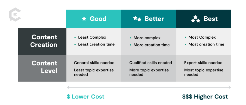
Impress your clients, co-workers, and leadership team with exceptional content for your next presentation, product demonstration, and more. If you need help getting your message across in a succinct, attention-grabbing, and persuasive way, talk to one of our content specialists today.
Stay in the know.
We will keep you up-to-date with all the content marketing news and resources. You will be a content expert in no time. Sign up for our free newsletter.

Business Case

How to Measure Success in Content Distribution: Essential Metrics and KPIs

The Ultimate Spring Cleaning Checklist for Your Freelance Business
- Content Production
- Build Your SEO
- Amplify Your Content
- For Agencies
Why ClearVoice
- Talent Network
- How It Works
- Freelance For Us
- Statement on AI
- Talk to a Specialist
Get Insights In Your Inbox
- Privacy Policy
- Terms of Service
- Intellectual Property Claims
- Data Collection Preferences
The Visual Medium Has a Message
How does the medium in which an image is rendered, its materiality, shape our perception of the subject matter?

What is the difference between a painting and a photograph?

The artist’s role as the creator of a painting is usually obvious. Even the most casual viewer recognizes the artist’s signature or the choices that must be made when putting paint on canvas. In contrast, many assume that photographs have an unshakeable veracity, that they capture the world exactly as it is. Yet, just as anyone who recognizes themselves in a family photograph can attest, photographs obscure or leave out just as much reality as they contain. As Alan Trachtenberg notes , “They are, we learn, vulnerable to exactly the same obscurities of other forms of evidence.”
The Medium Has a Message
Visual works, no matter what form they take, are subject to both the limitations and possibilities of their medium. Medium refers to what material a visual work is made of: the vehicle for an idea. This could refer to a general form, like sculpture or drawing, or a specific material, like marble or charcoal on paper.
By understanding how a visual medium shapes interpretations of a work’s subject matter, unique perspectives on the same subject begin to emerge, highlighted by the capabilities of different media or the expectations viewers bring to a medium.
Of Time and Space
Consider a photograph of a basketball player, mid-shot. Photography as a medium has the capability to freeze movement in time, to capture actions and interactions in a split second. Given this technical possibility, photography reflects a moment in a way that no other medium can. Yet this photograph is not a complete representation of basketball as a sport, this particular game, or even this specific moment on the court.
The photograph below, for example, seems to give a complete picture of the game: the viewer sees the ball, the players, the crowd, and the referee. Yet much is left out of the image, and hints of this can be found lurking everywhere. In the image itself, there are glimpses of what’s missing, like the shoes peaking up from the bottom of the frame that allude to someone just out of view. Most viewers see a player mid-layup and can infer what came before and after this moment in time, but a single photograph cannot truly capture this; it remains in the viewer’s imagination only.

Photography’s ability to create a visual representation of something is not as restricted or limited to a single visual truth about a moment as it may seem. The creator makes many choices that lead to this image. The photographer of the image above could have made any number of minor or significant changes that would have completely altered viewers’ perceptions of that moment. A photographer chooses what to include in the frame and what to leave out. They choose the moment when they release the shutter and capture an image. They choose how quickly the aperture closes, deciding what the balance between detail and movement will be.
In the image above, for example, the photographer captures nuanced details about the player’s interactions and expressions from the sweat glistening on the central player’s neck to the anticipation on his teammate’s face. An understanding of movement in this image comes not from the photograph actually capturing movement but from the viewer’s familiarity with what likely led to—and followed—the moment when these players found themselves mid-air.
This stands in contrast to the image below, in which the movement and urgency of the player’s actions are prioritized over capturing clear details. Rather than freezing motion in time to reflect minute details of the moment, the photographer of the image below made the choice to leave the camera shutter open just a bit longer. The resulting image represents movement and gives an emotional impression in a completely different way than the photograph above.

Other visual art forms, like painting, are not temporally bound. While both photographs and paintings are static and two-dimensional, painters can defy time and perspective to create a particular and deliberate visual impression.

The painting above, for example, may depict all the players in a single moment, just as a photograph would. Yet the medium allows the artist to show them improbably placed on a single plane, flattened and equal in size and importance. The basketball players are carefully positioned in a way that suggests movement, but this comes from their angled limbs and their music note-like positioning on the court. This stands in contrast to photography, where movement is inferred based on viewers’ understanding of the physical world and their expectations about how photography captures this.
The players in this painting are also viewed directly from the side, yet we see the court shrunken and upturned behind the figures. Paint provides the painter with opportunities to depict these basketball players in ways that photography and other mediums could not. Perspective can be manipulated and rhythm can be created through any medium, but paint makes possible this flat, multi-perspective depiction that emphasizes rhythm through contrast and repetition.
When visual experiences move into three dimensions, they communicate differently still. Unlike flat works, three-dimensional works like sculptures enter our space and interact with the physical world. They shift with the environment around them and reveal something new with each change in the viewer’s position. A photograph of a three-dimensional work can only capture one perspective of a sculpture in a single moment, but changes that emerge as one peeks around the corner or observes the sculpture over time can be easily imagined.

In the proposed sculpture above, viewers would experience basketball from an impossible perspective, one which changes with the viewers’ movements and the seasons. From this sketch the net and ball may be quickly recognizable, but consider the perspective of the tiny viewers depicted in the image. Claes Oldenberg’s proposed sculpture gives the viewer the perspective not of an audience member or a player but of the fingertips of a player, just as the ball makes it into the basket. Where a photograph might seek to elicit the excitement of the crowd in a viewer, this sculpture would instead excite a viewer with the energy that would course through a player’s fingertips as they brush the hoop. This is an experience that only large-scale, open-air sculpture could create.
Different still is the experience of installations, works that are difficult to define but generally create an experience for the viewer in a particular time or place. Like a sculpture, Xiuzhen Yin’s installation, Prize of Desire (Basketball) , can be viewed from many perspectives and with changing context.

Unlike sculpture, however, installations are not fixed or static. The basketball may roll, a shirt’s creases may settle. The viewer’s visual experience changes depending on time and place and, as with some installations, upon interaction with the items. Here, items like the basketball exist in the viewer’s world, at their scale.
A photograph allows the viewer to observe an image from exactly the perspective of the photographer, but an installation allows the creator to construct an environment in which the viewer has a singular, unique visual experience. A painting allows the viewer to experience many perspectives at once and share the painter’s impression of the subject, while a sculpture engages with a changing physical environment. Each provides a way to engage with the subject matter that another medium could not.
Consider the following images. Focus on what you can see and how the medium impacts your perception of the subject matter.
- What is unique about each depiction?
- How do you think the medium chosen impacts these unique features?
- How is your understanding of the subject enriched by each medium?
- What is each work able to convey through their medium that the others cannot?
Want to learn more about using close looking to explore images? Check out Cultivating the Art of Slow Looking .
Follow this “Learning to Look” column via RSS Feed .
Support JSTOR Daily! Join our new membership program on Patreon today.
JSTOR is a digital library for scholars, researchers, and students. JSTOR Daily readers can access the original research behind our articles for free on JSTOR.
Get Our Newsletter
Get your fix of JSTOR Daily’s best stories in your inbox each Thursday.
Privacy Policy Contact Us You may unsubscribe at any time by clicking on the provided link on any marketing message.
More Stories

- Going “Black to the Future”

- A Garden of Verses

- Make Your Own Poetry Anthology

- She’s All About That Bass
Recent Posts
- NASA’s Search for Life on Mars
Support JSTOR Daily
- More from M-W
- To save this word, you'll need to log in. Log In
presentation
Definition of presentation
- fairing [ British ]
- freebee
- largess
Examples of presentation in a Sentence
These examples are programmatically compiled from various online sources to illustrate current usage of the word 'presentation.' Any opinions expressed in the examples do not represent those of Merriam-Webster or its editors. Send us feedback about these examples.
Word History
15th century, in the meaning defined at sense 1a
Phrases Containing presentation
- breech presentation
Dictionary Entries Near presentation
present arms
presentation copy
Cite this Entry
“Presentation.” Merriam-Webster.com Dictionary , Merriam-Webster, https://www.merriam-webster.com/dictionary/presentation. Accessed 4 Apr. 2024.
Kids Definition
Kids definition of presentation, medical definition, medical definition of presentation, more from merriam-webster on presentation.
Nglish: Translation of presentation for Spanish Speakers
Britannica English: Translation of presentation for Arabic Speakers
Britannica.com: Encyclopedia article about presentation
Subscribe to America's largest dictionary and get thousands more definitions and advanced search—ad free!

Can you solve 4 words at once?
Word of the day.
See Definitions and Examples »
Get Word of the Day daily email!
Popular in Grammar & Usage
The tangled history of 'it's' and 'its', more commonly misspelled words, why does english have so many silent letters, your vs. you're: how to use them correctly, every letter is silent, sometimes: a-z list of examples, popular in wordplay, the words of the week - mar. 29, 10 scrabble words without any vowels, 12 more bird names that sound like insults (and sometimes are), 8 uncommon words related to love, 9 superb owl words, games & quizzes.

- Cambridge Dictionary +Plus
Meaning of medium in English
Your browser doesn't support HTML5 audio
medium adjective ( MIDDLE )
- My hairdryer has three settings - high, medium and low .
- I take a medium size in clothes .
- He earns a medium amount of money .
- Cook the sauce over a medium heat .
- Chop one medium carrot .
You can also find related words, phrases, and synonyms in the topics:
medium adjective ( MEAT )
- baking parchment
- deep fat fryer
- warm (someone/something) up
medium noun [C] ( METHOD )
- editorially
- mainstream media
- media event
- non-broadcast
- the Fourth Estate
- the mass media
medium noun [C] ( PERSON )
- clairvoyant
- escapologist
- ghostbuster
- illusionist
- witch doctor
medium noun [C] ( SUBSTANCE )
- be neither one thing nor the other idiom
- blend in/blend into something
- homogeneous mixture
- saturated solution
medium | American Dictionary
Medium adjective [not gradable] ( average ), medium noun [c] ( material/substance ), medium | business english, examples of medium, collocations with medium.
These are words often used in combination with medium .
Click on a collocation to see more examples of it.
Translations of medium
Get a quick, free translation!

Word of the Day
cloak-and-dagger
used to describe an exciting story involving secrets and mystery, often about spies, or something that makes you think of this

Shoots, blooms and blossom: talking about plants

Learn more with +Plus
- Recent and Recommended {{#preferredDictionaries}} {{name}} {{/preferredDictionaries}}
- Definitions Clear explanations of natural written and spoken English English Learner’s Dictionary Essential British English Essential American English
- Grammar and thesaurus Usage explanations of natural written and spoken English Grammar Thesaurus
- Pronunciation British and American pronunciations with audio English Pronunciation
- English–Chinese (Simplified) Chinese (Simplified)–English
- English–Chinese (Traditional) Chinese (Traditional)–English
- English–Dutch Dutch–English
- English–French French–English
- English–German German–English
- English–Indonesian Indonesian–English
- English–Italian Italian–English
- English–Japanese Japanese–English
- English–Norwegian Norwegian–English
- English–Polish Polish–English
- English–Portuguese Portuguese–English
- English–Spanish Spanish–English
- English–Swedish Swedish–English
- Dictionary +Plus Word Lists
- medium (MIDDLE)
- medium (MEAT)
- medium (METHOD)
- medium (PERSON)
- medium (SUBSTANCE)
- medium (AVERAGE)
- medium (MATERIAL/SUBSTANCE)
- Business Noun Adjective
- Collocations
- Translations
- All translations
Add medium to one of your lists below, or create a new one.
{{message}}
Something went wrong.
There was a problem sending your report.
What is Good Friday? What the holy day means for Christians around the world

Christians around the world observe Good Friday two days before Easter, but what is it, and why do they commemorate the holy day?
The holiday is part of Holy Week, which leads up to Easter Sunday. Palm Sunday kicks off the series of Christian holy days that commemorate the Crucifixion and celebrate Jesus Christ's resurrection.
"Good Friday has been, for centuries now, the heart of the Christian message because it is through the death of Jesus Christ that Christians believe that we have been forgiven of our sins," Daniel Alvarez, an associate teaching professor of religious studies at Florida International University, told USA TODAY.
What is Holy Saturday? What the day before Easter means for Christians around the world
When is Good Friday?
Good Friday is always the Friday before Easter. It's the second-to-last day of Holy Week.
In 2024, Good Friday will fall on March 29.
What is Good Friday?
Good Friday is the day Christ was sacrificed on the cross. According to Britannica , it is a day for "sorrow, penance, and fasting."
"Good Friday is part of something else," Gabriel Radle, an assistant professor of theology at the University of Notre Dame, previously told USA TODAY. "It's its own thing, but it's also part of something bigger."
Are Good Friday and Passover related?
Alvarez says that Good Friday is directly related to the Jewish holiday, Passover.
Passover , or Pesach, is a major Jewish holiday that celebrates the Israelites’ exodus from Egypt.
"The whole Christian idea of atoning for sin, that Jesus is our atonement, is strictly derived from the Jewish Passover tradition," said Alvarez.
How is that possible?
According to the professor, Passover celebrates the day the "Angel of Death" passed over the homes of Israelites who were enslaved by the Egyptians. He said that the Bible states when the exodus happened, families were told to paint their doors with lamb's blood so that God would spare the lives of their firstborn sons.
Alvarez says this is why Christians call Jesus the "lamb of God." He adds that the symbolism of the "blood of the lamb" ties the two stories together and is why Christians believe God sacrificed his firstborn son. Because, through his blood, humanity is protected from the "wrath of a righteous God that cannot tolerate sin."
He adds that the stories of the exodus and the Crucifixion not only further tie the stories together but also emphasize just how powerful the sacrifice of the firstborn and the shedding of blood are in religion.
"Jesus is the firstborn, so the whole idea of the death of the firstborn is crucial," said Alvarez.
He adds that the sacrifice of the firstborn, specifically a firstborn son, comes from an ancient and "primitive" idea that the sacrifice unleashes "tremendous power that is able to fend off any kind of force, including the wrath of God."
Why Is Good Friday so somber?
Alavarez says people might think this holiday is more depressing or sad than others because of how Catholics commemorate the Crucifixion.
"I think [it's] to a level that some people might think is morbid," said Alvarez.
He said Catholics not only meditate on Jesus' death, but primarily focus on the suffering he faced in the events that led up to his Crucifixion. That's what makes it such a mournful day for people.
But, the professor says that Jesus' suffering in crucial to Christianity as a whole.
"The suffering of Christ is central to the four Gospels," said Alvarez. "Everything else is incidental."
According to the professor, statues that use blood to emphasize the way Jesus and Catholic saints suffered is very common in Spanish and Hispanic Countries, but not as prevalent in American churches.
Do you fast on Good Friday?
Father Dustin Dought, the executive director of the Secretariat of Divine Worship of the United States Conference of Catholic Bishops, previously told USA TODAY that Good Friday and Ash Wednesday are the two days in the year that Roman Catholics are obliged to fast.
"This practice is a way of emptying ourselves so that we can be filled with God," said Dought.
What do you eat on Good Friday?
Many Catholics do not eat meat on any Friday during Lent. Anything with flesh is off-limits. Dought says this practice is to honor the way Jesus sacrificed his flesh on Good Friday.
Meat that is off limits includes:
Instead, many Catholics will eat fish. According to the Marine Stewardship Council , this is allowed because fish is considered to be a different type of flesh.
Contributing: Jordan Mendoza ; USA TODAY
IMAGES
VIDEO
COMMENTS
One-Way Presentation: In this format, the presenter speaks, and the audience listens without interruption. Communication flows from the presenter to the audience, with no expectation for questions or comments. TED talks and keynote speeches are prime examples of one-way presentations. Two-Way Presentation: Here, the presenter leads the ...
Introduction. How do the characteristics of a communication medium affect its messages? This question has been the subject of much philosophical and empirical inquiry, with some (e.g., []) claiming that the medium determines the message ("the medium is the message"), others (e.g., []) claiming that characteristics of a medium affect the message, and others claiming that the medium and ...
Introduction. How do the characteristics of a communication medium affect its messages? This question has been the subject of much philosophical and empirical inquiry, with some (e.g., []) claiming that the medium determines the message ("the medium is the message"), others (e.g., []) claiming that characteristics of a medium affect the message, and others claiming that the medium and ...
2. Know your audience. 3. Match your context. 4. Balance your content. 5. Here's what else to consider. Choosing the right visual medium for your presentation can make a huge difference in how ...
Despite the prevalence of PowerPoint in professional and educational presentations, surprisingly little is known about how effective such presentations are. All else being equal, are PowerPoint presentations better than purely oral presentations or those that use alternative software tools? To address this question we recreated a real-world business scenario in which individuals presented to a ...
Here are a few tips for business professionals who want to move from being good speakers to great ones: be concise (the fewer words, the better); never use bullet points (photos and images paired ...
Medium. Medium refers to the method you use to relay your communication. Media for professional communications include face to face, email, social media, written documents, PowerPoint presentations, websites, and more. Some media are richer in terms of the types of communication they support. For example, face-to-face communication supports ...
Always keep your audience in mind, and adjust the language based on them. At the end of the day, people don't want to waste their time. They want to contribute. They want to feel their ideas and ...
Participants (playing the role of the presenter) were randomly assigned to create PowerPoint, Prezi, or oral presentations, and then actually delivered the presentation live to other participants (playing the role of corporate executives). Across two experiments and on a variety of dimensions, participants evaluated PowerPoint presentations ...
Does a presentation's medium affect its message? PowerPoint, Prezi, and oral presentations ... There is a need to define the use of ESP, by assaying their application and simultaneously develop other pedagogical ways of teaching, whose articulation can make the student's role more active and pertinent, and enable the feedback to the student ...
1. Face-to-face communication. One of the most common types of communication in the workplace is face-to-face communication. This involves direct communication between two or more people, usually in conversation with one another. It can also include nonconversational, in-person communication, like a speaker presenting at a conference with an ...
Presentation skills are the abilities and qualities necessary for creating and delivering a compelling presentation that effectively communicates information and ideas. They encompass what you say, how you structure it, and the materials you include to support what you say, such as slides, videos, or images. You'll make presentations at various ...
A multimedia presentation is a computer-based presentation that uses various forms of media to effectively communicate and engage an audience. In today's fast-paced world, multimedia presentations have emerged as one of the most powerful and impactful means of communication.
Quick Read. Using different types of presentations helps you to adapt to different settings, improves audience interest and response, enhances the quality of presentations and increases the likelihood of recognition and promotion. The different types of presentations include; Educational, Instructional, Motivational, Persuasive and Problem ...
It represents a medium facilitating the seamless transfer of information between locations. Multimedia encompasses the computer-assisted integration of various elements like text, drawings, still and moving images (videos), graphics, audio, animation, and other forms of media [1]. ... Define Presentation Objectives. The goals and objectives of ...
A media presentation is a presentation that provides information to an audience in the form of a single type of media, such as visual media in the form of print, charts, tables, or graphs. Media ...
Knowing your audience. You probably wouldn't speak to your lecturer the same way you speak to your friends. Delivering a presentation is the same; you need to tailor the tone, style and content ...
Data scientist. This presentation style uses facts, data, analysis and statistics to explain and expand upon talking points. A data scientist style helps speakers prove a point and persuade their audience. If you're giving a presentation on a subject that needs more facts and data to support it, this style may be a good choice.
Any company that has a pitch deck, executive summary, sales presentation, or any kind of internal document that can be repurposed into external-facing content pieces — without pain. Presentation Examples - Short Form. Presentation Examples - Standard Form. Presentation Examples - Long Form. Understanding Content Quality in Examples
Medium refers to what material a visual work is made of: the vehicle for an idea. This could refer to a general form, like sculpture or drawing, or a specific material, like marble or charcoal on paper. By understanding how a visual medium shapes interpretations of a work's subject matter, unique perspectives on the same subject begin to ...
medium: [noun] something in a middle position. a middle condition or degree : mean.
presentation: [noun] the act of presenting. the act, power, or privilege especially of a patron of applying to the bishop or ordinary for instituting someone into a benefice.
MEDIUM definition: 1. being in the middle between an upper and lower amount, size, degree, or value: 2. (of meat…. Learn more.
What is Good Friday? Good Friday is the day Christ was sacrificed on the cross. According to Britannica, it is a day for "sorrow, penance, and fasting." "Good Friday is part of something else ...