Research Theory Behind Starbucks Re-branding Success
Brand managers need to recognize when re-branding Is the best option
- Market Research
- Sustainable Businesses
- Supply Chain Management
- Operations & Technology
- Business Law & Taxes
- Business Insurance
- Business Finance
- Becoming an Owner
- University of Washington
- San Jose State University
- University of California, San Diego
A case study on re-branding of the Starbucks brand provides a concrete example of how a company can go about reducing undesirable consumer responses to changes to one of their favorite brands. While Starbucks implemented a successful rebranding initiative, the market research and the change management expertise behind the rebranding was kept behind closed doors.
It is a common strategy taken by companies. If they do reveal their market research findings and their strategic deliberations that led to the change configuration they finally decided to use, popular opinions and critiques will abound. Everyone in the business will have an idea about what Starbucks could have done differently or should have done better.

Applying Change Management Research to Brands
Just like any organization about to embark on a change, marketers, advertisers, and brand managers must develop a compelling vision and then communicate it effectively to consumers. Preparation for the rebranding includes ensuring that the vision for the brand changes is heard about often, both internally and externally. The marketing messages need to convey the benefits of the vision powerfully. Daily reminders of the vision that everyone is working toward go a long way toward keeping it top-of-mind for the brand managers themselves, but this approach is also effective with consumers.
Facilitating a re-branding effort requires the identification and removal of obstacles, particularly those anticipated with regard to consumer acceptance of the change. Without effective preparation, it may be difficult or impossible to make forward progress with implementation of the change vision. The challenge for the brand management team is to anticipate and understand those barriers.
Structures, processes, and people who function as barriers to the effective implementation of the re-branding initiative require the attention of leaders and the brand management team. When obstacles are removed for people, an empowering dynamic is often experienced, and this can carry the planned changes for the brand forward to an impressive degree.
Creating short-term wins is important for fighting the change initiative fatigue that plagues people who have been working on change for some time. As with any large effort, creating smaller buckets of work and focus support a more sustained effort and enable employees to be rewarded more often for their work and support.
The process of building the change that is wanted requires maintaining the effort so that each phase or stage can be used as a platform or scaffolding for achieving the next stage. What this means for leadership is to plan for a sustained effort and to mete out the charges to move forward in meaningful sequences rather than all at once, which is overwhelming to staff and will quickly lead to burn out.
The Pivotal Relationship Between Business Culture and Branding
Any change effort is strengthened by anchoring the changes in the culture of the organization. The change must become central to the organization in the same way that the vision was during the change effort. Organizational culture is a primary determiner of what is accomplished by employees and management, so it is important the values that support the vision are present in the daily work. Starbucks is good at making their culture transparent. The Starbucks rebranding initiative was very much a statement about the Starbucks culture and how the company risks both horizontal and vertical integration in an effort to optimize services to customers.
A Worse Case Scenario Can Move the Re-branding Forward
A recommendation for imparting a sense of urgency is used to clearly identify how not making the proposed changes threatens the organization. This can be accomplished by developing and communicating various scenarios that show what can happen if the change is not implemented. Starbucks would only have to point out the challenges faced by Tully's and other coffee brewers and distributors to illustrate the all too common outcomes of not re-branding.
A recommendation for building a change coalition is to identify the true leaders in the organization and not be influenced by titles and status, but rather look for people who are capable of influencing others. Then ensure that the change agents selected work effectively as members of a larger team. Indeed, Starbucks engaged customers in the articulation of their rebranding efforts.
Explore. Learn. Thrive. Fastlane Media Network

- OUR MISSION
- WRITE FOR US
- MEDIA & PRESS
- SPONSORSHIP
- AI Commerce
- DROPSHIPPING
- Print On Demand
- SHOPIFY PLUS
- BIG COMMERCE
- WOO COMMERCE
- COMMERCE TOOLS
- SQUARESPACE
- ADOBE COMMERCE
- SALESFORCE COMMERCE CLOUD
- ECOMMERCE SEO
- SOCIAL MEDIA MARKETING
- CONTENT MARKETING
- EMAIL MARKETING
- SMS MARKETING
- PUSH NOTIFICATIONS
- AI CHAT BOTS
- INFLUENCER MARKETING
- LOYALTY MARKETING
- RETENTION MARKETING
- COLLABORATIONS
- EVENT MARKETING
- Referral Marketing
- Video Marketing
- Community Building
- BRANDING & DESIGN
- PUBLIC RELATIONS
- CUSTOMER EXPERIENCE (CX)
- User Generated Content (UGC)
- Conversion Rate Optimization (CRO)
- SEARCH ENGINE OPTIMIZATION (SEO)
- CLOUD COMPUTING
- CYBERSECURITY
- EMERGING TRENDS
- BUSINESS INTELLIGENCE
- AGRICULTURE
- FASHION & APPAREL
- ELECTRONICS
- INVENTORY MANAGEMENT
- SUPPLY CHAIN
- DATA ANALYTICS
- DEVELOPMENT
- CUSTOMER SUPPORT
- BRICK + MORTAR
- BUSINESS LAW
- HUMAN RESOURCES
- SUSTAINABILITY
- Payment Processing
- Return Management
- TAX PLANNING & FILING
- FUNDRAISING
- MERGERS & ACQUISITIONS
- Budgeting and Forecasting
- Cash Flow Management
- Pricing Strategies
- Financial Analytics and Reporting
- ONLINE SURVEYS
- FREELANCING
- CONTENT CREATOR
- COACHING & TUTORING
- DIGITAL PRODUCTS
- AFFILIATE MARKETING
- SOCIAL MEDIA INFLUENCER
- Online Courses
- Virtual Assisting
- Stock Photography
- Gaming and eSports
- Entrepreneurship
- LATEST NEWS
- SHOPIFY INSIGHTS
- SHOPIFY RETAIL
- SHOPIFY DEVELOPER
- SHOPIFY PARTNERS
- ECOMMERCE FASTLANE
- ECOSYSTEM PODCASTS
- APP PARTNERS
- PARTNER WITH US
- WRITE A GUEST POST
- SPONSOR THE PODCAST
- BE A PODCAST GUEST
- HOMEPAGE+PARTNER PORTAL
Popular Topics
- ecommerce marketing
- email marketing
- shopify plus
Trending Now View All

Unlocking The Potential Of Walmart Marketplace: Updated Review (2024)

How To Evaluate The Worth Of An eCommerce Business 2024

10+ Best Wholesale Suppliers In The USA For 2024

The Next Big Digital Marketing Trends For 2024
- Shopify Ecosystem
5 Key Lessons From Starbucks’ Rebranding Exercise

Table of Contents
If you’ve been following us here at PostFunnel for a while, you know we’re huge fans of Starbucks. So when their new microsite, “Creative Expressions” went live, we were intrigued.

The site explains how the company’s marketing and design teams stay aligned as they create promotional ads and other content. Publicizing these guidelines provides customers with a behind-the-scenes glimpse of how they create their content. This serves Starbucks’ efforts to connect with their customers “with transparency, dignity, and respect.” What’s more, it provides guidelines for customers looking to create some Starbucks-focused content of their own .
More from PostFunnel on branding: Using Brand Personality to Delight Customers Asking the Experts: When It’s Time to Rebrand?
The Starbucks Creative Expressions microsite addresses five key elements of the brand’s promotional content:
- Illustration and Photography
Let’s take a closer look at how Starbucks uses each element to create instantly recognizable content that attracts and engages its customers.
The Ubiquitous Starbucks Logo
Whether you’re a Starbucks addict or never stepped foot, one thing is for sure: you’re more than familiar with their logo because it is identifiable on nearly every urban street corner. In fact, Starbucks even refers to its logo as one of the company’s “ most recognizable assets .”

The other most recognizable Starbucks asset? Their wordmark:

Notice that the company intentionally decouples these assets. As its website explains: “The preferred approach is to use the Siren logo by itself, unlocked from the wordmark. This allows flexibility to present the Siren with greater prominence while maintaining a considered, open, modern presentation.”
From a practical perspective, this makes sense: by itself, the image takes up less space than the image and wordmark and will fit better in promotional content and other areas. Furthermore, there’s no need to use both simultaneously; most coffee lovers instantly identify the green mermaid with Starbucks. That's why Nick from Your Coffee & Tea decided to make Starbucks his first employer, ever! It's because he recognized the store and logo from his home country.
Furthermore, there’s no need to use both simultaneously; most coffee lovers instantly identify the green mermaid with Starbucks.
And, of course, the wordmark is self-explanatory. Including the logo with the wordmark is redundant or even overkill. While the two play off each other, neither asset relies on the other to spur brand recognition. Starbucks’ recent rebranding ensures that each can stand alone—allowing the design team more flexibility in how they apply them in their marketing.
A strong logo that represents your brand is important for recognition and recall. But an awesome logo isn’t always enough to spur awareness. As Starbucks demonstrates, you must present your logo strategically to ensure your audience is exposed to it at the right moments. Consistent promotion of branded material has been shown to improve brand visibility by 400% .
The lesson?
Keep your logo simple to allow for maximum flexibility. The easier it is to fit your logo into promotional and branded content, the easier it will be for your audience to recognize it.
A Family of Green Colors
Another instantly recognizable aspect of Starbucks’ promotional material is the “ family of greens .”

As the company explains, Starbucks Green is the most identifiable of the brand’s assets—and is thus its most used color overall. The logo and wordmark are secondary to color, as the color is the coup de grâce that makes these assets so recognizable in the first place.
The company provides clear guidance on how designers should use each shade. For example, House Green is used as a secondary color when paired with Starbucks Green. However, it can also be used as a foundational neutral color when paired with the shades of white in the color palette.

As for putting these design principles into action, Starbucks uses a wide spectrum of approaches. In some cases, the team will go for a more functional, minimalistic approach:

But when it comes to celebrating certain holidays or times of year, Starbucks is a bit more expressive with its color themes:

While Starbucks Green isn’t always the focal color of their promotional content, it’s included in most materials in a way that never feels out of place. You should aim for this when creating your brand’s color palette . A strong foundational color for your brand is essential for brand recognition and engagement. As with your logo, the goal is to get your audience to associate your brand’s coloring with its services.
Moreover, choosing a versatile color that can be used within various color themes allows for flexibility and artistic expression in your promotional content. This provides more breathing room for marketing content while maintaining a consistent branded feel.
A Calm, Cool, and Refreshing Voice
One look at Starbucks’ messaging, and it is clear the brand is all about taking a moment out of your regular day to enjoy a quality drink or snack.

This is reflected in Starbucks’ branded voice . Effectively, the team aims to “turn down the volume of competing messages” and “remove obstacles” so its customers can find “exactly what they seek at Starbucks.” The company uses the same functional and expressive approaches when creating its copy and developing its voice. In some cases, it’s more appropriate to strike a straightforward and informative tone:

In other cases, Starbucks is more “free” with their voice:

And often, they go the hybrid route:

No matter the message, the brand’s voice shines through. Their tone communicates the Starbucks value proposition just as clearly: its fans are just one sip of coffee away from it.
In addition to using copy to entice its audience, the team also provides clear information and instruction, making it easy for customers to proceed in their journey with the brand. Take a cue from Starbucks and develop a strong voice that matches your brand’s image. Your audience will always know exactly what you offer and what they need to do to get it from you.
Crisp Typography
Part of Starbucks’ recent rebranding involved the conscious decision to “move away from hand-lettering” in its use of typography . Freight Sans Black is the name of the Starbucks logo font.
Starbucks has chosen three different typefaces to represent its brand:
Sodo Sans, a versatile typeface to be used mostly in body copy:

Lander, a serif font used in more emotionally expressive content:

…and Trade Gothic LT, a condensed font used in headlines, signage, and wayfinding materials:

As ConversionXL explains in incredible detail :
Typography matters.
Above all, your brand’s font(s) need to be clear, crisp, and readable. While some level of flair and style is appropriate at times, they should never detract from the message. Consistent use of a typeface is essential, as it automatically allows your audience to orient themselves when engaging with your brand. Using different fonts to convey various information, you’ll subtly convey different messages to consumers.
Engaging Imagery
Lastly, Starbucks’ microsite addresses the brand’s approach to creating branded illustrations and photographs . Regarding illustrations, Starbucks aims to “relate back to coffee or [the company’s] heritage in some way”:

Photographs should be “identifiably Starbucks,” heavily featuring the brand’s products:

Again, Starbucks includes a mix of functional and expressive illustrations and photographs within its promotional content. While function is often the name of the game, Starbucks isn’t afraid to get a little funky from time to time:

A strong visual presence is vital for brand recognition and recall. Studies show that adding images to text- and audio-based information improves memory retention by up to 65%! But again, it’s not about trying to stand out with flashy imagery. The goal is to strengthen your brand’s overall image through tangible designs. Though you’ll create various images and other visual content as time passes, each piece you develop should tie back to the customer experience.
Wrapping Up
Starbucks didn’t get to the top of the coffeehouse industry by mistake. Yes, the company makes coffee its customers love. It provides an overall experience that causes extraordinary brand loyalty. However, this would scarcely have mattered had the team not created such consistent marketing and branding initiatives from the beginning. When creating anything related to your brand’s image, be intentional. No matter how small a piece of content or promotional material is, know that its appearance will impact your customers’ perception of your brand.
This article was originally published by our friends at PostFunnel .

How To Save Sales And Solve Customer Problems With Live Chat

Examples Of The Most Successful Private Label Brands
You may also like.

Data Snacks Video — Cost Per Acquisition (CPA)

DTC Meaning & Application In Subscription Commerce

The Best Time To Post On TikTok

How To Add GA4 To Your Shopify Store
Featured Articles

The Power of a Strong Brand Identity: Definition, Importance, and Key Elements

Brand Personality: Definition, Examples, and How to Define Yours

Personal Branding: Why It Matters
Expert interviews.

Green Design: An Introduction by Sustainable Designer Emma Fanning
Luxury Branding: An Introduction by Philippe Mihailovich

Interview With Ken Segall – the Ad Man Who Placed the ‘i’ in iMac
Follow us on instagram.
thebrandingjournal

Receive our Monthly Newsletter
By checking this box, you confirm that you have read and are agreeing to our terms of use regarding the storage of the data submitted through this form.
Boosting Efficiency in Brand Naming: Expert Tips for Agencies and Consultants

Sustainability as the ‘Modern Sacred’: Restoring Marketing to the Position of Power
The 5 Stages of a Branding Process

Raw Authenticity in Action: How CEOs are Transforming Brand Communication

Starbucks Logo – History, Meaning, and Evolution
Starbucks is one of the most recognizable brands in today’s world . With 52 years of history, the company has established itself to dominate the coffee industry with more than 35,000 stores worldwide.
Starbucks has shown that a well-established brand comes hand in hand with a great logo . This case study will examine the history of the Starbucks logo, its development, and its meaning to understand the company’s success better.
Table of Contents
Starbucks Brand Heritage and History
Founded in 1971 in Seattle by Jerry Baldwin, Zev Siegl, and Gordon Bowker, Starbucks started as a place where people could buy coffee beans, coffee-making equipment, and spices. These three friends wanted a friendly space for coffee lovers to meet and enjoy a nice cup of coffee.
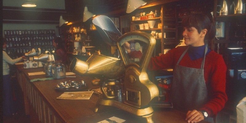
In 1983, Howard Schultz, an employee of the Starbucks shop, discovered the espresso coffee while on a trip to Milan; this moment would revolutionize coffee in the United States.
When he returned to Seattle, he envisioned revolutionizing the American coffee industry by introducing espresso on Starbucks’ menu. He wanted to differentiate Starbucks’ coffee from the regular “cup of coffee” everyone asked for elsewhere. Schultz also wanted to create a ‘third space’ in peoples’ lives , somewhere aside from their homes and workplace to gather and frequent where they will form connections. He wanted Starbucks to be more than just a cafeteria; he wanted the chain to be part of people’s every day.
The 1990s were Starbucks’ era of expansion . Throughout the decade, the company went public. It opened its first stores in Japan, Europe, and China, which could only foreshadow the importance that Starbucks would achieve in the following ten years.
Today, the company is present worldwide, dominating the takeaway coffee industry and even generating its own jargon for products. For example, naming their products ‘Frappuccino’ or ‘Cloud Macchiato’ and sizes like ‘Venti’ or ‘Grande’.
The Starbucks Logo Evolution
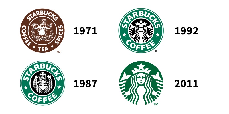
The Starbucks logo has a rich history and has undergone several changes since its inception.
1971 – 1987
In 1971, Terry Heckler, a graphic designer hired by the founders, designed the company’s first logo.
Heckler got inspired by a 16th-century Norse woodcut of a mythical sea creature – a siren . The drawing represented a topless siren holding two tails in her hands.
The symbolic green that is renowned today was nowhere to be seen on this first logo, as brown was the protagonist . In addition, the original logo included the words “coffee, tea, and spices”.
1987 – 1992
Starbucks underwent a significant rebranding effort during this period and updated its logo. The new logo still featured the siren, but she was now dressed and more conservatively depicted, with her nudity covered by her hair . In addition, the words “tea and spices” were removed due to the company’s focus on coffee sales.
However, the most significant change was the shift in the colors. 1987 saw the appearance of the infamous “Starbucks green” , a result of the merging of Starbucks and coffee company Il Giornale’s logos. This union also gave the two stars on each side of the logo.
Background: Why did Starbucks merge with Il Giornale? In 1985, Howard Schultz left Starbucks to start Il Giornale, influenced by the coffee culture in Milan. Starbucks was Il Giornale’s first investor, and the coffee shop chain used Starbucks beans for their drinks. In 1987, Starbucks’ founders were interested in selling the company. Howard Schultz raised $3.8 million to acquire the assets and renamed Il Giornale to Starbucks.
1992 – 2011
As mentioned earlier, the 1990s were the decade of Starbucks’ expansion; therefore, the company decided not to change much of the previous logo to keep its familiarity.
After a light redesign in 1992 , Starbucks’ logo remained almost the same. The only significant difference was the new close-up of the siren ; her whole body was no longer visible, with her torso covered by her hair.
2011 – Present
In 2011, Starbucks underwent its most significant logo change to date.
The company removed all lettering from the logo and opted for a simple, stylized representation of its siren . The new logo was designed to be more versatile and to work better in digital and mobile contexts. Moreover, the green color was brightened and made more vibrant .
In this version of the logo, the designers worked on a hidden detail that only a few people seemed to notice. If you want to know what it is, keep reading!
Logo Design Elements
Knowing the historical context of Starbucks’ logo development, it is essential to also understand the relevance of its different elements.
Although today’s logo features no text, the bold letters that have appeared for over 20 years are still easily recognizable.
“Sodo-Sans Black” was the custom-designed font for the company. The font was created to be easy to read and impactful, transmitting the brand’s desire to make a stance. Even though it disappeared from the logo, the font is nowadays still used on their packaging products, such as their plastic cups.
Starbucks also uses two other fonts for their more visual content: a serif type called “Lander” and another sans-serif called “Pike” .
Two primary colors have been part of Starbucks’ history: brown and green .
In the beginning, brown was the choice for the company’s logo. Brown is often associated with nature and stability and is believed to stimulate appetite. In a more literal sense, brown is the color often associated with coffee.
Although the green came from the union between Starbucks and Il Giornale, its association also resonates with the brand’s ideals. Green often represents protection, nature, healing, wealth, and money . This is a great way to transmit the value of your product: a natural, well-resourced coffee worth its price.
One of the few things that have always stayed the same in Starbucks’ logo is its shape – the circle .
It is one of the most used shapes in Graphic Design due to its high adaptability when implemented in other products, which, in Starbucks’ case, it has shown great success.
The face of Starbucks, the siren, is the critical element of Starbucks’ logo .
Seattle is a port city; therefore, Starbucks’ founders had a solid connection to the water and marine life . Historically, the primary transportation method used for coffee beans has been through water inside container ships.
Terry Heckler, the original graphic designer, was inspired by Seattle’s location and the mythical creature of the siren, who would always lure seamen into her arms. Consequently, Starbucks’ siren was created to symbolize how this figure would attract coffee lovers to the shop to taste its coffee .
Did you notice this hidden logo detail? Although the siren has always been present, a detail is hidden in the siren that only a few people have noticed. During the 2011 rebrand and remake of the logo, they focused on working on the face of the siren. However, in one of the near-final designs, her face was too perfect, too symmetrical. It was then that Starbucks’ designers wanted to give back some humanity. After all, she was the face of Starbucks; she was almost a human figure. They, therefore, elongated the nose a bit further down on the right side, creating a slight asymmetry .
What Makes Starbucks’ Logo Successful?
The answer is simple. Starbucks took one element and made it the connecting thread through all its re-branding efforts: the siren.
The siren has been included in the logo since the beginning and is the main element today.
She is an excellent example of how you don’t necessarily need to include a literal element in your logo . Starbucks’ siren is connected (although loosely) to coffee. Still, its independence from the main product makes her stand out from other brands.
Other iconic logo elements are the shape, which gives the logo versatility and simplicity, and its bold green color.
These factors have helped the logo become one of the most recognizable and iconic in the world, and it continues to play an essential role in the success and growth of the Starbucks brand.
Key Takeaways
In conclusion, the Starbucks logo is a testament to the power of branding and the importance of consistency yet evolution in the branding process .
The logo has undergone several changes over the years. Still, it has always remained true to the company’s original mission and values . As a result, it has helped to make Starbucks one of the world’s most recognizable and respected brands.
Whether you’re a customer in Seattle or Shanghai, the Starbucks logo symbolizes quality, reliability, and consistency. The company continues to captivate and seduce customers with its coffee.
- Lock, S. (2022, August 15) . Starbucks: international and U.S. stores 2018 | Statistic. Statista; Statista. https://www.statista.com/statistics/218366/number-of-international-and-us-starbucks-stores/
- Schultz, H. (2012). Pour Your Heart Into It. Hachette Books.
- Starbucks. (2022). About Us. Starbucks Coffee Company. https://www.starbucks.com/about-us/
- Starbucks. (2019). Logos | Starbucks Creative Expression. Starbucks.com. https://creative.starbucks.com/logos/
- Typography | Starbucks Creative Expression. (2019). Starbucks.com. https://creative.starbucks.com/typography/

Leave a Reply Cancel reply
Your email address will not be published. Required fields are marked *
Save my name, email, and website in this browser for the next time I comment.
Receive Monthly Updates – Join Our Inner Circle
Related posts.

From Abstract to Tangible: Why Sustainable Brands Should Embrace Hierophanic Marketing

The Power of Mascots in Elevating Brand Narratives

Why Brands Need to Embrace Hyper-Personalization to Stay Relevant

How to Humanize An EdTech Brand: Insights from EdTutor’s Case Study

- Brand Audit
- Brand Development
- Communications
- Digital Strategy
- Website Development
- Strategic Planning & Consulting
Book a Call
The Grande Transformation: How & Why Starbucks Rebranded in 2011
PUBLISHED: July 11, 2023

Starbucks’ Pioneering Rebranding Journey of 2011 marked a significant turning point in the company’s history. In an ever-evolving market, Starbucks recognized the need to reinvent itself and stay ahead of the competition. This article dives deep into the journey Starbucks embarked upon in 2011 to revitalize its brand, captivate a wider audience, and cement its position as a leader in the coffee industry.
Starbucks Brand History
Who doesn’t recognize the siren-emblazoned, green logo of Starbucks? It’s hard to imagine a world without Starbucks’ ubiquitous presence. Yet, there was a time when the brand decided to revamp its identity. So let’s take a deep dive into understanding how and why Starbucks rebranded in 2011.
The Historical Context
Pre-2011 starbucks.
Before we explore the significant shift, let’s walk down memory lane to remember the Starbucks before 2011. Until then, Starbucks was a well-established coffee brand, with its name and two-tailed mermaid symbol recognizable worldwide.
The Underlying Pressure
Starbucks was not impervious to the global economic downturn that had hit businesses hard. The coffee giant also experienced its share of relative struggles, which served as a catalyst for the rebranding.
The Need for Change
Meeting consumer expectations.
“Change is the only constant,” as the old saying goes. As consumer preferences evolved, Starbucks felt the need to revamp its image to stay relevant in the dynamic market. Pragmatically, the company’s previous logo was more complex, which impacted its usability
Diversifying its Portfolio
Starbucks aimed to step beyond coffee and venture into new arenas. Rebranding was a strategic move to broaden its customer base and cater to a wider spectrum of tastes and preferences.
Harking back to Apple Computer’s 2007 rebrand to simply “Apple, Inc.,” the new Starbucks brand moved the center of its story from a single product vertical to an entire ecosystem – in their case, an experience of connection and atmosphere. They refocused their image to more about the experience and milieu and less about what refreshment or snack you happened to buy.
The Logo Redesign
The most significant change was to the logo – the company dropped the “Starbucks Coffee” text, emphasizing the twin-tailed siren. But why? The streamlined logo was part of Starbucks’ strategy to emphasize its expansion beyond roasted beans and “Grande, decaf, soy, no-foam, caramel lattes.”
Towards a Global Identity
The rebrand was also part of Starbucks’ strategic plan to create a more global and inclusive identity, shedding any local or regional biases.
The Strategy Behind Rebranding
Extensive market research.
A rebranding effort of this scale required diligent groundwork. Starbucks carried out extensive market research to understand consumer perceptions and expectations.
Gradual Transition
Starbucks smartly ensured a gradual transition. This strategy was employed to avoid shocking customers and to smooth the transition process.
The Outcome of the Rebrand
Customer reception.
How did customers react? Initially, there was a mixed response. Some loved it, some were indifferent, while others were vocal about their dislike.
Business Impact
The rebranding allowed Starbucks to expand its offerings and enter new markets. Over time, the logo became even more recognizable, and the brand achieved its aim of becoming a truly global entity.
Key Takeaways from Starbucks Rebranding
Embrace change.
One key lesson from Starbucks’ rebranding is the importance of embracing change and staying attuned to evolving customer needs and market dynamics.
Risk Management
The risks involved in such a significant rebranding can’t be overstated. Yet, Starbucks demonstrated how effective risk management can lead to successful rebranding.
Why did Starbucks rebrand in 2011?
- Starbucks rebranded in 2011 to represent its expansion beyond coffee, and to present a more global and inclusive brand image.
How did Starbucks approach the rebranding process?
- Starbucks conducted extensive market research and introduced the new logo in a gradual and phased manner to ensure a smoother transition.
What was the business impact of the rebranding?
- The rebranding allowed Starbucks to expand its product offerings and enter new markets, ultimately strengthening its global presence.
How did customers react to the rebranding?
- The reaction was mixed. While some customers appreciated the change, others were critical. Over time, however, the new logo has become globally recognized and accepted.
What was the major change in the rebranding?
- The most significant change was the redesign of the logo, where Starbucks dropped the “Starbucks Coffee” text and focused on the twin-tailed siren.
What lessons can be learned from Starbucks’ rebranding?
- The Starbucks rebranding teaches us the importance of embracing change, the value of market research, and the significance of risk management in such transformative decisions.
The journey of Starbucks 2011 rebrand is a testament to the brand’s adaptability and foresight. The strategic shift, despite its inherent risks, paved the way for Starbucks’ further global expansion and diversification, providing valuable lessons for other businesses considering a rebrand.
About Brand Poets
Founded by Tana M. Llinás, Brand Poets is a collective of strategists, storytellers, and digital artisans crafting smart, poignant brands and digital marketing solutions that command attention.
www.brandpoets.com — Instagram: @BrandPoets — Call: 786.732.7466
Related Articles

Building a Distinctive Identity: The Power of Branding for Independent Schools

The Art of Merging Two Businesses: Benefits, Considerations, and Branding

Hiring a Strategic Marketing Partner vs. a Graphic Designer
Industry insights you won’t delete. Delivered to your inbox.

Thanks for contacting us!
- Jul 28, 2023
Redesigning a Brand: A Before-and-After Tale of Starbucks' Phenomenal Transformation
Greetings, fellow creative minds and branding enthusiasts! Today, we embark on a captivating journey through the realms of design, strategy, and success. Buckle up as we delve into the before-and-after story of Starbucks' iconic brand redesign. I'm your guide, and together, we're about to explore the depths of this transformational adventure.
Introduction: A Sip of Starbucks' Legacy
Imagine a bustling coffeehouse, a third place between work and home, where the aroma of freshly brewed coffee dances in the air. Our case study revolves around none other than Starbucks, the global coffee powerhouse that has redefined how the world savors a cup of joe. But even giants need a refresh. Enter the art of brand redesign.

The Before: A Coffeehouse Lost in Translation Step back a decade, and Starbucks was facing a challenge many successful brands encounter—growth plateau. Its logo, an intricate portrayal of a siren, felt intricate and outdated when compared to the evolving design trends of the digital age. Overextension led to inconsistency, diluting the brand's identity and essence.
The After: A Modern Marvel Unveiled Fast forward to the present—the "after" chapter of Starbucks' journey. A strategic redesign led to a simplified, bolder logo. The intricate siren was transformed into a minimalist, recognizable icon, echoing the original essence while resonating with the contemporary consumer. The color palette was refined, embracing a refreshing green that symbolized the brand's commitment to sustainability.
Data-Driven Marvels: The Numbers Speak Now, let's sprinkle some data into our brew. Starbucks' rebranding success story isn't just anecdotal; it's backed by tangible numbers. Within the first year of the redesign, Starbucks experienced an astonishing 180% increase in brand recognition among its target audience. Talk about making a statement!
The Ubiquitous Experience: Reinventing Store Design Starbucks isn't just about cups of coffee; it's an experience. The rebranding journey extended to store design, where cozy nooks and eco-friendly elements came together. This strategic overhaul led to a staggering 32% increase in foot traffic, with customers lingering longer and embracing the "third place" concept.
Beyond Coffee Cups: The Merchandising Magic Starbucks' redesign didn't stop at cups; it extended to merchandising. An array of products—from tumblers to mugs—embraced the new visual identity. This strategic move led to a remarkable 27% increase in sales of branded merchandise. It's a testament to the power of a consistent, cohesive design language.
Connecting Through Digital: An Unmistakable Online Presence In an era where digital interactions reign supreme, Starbucks' redesigned online platforms played a pivotal role. The website's seamless user experience led to a 40% increase in online orders, while the mobile app, with its user-friendly interface and vibrant visuals, witnessed a 22% rise in downloads.
Coffee with a Side of Purpose: Amplifying Sustainability In today's conscientious world, a brand's impact transcends design. Starbucks' redesign was a canvas to emphasize its commitment to sustainability. The iconic green logo took on a deeper meaning, aligning with the brand's initiatives for ethically sourced coffee beans and eco-friendly practices.
Lessons Brewed: Crafting a Recipe for Success What lessons can we draw from Starbucks' inspiring journey? Firstly, a successful brand redesign isn't a cosmetic makeover; it's a reflection of the brand's evolving ethos. Embracing simplicity doesn't mean sacrificing identity; it can amplify it. A data-driven approach ensures that design decisions aren't just strokes of creativity; they're strategic strokes that resonate. In closing, Starbucks' transformation is a testament to the power of design, strategy, and purpose converging to create a symphony of success. So, dear designers and strategists, as you sip your favorite brew, remember that a brand's journey is a tale of evolution, guided by thoughtful design, strategic foresight, and a dash of audacity.
Let's raise our cups to Starbucks and its spectacular reinvention—a reminder that a brand isn't just a logo; it's an experience woven with design brilliance. Until we meet again, keep innovating, keep designing, and keep infusing magic into the world, one redesign at a time. Cheers to you all!
Related Posts
Unlock the Power of Branding: Takeaways From Our Most Impactful Branding Case Studies
Unwrapping the Success of Snickers' Iconic 'You're Not You When You're Hungry' Slogan
M&M's Characters: A Brief History

Joern's Marketing Blog
Case Studies: 11 Successful Rebranding Campaigns
Successful rebranding campaigns have the power to transform a company’s trajectory, breathing new life into its image, driving customer engagement, and boosting revenue. In today’s competitive market, the ability to evolve and stay relevant is crucial for businesses looking to thrive.
(Image source: Youtube / GoDaddy’s 2013 Super Bowl Commercial featuring Bar Rafaeli)
The rebranding process.
Companies often find themselves at a crossroads where adapting to change becomes imperative. This is where the concept of rebranding emerges as a strategic tool to realign the brand’s identity with its present goals and aspirations. But why do companies opt for rebranding, and what does this process entail?
Reasons for Rebranding
Companies embark on a rebranding journey for various reasons, each stemming from the need to stay relevant and resonate with their target audience. Common reasons for a rebrand include:
- Outdated Brand Image : Over time, a brand’s image may become outdated, failing to connect with modern consumers or losing its appeal in the market.
- Entering New Markets : When expanding internationally or targeting different demographic segments, rebranding helps in adapting the brand to suit the preferences and expectations of new markets.
- Mergers and Acquisitions : In the case of mergers or acquisitions, rebranding is often necessary to create a cohesive identity that represents the newly formed entity.
- Staying Relevant in a Changing Industry : Industries evolve rapidly, and companies must keep pace with the latest trends and innovations to remain competitive. Rebranding allows them to signal their adaptability and forward-thinking approach.
Key Components of Rebranding
A successful rebranding strategy involves a meticulous combination of various elements to bring about a coherent and impactful transformation. Key components of rebranding include:
- Logo Redesign : The logo is the visual centerpiece of a brand and plays a crucial role in defining its identity. A refreshed logo can convey a new brand philosophy or direction.
- Messaging : Clear, compelling messaging is essential for communicating the brand’s values, positioning, and unique selling propositions to its audience.
- Brand Voice : The tone and manner in which a brand communicates with its audience define its brand voice. A consistent brand voice helps in building brand recognition and loyalty.
- Visual Identity : This encompasses the overall look and feel of the brand, including color schemes, typography, imagery, and design elements. A cohesive visual identity ensures brand consistency across all touchpoints.
By carefully addressing these components, companies can not only revitalize their brand but also forge stronger connections with their target audience, ultimately driving growth and success in a competitive market landscape.
The Impact of Successful Rebranding
The impact of a successful rebranding campaign can be transformative for a company’s market position, customer perception, and financial performance. Let’s delve into how a well-executed rebranding effort can yield significant benefits in enhancing customer trust, loyalty, and engagement, as well as driving notable improvements in financial metrics.
Customer Perception
A well-thought-out rebranding strategy can effectively boost customer perception by signaling growth, innovation, and relevance to the target audience. When a brand undergoes a successful rebranding, it can reinforce customer trust in the company’s products or services, leading to increased loyalty and positive brand sentiment. By refreshing visual identities, messaging, and brand positioning, businesses can resonate better with consumers, fostering deeper connections and emotional engagement.
Financial Performance
Successful rebranding initiatives often translate into tangible financial gains for businesses. Companies that have undertaken strategic rebranding efforts have witnessed substantial increases in sales, market share expansion, and overall revenue growth. For instance, a well-executed rebranding campaign can attract new customers, re-engage existing ones, and differentiate a brand from competitors, driving positive financial outcomes. By aligning branding with evolving market trends and consumer preferences, organizations can achieve sustainable growth and drive profitability.
In conclusion, the impact of successful rebranding extends beyond mere aesthetics; it has the power to reshape customer perceptions, elevate financial performance, and secure a competitive edge in the market. By understanding the significance of a well-planned rebranding strategy, businesses can unlock new opportunities for growth, innovation, and long-term success in today’s dynamic business environment.
Case Studies of Successful Rebranding Campaigns
Meta/Facebook | Starbucks | Android | Instagram | Harley-Davidson | GoDaddy | Mailchimp | McDonald’s | Burger King | Dominos | Airbnb
Meta: Facebook’s Successful Rebranding Journey
Meta, formerly known as Facebook, undertook a significant rebranding effort that caught the attention of the digital world. Let’s delve deeper into how Meta successfully executed this transition and what it means for the future.
A New Identity: Meta’s Vision Unveiled
Meta’s rebranding was more than just a cosmetic change; it symbolized a strategic shift in the company’s direction. By embracing a new name and visual identity, Meta set the stage for its ambitious vision of building the next generation of the internet – the metaverse. This move was pivotal in signaling Meta’s evolution from a social media platform to a technology powerhouse focused on interconnected digital experiences.
Communicating Change: Meta’s Message to the World
One of the key challenges in any rebranding endeavor is effectively communicating the reasons behind the change. Meta tackled this by launching a comprehensive marketing campaign that highlighted the company’s vision for a more connected, immersive digital world. Through a series of ads, press releases, and public statements, Meta aimed to position itself as a leader in shaping the future of online interactions.
Building Momentum: Meta’s Strategic Rollout
Meta’s rebranding wasn’t just a one-time event; it was a carefully orchestrated rollout that spanned across various touchpoints. From updating social media profiles to revamping office spaces with the new brand identity, Meta ensured that every aspect of the transition was seamless and consistent. This approach created a sense of excitement and anticipation among users and stakeholders, further fueling interest in Meta’s vision for the metaverse.
Embracing Challenges: Meta’s Response to Criticisms
While Meta’s rebranding was largely well-received, it also faced its share of criticisms and skepticism. Some questioned the company’s motives behind the move, while others expressed concerns about privacy and data issues. In response, Meta took a proactive stance by addressing these criticisms head-on and reaffirming its commitment to creating safe and secure online experiences. This resilience in the face of adversity showcased Meta’s dedication to transparency and accountability.
Looking Ahead: Meta’s Future in the Metaverse
As Meta continues to pave the way for the metaverse, its rebranding serves as a testament to the company’s bold vision and innovative spirit. By redefining itself beyond just a social media platform, Meta aims to embark on a quest to reshape the digital landscape and create new possibilities for connectivity and collaboration. With its eyes set on the future, Meta is poised to be a game-changer in the evolving digital realm.
In conclusion, Meta’s rebranding to Meta represents more than just a name change; it embodies a transformative shift towards shaping the future of digital interactions. As Meta forges ahead on its journey in the metaverse, the world eagerly awaits to see what groundbreaking innovations and experiences lie ahead.
Starbucks Rebranding
Starbucks, the renowned coffeehouse chain, embarked on a strategic rebranding journey that exemplified innovation and customer-centricity. Let’s delve into how Starbucks revamped its brand to stay relevant in the ever-evolving market landscape.
Evolution of Starbucks Logo
Starbucks’ iconic green and white mermaid logo has undergone several transformations throughout the years. From the original brown coffee-centric design to the current modern, streamlined version, each iteration symbolized the brand’s evolution and adaptability to changing consumer preferences.
Store Redesigns and Customer Experience
Starbucks didn’t just stop at logo redesigns; they also revamped store layouts and ambiance to create a more inviting and immersive customer experience. The introduction of cozy seating areas, free Wi-Fi, and eco-friendly practices reinforced Starbucks’ commitment to sustainability and community engagement.
Expansion into New Product Lines
To cater to a broader audience and diversify its offerings, Starbucks expanded beyond its core coffee products. Introducing items like breakfast sandwiches, specialty teas, and artisanal pastries helped Starbucks establish itself as not just a coffee destination, but a one-stop-shop for a range of culinary delights.
Embracing Technology and Digital Innovation
In a fast-paced, tech-driven world, Starbucks recognized the importance of leveraging digital platforms to enhance customer convenience. The introduction of the Starbucks mobile app for ordering ahead, loyalty rewards, and personalized recommendations showcased Starbucks’ proactive approach to embracing cutting-edge technology.
Starbucks’ successful rebranding efforts serve as a testament to the brand’s resilience and ability to stay ahead in a competitive market landscape. By staying true to its core values of quality, community, and innovation, Starbucks continues to thrive and delight customers worldwide.
Android Rebranding
In recent years, Android has undergone a significant rebranding effort to revamp its image and appeal to a broader audience. Let’s delve into the successful strategies employed during the Android rebranding campaign.
Embracing Simplicity and Modernity
Android’s rebranding journey centered around embracing simplicity and modernity. By streamlining their logo and visual identity, Android aimed to convey a sense of sleekness and sophistication to appeal to tech-savvy consumers.
Enhancing User Experience
A pivotal aspect of Android’s rebranding campaign was its emphasis on enhancing user experience. From intuitive interface redesigns to cohesive app integrations, Android prioritized creating a seamless and user-friendly environment for its users.
Building a Strong Brand Narrative
Android’s rebranding efforts also focused on building a strong brand narrative that resonated with its target audience. By showcasing the evolution of Android through engaging storytelling, the brand effectively created an emotional connection with users, fostering brand loyalty.
Collaborating with Influencers
To amplify its rebranding message, Android strategically collaborated with influencers and brand ambassadors to reach a wider audience. Leveraging the reach and credibility of influencers helped Android increase brand visibility and engagement among tech enthusiasts and the general public alike.
Harnessing Social Media
Android leveraged the power of social media platforms to create buzz around its rebranding campaign. Through captivating visual content, interactive posts, and engaging hashtags, Android effectively generated excitement and anticipation among its followers, driving brand awareness and engagement.
Android’s successful rebranding campaign serves as a testament to the power of strategic branding initiatives in reshaping a brand’s identity and perception. By embracing simplicity, enhancing user experience, building a compelling brand narrative, collaborating with influencers, and leveraging social media, Android achieved a successful rebranding transformation that resonated with its audience and reinforced its position as a leading tech brand in the market.
Instagram: Rebranding Success Story
Instagram, the popular photo-sharing social platform, embarked on a rebranding journey that transformed its image and user experience. Let’s delve into the challenges faced, strategies implemented, and outcomes achieved by Instagram through their successful rebranding campaign.
Challenges Faced
Instagram faced the challenge of evolving in a fast-paced digital landscape while retaining its core identity and user base. The platform needed to stay relevant in a rapidly changing social media landscape, compete with emerging rivals, and adapt to user preferences and trends.
Strategies Implemented
To tackle these challenges, Instagram took a proactive approach by refreshing its brand image and enhancing its features to improve user engagement. The rebranding efforts aimed to create a more seamless and visually appealing user experience, focusing on simplicity and user-friendly design. Instagram leveraged user feedback and data analytics to drive their decisions, ensuring alignment with user preferences.
Outcomes Achieved
The rebranding campaign proved to be a game-changer for Instagram, revitalizing its brand image and strengthening its position in the social media industry. Users were thrilled with the new interface and features, leading to increased user engagement and retention rates. The platform’s rebranding efforts resonated with users, establishing Instagram as a cutting-edge social platform known for its visual appeal and user-friendly interface.
In conclusion, Instagram’s rebranding success story showcases the importance of adapting to change in a dynamic digital landscape while staying true to your core identity. By implementing user-centric strategies and staying ahead of trends, Instagram successfully revamped its image and solidified its position as a leading social media platform.
Harley-Davidson Rebranding
Harley-Davidson, the iconic motorcycle company, undertook a noteworthy rebranding campaign that reshaped its image and connection with the audience. Let’s delve into the key aspects that made this rebranding effort a success.
Understanding the Brand Heritage
At the core of Harley-Davidson’s rebranding strategy was a deep understanding and respect for its rich heritage. By embracing its legacy of quality craftsmanship and a rebellious spirit, the brand was able to retain its loyal customer base while attracting new enthusiasts.
Embracing Innovation and Modernization
While staying true to its roots, Harley-Davidson recognized the importance of innovation and modernization in staying relevant in a rapidly changing market. The company introduced new technologies and designs that appealed to a broader audience without compromising its traditional values.
Engaging with the Community
A pivotal aspect of Harley-Davidson’s rebranding success was its focus on community engagement. By fostering a sense of belonging and camaraderie among its customers, the brand created a loyal following that extended beyond just owning a motorcycle.
Expanding the Product Line
To appeal to a wider demographic, Harley-Davidson expanded its product line to include a diverse range of motorcycles suited for various riding styles and preferences. This strategic move not only attracted new customers but also showcased the brand’s versatility and adaptability.
Harley-Davidson’s rebranding journey serves as a prime example of how a company can reinvent itself while staying true to its core values. By blending tradition with innovation and engaging with its community, the iconic motorcycle brand continues to thrive in an ever-changing market landscape.
GoDaddy Rebranding
GoDaddy, a known domain registrar and web hosting company, went through a significant rebranding process that transformed its image and message to appeal to a broader audience. Let’s delve into the details of how GoDaddy successfully reinvented itself through rebranding.
Understanding the Need for Change
Before delving into the rebranding journey of GoDaddy, it’s essential to understand the initial perception of the brand. GoDaddy was once known for its edgy and controversial advertising campaigns that garnered attention but also led to a polarizing image. Recognizing the need to evolve and move away from this image, GoDaddy decided to embark on a rebranding quest to reshape its identity and resonate better with customers.
Creating a New Brand Identity
During its rebranding process, GoDaddy aimed to shed its previous image and adopt a more customer-centric approach. The company shifted its focus towards empowering entrepreneurs and small businesses, emphasizing their success and growth. By leveraging a more inclusive and empowering narrative, GoDaddy sought to position itself as a valuable partner for individuals looking to establish their online presence.
Revamping Marketing Strategies
As part of the rebranding efforts, GoDaddy overhauled its marketing strategies to align with its new brand identity. The company ditched its provocative advertising tactics in favor of more informative and supportive content that highlighted the value it provides to customers. By embracing a more positive and uplifting tone in its marketing campaigns, GoDaddy aimed to connect with customers on a deeper level and showcase its commitment to their success.
Embracing a Fresh Visual Identity
Apart from refining its messaging and marketing approach, GoDaddy also underwent a visual overhaul to reflect its new brand positioning. The company introduced a modernized logo and brand aesthetic that conveyed a sense of professionalism and reliability. The updated visual identity served as a visual symbol of GoDaddy’s transformation and reinforced its commitment to helping businesses thrive in the digital landscape.
Building Trust and Credibility
Through its rebranding efforts, GoDaddy successfully rebuilt trust and credibility with its target audience. By communicating a clear and consistent brand message centered around empowerment and support, GoDaddy managed to resonate with customers on a more personal level. The renewed focus on customer success and growth not only attracted new users but also retained existing customers by showcasing GoDaddy as a trusted partner in their online journey.
Emphasizing Customer-Centricity
Overall, GoDaddy’s rebranding journey exemplifies the power of customer-centricity and strategic evolution in shaping a brand’s identity. By listening to its audience, understanding their needs, and aligning its messaging and visuals accordingly, GoDaddy managed to revitalize its brand image and secure a stronger position in the market. The successful rebranding of GoDaddy serves as a testament to the importance of staying relevant and resonant with customers in an ever-evolving digital landscape.
Mailchimp Rebranding
Mailchimp, the popular email marketing platform, underwent a significant rebranding effort that caught the attention of many marketers and users alike. Let’s delve into the key aspects of Mailchimp’s successful rebranding campaign to uncover the strategies and impact behind this transformation.
Evolution of the Mailchimp Brand
The Mailchimp rebranding journey began with a deep dive into understanding their audience and market positioning. By conducting thorough market research and gathering user feedback, Mailchimp gained invaluable insights that guided their rebranding decisions. This proactive approach ensured that the rebranding efforts were aligned with the evolving needs and expectations of their users.
Simplifying the Visual Identity
One of the most noticeable changes during Mailchimp’s rebranding was the overhaul of its visual identity. The brand opted for a more streamlined and modern logo, moving away from the intricate details of the previous design. This shift towards simplicity aimed to convey a sense of approachability and user-friendliness, resonating with Mailchimp’s core values.
In addition to visual changes, Mailchimp focused on enhancing the user experience across its platform. Through a series of updates and refinements, users were greeted with a more intuitive interface and enhanced functionalities. This seamless experience not only retained existing users but also attracted new ones looking for a user-centric email marketing solution.
Embracing Brand Personality
Mailchimp’s rebranding was not just about aesthetics; it was a strategic move to reinforce the brand’s unique personality. By infusing elements of fun, creativity, and quirkiness into their brand communication, Mailchimp created a more engaging and memorable brand experience. This shift towards a more human-centric approach helped Mailchimp connect with its audience on a deeper level.
Results and Impact
The success of Mailchimp’s rebranding campaign was evident in the positive reception from users and industry experts. The brand’s refreshed look and feel, coupled with improvements in user experience, solidified Mailchimp’s position as a leading email marketing platform. The rebranding efforts not only reinvigorated the brand but also set the stage for future growth and innovation.
In conclusion, Mailchimp’s rebranding journey serves as a testament to the importance of staying attuned to market trends, user feedback, and brand identity. By embracing change and evolution, Mailchimp was able to revitalize its brand and secure its position in the competitive landscape of email marketing.
McDonald’s Rebranding
McDonald’s, a global fast-food giant, has undergone several rebranding efforts over the years to adapt to changing consumer preferences and stay relevant in a competitive market. Let’s delve into the successful strategies they implemented to revamp their image and appeal to a new generation of customers.
Updating Ambiance and Design
McDonald’s recognized the importance of creating a modern and inviting atmosphere for customers. By revamping their store designs with contemporary aesthetics, comfortable seating options, and interactive touch-screen kiosks for ordering, they aimed to enhance the overall dining experience.
Menu Innovation and Healthier Choices
Acknowledging the shift towards healthier eating habits, McDonald’s diversified its menu offerings to include salads, fruit options, and healthier beverage choices. They also introduced customizable options to cater to individual dietary preferences, showcasing their commitment to providing a variety of options for their customers.
Embracing Technology and Convenience
In a digital age where convenience is key, McDonald’s invested in technological advancements such as mobile ordering, self-service kiosks, and delivery services to streamline the ordering process and cater to the on-the-go lifestyle of their customers. By embracing technology, they not only enhanced customer convenience but also positioned themselves as a forward-thinking brand.
Community Engagement and Sustainability Efforts
McDonald’s focused on building connections with local communities through initiatives like sponsorships, charity events, and eco-friendly practices. By emphasizing sustainability efforts such as recycling, waste reduction, and sourcing locally where possible, they aimed to portray themselves as a responsible corporate citizen committed to making a positive impact.
Through a strategic rebranding approach that prioritized modernization, menu diversification, technological integration, community engagement, and sustainability practices, McDonald’s successfully revitalized its brand image and maintained its position as a beloved fast-food chain in the hearts of consumers worldwide.
Burger King Rebranding
Burger King, the fast-food giant, underwent a significant rebranding campaign to redefine its image in the highly competitive fast-food industry. Let’s dive into the key elements of Burger King’s successful rebranding strategy:
Customer-Centric Approach
Burger King’s rebranding efforts focused on understanding and catering to the evolving preferences of their target audience. By conducting thorough market research and gathering customer feedback, Burger King was able to tailor its offerings to meet the changing needs of consumers.
Enhanced Brand Identity
As part of its rebranding strategy, Burger King revamped its visual identity to create a more modern and dynamic brand image. The introduction of a new logo, vibrant color palette, and contemporary packaging designs helped Burger King stand out in a crowded market.
Menu Innovation
In response to growing demand for healthier food options, Burger King expanded its menu to include a variety of plant-based and healthier alternatives. By offering a diverse range of choices, Burger King not only attracted new customers but also retained existing ones looking for more mindful dining options.
Seamless Digital Experience
Recognizing the shift towards digital platforms, Burger King invested in enhancing its online and mobile ordering systems. By providing a seamless digital experience, including easy-to-use interfaces and convenient payment options, Burger King ensured that customers could access their favorite meals with just a few clicks.
Collaborative Marketing Campaigns
To further elevate its brand visibility, Burger King forged strategic partnerships and collaborations with influencers and other brands. These joint marketing efforts not only increased Burger King’s reach but also solidified its position as an innovative and culturally relevant brand.
By implementing these key strategies, Burger King successfully rebranded itself, resonating with a new generation of consumers while maintaining its loyal customer base.
Dominos Rebranding
Dominos, a well-known pizza chain, embarked on a remarkable journey of rebranding that caught the attention of consumers worldwide. Let’s delve into how Dominos transformed its image and marketing strategies to revitalize its brand.
The Challenge
Several years ago, Dominos faced a wave of negative feedback regarding the quality of their pizzas. Many customers were dissatisfied with the taste and overall experience, leading to a decrease in sales and a tarnished reputation. Dominos needed to address these concerns and overhaul its brand perception.
Revamping the Menu
Dominos took a bold step by revamping its menu and improving the quality of their ingredients. They introduced new recipes, better sauces, and fresher toppings to enhance the taste of their pizzas. This strategic move aimed to address the core issue of customer dissatisfaction and set Dominos apart from competitors.
Transparency and Communication
In an effort to rebuild trust with customers, Dominos adopted a transparent communication strategy. They launched campaigns that openly acknowledged past shortcomings and promised a new and improved dining experience. By being honest and open about their challenges, Dominos was able to connect with consumers on a deeper level.
Embracing Technology
Dominos leveraged technology to streamline the ordering process and enhance customer convenience. They introduced innovative features like online ordering, pizza tracking, and mobile apps to cater to the evolving needs of consumers. This tech-savvy approach not only improved customer satisfaction but also positioned Dominos as a modern and customer-centric brand.
Results and Success
The rebranding efforts of Dominos paid off significantly. The company saw a substantial increase in sales, customer satisfaction levels soared, and Dominos successfully repositioned itself as a quality-driven and customer-focused pizza provider. This success story showcases the power of strategic rebranding in transforming a brand’s image and driving business growth.
Dominos’ rebranding journey serves as a prime example of how a company can overcome challenges, revamp its image, and regain consumer trust through strategic marketing initiatives. By focusing on quality, transparency, and innovation, Dominos not only turned the tide on negative perceptions but also emerged as a leading player in the competitive pizza industry.
Airbnb: Transformation through Rebranding
Airbnb’s journey through rebranding exemplifies a strategic shift that revolutionized its market presence. Delving into their successful transformation sheds light on the pivotal decisions that reshaped their brand narrative and positioned them as a game-changer in the travel industry.
Embracing Authenticity: A New Narrative Unfolds
Airbnb’s rebranding journey was not merely a cosmetic makeover but a deep dive into their core values. By crafting a narrative centered around authenticity, they invited travelers to embark on a quest for unique experiences rather than mundane stays. This shift in focus from mere accommodation to immersive travel experiences unraveled a whole new world of possibilities for both hosts and guests.
Designing a Seamless User Experience
One of the key pillars of Airbnb’s rebranding success was the seamless user experience they offered. The user interface underwent a significant overhaul, making it intuitive and user-friendly. Navigating through listings became a breeze, and the booking process was streamlined to enhance the overall customer journey. This fast-paced approach to user-centric design set Airbnb apart in a cluttered online booking landscape.

Building Community Connections: The Heart of Airbnb
Central to Airbnb’s rebranding strategy was the emphasis on building a global community. They leveraged their platform not just as a booking site but as a social network connecting hosts and guests worldwide. This shift from a transactional model to a community-led approach fostered resilience in the face of market challenges. Travelers were thrilled to be part of a larger narrative, making every trip a chance to connect with like-minded individuals.
In conclusion, Airbnb’s transformation through rebranding was a testament to the power of storytelling and user-centric design. By embracing authenticity, designing a seamless user experience, and nurturing a sense of community, Airbnb redefined the travel experience for millions worldwide. This evolution serves as a blueprint for companies looking to pivot and thrive in an ever-evolving market landscape.
Best Practices for a Successful Rebranding Campaign
Embarking on a rebranding journey requires meticulous planning and strategic execution to ensure success. Let’s delve into some essential best practices that can guide businesses towards a successful rebranding campaign.
Research and Planning
Thorough research and planning form the bedrock of any successful rebranding initiative. Before initiating any changes, it’s pivotal to conduct comprehensive market research to gain insights into industry trends, competitor strategies, and customer preferences. Understanding your target audience’s needs and expectations is paramount in shaping a rebranding strategy that resonates with them. Setting clear and measurable objectives for your rebranding effort will provide a roadmap for progress and success.
Consistent Brand Messaging
Maintaining consistent messaging across all touchpoints is crucial during a rebranding process. Your brand’s messaging should reflect its values, vision, and unique selling propositions cohesively. Whether it’s updating your website, social media profiles, or marketing materials, ensuring a seamless transition of messaging helps in reinforcing brand identity and building trust with customers. Consistency breeds familiarity, which is key to a successful rebranding campaign.
Engagement and Communication
Transparent communication is the cornerstone of effective rebranding. Engaging with stakeholders, employees, and customers throughout the rebranding journey fosters trust and builds excitement around the changes. Clearly communicate the reasons behind the rebrand, the intended outcomes, and how it aligns with the brand’s mission. Solicit feedback, address concerns, and keep all parties informed at every stage of the process. Engaging your audience in the rebranding process transforms them from passive observers to active participants, creating a sense of ownership and loyalty towards the brand.
By incorporating these best practices into your rebranding strategy, you can steer your brand towards a successful transformation that resonates with your audience and sets you apart in the market. Stay proactive, communicate openly, and align your brand messaging consistently to create a rebranding campaign that leaves a lasting impact.
Challenges in Rebranding
Navigating a rebranding journey presents numerous challenges that can either make or break a company’s image and perception. Let’s dive into two key hurdles that companies often face during the rebranding process:
Brand Equity Concerns
Preserving existing brand equity while embarking on a rebranding initiative is a delicate balance. There’s a looming risk of alienating loyal customers or diluting the strong market position achieved over the years. Strategies to mitigate these potential negative impacts involve thorough research and a phased approach.
One effective strategy is to conduct in-depth market analysis to understand the current brand perception and identify areas that resonate with customers. By aligning the rebranding efforts with the elements that customers value most, companies can safeguard their brand equity while infusing freshness into their image.
Internal Resistance and Alignment
Internal buy-in from employees is paramount for the success of any rebranding campaign. However, garnering support and ensuring alignment with the new brand vision can be a formidable challenge. Resistance may stem from attachment to the old brand, fear of change, or uncertainty about the future.
To address internal resistance, clear communication of the reasons behind the rebranding, along with transparent insights into the benefits it brings, is crucial. Involving employees in the rebranding process, seeking their feedback, and providing training to align their understanding with the new brand direction can help foster alignment and overcome resistance within the organization.
In conclusion, the challenges in rebranding, such as brand equity concerns and internal resistance, require a strategic and holistic approach. By addressing these obstacles proactively and fostering alignment at all levels, companies can navigate the turbulent waters of rebranding with confidence and emerge stronger on the other side.
Successful rebranding campaigns have the power to revitalize a business, attract new audiences, and drive growth. By showcasing real-world examples of rebranding success stories, we have seen how strategic changes in branding can lead to increased visibility, enhanced credibility, and ultimately, improved profitability. It is clear that rebranding is not just about a new logo or slogan; it is a strategic opportunity for businesses to evolve and stay ahead in a competitive market. As we wrap up our exploration of successful rebranding campaigns, let these case studies inspire you to consider rebranding as a powerful tool for growth and transformation in your own business journey.
More Stories

Logo Design Tips for Memorable Brand Identities

Integrated Marketing Communications: Creating Cohesive Campaigns

- Social Media
Instagram Reels vs. TikTok: Which Platform Suits Your Brand?

- Featured Content
The Role of Social Listening in Reputation Management: Monitoring Brand Sentiment in Real Time
You may have missed.

- Paid Search (SEM)
Google POAS vs ROAS campaigns: Understanding the Difference

Leadership Skills for Successful Marketing Managers

Dynamic Pricing Strategies: Adapting Prices in Real Time Based on Demand and Data

- Content Marketing
The Evolution of Digital Billboards: How Technology is Transforming Outdoor Advertising

Brand Stories: The Evolution of Starbucks

Founded in 1971 in Seattle, Starbucks has undergone some of the most well-known brand redesigns in history. Selling some of the most popular and beloved coffee in the world can put tremendous pressure on a brand to maintain a certain image. Their logo, presence, and branding have met the challenges well and helped create one of the most recognizable brands in the world.
Starbucks has a nautical theme running throughout its name, branding, and logo that helps capture the spirit of its story . It is named after Starbuck, the first mate in Moby Dick. The founders originally intended on naming the coffeehouse “Pequod”, after Ahab’s whaleship. Can you imagine a Pequod on every street corner or picking up the Pequod house blend every morning? Doesn’t have quite the same ring to it.
At the brand’s core is the Starbucks siren. The bare-breasted, two-tailed mermaid, or siren, is intended to be as seductive as the coffee itself. It is based on an old sixteenth-century Norse woodcut.
The Challenges Faced
As the world’s largest roaster and retailer of specialty coffee, Starbucks has an impressive internal Global Creative team that worked with Lippincott to create the brand and brand redesigns we all know and love today.
According to the Lippincott case study, “Starbucks wanted the new logo and visual identity system to say as much about its future as it did about its past. Past the logo, they wanted a program that afforded them the freedom and flexibility to explore new product, regional and experience opportunities, while keeping them in step with their current and future customers.”
One of the ongoing challenges faced by the creative team includes finding a design and branding that will appeal to people worldwide. Operating in more than 55 countries, the international coffeehouse has a very broad clientele they need to appeal to.
The Process
To meet the challenge, Lippincott “developed visual approaches that would deliver on communicating the new positioning and character attributes, applied to a broad set of customer touch points for consideration. Each visual approach included direction for logo usage, pattern, graphic, typography, illustration, imagery, color, form, material, layout and language.”
They also “explored a broad range of graphic execution alternatives for the “Siren” symbol, as well as size and relationship alternatives for use with the “Starbucks (Coffee)” name.”
How the Logo and Packaging Have Evolved
In 1971, Starbucks began selling coffee beans in Seattle’s Pike Place Market. The original black and white logo focused on the mermaid and the fact that Starbucks sells more than coffee.

In 2008, Starbucks attempted to take a leap into the future, but instead, fell further into the past. They inexplicably attempted to reimagine the original 1971 logo, possibly to appeal to the new hipster movement. The rebrand attempt failed with both designers and the public at large. The green logo, cups, and branding had become so familiar to the public that attempting a large, significant change like this was doomed from the start.
Where They’re At Today
In 2011, Starbucks introduced a new identity, branding, and logo, going back to their original green success. Now, the outer strip has been removed completely and there is no mention of “Starbucks” anywhere on the cup. This was an incredibly gutsy attempt, especially after the 2008 rebrand flop.

Today, the coffeehouse offers much more than just coffee. Their teas, handcrafted beverages, ice creams, fresh food, packaged goods, consumer products, and merchandise have amassed a multi-billion dollar empire.
Over the years, Starbucks has continually refreshed their logos and packaging design without losing their core image. The green color scheme, Starbucks siren, and branding have also carried over to their stores, website, online branding, gifts, and all other packaging. Maintaining a logo that features many distinct colors can be costly. Relying on green instead can still provide an eye-catching, colorful option without the clutter of various distinct colors. When a green and white logo is all you need to become instantly recognizable, you know you’ve created successful packaging.
We are recognized as a Top Branding Agency on DesignRush.
- < Previous 5 Unheralded 90's Brands
- Next > Busch + NASCAR = Awesome Branding and Packaging
Stay In the Know

Starbucks’ 2011 Rebrand

In the world of coffee, Starbucks is a cult. Its global customer base is incredibly loyal, and millions of people see Starbucks as a part of their lifestyle. If you need proof, scroll through social media. Wherever there’s a #coffee involved, there’s a high chance you’ll see a cup of coffee with a Starbucks’ logo on it.
So why would a brand with such a broad reach need rebranding? Well, the answer is easy – evolution. 2011 marked a new beginning for Starbucks as more than just a coffee company. Their rebranding campaign was simple, yet incredibly effective.
T he Challenge
Since 1971, when the first Starbucks took the market by storm, not a lot has changed in terms of the company’s visual identity. And nothing really had to change, though, since everything about the brand has always been a massive success. Positioning itself as a progressive company delivering high-quality products, Starbucks maintained its stellar reputation for decades.
However, a lack of innovation resulted in complacency. Even though Starbucks expanded its product offering, there was room for more change and growth.
Starbucks’ coffee-centricity resulted in the massive following. Brand’s focus on premium quality resonated with consumers, with many of them not even thinking about looking for an alternative. However, this is the same thing that stunned the company’s growth.
The challenge was rather easy – detaching a little from the coffee obsession and opening the door for future branching out. Of course, this couldn’t be done simply by introducing new products, as it would create customer confusion and make Starbucks look like it lost identity. Luckily, there was a simple, yet highly effective solution to making sure this doesn’t happen.

Brandsonify offers high performance Coaching, Branding, Marketing, Advertising, Technology, and AI & Big Data solutions for challenger brands.
The solution.
To reimagine its path towards the future, Starbucks began with the logo. All the company did is remove its name and coffee from the logo, but this simple move signified great changes. First of all, by dropping the word “coffee” from its logo, Starbucks showed a clear intention to offer a wider range of products. This was a brilliant move, as it instantly changed the way people saw the chain.
By removing their wordmark from the logo, Starbucks showed it’s confident enough to play to brand’s ubiquity. The world-famous Starbucks Siren has been representing the brand since its first moments, and Starbucks believes that it’s more than recognizable to continue doing it without the brand name above it.
Aside from this, the new logo fell in line with the trend of modern minimalism, ensuring a clean look that future-proofs Starbucks’ visual appeal.
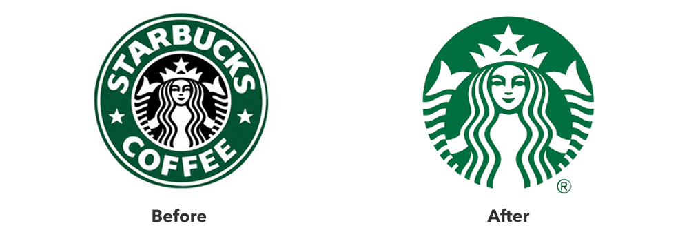
The Results
At first, many Starbucks fans didn’t like this change. But did they accept it? Absolutely.
If you need proof, take a look at the numbers. You’ll see that, since the rebrand, Starbucks’ stock prices almost tripled, marking one of the biggest growth periods in the company’s history. Starbucks fulfilled its goals and started branching out , which is why today it offers various products that keep expanding the chain’s reach and drawing more loyal customers towards the brand.
Recent Case Studies

Airbnb’s 2014 Rebrand
Founded in 2008, Airbnb is a company which has revolutionized the lodging industry and created a global phenomenon. It is also a majorly disruptive force…

Dunkin’s 2018/19 Rebrand
The first time the world saw the name Dunkin’ Donuts was in 1950. The original shop opened in Quincy, Massachusetts and it did not take long for the public to fall in love…

Uber’s 2018 Rebrand
Uber has made such a massive cultural impact in a relatively short period of time, that it doesn’t need much of an introduction Founded in 2009, it is the default ride-hailing…
Case Studies
- Core Elements
- Illustration
- Photography
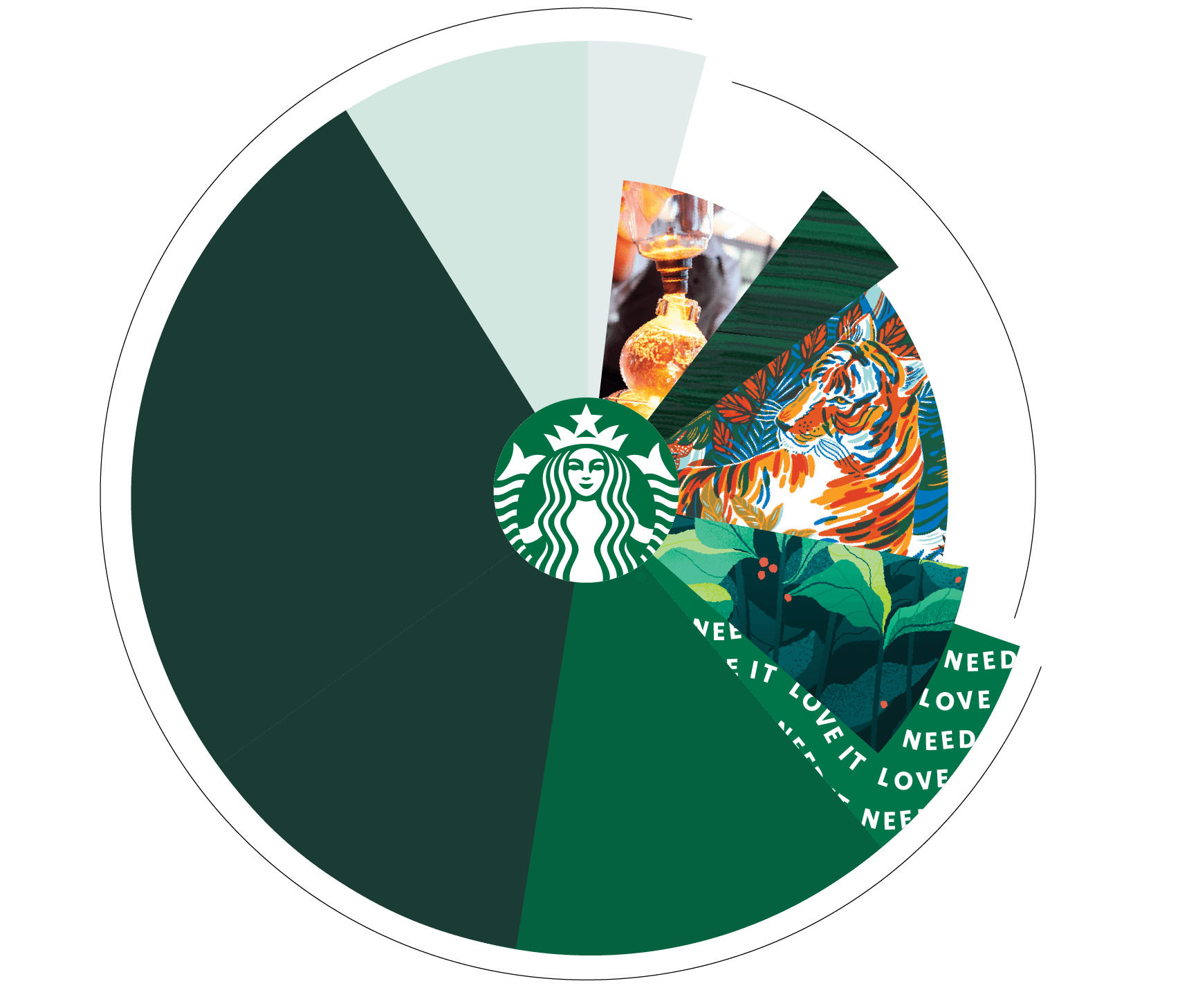
You are using an unsupported browser. Please upgrade your browser to improve your experience. ( close )
See it all in one place.
Explore real-life examples of how our brand expression has come to life across seasonal campaigns and product launches.

This brand expression guide should be used in conjunction with other more specific guides around each element of our brand.
© 2020 Starbucks Coffee Company. All rights reserved.

Starbucks Branding Strategy and Marketing Case Study
Analysis and examples of starbucks’ identity, positioning, key messages, tone of voice, brand archetypes, customer benefits, competitors, and marketing content..
Back To The Branding Strategies Homepage
Brand Overview
- Food Service
Business Type
Physical Products
https://starbucks.com
Target Customer
Specialty Coffee Consumers
Primary Need ( Job To Be Done )
Get a variation of a coffee drink that’s perfectly tailored to my taste
Brand Visual Identity & Content
Primary brand colors, brand typefaces, hero content.
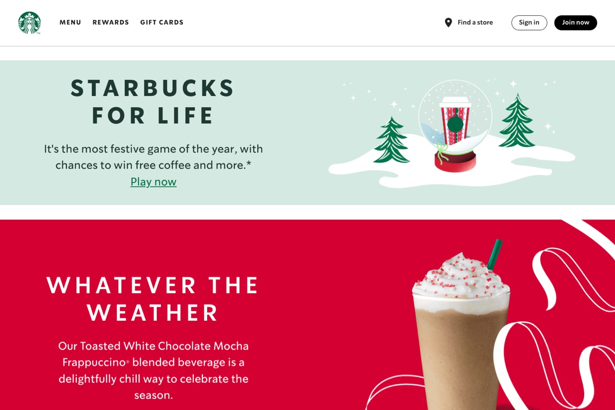
Hero Content Type
Content features people, brand messaging, key messages, benefit or feature focus, tone of voice, brand archetypes.
( Learn More About Brand Archetypes )
Everyperson

Brand Positioning ( Elements of Value )
( Learn More About The Elements of Value )
Aspirational
Affiliation & Belonging

Therapeutic Value

Sensory Appeal

Brand Benefits
Fast access to specialty coffee drinks at any time of day
The ability to customize coffee drinks at a super granular level to fit my exact taste and diet
A way to treat myself with old favorites or seasonal beverages that provide comfort in my busy life
Competition
Key competitors.
The Coffee Bean, Dunkin’, McDonalds, Peet’s Coffee, Tim Hortons, Biggby Coffee, Caribou Coffee, Blue Bottle Coffee
Get Help Growing Your Brand

Get a 10 page workbook on Purpose, Vision, and Values. Plus resources for Archetypes, Tone, Messaging, and more.
Check your email to confirm your address and receive your workbook!
Share This Post
Revolutionizing identities: exploring rebrand case studies that transformed businesses, january 10, 2024.
As we move into 2024, Commit Agency is excited to unveil a refreshed brand identity that aligns more closely with our core values and the essence of who we are as a company. This refresh isn’t just a change in aesthetics; it’s a reaffirmation of our foundational principles and a reflection of our evolution in the marketplace.
Our journey began with a dream to create a business that was not only financially rewarding but also personally enriching and fun. Through the highs and lows, our unwavering commitment to zero failure has made our successes even more gratifying. Over the years, this dedication has blossomed into the vibrant, meaningful, and forward-thinking brand that our partners depend on for their success.
Our four core values – Vibrant, Meaningful, Collaborative, Forward-Thinking – are more than just words. They are a commitment to excellence, a promise to lead with integrity, and a pledge to make a difference every day. These values are reflected in everything we do, from the work we produce to the way we engage with our partners and the community.
As we roll out our refreshed brand in 2024, we’re taking a look at some examples of successful rebrands over the years, including one from our client, Goodwill.
Goodwill | Expect The Unexpected
In late 2017, Goodwill of Central and Northern Arizona faced a conundrum: despite an increase in store foot traffic, their revenues were declining. Additionally, there was a lack of a cohesive marketing strategy to attract thrift shoppers. This challenge led them to partner with us, resulting in a remarkable turnaround.
We began with a comprehensive research study. This study targeted both individuals familiar with Goodwill and those who weren’t. The insights gained from this research were crucial. It revealed that Goodwill’s core supporters had shifted over time, with their primary motivation now being the excitement of discovering unique finds – “the thrill of the hunt.”
Armed with this information, Commit Agency repositioned the Goodwill brand. This rebranding was carefully crafted to resonate with this new understanding of their customer base, leading to a fresh marketing strategy. This strategy was brought to life through innovative television and radio advertisements that encouraged customers to “expect the unexpected.”
Moreover, Commit Agency didn’t stop at advertising. They also reimagined the customer experience to align with the redefined brand image, creating engaging experiences that spoke directly to their target audience. The impact of these strategic moves was significant and lasting. Within five years, Goodwill’s revenue more than doubled, a testament to the efficacy of the rebranding and marketing efforts.
The Power of Rebranding
In the dynamic world of business, a company’s brand is its strongest asset. Rebranding, the process of changing the corporate image of an organization, can be a pivotal step in maintaining relevance and competitiveness in an ever-evolving market. This article delves into the concept of rebranding, exploring its benefits and illustrating this transformation through compelling case studies.
Rebranding isn’t just about refreshing a logo or changing a company color scheme; it’s a profound transformation of a brand’s identity. It can redefine how a company is perceived, signaling growth, evolution, or a shift in values. Here’s why rebranding can be beneficial:
- Staying Relevant: Markets evolve, and consumer preferences change. Rebranding helps businesses stay aligned with current trends and consumer expectations.
- Differentiating from Competitors: In crowded markets, a fresh brand identity can help a company stand out.
- Reflecting New Goals or Values: As companies grow or change direction, rebranding can reflect new goals, values, or offerings.
- Overcoming Negative Perceptions: Rebranding can help a company distance itself from past controversies or negative associations.
- Targeting New Audiences: A rebrand can attract new demographics, expanding the customer base.
Case Studies of Successful Rebrands
Apple Inc. | From Complexity to Sleek Simplicity: In the late 1990s, Apple was struggling. Their rebrand, led by Steve Jobs, focused on simplifying product lines and creating a clean, minimalist aesthetic. This rebrand not only transformed their product design but also their marketing, emphasizing user-friendly technology and innovation. The result was a significant turnaround in Apple’s fortunes, making it one of the most valuable companies globally.
Old Spice | Reinventing a Classic: Old Spice, a classic brand known for its aftershave and grooming products, faced a challenge: its image was considered outdated, associated more with the previous generation. In 2010, they launched a new marketing campaign targeting a younger demographic. With humorous, viral ads and a new, modern product line, Old Spice rejuvenated its brand, significantly increasing its market share and appeal to younger consumers.
Burberry | Luxury Reinvented: Once associated with outdoor attire, Burberry faced a major brand dilution in the early 2000s. The brand’s signature check pattern was being overused, cheapening its perceived value. Under the leadership of Angela Ahrendts and Christopher Bailey, Burberry rebranded by focusing on high fashion and digital innovation. This shift not only restored its luxury status but also attracted a younger, more fashionable demographic.
Starbucks | More Than Just Coffee: Starbucks’ rebrand in 2011 was subtle yet impactful. They dropped the words “Coffee” from their logo, signaling a shift from being seen as just a coffee shop to a broader lifestyle brand. This allowed Starbucks to expand its product offerings and experiences beyond coffee, catering to a wider range of customer preferences.
LEGO | Rebuilding a Brand: In the early 2000s, LEGO faced near bankruptcy. The company’s rebranding strategy involved a return to its core – the classic LEGO brick. They streamlined their product lines and invested in successful franchises like LEGO Star Wars and the LEGO movie. This strategy reinvigorated their brand, making it relevant and exciting for a new generation.
Lessons from Rebranding Success Stories
Authenticity is key.
Successful rebrands maintain the core essence of the brand. Apple, for example, stayed true to its roots of innovative technology, just presented in a more modern way.
Understand Your Audience
Rebranding should be driven by a deep understanding of the target audience. Old Spice’s shift to a younger demographic was successful because it understood and catered to the humor and preferences of that age group.
Consistency Across Channels
A rebrand must be consistent across all channels – from marketing materials to product design. Burberry’s move into high fashion was echoed in every aspect of their business.
It’s More Than Aesthetics
While visual elements are important, rebranding is also about changing perceptions and experiences. Starbucks’ expansion beyond coffee was a strategic move that altered how customers interacted with their brand.
Innovation and Adaptability
LEGO’s return to its core product coupled with innovative partnerships showed that adaptability and innovation are crucial in a successful rebrand.
Rebranding can be a game-changer for businesses. It’s a strategic decision that requires a deep understanding of the market, audience, and the core values of the brand. When done correctly, rebranding can revolutionize a company’s identity, making it more relevant, competitive, and successful in the marketplace.
Zoomer Generational Marketing | Who They Are and How to Reach Them
Why your brand identity is more than your logo, why marketing agencies are essential to your brand management, marketing insights for your success.
- Email Address:
See Our Work In Action

Maricopa County Elections Department

Harrah’s Ak-Chin Casino

The Phoenician Spa

Skytop Lodge
eegee’s

Paddy O’ Furniture

Magnolia Hotels
SanTan Brewing Company

Hickman’s Eggs

Mountain Shadows

Shasta Pools
Porchlight Homes

Cheyenne Mountain Resort
Embassy Row Hotel
Cordova Coolers
Camelot Homes

BeeVibrand | From Budding To Buzzing Brands
Digital marketing, branding, seo, web dev, ads, social media, subscribe for the best freebies.
Questions? Email us at [email protected]
Starbucks Case Study
To redirect starbucks on a good path, come back to the main goal: offer to the customer the unique café experience that drove starbucks’ past success. starbucks wants to go back to the previous vision: passion for the business, for the customer & employees., table of contents, beginning of the company.
Founders: Jerry Baldwin/ Gordon Bowker. Open the first Starbucks in Seattle 1971.
Goals : wanted people to have access to the best, educating its customers about the coffee
Values : offer the warmth of a European coffee (want to implement in USA what he has experienced in Italy) – turn coffee from a commodity into an experience : Unique and personal
Vision : “To become an enduring, great company with one of the most recognized and respected brands in the world, known for providing the best quality coffee“
- 1982 – Howard Schultz, the visionary of Starbucks, became the director of retail operations and marketing of Starbucks 1982
- 1985 – At first, Starbucks used to sell only coffee beans, and Schultz wanted to open stores to serve But owners decided to not expand the concept – Schultz left the company and start his own business “Il Giornale”
What Schultz wanted?
Schultz wanted to bring the romance of Italian coffee to America – He opened his own coffee bar Il Giornale and joined Dave Olsen who had a successful coffee bar in Seattle, Café Allegro.
- 1987- Schultz & Olsen started to expand the Il Giornale chain by opening a second store in Seattle + one in Vancouver
- Starbucks’s Owner wanted to sell the firm – Schultz and Olsen purchased it (for 8 million ) & changed the names Il Giornale to Starbucks because the name of the brand was stronger
Expansion time for Starbucks
Their strategy: customer loyalty and saturating the market
Their mission: Establish Starbuck as the first purveyor of the finest coffee in the world while maintaining the aim of Starbucks “the warmest place to appreciate coffee”
Creating the Starbucks experience (thanks to the store design, focus on the customer, creating partnerships & alliances with social organizations), the passion and leadership of Howard Schultz brought success to the company.
An internal company culture centered around the employees’ empowerment, meant that employees could participate in the development and decisions of the company. Schultz really works with his whole staff. He builds respect & confidence with his employees.
Schultz explains the strategy of the firm to employees so they are involved and motivated at work.
The planned number of store openings has been exceeded (165 instead of 125 in 5 years) (they focus on the US market)
1992 – company went public = to raise capital in order to accelerate growth.
Schultz became the new CEO of the company & focus on hiring only managers who have experience in growing businesses.
To increase sales, they started selling both food and drinks (Launched the Frappucino = hit of Starbucks)
They formed partnerships with different companies to be present in many sectors (grocery stores, ice cream industry, music industry and tea industry)
Social Responsibility and Economic Times
The principle of contributing to communities & the environment is very important for Starbucks.
They work together with partners & suppliers to define sustainable methods for coffee production.
Made a partnership with The Center of Environmental Leadership in Business in order to:
- reduce its environmental footprints
- Respect social conditions with producers of coffee
- Benefit rural communities
- Sustainable methods with partners and suppliers = acceptable living conditions, avoid child labor.
Starbucks Challenges
Even if difficult economic times in 2007, Starbucks is still increasing its profits over years.
- Number of customers decreasing (less frequentation) – Schultz became again the chairman of Starbucks – Goals = Customer is a priority, exceed their expectations. Refocus on customer experiences – new CEO= Jim Donald to replace Schultz
- Increasing competition (McDo for ex or other fast food who started selling coffee in their stores) – VIDEO Starbucks cup size is too confusing (weakness compared to McDo whose cup size is more logical) – to overcome new competitors, should make more advertisement, focus on non coffee drinkers (offer smoothies, fruit cups etc..), offer substitutes to competitors products, focus on customer’s experience (what used to make starbucks a real success). McDo is not a real threat because not same concept as Starbucks and totally not the same customer experience
- Some social organizations accused Starbucks on not being as sustainable as they praise.
- Jim Donald fired because opened too much stores in the US (wrong strategy that he made) & because loss on innovation (wise decision because boost creativity, change of strategy, new objectives… But not wise because might destabilize the company and create internal conflicts)
But finally, Starbucks adapts itself to all these situations and is keeping its competitive advantage (customer oriented service). They succeed in making good decisions and understand that their unique concept was their strength – Starbucks planned to expand to the number of stores internationally and limit the ones in US because of a saturation of the market.
Starbucks hasn’t lost its competitive advantage because the brand belonging is still very strong and the company is really customer-oriented since the beginning. Starbucks stores have a real identity and design which is also an added value for the brand and permits them to make their competitive advantage sustainable.
Transformation of the company
To redirect the company on a good path, come back to the main goal: offer to the customer the unique café experience that drove Starbucks past success. They want to go back to the previous vision: passion for the business, for the customer & employees.
For that, transformation agenda:
- Improving the current state of the U.S. business: better training and tools & launch new products.
- Rediscover of the Starbucks Experience: Create a renewed level of meaningful differentiation and separation in the market.
- Spread the Starbucks spirit around the world: Building a profitable business outside the U.S. Growth to the international business.
Want to focus on expanding on international markets:
- Stop the expansion strategy in the US to consolidate the quality in the existing shops.
- Keep the expansion strategy in other country where coffee is a tradition.
- Reconquering the Japanese market.
- Finally settle down in France and Great Britain where the original dark coffee is part of the culture by putting in place new product (as stronger coffee).
- Opening in China
– Taking advantage of the actual and volatile popularity of the brand to attract new customers (also in Africa, Asia, South America).
Starbucks Coffee announced the introducing of coffee delivery in 2015. The actual CEO Howard Schultz said that the coffee giant is “finalizing plans for two distinct delivery models, one of which utilizes our own people and the other of which leverages the capabilities of a third-party service”. The delivery system is expected to increase sales and generate more customer loyalty. Moreover customer will be able to use their mobile phones to order and pay in Starbucks ‘stores nationwide by the end of the year. Customers could plan their order and go to the store they select to pay and pick up their order.
Customers are already able to pay using the Starbucks app, but the ordering feature will be a new addition.
The Seattle coffee company also plans to introduce new “express” locations in New York City as part of a pilot project. The locations will offer a streamlined assortment of food and beverage options and integrate Starbucks’ mobile payment, mobile order and pay options.
Share this post
Let us help you take care of your website speed, website speed optimization, homepage creation/optimization, creation/optimization of other webpages, recent posts, can ai images be considered art with a capital a, hiring women does not make you a feminist, misconceptions about marketing and web development, how much does it cost to build a website, the top 5 advantages of using social media marketing for your business, related posts, beevibrand - branding, seo, advertising, web dev.
Questions? Email us at [email protected]
- Premium SEO
- SEM - PPC ads
- Facebook Ads
- UX/UI Design
- Business Coaching
- Marketing Consultants
- Social media strategy
- Digital solutions
- Brand websites
- Revenue management
- Copywriting
- Lead-gen & Conversions
- Hotel Marketing
- Lifestyle Marketing
- Education Marketing
- Food & Beverage | HoReCa Marketing
- E-Commerce Marketing
- Enterprise Marketing
- B2B Marketing
- Marketing Blog For Entrepreneurs
Stay in touch
- No.30 Sukhumvit Soi 61 (Settabut) Klongton Nua, Wattana, Bangkok, 10110 TH
- Terms of Serice
- Privacy Policy
- Cookie Policy
Got a project?
Thank you for your message, subscribe to get 15% discount.

Starbucks Case Study - How Starbucks Conquered The Coffee Industry?

Devashish Shrivastava
Starbucks Corporation is an American coffee chain that was established in 1971 in Seattle, Washington. By mid-2019, the organization had a presence in over 30,000 areas around the world. Starbucks has been depicted as the fundamental delegate of "second wave espresso," a reflectively-named development that advanced high-quality espresso and specially simmered coffee. Starbucks now uses robotized coffee machines for proficiency and well-being.
Starbucks serves hot and cold beverages, entire bean espresso, micro-ground moment espresso known as VIA, coffee, caffe latte, full-and free leaf teas such as Teavana tea products, Evolution Fresh squeezes, Frappuccino refreshments, La Boulange baked goods, and bites (for example, chips and wafers); some offerings such as the Pumpkin Spice Latte are explicit to the territory of the store. Numerous Starbucks outlets sell pre-bundled nourishment items, sweltering and cold sandwiches, and drinkware such as cups and tumblers. Furthermore, there are Select "Starbucks Evenings" areas that offer brew, wine, and appetizers.
Starbucks first ended up productive in Seattle in the mid-1980s. Despite an underlying financial downturn with its venture into the Midwest and British Columbia in the late 1980s, the organization experienced rejuvenated success with its entrance into California in the mid-1990s. Starbucks opened an average of two new stores every day between 1987 and 2007. On December 1, 2016, Howard Schultz reported he would leave his position as the CEO and would be supplanted by Kevin Johnson. Johnson accepted the role of the CEO of Starbucks on April 3, 2017, and Howard Schultz resigned to end up as the 'Chairman Emeritus', effective from June 26, 2018. Kevin Johnson is currently serving as the CEO and President of Starbucks.
Starbucks - Company Highlights
Startup Story Of Starbucks Corporation History Of Starbucks Corporation Starbucks - Name and Logo Starbucks Expansion Journey Starbucks Corporation in India Business Strategy Of Starbucks In India Products Of Starbucks Corporation Business Growth Of Starbucks Corporation Over The Years Future Plans Of Starbucks Corporation
Startup Story Of Starbucks Corporation

If you are wondering how did Starbucks start? Then, the story of Starbucks started back in 1971, when the company was a roaster and retailer of whole bean and ground coffee, tea and spices with a single store in Seattle’s Pike Place Market.
Zev Siegel stated that at that time he knew the coffee industry inside and out, he was well-versed, especially with the gourmet end of the industry. Besides, he was also known as the most educated coffee guy in the country at that time. So, the three college friends - Zev Siegel, Jerry Baldwin and Gordon, started out with their coffee bean shop and roastery at Seattle’s famous Pike Place Market in 1971. Eventually, they found a mentor in Alfred Peet, who was the founder of Peet’s Coffee and the man responsible for bringing custom coffee roasting to the U.S. and started with the coffee business in full swing. Starbucks initially began by selling coffee beans that were roasted by Peet's, a gourmet coffee company in Berkeley, California, and later on, started roasting on their own.
History Of Starbucks Corporation

The first Starbucks store was initiated in 1971 in Washington by 3 individuals who met while they were studying at the University of San Francisco: English educator Hun Baldwin, history educator Zev Siegl, and author Gordon Bowker. The trio was encouraged to sell top-notch espresso beans and hardware after businessman Alfred Peet showed them his style of simmering beans.
During this time, the organization sold simmered, entire espresso beans. During its first year of activity, Starbucks bought green espresso beans from Peet's, and then started purchasing legitimately from producers.
Starbucks - Name and Logo

Bowker reviews that Terry Heckler, with whom Bowker claimed a publicizing office, thought words starting with "st" were ground-breaking. The organizers conceptualized a rundown of words starting with "st" and in the long run arrived on "Strabo," a mining town in the Cascade Range. The team then finalized on "Starbuck," the name of the young chief mate in the book "Moby-Dick".
Starbucks has given too many slogans/taglines already among which the most popular one is - " Brewed for those who love coffee".
Starbucks Expansion Journey

In 1984, the first proprietors of Starbucks, driven by Jerry Baldwin, acquired Peet's. During the 1980s, all-out offers of espresso in the US were falling. However, offers of strength espresso expanded, shaping 10% of the market in 1989; it stood at just 3% in terms of market share in 1983. By 1986, the organization worked six stores in Seattle and had just barely started to sell coffee.
In 1987, the first proprietors sold the Starbucks chain to the previous manager Howard Schultz, who rebranded his II Giornale espresso outlets as Starbucks and immediately extended. Starbucks then launched its outlets outside Seattle at Waterfront Station in Vancouver, British Columbia, and Chicago, Illinois. By 1989, 46 stores existed over the Northwest and Midwest, and every year Starbucks was simmering more than 2,000,000 pounds (907,185 kg) of coffee. At the hour of its first sale of stock (IPO) on the financial exchange in June 1992, Starbucks had 140 outlets with an income of $73.5 million, up from $1.3 million in 1987.
The organization's fairly estimated worth was $271 million at this point. The 12% segment of the organization that was sold raised around $25 million for the organization, which encouraged a multiplying of the number of stores throughout the following two years. By September 1992, Starbucks' offer cost had ascended by 70% to more than multiple times the income per portion of the past year. In July 2013, over 10% of in-store buys were made on the client's cell phones utilizing the Starbucks app.
The organization used the versatile social media stage when it propelled the "Tweet-a-Coffee" campaign in October 2013. People had the option to buy a $5 gift voucher for a companion by entering both "@tweetacoffee" and the companion's handle in a tweet. Research firm Keyhole observed the advancement of the event and a media article from December 2013 detailed that Starbucks had discovered that 27,000 individuals had taken an interest and $180,000 of buys were made to date.

As of 2018, Starbucks is positioned 132nd on the Fortune 500 rundown of the biggest United States organizations by revenue. In July 2019, Starbucks announced a "monetary second from last quarter total compensation of $1.37 billion, or $1.12 per share, up from $852.5 million, or 61 pennies for each offer, a year sooner." The organization's fairly estimated worth of $110.2 billion expanded by 41% in the middle of 2019. The income per share in quarter three was recorded at 78 pennies, considerably more than the estimate of 72 cents.
Starbucks Corporation in India

In January 2011, Starbucks Corporation and Tata Coffee reported designs to start opening Starbucks outlets in India. Despite a bogus beginning in 2007, in January 2012, Starbucks declared a 50:50 joint endeavour with Tata Global Beverages, called Tata Starbucks Ltd. , which would possess and work outlets marked "Starbucks, A Tata Alliance". Starbucks had endeavoured to enter the Indian market in 2007. However, it didn't provide any explanation behind its withdrawal of it.
It was on October 19, 2012 that Starbucks opened its first store, a 4,500 sq ft store in Elphinstone Building, Horniman Circle, Mumbai. Starbucks opened its first cooking and bundling plant in Coorg, Karnataka in 2013 to supply its Indian outlets. The company extended its reach to Delhi on 24 January 2013 by opening 2 outlets. Tata Global Beverages declared in 2013 that they would have 50 areas before the end of the year, with a venture of ₹4 billion ($58 million). The organization did open its 50th store in India on July 8, 2014.
The third city of India to get a Starbucks outlet was Pune, where the organization opened an outlet at Koregaon Park on 8 September 2013. Starbucks opened a 3,000-square-foot lead store at Koramangala, Bangalore on 22 November 2013, making it the fourth city to have an outlet. Starbucks opened the biggest espresso-forward store in the nation at Vittal Mallya Road, Bangalore on 18 March 2019. The store is estimated at 3,000 sq ft and is Starbucks' 140th outlet in India.
Tata Starbucks opened 25 stores between 2017 and 2018, which went up to 30 during 2018-19. On 21 February 2019, CEO Navin Gurnaney reported that Tata Starbucks would use only compostable and recyclable bundling materials over the entirety of its stores from June 2020.

Starbucks reported its entrance in Gujarat on 7 August 2019. The organization opened five stores in Surat and Ahmedabad the following day. Starbucks' leader store in the state is situated at Prahlad Nagar, Ahmedabad, and offers more vegan alternatives than other Indian outlets. CEO Navin Gurnaney expressed that the organization would open more than 30 stores in the 2019-20 financial year, of which 11 have already been opened.
Business Strategy Of Starbucks In India
Starbucks' strategies for business in India seemed rock-solid but the brand wasn't completely immune still. In any case, the world's biggest bistro chain is building its position cautiously via a progression of well-picked steps. Numerous worldwide brands have entered India since the 1990s, being pulled in by its developing and optimistic customer base. Yet, not all have succeeded.
Starbucks isn't the primary contestant in India's composed espresso showcase; so it doesn't have any first-participant advantage. Cafe Coffee Day (CCD) is the market head while Barista Lavazza was the main espresso chain to open for business. Both are valued by the white-collar class. Costa Coffee, Coffee Bean and Tea Leaf (CBTL), and Gloria Jean are valued by the rich group in India.
India is customarily a tea-drinking nation, so espresso chains have concentrated on giving a feel where individuals can unwind and invest energy with one another. This setup implies higher capital expenses. It is different from the US, where the vast majority have a liking for espresso. The Indian buyer base has likewise advanced in the recent decade. What can worldwide brands like Starbucks do to augment their odds of achievement in India? Here are a few thoughts:
Picking a Local Partner
Worldwide brands face the difficult choice of either going solo or tying up with a nearby accomplice. Starbucks' choice to team up with India's TATA Global Beverages demonstrates attention to utilizing different advantages. The TATA Group is one of India's morally determined brands, an observation passed on about Starbucks India too.
Given that India produces espresso beans in just a couple of spots, the other sourcing alternative was bringing in the beans. Be that as it may, this would have raised costs fundamentally.
Tata's espresso plant in Karnataka has been contracted to supply beans to Starbucks' universally, making common cooperative energies. It has contracted to take into account TATA's TAJ SATS, which supplies to TATA's top-notch lodging network – The TAJ. The TATAs are put into the retail part with store brands like Westside, Tanishq, Croma, Star Bazaar, and so forth. Starbucks can use them for information sharing on Indian land, territory points of interest, and handling land administrations. This would enable its very own development to outline. This strategy gives scope for store-in-store deals.
Consistency in Store Arrangements
This keeps up the one-of-a-kind selling purpose of customer experience and allows to pick up economies of scale on CAPEX. Starbucks plans to have a similar store group crosswise over India. However, the size can change depending on financial matters. This is how it works all around. Starbucks wants to provide an agreeable 'café' experience. Having a similar organization gives clients the solace of accepting the equivalent 'Starbucks' vibe any place they go throughout the world.
Keeping the store designs steady means it needs to pick and open new areas stringently, to such an extent that the area can yield a throughput by the venture. Its methodology in-store arrangement is different from CCD, which has picked various configurations to tap the potential interest in any region. CCD has opened a couple of premium outlets dependent on the area's customer profile . It has additionally gone for non-store organizations like takeaway booths and candy machines. Be that as it may, Starbucks may expect that such non-store configurations may weaken its image esteem.
Estimating the Pace of Expansion
India is the place where an inability to screen primary concerns has tossed numerous organizations out of the rigging. So, a top-line just approach doesn't work here. Since Starbucks needs to pick new areas stringently by its equivalent configuration approach, it has decided on a deliberate pace of extension. It is concentrating on the budgetary feasibility of every outlet, as opposed to going for an aggressive development plan which may have brought about rehashed calls for capital.
This operational process is different from its system in the USA and China where it has fabricated scale by opening stores in pretty much every area – being the main port-of-call for espresso by basically being all over the place. CCD's methodology behind adaptable store organizations was to guarantee there is a CCD bistro at a simple reach. It is intriguing to check its normal store gainfulness given its scale.
Guaranteeing Top-Authority Backing and Responsibility
Top initiative responsibility from the two sides of the organization, Tata and Starbucks, has been plentifully clear. Starbucks took as much time as is needed to enter the market (6 years), recognizing that India was a mind-boggling market and required cautious passage arranging. The two sides have spoken finally about their dedication and shared their future plans to give their business a new direction toward growth.
Altering Contributions to Suit Indian Market and Client Needs
Being adjusted to Indian culture, tastes, and inclinations conveyed at a suitable "esteem" guarantees customer importance, construct, and continued utilization. Starbucks mirrors this comprehension – as observed through a blend of western staples, a wide scope of intriguing Indian tidbits similar to confined refreshments on the idea. Since its experience ( and item as well, however to a lesser degree) is its image guarantee, its test lies in conveying an all-around steady, yet locally significant brand experience.
The stores, or the "third spot" as Starbucks calls them, have been altered likewise. The stores don't pursue the worldwide layout and appear to have been planned with consideration, with neighbourhood contacts consolidated. Stores in various urban communities have been structured unexpectedly, mirroring the neighbourhood culture – for e.g., New Delhi's store has ropes and chat on the dividers and henna designs on the floor, though the Pune store has a rich showcase of collectables and copper.
There appears to be sufficient utilization of shading – something missing in the US. The stores have been intended to convey a particular, premium café experience, predictable, and in a state of harmony with the one conveyed over the rest of the world.

Making Inventive and Restricted Plan of Action
Starbucks appears to have made a confined plan of action, planned for conveying a universally reliable item and involvement with locally-focused costs. The Tata group conveys a major sourcing advantage (attributable to its quality over the generation chain, developing, broiling, and exchanging espresso), yet it has just gone past that to develop and support associations with nearby espresso cultivators – putting resources into structure economical cultivating rehearses. All of Starbucks' espresso is sourced locally, a first-ever for the organization.
Scaling up using Arrangements and Organizations
The Tata organization is the genuine overthrow in the Starbucks passage story. Having Tata as an accomplice is gigantically profitable, not due to the validity and strength it offers, or because it coordinates the scale and stature of Starbucks as an organization.
It offers numerous advantages catalyzing pretty much every market section achievement variable - for example, The Tata group has involvement in the retail business , a solid reputation in advancing new pursuits, gives a sourcing advantage through Tata espresso, offers access to high traffic areas using its lodgings and other retail outlets, guarantee excellent nourishment and refreshment supply through its F&B business and so forth.
Furthermore, the potential for an effective organization is amazingly high given Starbucks' and Tata's mutual qualities – the two of them have a solid social inner voice and are resolved to "give back" to the general public and network.
Influencing India for Worldwide Items
Not long after it finished its first year, Starbucks reported that it was serving top-quality Indian Arabica espresso as "Indian coffee" in different markets. Another world-class office for cooking and bundling has just been initiated in Coorg, Karnataka; the results of which are to be analyzed in India and abroad.
Overseeing Discernment and Guidelines
This viewpoint is tied in with structure, a solid positive observation and a picture for the business and brand crosswise over key outer partners and crowds – incorporating the administration, corporate accomplices, networks inside the eco-framework, and customers on the loose. Given what Starbucks has figured out how to accomplish in a year and a half since dispatch, it appears to be genuinely evident that its thought combined with the Tata advantage (critical reach and impact) has helped in developing solid connections and a positive picture with key outside partners and voting demographics.
Engage Nearby Association
Starbucks is by all accounts constructing a nation-explicit activity with nearby individuals in charge and overall unmistakable customer interface focuses, giving them the necessary position to coordinate and work. There is overwhelming interest in enlisting the perfect individuals and giving the essential preparation – to install and instil the organization's culture and administration models.
Along these lines, how has Starbucks fared against the McKinsey spread out variables for long-haul India achievement? Its accomplishments against the scorecard look noteworthy. With thorough vigorous passage arranging and brilliant and quick execution, the multi-month-old endeavour appears to have impressive force, making purchaser and network-driven ventures and focused on sustaining its centre business and brand. It appears to be very much set to "win" in India.
Whether Starbucks will collect a huge piece of the overall industry and accomplish its objective of India being among its best 5 markets over the long haul is not yet clear. It's still early days, yet for the organization, this appears to be an incredible beginning and a great globalization model for multinationals looking for an India section.
Products Of Starbucks Corporation
Aside from the typical items offered globally, Starbucks in India has some Indian-style item contributions, for example, Tandoori Paneer Roll, Chocolate Rossomalai Mousse, Malai Chom Tiramisu, Elaichi Mewa Croissant, Chicken Kathi Roll, and Murg Tikka Panini to suit Indian customers. All coffees sold in Indian outlets are produced using Indian broiled espressos by Tata Coffee. Starbucks additionally sells Himalayan packaged mineral water. Free Wi-Fi is accessible at all Starbucks stores.

In January 2017, Tata Starbucks presented Starbucks' tea image "Teavana". Teavana offers 18 unique assortments of tea in India. One of the assortments called the India Spice Majesty Blend was explicitly created for the Indian market and is just accessible in India. India Spice Majesty Blend is a mix of full leaf Assam dark tea injected with entire cinnamon, cardamom, cloves, pepper, star anise, and ginger. On 15 June 2015, Tata Starbucks reported that it was suspending the utilization of fixings that had not been affirmed by the Food Safety and Standards Authority of India (FSSAI).
The organization didn't indicate what the fixings were or which items they were utilized in. The organization additionally expressed that it was applying for FSSAI endorsement for these ingredients.

As per the Latte Index positioning of the expense of a tall hot latte at Starbucks in 44 nations, India was the fifth most costly nation to buy the drink dependent on January 2016 costs. The record distributed by US-based buyer research firm ValuePenguin found that a tall hot latte cost $7.99 in India, far higher than the $2.75 it costs in the least expensive nation, the United States, yet much lower than the $12.32 in the most costly nation, Russia .
Tata Starbucks propelled the Starbucks Delivers program in mid-2019. The administration offers home conveyance from Starbucks outlets through an organization with Swiggy. The administration was first propelled in Mumbai, with designs to turn it out to other cities.
In its menu, the Tata Starbucks company has launched ice-creams as their new products. The frozen delights are available even in flavours like java chip and caramel macchiato among others and will come in takeaway tubs and single scoops. The ice-creams are now available in 50-60% of the Starbucks stores.
Business Growth Of Starbucks Corporation Over The Years

Tata Starbucks, a 50:50 joint endeavour between Tata Global Beverages and Starbucks Coffee of the US, has announced a 30% top-line development in financial 2018-19, driven by new store openings and improved execution. Tata Starbucks, which is hoping to make back the initial investment in the current money, has opened 146 stores to date. Tata Starbucks announced "twofold digit top-line development - 30% for the entire year, driven by new stores and improved store execution," Tata Global Beverages Ltd (TGBL) said in a financial specialists' introduction. Tata Starbuck's income for 2018-19 is required to be approximately INR 450 crores.
TGBL said Tata Starbucks opened 30 outlets in the past financial year, out of which 15 new stores were opened during the last quarter of the money-related year. The organization claimed detailed benefits at the store level; all urban areas were likewise productive, and additionally saw an ascend in nourishment share in general deals.
The Starbucks company has added around 40 stores in FY21 but the company had recorded a 33% Y-O-Y fall in its revenues during the same fiscal. According to the Sushant Dash, CEO of Tata Starbucks, the recovery that the company has seen after the second wave of COVID-19 was better than what it saw after the first wave of the deadly pandemic. The quarterly growth after Q2 FY22 was 120% more than what it saw during the same period in the previous fiscal. The company has hugely focused on home deliveries ever since the pandemic broke out. It has already addressed concerns associated with the spillage and other challenges pertaining to home delivery, which contributed to over 18% of the total sales that the company witnessed this fiscal, as per the reports in November 2021. Furthermore, the company has also added ice-creams to their menu in flavours like java chip and caramel macchiato. The Sanjeev Kapoor menu is another thing that has been freshly launched by Tata Starbucks. Besides, the company also launched a one-litre freshly brewed beverage and at-home coffee.

Future Plans Of Starbucks Corporation
Tata Starbucks Pvt. Ltd. is looking to forcefully grow its impression in the Indian market with its eyes on the quickly spreading "espresso culture" among the twenty to thirty-year-olds and upwardly versatile customers. Tata Starbucks, a JV between US-based Starbucks Coffee Company and Tata Global Beverages Ltd, hopes to set up altogether more number stores this monetary than it did previously.
Starbucks is hopeful about solid business development in India throughout the following year as it means to leave red in monetary numbers after 2020. "Our proceeded with development in topline and reasonable methodology towards extension will enable us to accomplish make back the initial investment by March 2020," Navin Gurnaney, CEO, Tata Starbucks disclosed to Business Line in the wake of declaring five new stores in Gujarat - three in Ahmedabad and two in Surat. Gurney likewise included, "First time in quite a while, we are opening five stores in any state in one go.
Gujarat is a significant market for us. In the wake of opening these five stores on Thursday, the all outnumber of hides away goes up to 157 in India." Starbucks entered India with its first store opened at Mumbai in 2012. Of the 157, the organization has opened all out 11 stores so far in this financial, as against complete 30 stores opened during 2018-19. It takes into account 270,000 clients each week in India. The organization had announced a turnover of INR 442 crores for the monetary 2018-19.
"Espresso business in India is developing significantly. The espresso culture is being initiated by recent college grads, upwardly versatile, and individuals who travel and get brand. Two years back, we set up 25 stores (in a year). During the last financial 2018-19, we included 30 stores.
This year we will beat that number considerably and by end of March 2020, we will have included a lot a greater number of stores than we included in the past," Gurney said. With per store venture prerequisites being evaluated at INR 1.7-2 crores, the complete CAPEX plan by the organization works out in overabundance of INR 50 crores during current monetary on the off chance that it opens more number of stores than a year ago. Be that as it may, Gurnaney ceased from giving venture figures for 2019-20.
The organization is likewise open to different open doors for development including inorganic development through acquisitions. Be that as it may, when tested about any probability of a venture plan in the espresso chain Cafe Coffe Day (CCD), Gurnaney denied estimating any discussions for securing. "We are very hopeful about India. We will be attentively forceful (to extend). (At present) we are not in discussions with anyone for obtaining.
In any case, we are hoping to develop constantly," he included. With an end goal to upgrade the client experience, Starbucks is presenting new nourishment things, taking into account all client needs including breakfast and lunch. The income share from nourishment things is right now around 25%, even as it keeps on developing with new things to meet the client's needs.
Who founded Starbucks?
Starbucks was started by Hun Baldwin, Zev Siegl, and Gordon Bowker in 1971.
Where was the first Starbucks started?
Starbucks was started in Pike Place Market, Seattle, Washington, United States.
When was Starbucks started in India?
Starbucks was launched in India in 2012.
What is the revenue of Starbucks?
Starbucks revenue was recorded $29.02 billion in 2021.
How many Starbucks stores are there worldwide?
There are 33,830 Starbucks stores in the world as of 2021.
Must have tools for startups - Recommended by StartupTalky
- Convert Visitors into Leads- SeizeLead
- Payment Gateway- Razorpay
- Spy on your Competitors- Adspyder
- Manage your business smoothly- Google Workspace
Dashhire: Redefining Tech Recruitment with Innovation and Speed
India's staffing and recruitment market reached a valuation of US$ 18.06 billion in 2022 and is expected to grow to US$ 48.53 billion by 2030. In this sector, Dashhire simplifies processes and supports organizational needs. Dashhire is a platform connecting companies with skilled candidates, leveraging technology to streamline
LifeChart: India’s First Digital Alternate Healthcare Platform
The healthcare industry is one of the most prominent industries in the world. It is the industry that keeps coming up with new innovations and technologies to help people improve their lives and increase their lifespan. However, in many cases, new scientific technologies and innovations are put to the test,
Paytm's Strategic Yearly Evaluation: Layoffs, Regulatory Scrutiny, and Technological Shifts
Despite the rough seas, Paytm appears to be continuing to navigate its course. The Reserve Bank of India (RBI) has already served the company with numerous notifications, putting it under its scrutiny. As part of their yearly evaluation cycle, Paytm is reportedly planning to lay off 20% of their workers.
How Online Course Platforms Turn Education into a Thriving Industry
The education landscape has undergone a metamorphosis. Online course platforms have emerged as a dominant force, shattering geographical barriers and democratizing access to knowledge. But for these platforms, the question remains: how do they translate education into a sustainable business model? This article delves into the diverse revenue strategies employed
ColorWhistle
Digital Web Design Agency India

Explore our Market-Fit Services
We ensure to establish websites with the latest trends as we believe that, products whose value satisfies the needs of the market and its potential customers can be efficiently successful.
Quick Links
- About Us – ColorWhistle
- Engagement Models
- Testimonials
- Case Studies
- Agency Services
- Web Development
- Web App Development
- Digital Marketing
- Travel Website Development Services Company
- Real Estate Website Development Services Company
- Education Website Development Services Company
- Healthcare Website Development Services Company
- Hotel and Restaurant Website Development Services
Category: Case Study blogs Redesign
Date: December 15, 2023
Popular Rebranding Case Studies for Inspiration
Establishing a compelling brand is pivotal for any business, and comprehending the intricacies of branding can be complex. It’s essential not only to understand your brand identity but also how customers perceive your products and services. Exploring brand case studies provides valuable insights, uncovering potential growth avenues based on the triumphs of other businesses. Leveraging the expertise of a reputable digital marketing company can further amplify your brand’s impact through strategic digital marketing services .
Did You Know?
It takes 5 to 7 impressions for people to remember a brand. And what if you were to rebrand the existing one?
Popular companies that were looking to rebrand often found it difficult because the old name was already established. The problem with this is when you are trying not only to establish your new brand but also live up the expectations of existing customers who have grown accustomed to buying from that particular business or industry category over time.
A lot goes down during this step: from researching companies’ history (both past successes/failures), coming up with new ideas about logo designs .
Here at ColorWhistle , we have curated a list of popular (non popular but useful ones too) rebranding case studies that you can refer to, when you are looking to rebrand your brand.
Inspirational Rebranding Case Studies
The rebranding process is a lot like an organism that evolves over time. The goal for any brand, whether they’re doing well or not so much in their market space, is to be able to find ways of improving on what’s already there and sometimes this means changing how you look from head-to toe!
As seen with many brands who’ve gone through major transformations such as Nike Inc., Redbull, Target etc.. Let’s have a look at some popular rebranding case studies to have a better vision of what worked and what was the thought process behind rebranding.
Animal Planet

The new logo and tagline for Animal Planet is “Bringing people up close in every way,” which really tells the channel’s story. The graphic reflects this mission statement with an elephant, just representing the mood of the brand!
Case Study Link
Animal Planet has been a much-loved brand around the world for more than 20 years and the time has never been more right to engage with mass audiences across every platform who are as passionate about animals as we are.
– Susanna Dinnage, Animal Planet’s Global President
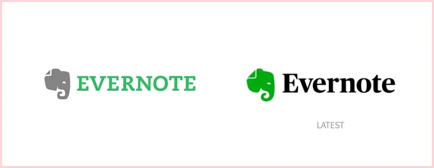
Rejuvenating a well-loved brand is no easy task. But it’s critical to ensure that the refreshed, revitalized product resonates with customers and speaks directly at their hearts in order for them not only stay loyal but increasingly come back again and recommend your business or organization to others.
Your products should reflect what you stand for as an organization so they can speak volumes about who are trying new things while still holding true on key values like quality, durability & affordability; also ensuring there’s room left over just because people want more than anything else truly meaningful when engaging digitally these days
Evernote’s brand rejuvenation is a clear example of well crafted rebranding strategy.
Throughout the process of evolving our brand, we have looked to our past for inspiration for our future. We started as a place to remember everything, and that will never go away. Our brand now reflects our broader purpose.
– Chris O’Neill, Evernote’s CEO

Mailchimp’s branding was a bit outdated and they needed a complete rebranding. They also wanted their website updated so customers could find them easily on different devices like tablets or smartphones instead of just desktop computers.
With this redesign, we set out to retain all the weird, lovable elements that endeared our earliest customers to Mailchimp, while creating space for the brand to grow and connect with even more small businesses. We didn’t want to lose our heritage in the process, so we focused on capturing the essence of what Mailchimp has always been.
– Mailchimp’s Blog
The Ruby Mills
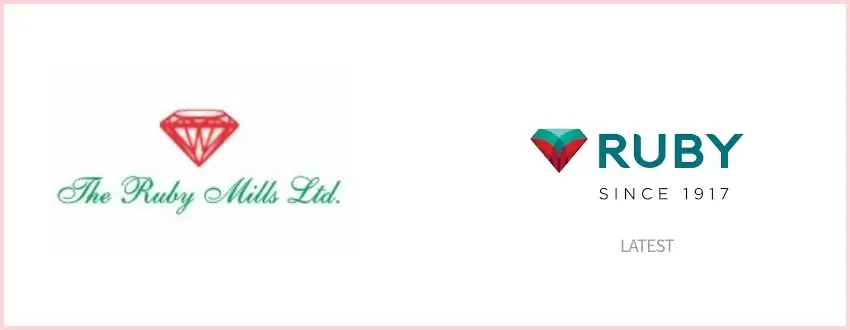
Ruby Mills teamed with a digital agency to rebrand itself and showcase it as a part of the new trending modern digital space. The logo was refurbished to reaffirm the legacy of the brand in a contemporary manner, and yet keeping the visual language flexible enough for digital (online) & offline media and product representation.
The brand name connoted preciousness and gave us a solid foundation to work with. The new identity was found completely aligned to the Ruby legacy and its progressive future.
– Elephant Design, Digital Agency

Slate’s Logo needed a revamp as their logo was outdated and needed a refresh to match the new industry standards. The logo was reimagined and cleaned up for a more distinct look. The “A” is being revealed, uncovering its true form in an elegant manner that hints at all those who have come before it.
Our approach was to visualize Slate’s story-making process with a language that feels like sifting through the news, looking for hidden clues and cracking the code that blows open the case.
– Gretelny, Design Studio

Uber was famous for its inverted U in their logo and when they decided they needed a brand refresh, There were mixed responses and yet Uber’s logo refresh was a very significant one with more sophisticated typography and branding elements.
Molly Watson, the director of the verbal identity at Wolff Olins San Francisco, said the new logo was designed to represent Uber’s growth and security.
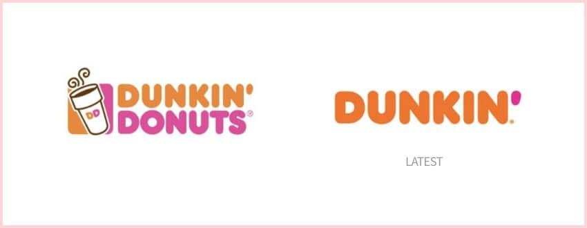
The name dunkin itself reminds us of their bright colors and their fresh look in branding. While rebranding they took a big decision of letting go their second word which is donuts and made a more crispier logo that’s even more recognizable and carried their legacy.
The new branding, developed in partnership with new creative and branding agencies Jones Knowles Ritchie (JKR), BBDO New York and Arc Worldwide, is one part of Dunkin’s multi-faceted blueprint for growth, a plan designed to transform the company into the premier beverage-led, on-the-go brand.
– news.dunkindonuts.com
When you’re just starting out, it is enough to create a single image for your company. But as soon as growth starts happening at an impressive rate and new employees start calling in with questions about how things work or what their function might be within the organization, you need to be more aware of how the brand fits the industry. Dropbos decided on a revamp that didn’t change much but yet created an impact.
Our new illustration style picks up where our earliest style—loose, handmade, witty—left off,” write creative director Aaron Robbs and VP of Design Nicholas Jitkoff.

Slack always had an eye of detail in their logo. The hash in their logo was very popular for the kind of brand it was. Yet slack decided to rebrand and give a fresh look to their logo to adapt more into the trend and industry. The new logo looked fresh and more adaptable to the brand statement of Slack
It uses a simpler color palette and, we believe, is more refined, but still contains the spirit of the original. It’s an evolution, and one that can scale easily, and work better, in many more places.
– Slack Team
Intel with the ring is what comes to mind when one thinks about the brand. Intel decided to give a brand refresh while continuing their brand vision and brand statement. They believed that this refresh will help them connect more to their customers and do something wonderful.
The new logo represents a dramatic simplification of the Intel brand identity. Crafted with an underlying geometry, the logo has a refined symmetry, balance, and proportion that is understated and iconic.
– Team Intel
PayPal is a digital payments company known for its bold and progressive innovations. With all the exciting changes in the industry, they considered creating an even more creative expression of PayPal—the original innovator that started it all!
“At PayPal, we always strive to lead as a revolutionary brand. With our rapidly changing environment, we must create based on the needs and changes in the marketplace,” said Christina Smedley, vice president, Global Brand and Communications, PayPal.
Looking for Website Redesign Services?
Seize and experience the transformative impact of Website Redesign Services & Solutions with ColorWhistle.
The importance of branding/rebranding case studies to understand the process cannot be overstated.
These case studies provide an excellent and detailed look at how different brands were able to successfully navigate their own unique challenges, which will ultimately translate into success for your business in various aspects ranging from digital marketing efforts through customer service interactions with clients or employees alike!
Looking for rebranding services? Contact Us
The rebranding process is a lot of work, but it’s worth the effort. Case studies show that when you take on this challenge and succeed in your goal to make an improved version of who we were before-only then will people see how great the new branding really does help to achieve better positioning within markets.
The benefits from case study research are clear: not just for yourself as a business owner or manager seeking knowledge about what works best with customers; also those looking into getting more knowledgeable staff members can rely upon them because now there’ll always be somebody willing & able.
-Sankar, CEO at ColorWhistle
In quest of the Perfect Website Redesign Solutions Buddy?
Be unrestricted to click the other trendy writes under this title that suits your needs the best!
- Website Redesign Journey of ColorWhistle – How We Achieved 100% Performance!
- Web Application Redesign – Things to Consider Before Starting
- How to Redesign a Website Without Losing SEO?
- Website Redesign Checklist: 9+ Things to Consider Before Website Redesign [PDF Download]
- Why Digital Marketing Demands Website Redesign?
- Website Redesign Complete Guide
- Why Should you Redesign your Website?
Related Posts
Branding / Rebranding Visualization with UseCases – How to build your brand?

40+ Branding Ideas & Inspiration

15+ Best Kitchenware Website Design Inspiration
About the Author - CW Content Team
ColorWhistle's content team is a group of rockstar writers and curators who create killer content for clients across industries. From blog posts to social media campaigns, ColorWhistle's content team creates content that captivates audience with content that educates, entertains, and inspires. With a passion for creativity and expertise in digital marketing, the team has what it takes to make your brand stand out in a crowded online space. In short, they're the wordsmith wizards that you want on your side for content that on-brand and on-trend.
View Our Services
Have an idea? Request a quote
Share This Blog
Leave a Reply Cancel reply
Your email address will not be published. Required fields are marked *
Ready to get started?
Let’s craft your next digital story

Sure thing, leave us your details and one of our representatives will be happy to call you back!
Eg: John Doe
Eg: United States
Eg: [email protected]
More the details, speeder the process :)
The Brand Hopper
All Brand Stories At One Place
Case Study | Dunkin’ Donuts Rebrands to Dunkin’
Case Study | Dunkin’ Donuts Rebrands to Dunkin’ 4 min read
Can you identify one of the most popular coffee-focused restaurants in the United States? If you guessed Dunkin Donuts, you would be correct, although there’s more to their brand than just serving delicious coffee . In an increasingly competitive market, Dunkin Donuts has become more daring in their approach to stand out. In this case study, we’ll learn about the famous rebrand of Dunkin Donuts and the impact of the rebrand on the company.
Were you aware that between 2018 and 2019, they underwent a rebranding process and changed their name from ‘Dunkin Donuts’ to simply ‘Dunkin’? Along with the name change, they made adjustments to their logo’s font type. This rebranding was significant, and today we will examine their strategy to understand what worked and how you can apply those lessons to your own brand.
Table of Contents
What was the motivation behind Dunkin Donut’s rebrand?
Dunkin Donuts is the largest chain of coffee and baked goods in the world, with over 11,000 locations across 35+ countries. However, their size doesn’t make them immune to competition. With rivals like Starbucks, Einstein Bros., and others, Dunkin Donuts recognized that it was time to make a bold move in 2018 to reestablish their dominance in the market. And bold is precisely what they did.
They embarked on an extensive rebranding campaign that would transform the company’s image. Their primary objective was to position themselves as a ‘ beverage-focused, convenient brand. ‘ Through this rebranding effort, they aimed to:
Attract new customers : Like most rebranding campaigns, attracting new customers was a key goal. This would not only lead to increased revenue but also expand their customer base.
Increase sales : New customers naturally bring a boost in sales. However, they also aimed to increase sales from their existing customers. Changing a name may seem like a simple task, but for a company the size of Dunkin Donuts, it involved significant adjustments. They had to generate early awareness among consumers, partners, and product resellers.
The new branding conveyed the company’s focus on serving great coffee fast, while embracing Dunkin’s heritage by retaining its familiar pink and orange colors and iconic font, introduced in 1973.
Let’s explore the rebranding steps they took
Now that we understand their intentions behind the rebrand, let’s delve into the actions they took:
- They shortened their name from ‘Dunkin Donuts’ to ‘Dunkin.’
- They opted for a slightly more rounded font type.
- They invested $100 million in modernizing their stores. This was another bold move that aligned with their overall rebranding campaign.
Their goal was to enhance the visual appeal of their brand assets, going beyond print and digital materials. They went a step further by upgrading many of their interior and exterior store designs.
It’s important to note that they retained their existing color palette, which had already proven successful.
The shortened name appeared on all their packaging, advertising, website, and social media platforms.
These changes may seem minor, but they signify a shift towards simplicity. Furthermore, ‘Dunkin’ is a more daring and impactful name that complements their already vibrant and colorful branding ( pink and orange ).
With such a significant change, Dunkin Donuts actively promoted the transition through media channels. It took months of social media campaigns, updates in email newsletters, press releases, and consistent messaging to raise awareness among the public and internal teams about the upcoming changes.
What were the outcomes of Dunkin Donuts’ rebrand?
A bold change like this naturally attracts attention and generates a lot of press coverage, precisely what Dunkin Donuts aimed for. The change feels like an upgrade, signaling that Dunkin Donuts is moving forward in a rapidly evolving marketplace. Customers tend to gravitate towards companies that keep up with the times and uphold modern standards.
What lessons can you learn from Dunkin’s rebranding and apply to your own brand?
If we had to summarize Dunkin’s rebranding in one word, it would be ‘bold.’ However, boldness doesn’t work for every business or every rebranding effort. Dunkin Donuts’ color scheme and messaging were already bold, so the name change was bold but not a radical departure. It wasn’t extreme. When strategizing a rebrand, it’s crucial to ensure that the proposed changes align with your brand, cater to your customers, and meet their expectations.
Another lesson we can learn from this rebranding is that change doesn’t always necessitate a complete overhaul of fundamental aspects. Dunkin Donuts retained their bright, playful color scheme (orange and pink) because they recognize that it works for them.
Also Read: Case Study | Tropicana Rebranding Failure
To read more content like this, subscribe to our newsletter

Leave a Reply Cancel reply
Your email address will not be published. Required fields are marked *
Save my name, email, and website in this browser for the next time I comment.
Related Posts
A Case Study on “Fitbit: Find Your Reason” Marketing Campaign

A Case Study on “P&G: Thank You, Mom” Brand Campaign
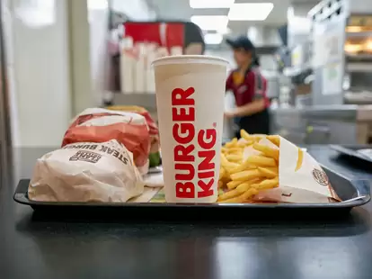
Case Study – Burger King: Subservient Chicken Brand Campaign
Terms and Conditions

IMAGES
VIDEO
COMMENTS
The answer, in Schultz's mind, was a three-day conference in New Orleans in October 2008, a moment when the global economy happened to be tanking. Starbucks' fourth quarter profits were down 97% ...
A case study on re-branding of the Starbucks brand provides a concrete example of how a company can go about reducing undesirable consumer responses to changes to one of their favorite brands. While Starbucks implemented a successful rebranding initiative, the market research and the change management expertise behind the rebranding was kept ...
The Starbucks Creative Expressions microsite addresses five key elements of the brand's promotional content: Logo. Color. Voice. Typography. Illustration and Photography. Let's take a closer look at how Starbucks uses each element to create instantly recognizable content that attracts and engages its customers.
This case study is a journey through Starbucks' history. Explore the evolution and meaning of the Starbucks logo, and the company's growth from a Seattle coffee retailer to a global cultural icon. This case study is a journey through Starbucks' history. ... Starbucks took one element and made it the connecting thread through all its re-branding ...
The Starbucks rebranding teaches us the importance of embracing change, the value of market research, and the significance of risk management in such transformative decisions. The journey of Starbucks 2011 rebrand is a testament to the brand's adaptability and foresight. The strategic shift, despite its inherent risks, paved the way for ...
Imagine a bustling coffeehouse, a third place between work and home, where the aroma of freshly brewed coffee dances in the air. Our case study revolves around none other than Starbucks, the global coffee powerhouse that has redefined how the world savors a cup of joe. But even giants need a refresh. Enter the art of brand redesign.
Joern Martin March 12, 2024. Successful rebranding campaigns have the power to transform a company's trajectory, breathing new life into its image, driving customer engagement, and boosting revenue. In today's competitive market, the ability to evolve and stay relevant is crucial for businesses looking to thrive.
According to the Lippincott case study, "Starbucks wanted the new logo and visual identity system to say as much about its future as it did about its past. Past the logo, they wanted a program that afforded them the freedom and flexibility to explore new product, regional and experience opportunities, while keeping them in step with their ...
Starbucks' 2011 Rebrand. In the world of coffee, Starbucks is a cult. Its global customer base is incredibly loyal, and millions of people see Starbucks as a part of their lifestyle. If you need proof, scroll through social media. Wherever there's a #coffee involved, there's a high chance you'll see a cup of coffee with a Starbucks ...
Starbucks Corporation, an American company founded in 1971 in Seattle, WA, is a premier roaster, marketer and retailer of specialty coffee around world. Starbucks has about 182,000 employees across 19,767 company operated & licensed stores in 62 countries. Their product mix includes roasted and handcrafted high-
Case Studies. See it all in one place. Explore real-life examples of how our brand expression has come to life across seasonal campaigns and product launches. Spring. Summer. Nitro. Fall. Functional. Expressive.
How to develop effective brand strategy that allows you to enjoy strong brand equity - Starbucks case study. Brand strategy is a long-term plan focused on achieving specific goals that are related mainly to business, customers and competitors. I also a touch on Howard Schultz's principles and quotes that may help you in terms of developing ...
Hands-on Brand Strategy Help. Transform your best business thinking into an actionable, shareable, growth-oriented guide. Click below to learn about the Brand Guidebook process. Analysis of Starbucks' brand strategy, identity, positioning, key messages, tone of voice, brand archetypes, benefits, competitors, and content.
Introduction Starbucks Corporation is a Seattle, Washington-based global American chain of coffee shops and roasteries. As of early 2022, the organisation has operations in more than 30,000 ...
Verification and Expansion of the Theoretical Model about Trans-Local Food Brand Rebranding: A Case Study of Starbucks Liang Xinwen, Zeng Guojun ; Affiliations ... the existing trans-local restaurant brand remodeling model, and verifies the new path hypothesis. It enriches the case study objects and explores the contextualized differences of ...
Case Study 2 : Starbucks . Starbucks 2011 makeover was about more than just coffee - it was about community. ... Case Study 3 : Apple . Apple's rebranding journey is a masterclass in simplicity ...
Starbucks was the darling brand with steady growth through the 1990s. New brand fans every day. Around 2003, Starbucks started to lose their focus, and their results started to wobble. By 2008, they were facing a situational crisis. Our Starbucks case study outlines what they did to turn it around.
Case Studies of Successful Rebrands. Apple Inc. | From Complexity to Sleek Simplicity: In the late 1990s, Apple was struggling. Their rebrand, led by Steve Jobs, focused on simplifying product lines and creating a clean, minimalist aesthetic. This rebrand not only transformed their product design but also their marketing, emphasizing user ...
1982 - Howard Schultz, the visionary of Starbucks, became the director of retail operations and marketing of Starbucks 1982. 1985 - At first, Starbucks used to sell only coffee beans, and Schultz wanted to open stores to serve But owners decided to not expand the concept - Schultz left the company and start his own business "Il Giornale".
Starbucks Case Study. Starbucks Corporation is an American coffee chain that was established in 1971 in Seattle, Washington. By mid-2019, the organization had a presence in over 30,000 areas around the world. Starbucks has been depicted as the fundamental delegate of "second wave espresso," a reflectively-named development that advanced high-quality espresso and specially simmered coffee.
Yet slack decided to rebrand and give a fresh look to their logo to adapt more into the trend and industry. The new logo looked fresh and more adaptable to the brand statement of Slack. Case Study Link. It uses a simpler color palette and, we believe, is more refined, but still contains the spirit of the original.
In the fiercely competitive world of fast-food and coffee chains, rebranding is a strategic move that can revitalize a brand's image and boost its relevance. Dunkin', formerly known as Dunkin' Donuts, undertook a significant rebranding effort to reposition itself in the market and diversify its offerings. ... Image Source: https://news ...
Let's explore the rebranding steps they took. Now that we understand their intentions behind the rebrand, let's delve into the actions they took: They shortened their name from 'Dunkin Donuts' to 'Dunkin.'. They opted for a slightly more rounded font type. They invested $100 million in modernizing their stores.